Wall Art Guide, Wall Art Tutoriels
Three Panel Wall Art: Triptych Arrangement Guide
Mar
So I’ve been working with triptych arrangements for like five years now and honestly, the biggest mistake people make is treating them like three separate pieces instead of one cohesive unit. Let me just dump everything I know because I literally just finished hanging a massive three-panel set in a client’s dining room yesterday and my arms are still sore.
Getting the Spacing Right
Okay so spacing is where everyone freaks out but it’s actually pretty straightforward once you get it. The standard gap between panels is 2-4 inches. I usually go with 3 inches because it’s visible enough to create distinction but not so wide that it looks disconnected. My cat knocked over my coffee while I was measuring last week and I accidentally did 6 inches between panels and it looked SO wrong, like three random pictures that happened to be near each other.
Here’s the thing though – the spacing also depends on your wall size. If you’ve got a massive wall, you can push it to 4-5 inches. Small wall? Keep it tight at 2 inches. I saw someone on Instagram do 1 inch spacing and it actually looked pretty cool for a modern minimalist vibe, but that’s gonna sound weird but it made the triptych feel almost like one continuous image with subtle breaks.
Measuring Without Losing Your Mind
Get painter’s tape. Seriously. Outline where each panel will go on the wall before you commit to any holes. I cannot stress this enough because I’ve patched more walls than I care to admit from “eyeballing it.”
The formula I use:
- Measure your total wall width
- Add up all three panel widths plus your desired gap spacing
- Subtract that total from wall width and divide by 2 for your starting point
- Mark the center of your wall first as a reference point
Wait I forgot to mention – you want the CENTER of your triptych centered on the wall, not the left edge. This trips people up constantly.
Height Placement That Actually Works
The art world says center your artwork at 57-60 inches from the floor, which is “gallery height” or whatever. In real life? I do 60 inches to the center of the middle panel for most residential spaces. But here’s what nobody tells you – if you’re hanging above a sofa, you want 6-8 inches above the sofa back, and sometimes that means ignoring the 60-inch rule completely.
I had this client who insisted on the 60-inch rule above her low-profile modern couch and there was like 14 inches of gap and it looked ridiculous. We moved it down and suddenly the whole room came together. Trust your eyes over rules sometimes.
The Alignment Situation
All three panels should be at the SAME height. Use a level. Please use a level. I’ve seen too many DIY attempts where each panel is at a slightly different height and it creates this weird stair-step effect that makes people feel vaguely nauseous without knowing why.
Pro tip: measure from the ceiling down instead of the floor up, because floors are rarely level. Ceilings aren’t always level either but they’re usually closer.
Horizontal vs Vertical Orientation
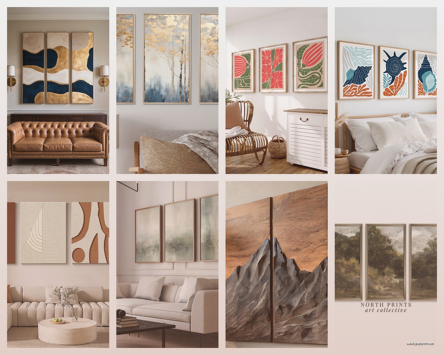
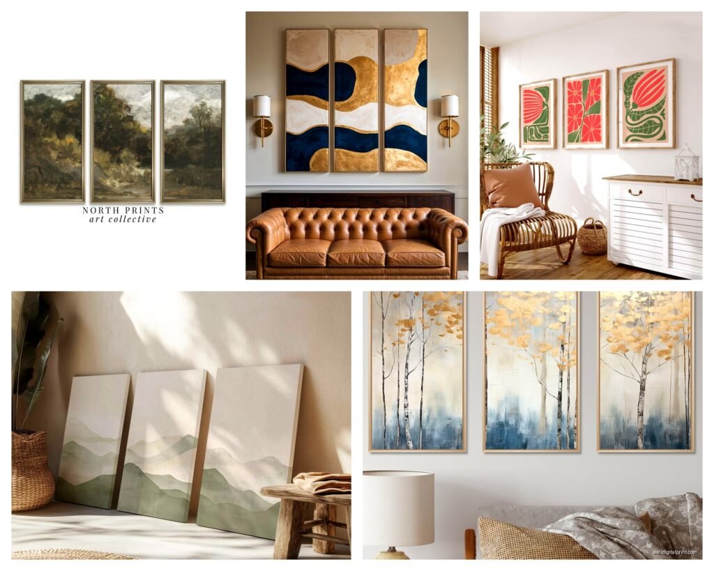
Okay so funny story, I once bought a vertical triptych thinking it would work above my credenza and it was a complete disaster because the proportions were all wrong. Horizontal triptychs (landscape orientation) work better for:
- Above sofas and beds
- Long hallways
- Above console tables or credenzas
- Spaces where you want to emphasize width
Vertical triptychs are trickier but they’re amazing for:
- Narrow walls between windows
- Spaces with high ceilings where you want to draw the eye up
- Creating drama in entryways
The general rule is your triptych should take up about 2/3 to 3/4 of the width of your furniture piece if it’s hanging above something. So if your sofa is 84 inches wide, you’re looking for a triptych with a total width (including gaps) of around 56-63 inches.
Frame Matching and Panel Sizes
This is gonna be controversial but I actually don’t think all three panels need to be the exact same size. Equal sizes are easier and look more traditional, sure. But I’ve done plenty of arrangements where the center panel is larger and the side panels are smaller, and it creates this really interesting focal point.
If you go this route though, keep the HEIGHT consistent across all three. Like you could do 16×20 for the center and 12×20 for the sides. The varying widths create interest but the matching heights keep it cohesive.
Frames should match. Just… match them. I’ve tried the eclectic frame thing with triptychs and it never works because the whole POINT of a triptych is unity. Save your frame mixing for gallery walls.
The Actual Hanging Process
Get yourself some proper picture hanging hooks rated for your frame weight. Those tiny nails that come with frames are garbage. I use monkey hooks for lighter pieces (under 10 lbs) because they don’t require finding a stud, but anything heavier needs a proper wall anchor or stud.
My process:
- Mark all positions with painter’s tape first
- Hang the center panel first using a level
- Measure out from the center panel to mark your side panels
- Use the level across ALL THREE panels before hammering anything
- Step back frequently – like every 30 seconds – to check the overall look
Oh and another thing, take a photo with your phone from across the room. Your camera will catch alignment issues your eyes might miss because you’re too close to it.
Hardware Considerations
If your panels have D-rings on the back, make sure they’re at the SAME HEIGHT on each panel. I’ve bought sets where the manufacturer attached them at slightly different heights and it’s maddening. You can fix this by moving the D-ring or using picture wire to adjust.
Picture wire is actually my preferred method for triptychs because it gives you more flexibility in adjusting the height after hanging. You can hook the wire at different points to raise or lower the panel slightly without re-doing your wall hooks.
What Actually Looks Good Together
Content-wise, your three panels should have some relationship to each other. The obvious ones:
- One image split across three panels (panoramic)
- Three complementary abstract pieces in the same color palette
- Three photos from the same location or theme
- Sequential images showing progression or movement
I’m currently watching this show about art forgers and it’s making me paranoid about buying prints online but anyway – when you’re choosing your triptych, make sure there’s a visual flow from left to right. Your eye should move naturally across all three panels.
Color coordination matters more than you think. Even if the images are different, pulling from the same color family makes them feel intentional. I did a beach triptych once where all three had different scenes but they all had that same blue-grey ocean color and it tied everything together perfectly.
Common Spacing Mistakes
Too wide: anything over 6 inches starts looking like three separate pieces that happen to be on the same wall. I see this all the time in online tutorials and it drives me crazy.
Too tight: less than 1 inch makes it look cramped and the panels compete with each other instead of complementing.
Uneven spacing: this happens when people measure from the wall edges instead of accounting for frame width variations. Always measure the GAP between frames, not from wall to frame.
The Furniture Proportion Thing
If your triptych is too small for the wall or furniture, it looks like it’s floating in space. Too large and it overwhelms everything. I had a client who bought this gorgeous triptych but it was literally the same width as her sofa and it looked like it was gonna fall on someone’s head even though it was properly secured.
The sweet spot is having at least 6-8 inches of wall visible on each side of your triptych if it’s above furniture. This creates visual breathing room.
Lighting Makes or Breaks It
Natural light is great but watch for glare, especially if you’ve got glass on your frames. I position triptychs perpendicular to windows when possible to minimize this.
For artificial lighting, picture lights mounted above the triptych look amazing but they’re a pain to install. Track lighting or adjustable spotlights work too. The goal is to light the artwork evenly across all three panels – you don’t want one panel in shadow and the others bright.
Avoid hanging triptychs directly across from windows if you can help it because you’ll get that reflection thing where you can’t actually see the art during certain times of day.
Different Wall Types
Drywall is standard – use anchors for anything heavy.
Plaster walls are harder and you’ll want to use a masonry bit and proper plaster anchors. My old apartment had plaster and I cracked it twice before figuring this out.
Brick or concrete needs a hammer drill and concrete anchors. This is honestly where I call in help because it’s too easy to mess up.
If you’re renting and can’t make holes, there are adhesive strips rated for heavy pictures now. I’ve used the Command brand ones for panels up to 15 lbs each and they’ve held fine, but read the instructions carefully about wall texture and weight limits.
Style-Specific Arrangements
Modern minimalist spaces look best with simple frames, lots of white space around the triptych, and clean lines. Go with the standard 2-3 inch spacing.
Traditional or classical rooms can handle more ornate frames and you can push the spacing slightly wider, maybe 4 inches, to give each piece more individual presence.
Bohemian or eclectic spaces are where you can play with that varied panel size thing I mentioned earlier. Mix in some texture with canvas prints instead of framed pieces.
When Symmetry Isn’t Working
Sometimes your wall has weird architectural features – a window off to one side, a doorway that’s not centered, whatever. In these cases, you might need to offset your triptych slightly to create VISUAL balance rather than mathematical center.
This is more art than science and you gotta just trust what looks right. Take pictures from different angles and see what feels balanced.
Maintenance Nobody Talks About
Dust your triptych regularly with a microfiber cloth. Sounds obvious but people forget about art until it’s visibly dirty.
Check the hanging hardware every few months, especially if you live somewhere humid or with temperature fluctuations. Things shift and loosen over time.
If a panel goes crooked, don’t just straighten that one – check all three because if one shifted, the others probably did too.
The investment in a triptych is worth it when you get it right – it creates such a strong focal point and ties a room together in a way that single pieces just can’t match. Just take your time with the planning and measuring part and you’ll be fine.