Wall Art Guide, Wall Art Tutoriels
Elegant Wall Art for Living Room: Sophisticated Designs
Apr
So I’ve been obsessing over wall art lately because my living room looked like a sad beige box for way too long, and honestly the difference between elegant art and just… stuff on your wall comes down to materials more than people think.
Canvas vs Fine Art Prints and Why It Actually Matters
Okay so canvas is everywhere right? But here’s the thing – not all canvas is created equal. I learned this the hard way when I bought this gorgeous abstract piece online and it arrived looking like someone printed it on a bedsheet. The material was so thin you could see the wooden frame through it, and it just screamed cheap even though the design itself was beautiful.
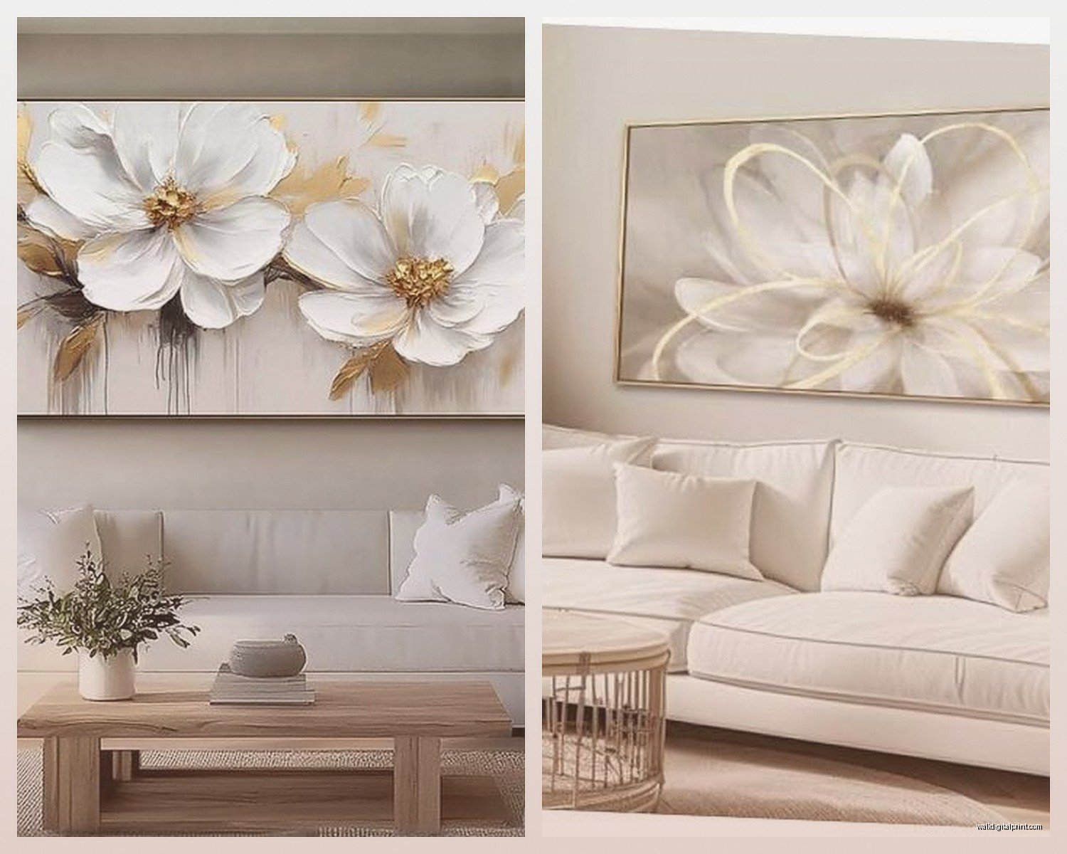
What you actually want is gallery-wrapped canvas that’s at least 400gsm weight. That number matters because thinner canvas shows every imperfection and sags over time. I’ve got this one piece in my living room that’s been up for three years now, 400gsm cotton-polyester blend, and it still looks taut and professional. The edges are wrapped cleanly around a 1.5-inch deep frame which gives it this really sophisticated floating effect.
But honestly? Fine art prints on archival paper sometimes look even more elegant than canvas. Giclée prints on cotton rag paper have this texture and depth that canvas can’t match. My favorite piece above my sofa is actually a giclée print of this minimalist line drawing, and the paper quality makes such a difference. You can see the individual ink deposits if you look close enough, gives it that gallery vibe.
Frame Materials That Don’t Look Basic
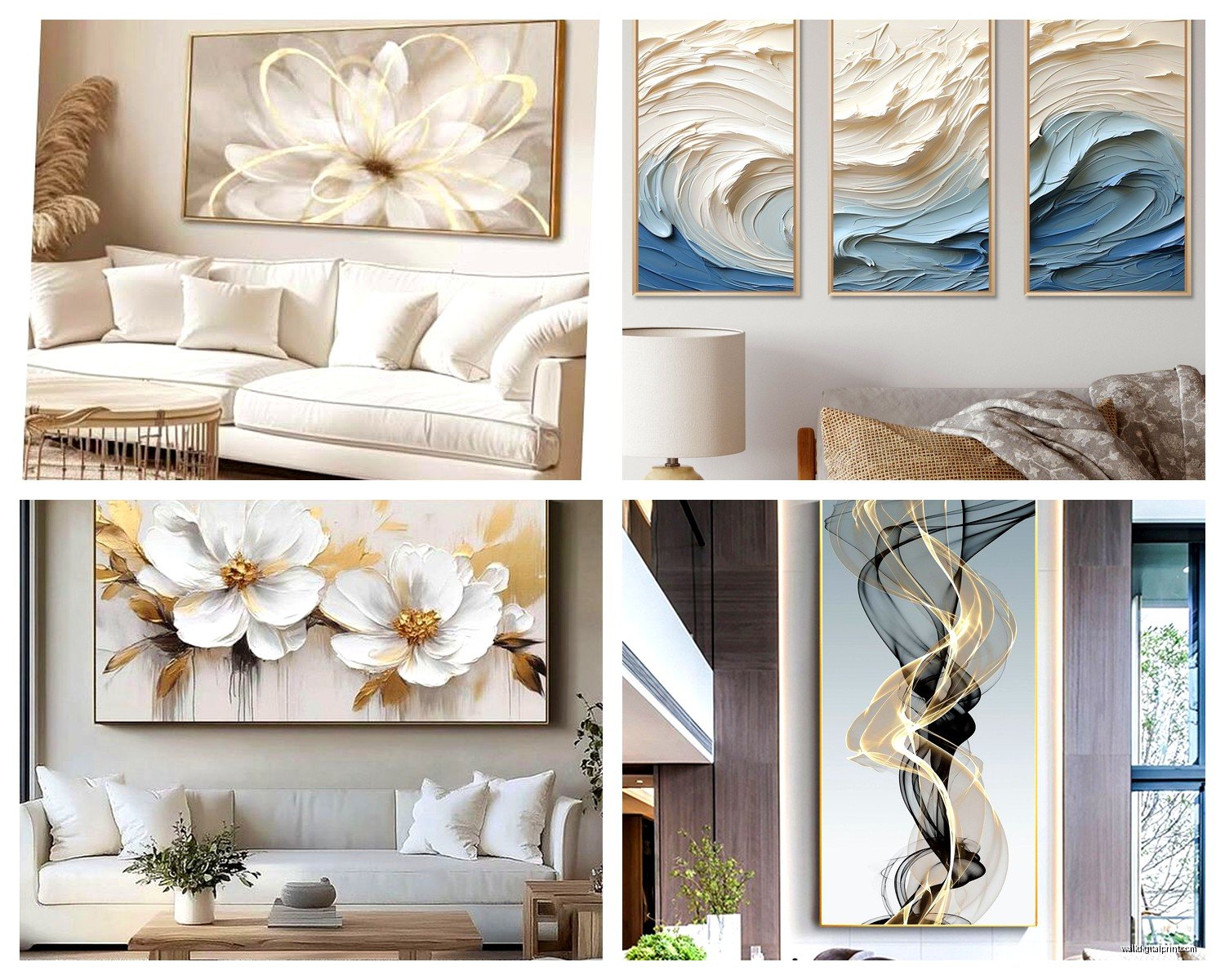
Oh and another thing – frames are where most people mess up the elegant factor. Black aluminum frames are having a moment and I’m here for it. They’re lightweight, they don’t warp like wood can, and they have this clean contemporary look that works with literally everything. I just installed three matching aluminum-framed botanical prints in a client’s living room last week and the transformation was insane.
Natural wood frames are classic but you gotta be careful. Oak and walnut are your friends for sophistication. Pine? Unless it’s stained really well, it can look craft-store-y. I made that mistake once with these gorgeous pressed flower prints – put them in raw pine frames thinking it would look rustic-elegant, and it just looked unfinished. Switched them to oil-rubbed walnut frames and suddenly they belonged in the space.
Brass or gold leaf frames are tricky. They can look either incredibly elegant or like your grandmother’s house, there’s no middle ground. The secret is going modern with the shape – thin profiles, clean lines, no ornate corners. I’ve got this one gold-leaf frame that’s literally just four thin strips of gilded metal, and it makes this simple charcoal sketch look like it costs thousands.
Acrylic vs Glass and the Weight Issue
This is gonna sound weird but I’m obsessed with acrylic glazing now. Museum-grade acrylic is lighter than glass, doesn’t shatter if it falls, and has better UV protection. The clarity is just as good as glass if you get the good stuff – look for optically clear acrylic or Plexiglas OP-3.
Regular glass is fine for smaller pieces but anything over 24×36 inches gets SO heavy with glass. I helped my sister hang this massive 40×60 landscape photograph in glass and we needed three people plus special anchors. When I redid my own gallery wall, I went all acrylic for everything over 20 inches and the installation was so much easier.
The only downside with acrylic is it scratches easier than glass, so you gotta use microfiber cloths only when cleaning. No paper towels or you’ll see every little scratch in the right light.
Metal Art That Doesn’t Look Like Gas Station Decor
Metal wall art gets a bad rap because there’s so much tacky stuff out there, but high-quality metal pieces are actually incredibly elegant. I’m talking about powder-coated aluminum or brushed steel, not the laser-cut stuff from discount stores.
I recently installed this brushed brass geometric piece in someone’s living room and it completely elevated the space. The material matters here – you want solid metal, not metal-look plastic or thin stamped sheets. When you tap it, it should sound solid, not hollow or tinny.
Corten steel has this beautiful rust patina that works in modern spaces. It’s weathered but intentional, you know? I’ve got a small corten piece near my fireplace and my cat is obsessed with sitting next to it for some reason, but anyway – the texture catches light differently throughout the day which keeps the wall interesting.
Textured Materials for Dimension
Wait I forgot to mention – textured materials add SO much sophistication because they create actual shadows and depth. Embossed prints, encaustic (that’s wax-based art), sculptural elements… these take wall art from flat decoration to actual design element.
I tested this theory last month when a client couldn’t decide between a flat abstract print and a textured resin piece. We hung both temporarily and the textured one won immediately. It created these subtle shadows that changed with the natural light, made the whole wall feel alive instead of static.
Handmade paper art is another material people overlook. I’m talking about thick cotton pulp paper with deckled edges, sometimes with pressed flowers or natural fibers embedded. It has this organic elegance that feels really current right now. You just gotta seal it properly if your living room gets humid.
What Actually Works in Different Lighting
Okay so funny story – I spent like three hours picking the perfect charcoal drawing for above my couch, hung it up, loved it during the day, then turned on my lamps at night and it completely disappeared. The material was too matte, absorbed all the light.
This is where finish matters as much as material. Semi-gloss or satin finishes on prints reflect just enough light to stay visible in dim lighting without creating glare. Totally matte works great in bright rooms or with dedicated picture lighting, but in living rooms with ambient lighting? You need some reflective quality.
Metallic inks or gold leaf accents catch light beautifully at night. I’ve got this one print with subtle gold details that you barely notice during the day, but when the table lamps come on? It glows. That material choice makes it work 24/7.
Sustainable Materials If You Care About That
I’m gonna be real, sustainable art materials are getting really good. Recycled aluminum frames, FSC-certified wood, plant-based inks, bamboo paper – you don’t have to sacrifice elegance for eco-friendliness anymore.
There’s this company I work with sometimes that makes frames from reclaimed barn wood, and they’re stunning. Each piece has its own character from the weathering and old nail holes, but they clean them up and finish them so they look intentionally rustic-elegant, not distressed-farmhouse-y.
Cork is another material showing up in modern wall art. Sounds weird but thin cork sheets printed with minimalist designs have this warm texture that works really well in contemporary spaces. Plus it’s naturally antimicrobial which is random but kinda cool.
The Mounting Material Nobody Thinks About
Oh and another thing that affects the final elegant look – how it’s mounted matters. I see beautiful art ruined by visible wire hangers or cheap sawtooth brackets showing at the top.
French cleats are my go-to for anything heavy. They’re two interlocking pieces of wood or metal, one on the wall and one on the frame, that slide together. Super secure and completely invisible from the front. You can hang and rehang without making new holes.
For lighter pieces, I love keyhole mounts recessed into the back of the frame. Or D-rings positioned one-third down from the top on each side with braided steel wire. Not that cheap brass wire that stretches – proper steel cable that stays taut.
Museum putty for very small lightweight pieces gives that floating-on-the-wall look which feels really sophisticated. No visible hardware at all.
Mixing Materials Without Looking Chaotic
This is where people get nervous but honestly it’s easier than you think. The trick to mixing materials elegantly is keeping one element consistent. Either the color palette, or the frame style, or the subject matter.
I’ve got a gallery wall with canvas, framed prints, a small metal sculpture, and a woven fiber piece. Sounds like it should be a mess right? But they’re all in the same neutral color scheme – blacks, whites, natural wood tones – so it feels cohesive even though the materials vary.
Or go the other direction and keep all the same material but vary everything else. All black-framed prints but different sizes, subjects, and orientations. The material consistency holds it together.
My living room has mostly works on paper in wood frames, but I added one large canvas piece as an anchor. That one material difference actually makes it more interesting because it’s intentional, not random.
What to Avoid Material-Wise
Okay real talk – some materials just don’t read as elegant no matter how you style them. Printed vinyl or fabric posters, even framed, usually look temporary. The material itself lacks weight and presence.
Plastic frames trying to look like wood or metal – they always give themselves away. The weight is wrong, the corners never quite match up perfectly, and they warp over time. Just gotta spend a bit more for actual materials.
Really high-gloss finishes on prints can look cheap unless you’re going for that modern gallery vibe specifically. Too much shine reads as commercial rather than sophisticated in most living rooms.
And I learned this one the hard way – avoid materials that require constant maintenance in a living room setting. I had this beautiful raw canvas piece that needed to be brushed weekly to prevent dust buildup in the texture. Looked amazing but wasn’t practical for everyday living.
Where to Actually Source Quality Materials
So my client canceled yesterday so I spent an hour comparing art suppliers online, and the price difference for the same materials is wild depending on where you look.
For frames, I usually go to Frame USA or American Frame online – they do custom sizing in quality materials without the markup you get at framing shops. Michaels and Hobby Lobby are fine for very small pieces but their larger frames are often lower quality materials.
Art prints, I look for artists selling directly on their own sites or through Society6, Minted, or Saatchi Art. You can filter by material type and read the actual specs. Etsy can be good but you really gotta read descriptions carefully about what materials they’re actually using.
For canvas specifically, I test-ordered from like five different print-on-demand sites and CanvasPop had the best material quality for the price. Heavy canvas, solid stretcher bars, clean wrapping.
Metal art is trickier – you kinda have to see it in person or order from places with good return policies. West Elm and CB2 actually have decent metal pieces if you catch them on sale, real materials not just metal-look.
The Long-Term Material Considerations
Something I wish someone had told me earlier – think about how materials age in your actual living conditions. My living room gets afternoon sun, so anything with cheap inks has faded over time. Now I only buy archival inks rated for lightfastness, usually labeled as museum-quality or conservation-grade.
Canvas can sag over the years, especially in humid climates. If you live somewhere humid, either go with prints under glass/acrylic, or make sure canvas pieces have proper stretcher bars with corner keys you can tighten to re-stretch them.
Wood frames in rooms with big temperature swings (like near fireplaces or windows) can warp. Metal doesn’t have this issue which is why I’m using it more and more.
Some materials are just gonna need replacing eventually and that’s okay. I’ve accepted that my beloved paper prints will probably need conservation work in 15-20 years. But metal and quality canvas should last basically forever if treated well.
Anyway that’s basically everything I’ve figured out through way too much trial and error with wall art materials. The elegant look really does come down to choosing quality materials that work with your specific space and lighting, not just pretty designs. And honestly once you know what to look for in terms of canvas weight, frame materials, and proper finishes, shopping for wall art gets way easier because you can immediately spot the good stuff.