Wall Art Guide, Wall Art Tutoriels
Family Wall Art for Living Room: Photo & Quote Displays
Apr
So I spent like three weekends completely redoing my living room wall situation and honestly, the whole family photo and quote display thing is trickier than Pinterest makes it look. Let me just dump everything I learned because I made SO many mistakes first.
Frame Materials That Actually Matter
Okay so wooden frames. Everyone says get them but here’s the thing – you need to know what kind of wood. I bought these cheap pine frames from that big box store and they warped within like six months because my living room gets afternoon sun. Total waste. Now I only buy hardwood frames (oak, walnut, maple) or at minimum, MDF with a decent veneer that won’t peel.
The metal frames are honestly underrated? I use aluminum frames for my black and white family photos and they’re SO much lighter than wood. Like you can hang a 20×24 metal frame with just a basic picture hanger nail, whereas the wood one needs actual anchors. My cat knocked one off the console table once and it didn’t even dent. Just… bounced. The glass cracked but the frame was fine.
For quotes specifically, I’ve switched almost entirely to acrylic frames. They’re plastic but the good ones look like glass, and if you’ve got kids running around or you’re hanging stuff in high-traffic areas, it’s just smarter. I use the Framebridge acrylic ones mostly – yeah they’re pricier but they don’t yellow like the cheap acrylic does.
Glass vs Acrylic Breakdown
Real glass pros: doesn’t scratch easy, actually looks clearer, feels more substantial
Real glass cons: heavy as hell, breaks, creates glare unless you get the museum glass which is $$$$
Acrylic pros: lightweight, shatterproof, decent UV protection on the good stuff
Acrylic cons: scratches if you look at it wrong, can get staticky and attract dust
I use glass for photos I’m never touching again once they’re hung, acrylic for quote prints that I swap out seasonally.
Print Quality Stuff Nobody Tells You
This is gonna sound weird but the paper texture matters more than I thought. I printed the same family photo on glossy, matte, and this textured fine art paper. The glossy looked like a school photo from 1995. The matte was fine but kinda flat. The textured paper made it look like an actual professional photograph you’d see in a gallery.
For family photos, I do either luster finish or this semi-gloss that Mpix offers. Luster has just enough sheen to make colors pop without that glare problem. I print everything at least 300 DPI – learned that the hard way when I tried to blow up a phone photo to 16×20 and it looked pixelated from like two feet away.
Quote prints are different though. I actually prefer matte for typography because any glare makes text harder to read. And honestly? I’ve started just designing my own quote prints in Canva and sending them to a local print shop instead of buying those Etsy downloads. Not because Etsy ones are bad but because I got tired of seeing the same “In this house we do…” print in literally every living room on Instagram.
Layout Planning Without Losing Your Mind
okay so funny story, I spent four hours putting nail holes in my wall for a gallery wall arrangement that looked terrible once I actually hung everything. Now I use painter’s tape. Just… trust me on this.
Cut pieces of painter’s tape or kraft paper to the exact size of each frame. Stick them on the wall. Move them around until it looks right. Stand back. Look at it for a day. Move them again probably. THEN make your nail holes.
The spacing thing is weirdly specific but 2-3 inches between frames is the sweet spot for gallery walls. Less than that looks cramped, more than 4 inches starts looking disconnected. I use a ruler and level for the first few frames then honestly just eyeball the rest because perfectionism will kill you here.
For a single large statement piece (like a big family portrait with a quote overlay), you want the center of the frame at eye level, which is usually 57-60 inches from the floor. But this depends on your ceiling height and furniture. If you’ve got a sofa underneath, the bottom of the frame should be 6-8 inches above the sofa back.
Grid vs Salon Style
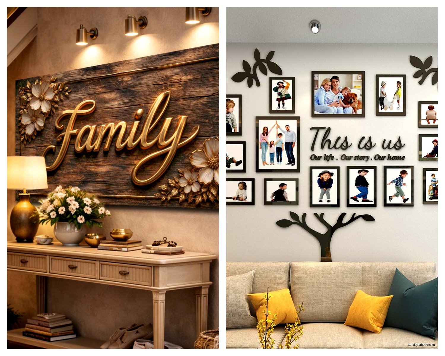
Grid layouts (same size frames, evenly spaced) are easier and look more modern. I did a 3×3 grid of 8×10 family photos with matching black frames and it took maybe an hour to hang. Very satisfying if you like symmetry.
Salon style (different sizes, more organic arrangement) looks amazing but requires actual patience. I map these out on the floor first, take a photo, then recreate it on the wall with that tape method. The trick is to maintain roughly the same spacing between all frames and create an overall shape – like keep the outer edges forming a rectangle or square even if the inside is chaotic.
Hanging Hardware That Won’t Fail
Wire hangers that come with frames are honestly terrible for anything over 5 pounds. I replace them immediately with D-rings positioned about 1/3 down from the top of the frame. Use two D-rings with picture wire if the frame is wider than 20 inches.
For the wall side, I’m obsessed with these monkey hook things for drywall. You just push them in and twist, no tools needed, they hold up to 50 pounds. But only in drywall – they don’t work in plaster or on studs obviously.
If you’re hanging something heavy (like a big wooden frame with glass), find the stud. I use a stud finder app on my phone which sounds ridiculous but actually works? Or just knock on the wall until the sound changes from hollow to solid. Use wood screws directly into the stud for anything over 20 pounds.
Command strips work for lightweight stuff under 5 pounds but they WILL eventually fail in humid environments or if your wall gets hot from sun exposure. Ask me how I know. Actually don’t, it involved my favorite wedding photo crashing down at 2am.
Quote Selection and Sizing
I’m just gonna say it – most family quotes are cheesy as hell. I avoid anything that rhymes or mentions “blessed” or has more than 10 words. Shorter quotes have more impact anyway.
Some that actually work in real living rooms:
“Family” in simple typography
Coordinates of where you got married or where your kids were born
Just your last name in a nice serif font
A single word like “Together” or “Home” or whatever
Song lyrics that aren’t cringey (harder than it sounds)
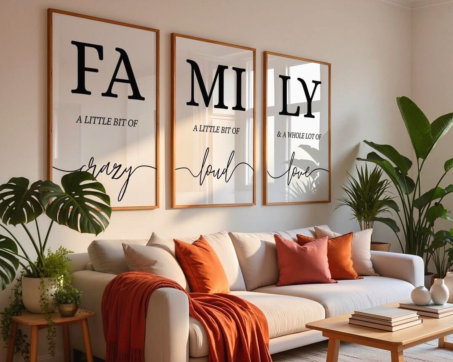
Size-wise, the quote print should be proportional to your wall and surrounding frames. A 5×7 quote on a huge empty wall looks lost. I generally don’t go smaller than 11×14 for quote prints in a living room, and I’ve gone up to 24×36 for a statement piece.
The font matters too. Sans serif fonts (like Helvetica, Futura) look modern and clean. Serif fonts (like Garamond, Didot) look more traditional. Script fonts can look elegant or can look like a wine mom’s Pinterest board depending on execution. I stick with classic serif fonts mostly because they age better.
Mixing Photos and Quotes
This is where people mess up usually. Don’t mix too many fonts if you’re doing multiple quote prints. Pick one or maybe two max and stick with them. Same with frame colors – I learned this after creating a chaotic mess of black, white, and natural wood frames that just looked… confused.
My current setup is black frames throughout, mix of family photos and two quote prints (our wedding coordinates and just the word “Family” in Garamond). The consistency in frames lets the content be varied without looking cluttered.
Another approach is to do all photos in one style (all black and white, or all color) with quotes in the opposite to create contrast. So color family photos with black text on white background quotes.
Lighting Considerations
Picture lights are expensive and honestly unnecessary unless you’re going full formal living room vibes. But you do need to think about natural light. I had family photos fading on my west-facing wall until I switched to UV-protective glass and moved the color photos to a different wall.
If your living room is dark, lighter mat boards and white frames help. Dark frames can disappear into shadowy walls. I added a couple of those battery-operated puck lights above my gallery wall which sounds extra but actually it looks way better in the evenings.
Budget Breakdown
You can do this cheap or you can spend a fortune. I’ve done both.
Cheap route: IKEA frames ($5-15 each), print your own photos at Costco or Walgreens (like $0.50-3 per print), design quotes in Canva free version, hang with monkey hooks ($8 for a pack). Total for a small gallery wall maybe $50-75.
Mid-range: Better frames from Target or West Elm ($20-40 each), professional printing from Mpix or Nations Photo Lab ($10-30 per print), custom quote prints from Minted ($30-60), proper hanging hardware. Maybe $200-400 for a decent wall.
Splurge: Custom framing from a frame shop ($100-300 per frame easily), museum-quality prints, original art mixed in. Sky’s the limit really but you could hit $1000+ quick.
I’m somewhere in the middle usually. I’ll splurge on frames for the main family portrait and go cheaper on the supporting pieces.
Common Mistakes I Made So You Don’t Have To
Hanging everything too high. Seriously everyone does this. Lower than you think.
Not considering the furniture below. Your wall art should relate to your sofa or console table, not just float randomly.
Too many different styles. Pick a vibe and commit – modern, traditional, eclectic, whatever. Don’t mix farmhouse quote prints with ultra-modern photo frames unless you really know what you’re doing.
Forgetting about cords and vents. I hung a beautiful frame directly over an air vent once and the heat warped it. Also hung one where the TV cord hung right through the middle of my gallery wall. Not cute.
Using photos from different eras with different color tones all together. Either convert everything to black and white or make sure the color editing is consistent. I ran all mine through the same VSCO filter before printing.
Not planning for changes. Kids grow, you take new photos, you get sick of that quote. I leave space or use arrangements where I can swap pieces out without redoing the whole wall. Modular is smarter than permanent.
wait I forgot to mention matting – mats are those borders inside frames around prints. They’re not required but they make everything look more expensive and professional. White or cream mats work with literally everything. I use 2-3 inch mats for most frames. You can get pre-cut mats cheap online or get custom ones cut at a frame shop.
The other thing is keeping your photos updated. I see so many living rooms with baby photos when the kids are clearly teenagers now. Update your wall at least every few years with current family photos. Mix in some older ones for nostalgia but keep it somewhat current.
My dog just knocked over my water bottle but anyway – the biggest thing is just starting. You can always rearrange, replace frames, swap photos. Nothing is permanent unless you want it to be. I’ve redone my living room wall like four times in two years and it’s fine, it’s how you figure out what actually works in your space.