Wall Art Guide, Wall Art Tutoriels
Metal Wall Art for Dining Room: Sculptural Focal Points
Apr
So I’ve been obsessing over metal wall art for dining rooms lately because honestly, it’s one of those things that can either make your space look like an art gallery or like you grabbed something random from HomeGoods without thinking. And there’s a huge difference.
First thing – size is where everyone messes up. I had this whole situation last month where a client bought this gorgeous copper piece, spent like $400 on it, and it was completely swallowed by their wall. The dining room was maybe 12×14 feet and they got something that was 24 inches wide. Which sounds big until you actually hang it and realize it looks like a postage stamp. Generally you want your metal art to take up about 60-75% of the wall space you’re filling, or if it’s above a sideboard or console, it should be roughly two-thirds the width of the furniture piece.
Material Types and What They Actually Mean for Your Space
Okay so there are like five main types of metal you’ll see and they all age differently which no one tells you until it’s too late.
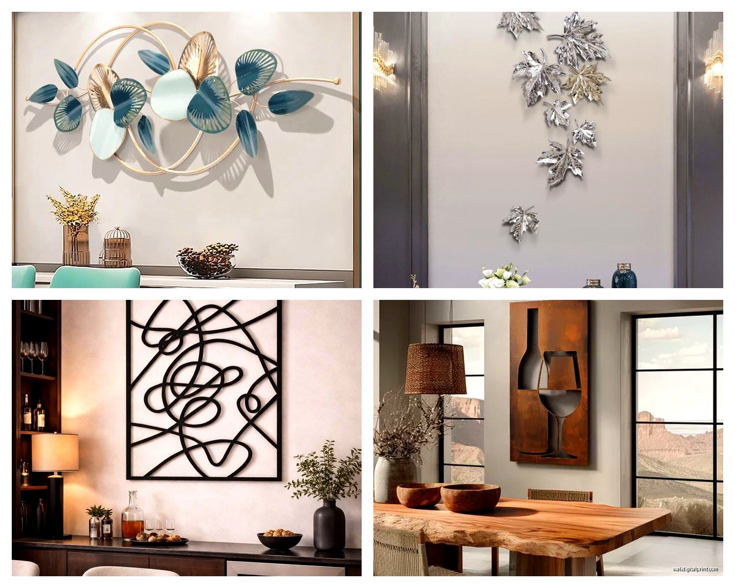
Wrought iron is super traditional and heavy – I’m talking like you need to find a stud or use serious anchors. It’s got that matte black finish usually and works amazing in farmhouse or industrial spaces. The sculptural pieces tend to be more organic, like branches or abstract nature stuff. Downside is it can rust if you live somewhere humid, so my friend in Charleston had to seal hers with a clear coat.
Copper and brass develop this patina over time which is either exactly what you want or your worst nightmare depending on your aesthetic. I have a copper sunburst in my own dining room and after about eight months it went from shiny penny to this gorgeous greenish tone. But you gotta be okay with that change. If you want it to stay shiny, you’re gonna be polishing it every few months and honestly who has time for that.
Aluminum is lightweight which makes it easier to hang but it can look cheap if you get a poorly made piece. The benefit is it doesn’t rust or tarnish, so it’s basically set it and forget it. I’ve noticed a lot of the geometric modern pieces are aluminum because you can get these really thin, clean lines.
Steel and stainless steel – steel rusts (that’s actually desirable for some industrial looks), stainless doesn’t. Stainless is more expensive but if you’re putting it anywhere near a kitchen or where there’s moisture, it’s worth it. I learned this the hard way with a piece near my coffee bar that started showing rust spots within like three months.
Mixed metal pieces combine different finishes and they’re having a moment right now. Like copper leaves with black iron branches. These work really well if you’re trying to tie together different metal finishes in your dining room – like if you have brass light fixtures and black cabinet hardware.
Style Categories That Actually Matter
The sculptural aspect is what makes metal wall art different from just hanging a framed print. You’re adding dimension and shadow play.
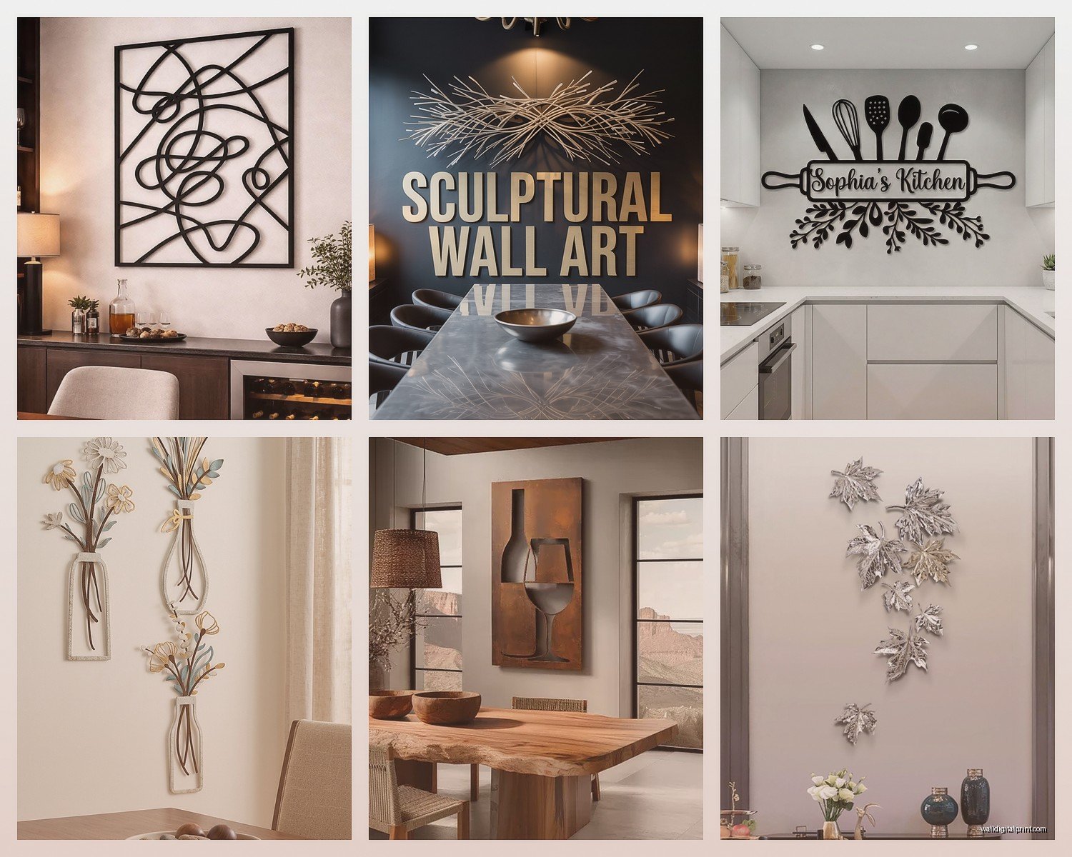
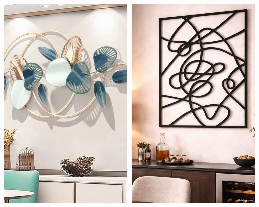
Abstract geometric – think overlapping circles, hexagons, angular shapes. These work in modern and contemporary spaces. I just installed one that’s basically a bunch of gold-finished metal rectangles at different depths and the way it catches light during dinner is actually really cool. These tend to be flatter though, maybe 2-3 inches of depth.
Nature-inspired – leaves, trees, birds, flowers. This is the biggest category and honestly some of it veers into tacky territory real fast. The key is scale and simplification. A single oversized metal leaf sculpture? Gorgeous. A bunch of tiny metal butterflies scattered across the wall? We’re not doing that. I saw this willow tree piece last week that was like 48 inches wide and it had maybe 20 branches total – the negative space was doing all the work.
Sunbursts and radiating designs – these have been popular forever and they’re not going anywhere. They work above sideboards or as a centerpiece on a large wall. The trick is matching the finish to your other metals and making sure the size is substantial. A 36-inch diameter is usually the minimum for a standard dining room.
Layered dimensional pieces – these have multiple planes that create serious depth, sometimes 6-8 inches off the wall. They’re basically sculptures that happen to hang. I’m working with one right now that’s waves of bronze-finished metal and it costs a fortune but it looks like actual art. These need space around them to breathe – don’t crowd them with other stuff.
The Whole Installation Thing No One Explains Properly
Okay so funny story, I once hung a 40-pound metal piece using the hardware that came with it and it literally fell off the wall during a dinner party. Scared everyone half to death and put a hole in the drywall. So here’s what actually works.
For anything over 15 pounds, you need to hit studs or use toggle bolts. Those little picture hanging strips? Not gonna cut it. Most metal art comes with D-rings or a sawtooth hanger on the back, and I always replace them with heavy-duty D-rings if they feel flimsy.
My go-to setup: two D-rings, each one-third in from the edges, attached to wall anchors rated for twice the weight of the piece. Yeah it’s overkill but I sleep better. And use a level – metal art shows off being crooked way more than a framed picture does because of how light hits it.
For really heavy pieces (over 30 pounds), I use a French cleat system. It’s basically two interlocking pieces of metal – one on the wall, one on the art. It distributes weight evenly and the piece just hooks on and sits flush. You can get these at hardware stores for like $15.
Finish and Color Choices
This is where I see people get paralyzed with options. My cat just knocked over my coffee cup so hold on…
Okay back. So finishes – you’ve got matte, brushed, polished, antiqued, powder-coated colors, and everything in between.
Matte black is probably the safest choice and works with literally any color scheme. It creates strong contrast against light walls and adds definition without competing with your other decor. I use this a lot in transitional spaces.
Gold and brass finishes add warmth and luxury but they can read as dated if the piece itself is too traditional. Modern geometric pieces in gold? Amazing. Ornate scrollwork in gold? Feels very 2008. The key is keeping the design clean if you’re going with a warm metallic.
Silver, chrome, and pewter finishes are cooler toned and work well in contemporary spaces or with gray/blue color schemes. They can feel a bit cold though, so I usually make sure there’s wood or warm textiles in the room to balance it out.
Copper and bronze are having this huge moment because they bridge warm and cool. They work with both modern and traditional styles. That patina I mentioned earlier adds character over time – my bronze piece has gotten more beautiful as it’s aged.
Powder-coated colors – you can get metal art in literally any color now. Navy blue, emerald green, rust orange. These work if you’re committed to a color scheme, but they’re harder to swap out if you redecorate. I did a teal piece for a client’s coastal dining room and it’s perfect for that space but wouldn’t work anywhere else.
Where to Actually Buy Quality Pieces
This is gonna sound weird but I’ve found some of my favorite pieces on Etsy from metalworkers who do custom stuff. Yeah it takes 4-6 weeks but you’re getting something unique. Search for “metal wall sculpture” plus your style – modern, industrial, whatever.
West Elm and CB2 have decent mid-range options, usually $150-$400. The quality is pretty consistent and you can see them in person before buying.
For high-end stuff, I look at 1stDibs and Chairish for vintage pieces, or galleries that rep metal artists. Expect to pay $800-$3000 but you’re getting actual art.
Wayfair and Overstock are hit or miss – read reviews carefully and check the actual dimensions because things photograph bigger than they are. I’ve had good luck with their larger statement pieces though.
Lighting Makes or Breaks the Whole Thing
Wait I forgot to mention this earlier but it’s actually super important – metal wall art needs proper lighting to show off the dimensional aspect. If it’s just lit by overhead ambient light, you’re losing like 60% of the visual interest.
Picture lights mounted above the piece work great if you want a gallery vibe. Or if you have recessed lighting, angle the canisters to graze across the surface of the art. This creates shadows and highlights that change throughout the day.
I installed a piece in a dining room last year that looked completely flat and boring until we added two small spotlight cans aimed at it from angles. Suddenly all the depth and texture popped and it became the focal point we wanted.
Natural light is also a consideration – if your metal art is opposite a window, think about how morning or evening light will hit it. Reflective finishes can create interesting effects or they can create glare that’s annoying during dinner.
Common Mistakes I Keep Seeing
Hanging it too high – the center of the piece should be at eye level, which is usually 57-60 inches from the floor. Unless it’s above furniture, then you want 6-8 inches between the furniture top and the bottom of the art.
Buying something too small because you’re scared of it being too big. I’ve literally never had someone say their art was too large once it’s up, but I’ve had dozens say it’s too small.
Not considering the profile/depth – some metal art sticks out 6+ inches from the wall. Make sure you have clearance if it’s near a doorway or if you’re pulling chairs back near it.
Mixing too many metal finishes in one space without a plan. Like if you have chrome light fixtures, brass cabinet hardware, and black iron wall art, it can feel chaotic. Pick 2-3 metal finishes max and repeat them throughout the room.
Putting screws directly through decorative metal without proper backing. This can warp thinner metal or create stress points that lead to cracking over time, especially with copper or aluminum.
Styling Around Your Metal Art
So once you’ve got this sculptural piece up, everything else needs to complement it without competing. My client canceled yesterday so I spent an hour comparing different styling approaches and here’s what works.
Keep the wall relatively clear around it – metal art needs negative space. Don’t add floating shelves or sconces right next to it unless they’re very minimal.
Your dining table decor should be simpler when you have a bold metal piece. Like if you’ve got this dramatic bronze sculpture on the wall, don’t also do an elaborate floral centerpiece. Keep the table more streamlined.
Consider the sightlines from where people sit. You want the art visible from the table but not so low that it’s awkwardly behind someone’s head in photos.
If you’re doing a gallery wall situation with metal art as the centerpiece, keep other pieces smaller and simpler. The metal should be the star.
Area rug and curtains can either complement or contrast with the metal finish. Cool-toned metals look great with blue/gray textiles, warm metals with rust/terracotta/cream tones.
The thing is, metal wall art for dining rooms isn’t just about filling a blank wall – it’s about creating a focal point that adds texture, dimension, and personality. When you get it right, it elevates the entire space from “room where we eat” to “room where we want to linger.” And that sculptural quality, the way light plays across the surface and creates shadows, that’s what makes it worth investing in a good piece rather than just grabbing whatever’s on sale.
Just measure twice, use proper hardware, and don’t be afraid to go bigger than you think you should. That’s basically the whole thing.