Wall Art Guide, Wall Art Tutoriels
Rectangular Wall Art for Living Room: Horizontal & Vertical
Apr
So I’ve been working with rectangular wall art for like forever now and honestly the horizontal vs vertical thing is way more important than most people realize. Last week I had this client who bought this gorgeous vertical piece and then couldn’t figure out why their living room felt… off. Turned out the whole issue was the orientation fighting against their sofa line.
The Basic Stuff Nobody Tells You About Orientation
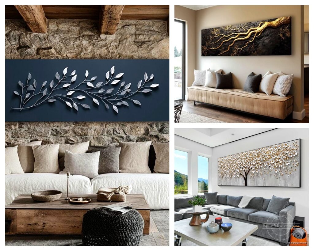
Okay so horizontal pieces – these are gonna be your workhorses for living rooms. They mirror the lines of your furniture which is mostly horizontal (sofas, console tables, that media unit you probably have). When you hang a horizontal piece above your couch, it creates this visual continuation that makes the whole wall feel intentional. I usually go for pieces that are about two-thirds to three-quarters the width of whatever furniture is below it. Not a hard rule but it works like 90% of the time.
Vertical pieces are trickier but honestly when they work they WORK. I use them in spaces with high ceilings where I need to draw the eye up, or in narrow wall sections like between windows or next to a doorway. My apartment has this weird skinny wall next to the fireplace and a vertical piece there literally saved that whole corner from being awkward dead space.
Materials That Actually Matter
Canvas is still the most popular and I get why – it’s lightweight, doesn’t need glass, and has that gallery vibe everyone wants. But here’s the thing about canvas that drove me nuts until I figured it out: the depth matters SO much. You’ve got your standard wrapped canvas which is usually 0.75 inches deep, then gallery wrapped at 1.5 inches. The deeper ones look more expensive and modern, the thinner ones can feel a bit… I dunno, 2010? Unless that’s the aesthetic you’re going for.
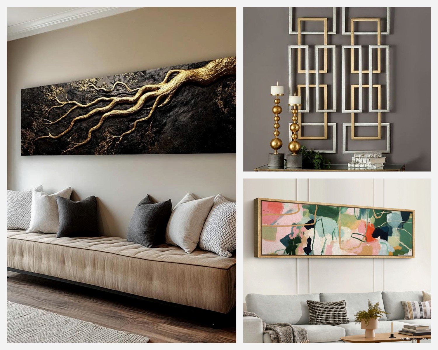
I’ve been really into framed prints lately though. Yeah they’re heavier and you gotta deal with glass glare sometimes, but the frame adds this layer of sophistication that canvas can’t quite match. For living rooms I usually skip the ultra-modern thin metal frames and go for something with a bit more presence – maybe 2-3 inches wide. Wood frames in walnut or oak are having a moment and they actually deserve it.
Acrylic and Metal Prints
Oh and another thing – acrylic prints are incredible if you want that super contemporary look. The image is printed directly on or behind acrylic so you get this depth and luminosity that’s completely different from paper or canvas. They’re pricey though, not gonna lie. I used one in a client’s living room last month (this massive horizontal piece, like 48×24 inches) and every single person who walks in comments on it. The downside is they’re heavy as hell and you need proper wall anchors.
Metal prints are lighter than acrylic but give you that same modern edge. The colors pop differently on metal – more saturated and vibrant. Great for photography or graphic art, less great for traditional paintings or anything that needs texture.
Size Guidelines That Actually Work
This is where everyone gets paralyzed. I was literally watching this documentary about interior design history last night instead of sleeping and even the professionals can’t agree on exact measurements, so here’s what I do:
For horizontal pieces above a sofa, measure your sofa width and multiply by 0.66. That’s your target width for the art. So if you’ve got a 90-inch sofa, you’re looking at around 60 inches wide for the art. You can go a bit bigger or smaller but that’s your sweet spot.
Height-wise for horizontal pieces, I aim for 18-24 inches tall for standard 8-foot ceilings. If you’ve got higher ceilings you can push that to 30-36 inches. The piece should feel substantial but not overwhelming.
Vertical pieces are harder to calculate because it depends so much on your wall height and what’s around them. I usually keep vertical pieces between 36-60 inches tall for living rooms. Anything taller starts feeling like you’re in a commercial gallery space which… maybe that’s cool for you but it can feel cold.
The Horizontal Layout Thing Everyone Does Wrong
So when you’re hanging a horizontal piece, the center should be at eye level, which is supposedly 57-60 inches from the floor. But here’s what I actually do – I hang it so the center is about 8-10 inches above the back of the sofa or console table. This creates a relationship between the furniture and the art instead of treating them as separate elements.
Wait I forgot to mention – if you’re doing a horizontal piece in a room without furniture below it (like on a wall opposite your seating area), then yeah, use that 57-60 inch center point rule. My dog just knocked over my coffee but we’re good.
Material Combos That Look Intentional
This is gonna sound weird but mixing materials in the same room actually makes your art collection look more curated. Like if you have a large horizontal canvas above your sofa, add a smaller framed print or metal piece on an adjacent wall. The variation in materials adds visual interest without making things feel chaotic.
I’ve got this thing I do where I pair a matte canvas with a glossy acrylic or metal print in the same room. The different surface finishes catch light differently throughout the day and it keeps the space from feeling flat.
Vertical Pieces for Specific Situations
Narrow walls between windows – vertical pieces were literally invented for this situation. Go as tall as you can without it feeling cramped. I usually leave about 12-18 inches between the top of the piece and the ceiling.
Flanking a fireplace or TV – two matching or complementary vertical pieces can frame these focal points really nicely. Keep them slightly narrower than you think they should be though, maybe 16-24 inches wide max.
High ceilings where you need to fill vertical space – this is where those 48-60 inch tall vertical pieces shine. They pull the eye up and make the room feel cohesive instead of having this weird empty space near the ceiling that makes the room feel unfinished.
Frame Materials and What They Do
Wood frames add warmth and work with literally any style from traditional to contemporary. I’m obsessed with light oak right now for Scandinavian-ish spaces, and walnut for mid-century modern rooms. The grain pattern matters more than you’d think – something with visible grain feels casual, smooth uniform wood reads more formal.
Metal frames in black or brass are your modern minimalist options. They disappear more than wood frames so the art takes center stage. Great if your art is the statement and you don’t want the frame competing.
Floater frames for canvas – these are frames where the canvas sits inside and you can see the edges, creating this floating effect. They add formality to canvas prints and I use them when canvas alone feels too casual but a traditional frame would be too much.
Glass vs No Glass
Canvas obviously doesn’t need glass. For framed prints you’ve gotta decide between regular glass, non-glare glass, or acrylic glazing. Regular glass is cheapest but can have serious glare issues depending on your lighting. Non-glare glass (also called museum glass) is expensive but worth it if you’re framing something you really love and you have windows or lamps that would create glare.
Acrylic glazing is lighter than glass and won’t shatter but it scratches easier. I use it for larger pieces where weight is an issue or in homes with kids where safety matters.
Color and Subject Matter by Orientation
Okay so funny story – I once had a client insist on a vertical landscape photograph and it just… didn’t work. Landscapes want to be horizontal because that’s how we experience them in real life. Your eye wants to scan side to side.
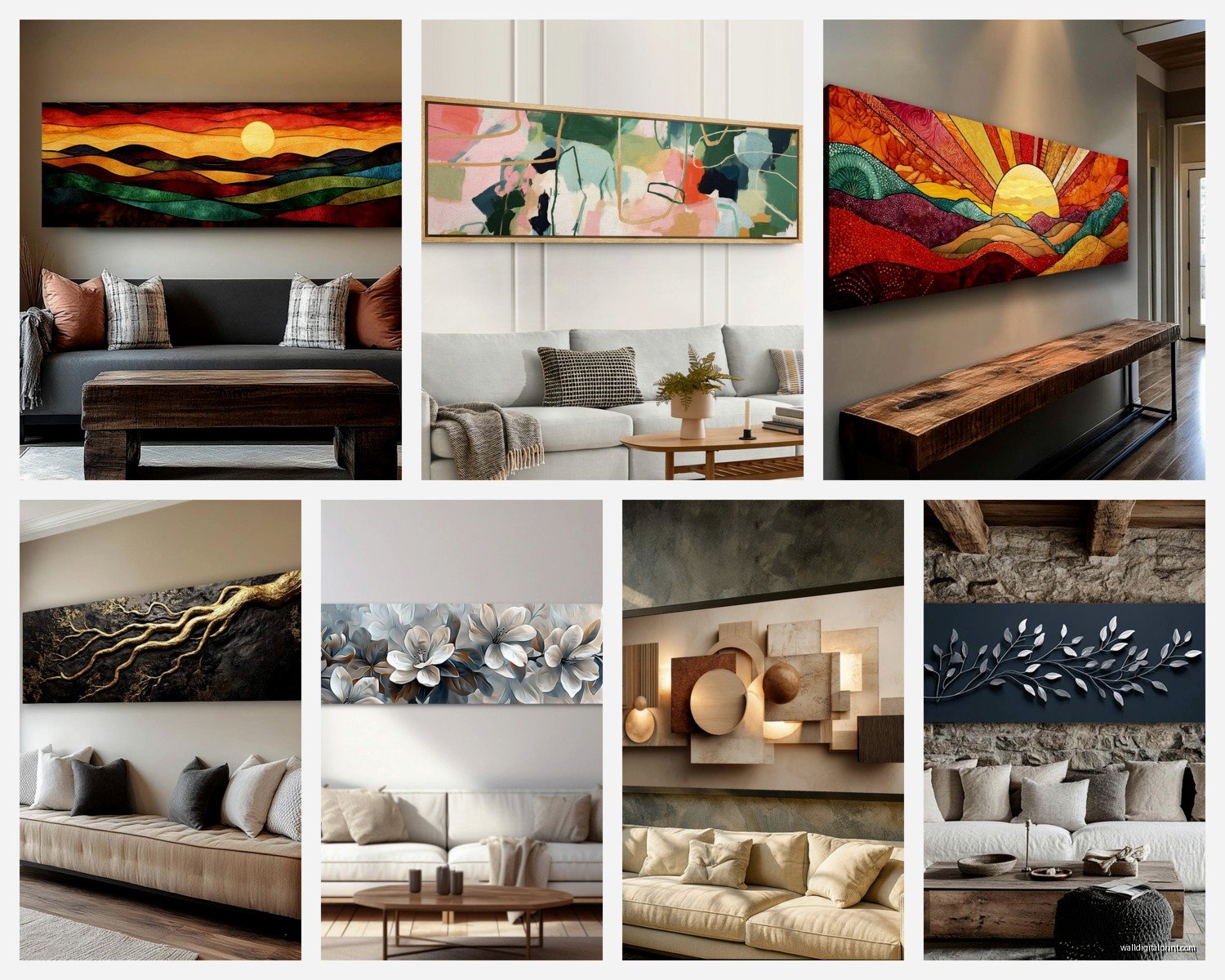
Horizontal orientations work best for landscapes, cityscapes, panoramic anything, and abstract pieces with strong horizontal elements. They create calm and stability.
Vertical pieces are better for portraits (obviously), tall subjects like trees or buildings, and abstract art with vertical movement. They create energy and draw the eye upward.
What Actually Looks Good Above Different Furniture
Above a sofa: Horizontal piece, always. Or a gallery wall arranged in a horizontal overall shape. The piece should relate to the sofa’s proportions or it’ll feel random.
Above a console table: Horizontal works great here too, but you can also do a vertical piece if the console is narrow. I actually love a vertical piece above a slim console table in an entryway that opens to the living room.
On a wall with no furniture: Either orientation works but think about the wall proportions. Wide walls want horizontal, tall narrow walls want vertical.
Flanking a TV or fireplace: Vertical pieces create symmetry and frame the focal point without competing with it horizontally.
Mixing Horizontal and Vertical in One Room
This is totally doable but you gotta be strategic. I usually make one orientation dominant – like maybe 70% of your art is horizontal and 30% is vertical. This creates variety without chaos.
The dominant orientation should be your largest or most prominent piece. So if you’ve got a big horizontal piece above the sofa (your main focal point), you can add a vertical piece on a different wall as a secondary element.
Make sure there’s enough visual weight balance. A large horizontal piece on one wall needs something substantial on other walls or the room feels lopsided. That something could be a vertical piece, furniture, or even just a good sized plant honestly.
Practical Installation Stuff
Canvas pieces under 20 pounds can usually hang on a regular nail. Anything heavier needs wall anchors or you’re gonna have a bad time. I learned this the hard way don’t ask.
Framed pieces with glass are always heavier than you expect. Use D-rings and picture wire for anything over 10 pounds, and definitely use wall anchors rated for the weight.
For horizontal pieces especially wide ones, use two hanging points instead of one centered point. This prevents tilting and distributes weight better.
Level is non-negotiable. Get a small bubble level or use the one on your phone. A piece that’s even slightly off-level will bug you forever even if you don’t consciously notice it.
Budget Reality Check
Canvas prints are usually your most affordable option, running maybe $50-200 for decent quality in living room sizes. Framed prints add $50-150 for the frame depending on size and materials. Acrylic prints start around $200 and go up quickly. Metal prints are similar.
If you’re on a tight budget, get a high quality print and invest in a nice frame. The frame elevates everything. I’d rather have a $30 print in a $100 frame than a $130 print in a cheap frame.
Where This All Falls Apart
Sometimes you just love a piece and the orientation is what it is and you make it work anyway. I have a vertical abstract piece in my own living room that breaks like three of my own rules but I love it so it stays. Rules are guidelines not laws.
Also if your living room has weird architecture – angled ceilings, lots of windows, built-ins everywhere – you might need to ignore standard advice and just experiment. Take a Saturday, use painter’s tape to mark out different sizes and orientations on your wall, live with it for a few days, see what feels right.
The whole point is making your space feel good to be in, and sometimes that means a vertical piece where horizontal would be “correct” or vice versa. Trust your gut after you’ve considered the guidelines.