Wall Art Guide, Wall Art Tutoriels
Pink Bedroom Wall Art: Feminine Rose Sleep Space Decor
Apr
So I’ve been working with pink bedroom spaces for like three years now and the wall art situation is honestly where most people mess up, not because they pick ugly stuff but because they don’t think about the actual pink they’re working with first.
The thing nobody tells you is that pink comes in like a million temperatures and your wall art has to match that vibe or everything looks… off. I had this client last month who bought these gorgeous dusty rose prints from Minted but her walls were this bright bubblegum situation and it just looked muddy. We had to return everything and start over.
Figure Out Your Pink First
Okay so before you buy anything, take a photo of your pink walls in natural daylight. Not morning golden hour, like actual noon light. Then look at it on your phone. Is it leaning coral? Is it more mauve? Does it have gray undertones or peachy ones?
Cool pinks (the ones that look kinda purple-ish) need art with silver frames, white mats, maybe some navy or sage green in the actual artwork. Warm pinks (peachy coral vibes) look better with gold or brass frames and artwork that has terracotta, cream, or soft yellow accents.
I learned this the hard way in my own bedroom where I kept buying art I loved on Instagram but it all clashed because my walls are this specific millennial pink that’s right between warm and cool and I was just… buying whatever looked pretty.
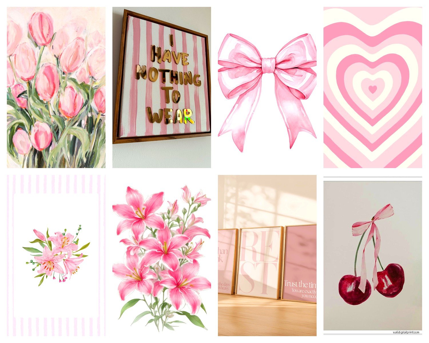
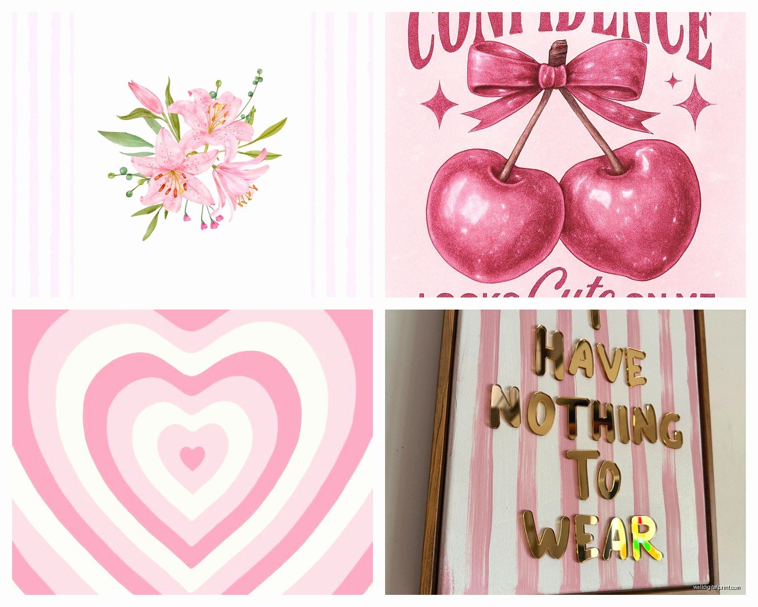
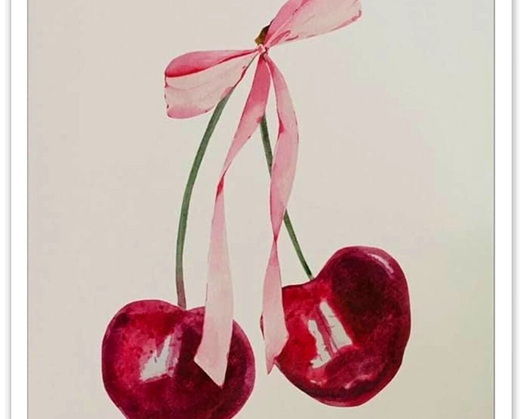
Rose Art That Actually Works
Real talk, rose prints can go either super romantic grandma or modern sophisticated and the difference is in the style not the subject.
For modern rose art look for:
- Line drawings instead of realistic watercolors
- Oversized single blooms rather than bouquets
- Abstract interpretations with geometric elements
- Black and white rose photography
- Minimalist ink illustrations
I found this amazing oversized rose line drawing from Desenio last year that’s literally just black lines on white background, like 24×36 inches, and it’s perfect above a bed because it’s soft enough to not feel aggressive but has enough presence that you’re not stuck with boring walls.
The romantic cottage style roses work too if that’s your thing but you gotta commit. Like full cottagecore with the ruffled bedding and everything. You can’t do one vintage rose bouquet print with modern furniture, it’ll look like you grabbed something from your mom’s garage.
Gallery Wall or Statement Piece
This depends entirely on your headboard situation and I’m gonna be honest about this.
If you have an upholstered headboard or any headboard with visual weight, you need ONE large piece or a very simple diptych. A gallery wall will compete and make everything feel cluttered. I usually do a single 30×40 inch piece or two 20×24 inch pieces hung horizontally about 6-8 inches apart.
No headboard or a simple metal frame? Gallery wall time. But here’s where people mess up the most and oh my god I see this constantly on Pinterest…
Your gallery wall needs an anchor piece. Start with one larger print (at least 16×20) and build around it. Don’t do the thing where everything is the same size in a grid unless you’re going for that specific hotel art vibe which honestly sometimes works in a pink bedroom because it feels intentional and calm.
I did a gallery wall in my guest room last spring with:
- One 20×24 abstract pink and white piece (the anchor)
- Two 11×14 rose line drawings
- Three 8×10 mixed pieces (one quote print, two botanical)
- One small round mirror like 10 inches
The mirror was key because it reflects light and breaks up all the rectangular frames. My dog knocked it off the wall twice before I finally used better hanging strips.
Frame Colors That Don’t Suck
White frames disappear on pink walls if the pink is light. They just vanish and then your art looks like it’s floating weird.
Black frames are almost always safe but can feel harsh if your pink is really soft and your whole room is light and airy. They work best when you have other black elements in the room like drawer pulls or a black metal bed frame.
Natural wood (light oak or maple) is my go-to for most pink bedrooms because it adds warmth without competing. Matches basically any pink undertone.
Gold or brass frames are gorgeous but pricey and you gotta make sure you have other gold accents or it looks random. Like gold drawer pulls, a gold mirror, gold lamp base, something.
I bought a set of gold frames from Michaels last year during a 70% off sale and honestly they look just as good as the expensive ones from West Elm. Nobody can tell the difference once they’re on the wall.
Where to Actually Buy This Stuff
Etsy is overwhelming but if you search “minimalist rose print” or “abstract pink bedroom art” you’ll find tons of instant download options. Like $6 and you print them yourself at Staples or whatever. I do this for clients all the time when we’re on a budget. The quality is honestly fine if you print on matte cardstock.
Minted has really sophisticated options and they do custom framing which is convenient but expensive. Their rose photography collection is beautiful though, very editorial.
Desenio and Juniqe are my European sources, they ship to the US and have constant sales. Sign up for emails because they do 40% off like every other week.
Society6 if you want something more artistic and unique. Their stuff tends to be more colorful and bold which can be good if your pink walls are neutral enough.
Target’s Threshold line has been surprisingly good lately? I got these abstract prints with pink and cream brushstrokes that were like $25 framed and they look way more expensive.
DIY Options That Don’t Look DIY
Okay so funny story, I was watching The Great British Baking Show last month and decided to try painting my own abstract art and it actually turned out decent.
You need:
- Canvas from Michael’s (wait for 50% off)
- Acrylic paint in white, your pink shade, maybe a dusty rose and cream
- A big flat brush
- Literally no skill
Just do broad brushstrokes. Mix your colors on the canvas. Let some white show through. Don’t overthink it. The key is using colors that already exist in your room so it automatically coordinates.
I also frame fabric swatches which sounds weird but looks intentional. Like you can buy really pretty rose-printed fabric from Spoonflower, cut it to size, and frame it in a floating frame. Costs maybe $30 total and looks custom.
Sizing Guidelines Because Everyone Asks
Above a queen bed with no headboard or a low headboard: go at least 32 inches wide, preferably 40-50 inches. Can be one piece or multiple pieces that together equal that width.
Above a king bed: 50-60 inches of total art width minimum. This is where a diptych or triptych works really well.
Side walls: these depend on your other furniture but generally 16×20 or 20×24 works over a nightstand. Leave like 6-8 inches between the top of the nightstand and bottom of frame.
The rule I use is your art should be roughly 2/3 the width of the furniture below it. Not exact science but it’s a good starting point.
Hanging Height
Center of the artwork should be at 57-60 inches from the floor. This is “gallery height” and it actually works in bedrooms too.
Above a bed, ignore that rule. Bottom of the frame should be 8-10 inches above your headboard or 8-10 inches above where your pillows sit if you don’t have a headboard.
I use those Command picture hanging strips for everything under 10 pounds because I move art around constantly and don’t wanna deal with nail holes. The velcro ones, not the wire ones.
What to Avoid
Live Laugh Love anything. Just no.
Too many quotes. One quote print in a gallery wall is fine but if every piece has text it feels like a TJ Maxx exploded.
All pastel everything. Your pink walls are already soft, you need some contrast or depth. Add in some black, navy, terracotta, forest green, something with visual weight.
Matching sets from HomeGoods. They’re fine but they read very generic. Mix in at least one unique piece.
Really dark or busy florals unless you’re going full maximalist. Most pink bedrooms benefit from keeping the art relatively light and simple.
Adding Texture
This is gonna sound random but macrame or woven wall hangings work really well mixed into pink bedroom art. Adds dimension and softness without adding more pink.
I hung a cream-colored woven piece next to two framed rose prints in my daughter’s room and it made everything feel more layered and interesting. Got it from Urban Outfitters for like $35.
Pressed flowers in frames are another texture option. You can buy them pre-made or DIY if you’re patient. They add a romantic touch without being too precious about it.
Oh and floating shelves with small art pieces leaning against the wall plus some books or a plant… that’s become my favorite solution for renters who can’t put a million holes in the wall. One shelf, multiple pieces you can rotate out whenever.
Lighting Matters More Than You Think
Your beautiful rose art will look completely different depending on your lighting. Warm white bulbs (2700K) make everything feel cozier but can make some pinks look orange. Cool white (3500K+) keeps things crisp but can feel sterile.
I usually go with 3000K bulbs in pink bedrooms as a compromise. And if you can add a picture light above your main art piece, do it. Makes everything look intentional and expensive even if you bought it at Target.
The other thing is natural light throughout the day will change how your art looks. That rose print might look perfect at noon and totally washed out at 7pm. This is why I always tell people to live with art for a week before committing to a whole gallery wall plan.
Wait I forgot to mention, if your pink walls are temporary (rental situation or you’re planning to repaint eventually), go more neutral with your art. Lots of white, cream, soft grays, black and white photos. Then the art works in your next space too. But if you own the place and you’re committed to pink, you can go more specific with blush tones and rose themes.
Anyway that’s basically everything I know about pink bedroom wall art from actually doing this in probably 30+ rooms at this point. Start with one piece you really love, build from there, and don’t stress too much about perfection. You can always swap stuff out later.