Wall Art Guide, Wall Art Tutoriels
Beach Wall Art for Living Room: Coastal Ocean Main Space
Apr
So I’ve been absolutely obsessed with beach wall art lately because three of my clients in the past month have asked for that coastal vibe without making their living rooms look like a literal beach shack, and honestly? It’s trickier than you’d think.
Canvas vs Metal vs Wood Prints
Okay so first thing – canvas is gonna be your safest bet for a living room because it doesn’t reflect light like metal does. I learned this the hard way when I installed this gorgeous metal ocean print above a client’s couch and every afternoon the sun would hit it and create this blinding glare right where they watched TV. Canvas absorbs light, feels warmer, less… I don’t know, less sterile?
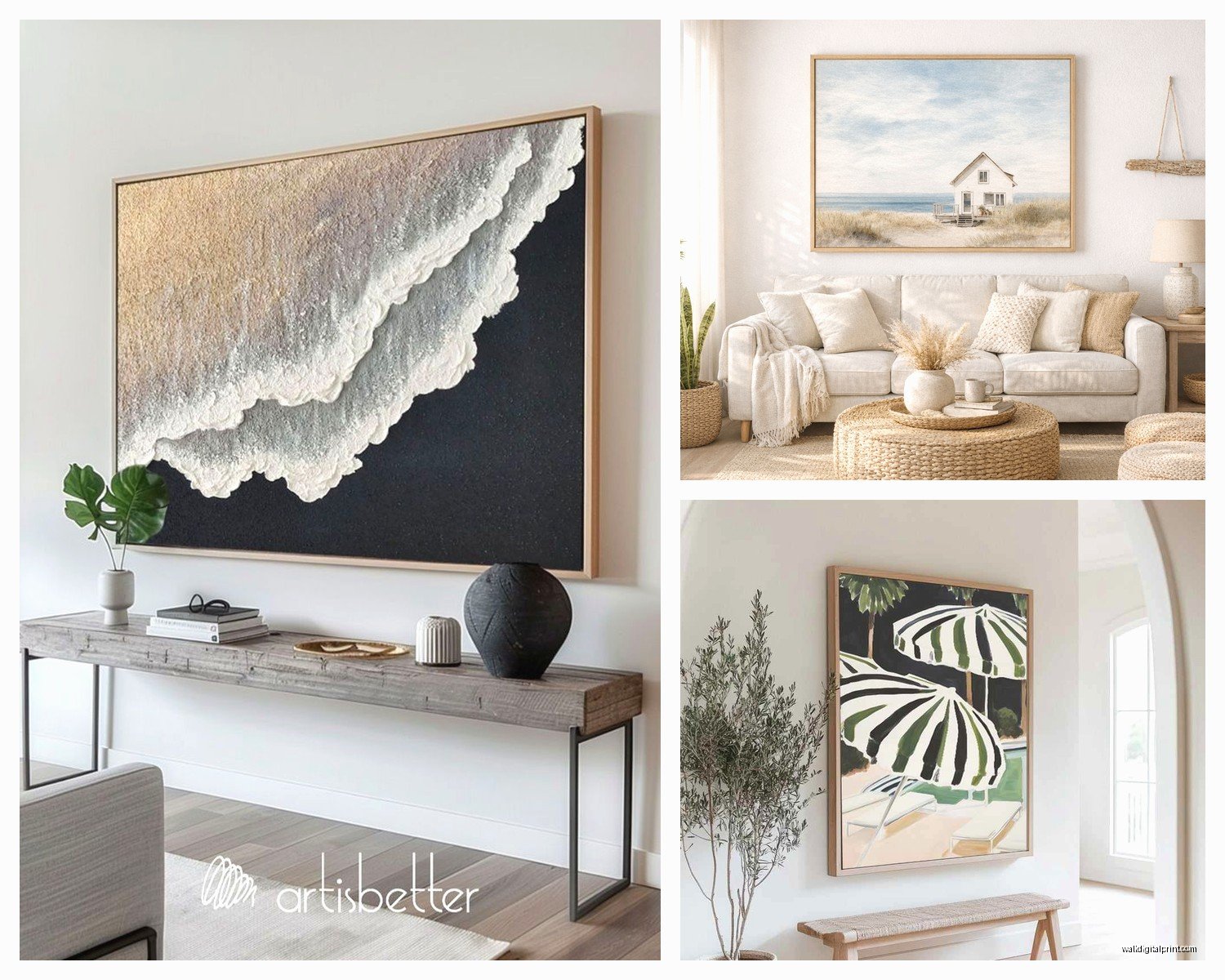
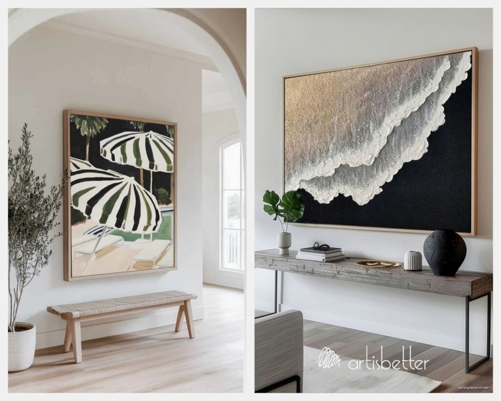
But here’s the thing about canvas – you gotta check the thickness. Like actually ask how deep the frame is. I always go for at least 1.5 inches because anything thinner looks cheap and flat against the wall. The gallery-wrapped ones where the image continues around the sides are worth the extra $30-40 because you don’t need to frame them.
Metal prints though, if you have the right lighting situation, they make ocean colors POP in a way canvas never will. The blues are deeper, the whites are crisper. I used aluminum prints in a living room that faced north (so no direct sun) and the effect was stunning. Just… test your lighting first.
Wood prints are having this moment right now and I’m kind of here for it? There’s something about ocean imagery on reclaimed wood or birch that feels more sophisticated than beachy. My dog knocked one off the wall last week while I was staging a room and it didn’t shatter, so there’s that practical advantage too.
Size and Scale That Actually Works
This is where everyone messes up. They buy art that’s too small. Your beach wall art should take up about two-thirds to three-quarters of your couch width if it’s going above the sofa. So if you have an 84-inch couch, you’re looking at artwork that’s 55-60 inches wide minimum.
I usually do one of three approaches:
- Single large statement piece (like 60×40 inches or bigger)
- Triptych set where the three panels together create that width
- Gallery wall with 5-7 pieces clustered together
The triptych thing is actually genius for beach themes because you can do a panoramic ocean view split across three canvases. Just make sure they’re meant to be hung together – I’ve seen people buy three random beach scenes and hang them side by side and it looks… chaotic.
The Height Rule Nobody Follows
Hang your art so the center is at 57-60 inches from the floor. This is eye level for most people. If it’s going over furniture, leave 6-8 inches between the top of the couch and bottom of the frame. I use painter’s tape to map it out on the wall first because I’m terrible at visualizing and have made too many unnecessary holes in walls.
Color Palette Choices
Okay so this is gonna sound weird but the biggest mistake I see is people choosing beach art with too many colors. Like they find this sunset beach scene with orange and pink and purple and turquoise and it’s beautiful in isolation but then it clashes with everything in their living room.
Stick to a limited palette:
Cool coastal: Blues, whites, grays, maybe some sandy beige. This works with literally any living room color scheme. I just finished a space with gray walls and navy accents and we used a black and white ocean wave photograph printed on canvas and it was *chef’s kiss*.
Warm coastal: Turquoise, coral, cream, weathered wood tones. This is trickier but gorgeous if your living room has warm undertones. Works amazing with terracotta or rust-colored accents.
Neutral coastal: All whites, creams, taupes with just hints of blue. Super sophisticated, very expensive-looking even if you bought it cheap.
I generally avoid anything with bright green or tropical vibes for a main living room unless your whole house is committed to that aesthetic. It reads more vacation rental than curated home.
Subject Matter That Doesn’t Feel Cliché
Everyone wants the wave photography or the pier at sunset and listen, those can work, but they’re also everywhere. Here’s what I’ve been using instead:
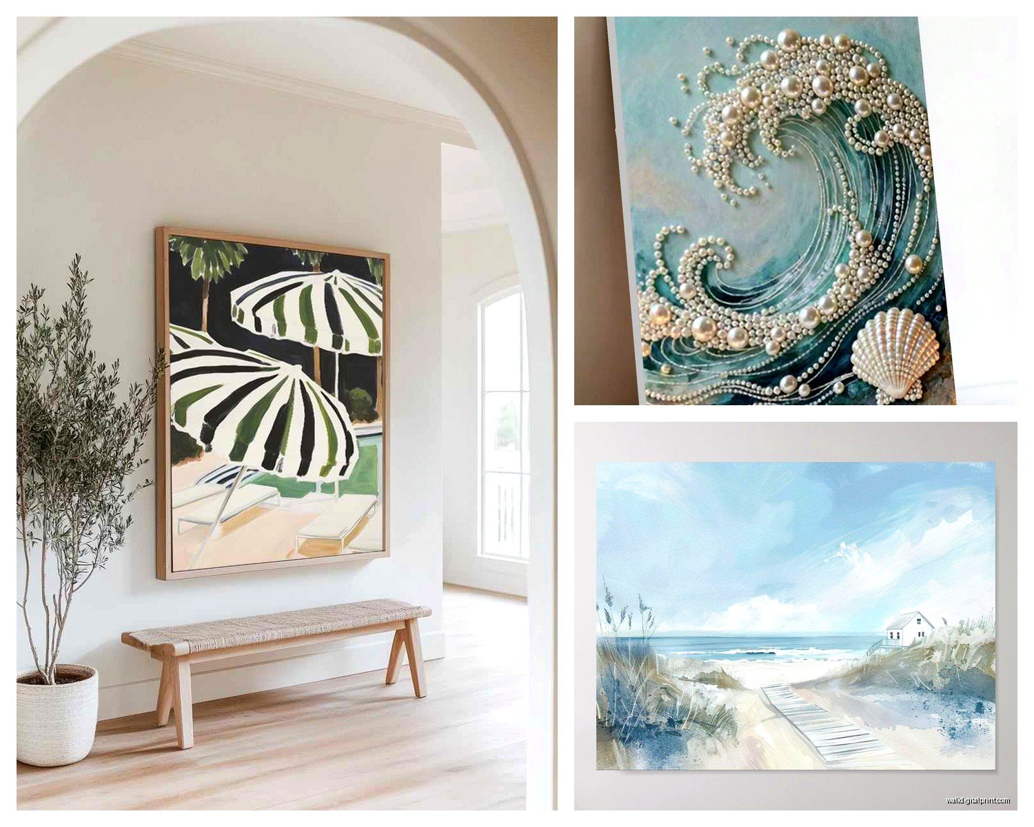
Abstract ocean art is having such a moment. Those paintings that suggest water through brush strokes and color rather than literally showing a beach scene. They give you the coastal vibe without screaming BEACH HOUSE.
Aerial beach photography is stunning and unexpected. Like those shots from above showing the water patterns and sand formations. Very modern, very National Geographic.
Vintage coastal maps or nautical charts as art. I found reproduction charts from the 1800s showing coastlines and they’re incredible in traditional or transitional living rooms.
Minimalist line drawings of waves or coastlines. Single continuous line art is trendy right now and when it’s ocean-themed it feels fresh.
Oh and another thing – seashell close-ups or beach grass photography can give you that coastal feeling without being so literal. I used a massive print of beach grass blowing in wind and it was more sophisticated than any sunset scene could’ve been.
Frame Choices Matter More Than You Think
If you’re going with framed prints instead of canvas, the frame literally makes or breaks it.
White or cream frames keep things light and airy. Black frames make it more dramatic and modern. Natural wood frames (especially weathered or driftwood-finish) are the most coastal-feeling but can also tip into souvenir-shop territory if you’re not careful.
I usually avoid ornate frames for beach art. Keep it simple. A clean floater frame (where there’s space between the art and frame) looks really high-end and costs like $40 more than regular framing.
Wait I forgot to mention – if you’re buying from places like Etsy or online print shops, a lot of them sell just the digital file or print-only, no frame. This is actually great because you can take it to a local framer or use a service like Framebridge and get exactly what you want. Just factor that cost in because it usually adds $100-300 depending on size.
Acrylic vs Glass
For framed pieces, acrylic is lighter and won’t shatter if it falls. Glass is cheaper and has less glare issues. Museum glass is amazing but expensive – like really expensive. For most living rooms, regular glass with a non-glare coating is fine.
Where to Actually Buy This Stuff
I’ve tested so many sources at this point. My client canceled last Tuesday so I spent like two hours comparing the same ocean print across different sellers and here’s what I found:
Minted: Great quality, ships fast, good variety. Their canvas prints are thick and well-made. Pricier but worth it for main statement pieces.
Etsy: Hit or miss on quality but you can find unique stuff. Read reviews obsessively. I found an amazing abstract ocean artist there who does custom sizes. Just know that shipping times vary wildly.
Society6: Good for trendy designs, quality is decent for the price. Their larger canvas prints can arrive a bit loose on the frame though, so check when it arrives.
Framebridge: If you have a print you love and need it framed perfectly. Not cheap but the quality is consistently excellent.
Local art fairs and coastal galleries: If you actually live near the coast, original art from local artists is gonna be more expensive but it’s unique and supports artists and honestly just feels better in a space.
Home Goods/TJ Maxx: Okay don’t hate me but I’ve found surprisingly good beach art here. You just have to go regularly because inventory changes constantly. Found a 48×36 inch canvas ocean print for $79 that would’ve been $300 elsewhere.
Lighting Your Beach Art
This is something nobody thinks about until after they hang it and then they’re like oh, it’s too dark or the glare is terrible or whatever.
Picture lights are great for framed art. The brass or bronze ones have a vintage nautical vibe that works with coastal themes. LED ones don’t get hot and won’t damage your art over time.
Track lighting or adjustable ceiling spots give you more flexibility. You can angle them to avoid glare on glass or metal prints.
Natural light is obviously free but you gotta be careful. Direct sunlight will fade your art over time, especially with canvas prints. UV-protective glass helps if it’s framed. I had a client whose gorgeous blue ocean print turned greenish-gray after two years in direct afternoon sun, which was heartbreaking.
If your living room gets a lot of sun, consider prints specifically made with UV-resistant inks or go with metal prints which hold up better.
Mixing Beach Art with Other Decor
Your beach wall art doesn’t have to be the only art in your living room, obviously. But it should be the dominant piece or theme for that wall.
I usually pair it with:
Neutral textiles that echo the colors. Like if your ocean art has deep blues, throw pillows in navy or slate blue tie it together.
Natural textures – jute rugs, linen curtains, rattan baskets. These reinforce the coastal vibe without being too themey.
Driftwood or natural wood furniture pieces. Even just a coffee table in weathered oak helps.
What I avoid mixing with beach art: tropical prints, nautical kitsch like anchor everything, overly rustic farmhouse stuff (it clashes with the coastal aesthetic), anything too country.
The Oversized Single Print Strategy
If you’re indecisive or don’t wanna deal with arranging multiple pieces, just go huge with one statement piece. I’m talking 60×40 inches minimum, bigger if your wall can handle it.
This works especially well in modern or minimalist living rooms where less is more. One massive abstract ocean piece above the sofa, nothing else on that wall. Done. It’s confident and intentional.
Make sure it’s high-resolution though. A grainy or pixelated ocean photo blown up to 72 inches looks terrible. Ask about DPI (should be at least 150, preferably 300) before ordering large prints.
DIY and Budget Options
Look, not everyone wants to drop $500 on wall art and that’s totally fine. I’ve done budget coastal living rooms that looked expensive.
Print your own from high-res download sites. Places like Unsplash have free high-resolution photos including ocean scenes. Download, take the file to Costco or your local print shop, get it printed on canvas for like $30-60 depending on size. Add a simple frame or hang it as-is.
Thrift store frame hacks. Buy a large framed print you don’t care about, remove the art, replace with your own ocean print. Repaint the frame if needed. I did this with a $15 thrift store find and it turned out gorgeous.
Make your own abstract ocean art. Okay hear me out – you don’t have to be an artist. Get a large canvas, buy acrylic paints in ocean colors (blues, whites, teals), and literally just make abstract swirls and layers. It’s forgiving because the ocean is abstract anyway. I did this with a client who was skeptical and now it’s her favorite piece in the house.
oh and another thing – sometimes just getting creative with matting can make a cheap print look expensive. A small print with a huge white mat in a large frame looks way more intentional than it is.
Avoiding the Souvenir Look
The line between coastal chic and beach souvenir shop is thin. Here’s how to stay on the right side:
Avoid anything with words or quotes. “Life’s a beach” or whatever might seem fun but it dates your space immediately and feels juvenile.
Skip the literal seashells and starfish imagery unless it’s done in a really artistic, abstract way. Realistic starfish paintings read very 1990s beach condo.
No overtly nautical stuff mixed in. Like beach art is great, but don’t add ship wheels and anchors and rope everywhere. Pick a lane.
Stick to one or two pieces max. A whole gallery wall of different beach scenes feels like you raided a coastal gift shop.
Seasonal Flexibility
One thing I love about good beach wall art is it works year-round if done right. Unlike some decor that feels seasonal, ocean imagery in blues and neutrals reads fresh in summer and cozy in winter.
That said, you can swap out accent pieces around it seasonally. Lighter, breezier textiles in summer. Heavier textures and maybe warmer accent colors in winter while keeping the beach art as your anchor.
I’m watching this show while writing this and just got distracted but anyway – the point is your beach wall art can be permanent, which makes it worth investing in quality.
The key is making sure it feels like YOUR space with a coastal influence, not a themed room. The art should enhance your living room’s existing style, whether that’s modern, traditional, farmhouse, whatever, not overtake it completely.
Okay I think that covers most of what I’ve learned through trial and error with beach wall art. Just remember to measure twice, order samples if you can, and don’t be afraid to return stuff that doesn’t work. Most places have decent return policies and it’s better to get it right than live with art you’re meh about for years.