Wall Art Guide, Wall Art Tutoriels
Black and White Wall Art for Living Room: Monochrome Main Space
Apr
So I’ve been obsessing over black and white art lately because honestly, my living room was looking way too beige and I needed something that wouldn’t clash with literally anything. And like, monochrome is having this massive moment but it’s also kinda timeless? Which is perfect if you’re indecisive like me.
The Paper Quality Thing Nobody Talks About
Okay so first thing – and I learned this the hard way after buying three prints from Amazon that looked amazing online – paper quality is EVERYTHING. Museum-grade cotton rag paper is gonna run you more money but it actually matters. I bought this abstract piece on regular poster paper and within like six months it had this weird yellowing thing happening near the window. Not cute.
Cotton rag paper (also called archival paper) is acid-free which means it won’t deteriorate or change color. Look for anything that says “archival quality” or “museum grade.” Hahnemühle is the brand I see everywhere in galleries and yeah it’s pricier but my friend Sarah’s had hers up for four years and they still look brand new.
If you’re on a budget though, enhanced matte paper is totally fine for most situations. Just keep it away from direct sunlight and you’re good. I have a few prints on enhanced matte in my hallway and they’ve held up perfectly.
Giclée vs Regular Prints
This is gonna sound pretentious but giclée prints are actually worth it if you’re buying something larger than like 16×20. It’s basically a fancy inkjet printing method that uses archival inks and has better color depth. Even with black and white art, you get these subtle gradations and tones that regular prints just flatten out.
I compared two versions of the same geometric print once – one giclée and one standard – and the standard one looked kinda flat and lifeless? The giclée had this richness to the blacks and the whites were actually crisp instead of slightly gray.
Frame Choices That Won’t Make You Broke
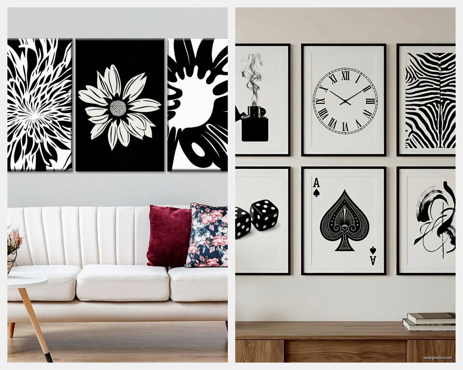
Oh and another thing, frames can literally cost more than the art itself which is insane. IKEA’s RIBBA frames are honestly my secret weapon. They’re like $15-30 depending on size and they look way more expensive than they are. The black ones especially work perfect with monochrome art.
For a more elevated look though, I’ve been buying from Framebridge. They’re pricier but they do custom sizing which is clutch when you find art in weird dimensions. Their contemporary black frame is *chef’s kiss* – it’s slim, modern, doesn’t compete with the artwork.
Wait I forgot to mention – if you’re doing a gallery wall situation, mix frame thicknesses. Like combine some thin frames with some chunkier ones. All matching frames can look a bit corporate conference room vibes. I learned this from my friend who’s an actual curator and it completely changed how my wall looked.
Glass vs Plexiglass
So regular glass is heavier and can shatter but it doesn’t scratch as easily. Plexiglass (acrylic) is lighter, won’t shatter if it falls, but scratches if you look at it wrong. I use plexiglass for anything going above the couch because the thought of glass falling on someone’s head freaks me out.
Museum glass is this whole other category – it’s anti-reflective and has UV protection. Expensive as hell but if you’re investing in like a $500+ piece of art, it’s worth considering. I splurged on it for one large photograph in my living room and you literally can’t see any glare from any angle.
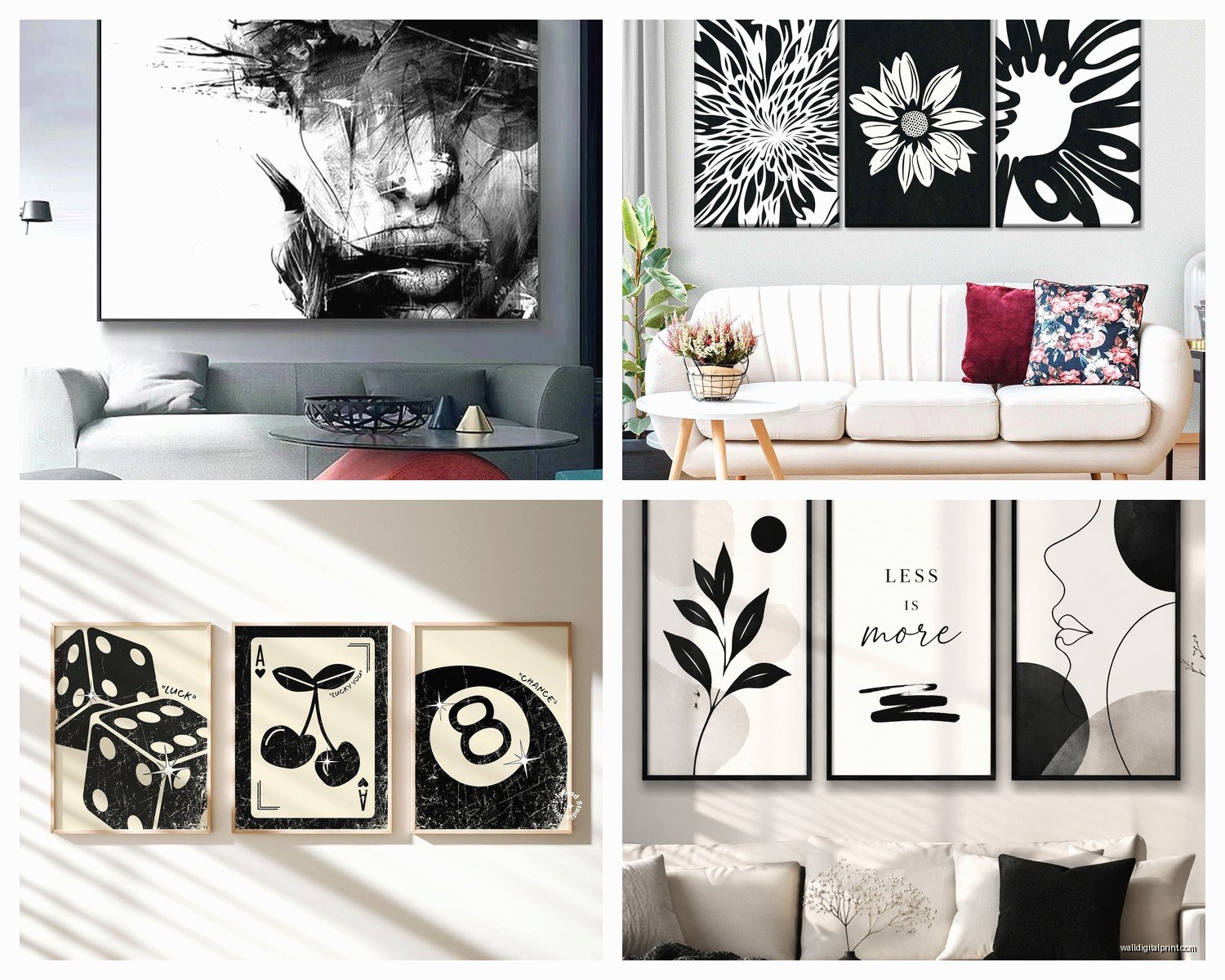
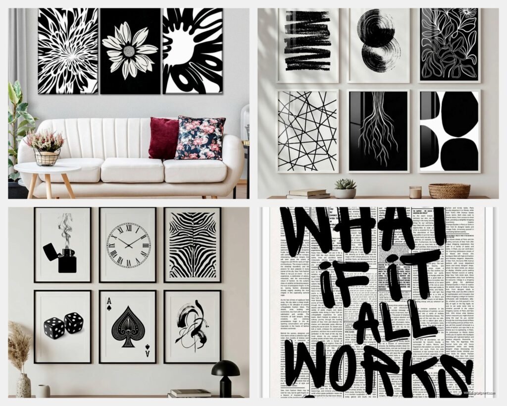
What Actually Works on Walls
Abstract geometric stuff is everywhere right now and for good reason – it’s bold without being too literal. I have this large scale piece with overlapping circles and lines that I got from Minted and it’s become like the focal point of the whole room. Cost me around $200 framed but it looks like I spent way more.
Photography is another route that’s super sophisticated. Architectural photos, nature shots with high contrast, urban landscapes. Ansel Adams style stuff never goes out of fashion. I found this amazing print of sand dunes on Etsy from a photographer in California and the texture in black and white is just *dramatic*.
Typography and Text Art
This is gonna sound weird but I’m obsessed with vintage text art right now. Like old dictionary pages, botanical illustration prints, vintage maps. There’s something about black ink on aged paper that just works. My cat knocked over one of these prints last week and I literally yelped because I thought the frame broke but thankfully just the hanging wire came loose.
Modern typography is cool too but can read a bit trendy. If you’re doing word art, make sure it actually means something to you because you’re gonna be staring at it every day. My sister has “BREATHE” in giant letters and I’m like… does that not stress you out to be constantly reminded to breathe?
Size Guidelines That Actually Help
Okay so funny story, I once bought what I thought was a huge statement piece and when it arrived it was like 11×14. The listing said “large” but apparently that’s relative. Always check actual dimensions.
For above a couch, you want your art to be roughly two-thirds to three-quarters the width of the sofa. So if your couch is 90 inches, you’re looking at art that’s 60-70 inches wide total. This can be one large piece or a gallery wall arrangement.
Single large pieces (like 40×60 or bigger) make a strong statement and are honestly easier than gallery walls. Less measuring, less holes in your wall. I have a 48×36 abstract piece above my couch and it anchors the whole room without me having to fuss with arranging multiple pieces.
Gallery Wall Math
If you’re doing multiple pieces, lay them out on the floor first. I use painter’s tape on the wall to mark where frames will go before I commit to nails. Spacing between frames should be 2-3 inches typically. Closer than that looks cramped, farther looks disconnected.
The center of your arrangement should be at eye level, which is usually around 57-60 inches from the floor. But honestly if you have high ceilings or low furniture this rule gets weird. Just step back and eyeball it.
Where to Actually Buy This Stuff
Etsy is my go-to for unique stuff. You can find actual artists selling original work or limited edition prints. I filter by “ships from United States” because international shipping takes forever and customs fees are annoying. Search terms that work: “minimalist line art,” “abstract black and white,” “modern monochrome print.”
Minted has really elevated prints and you can preview them in different frame options which is super helpful. Their paper quality is consistently good. Prices range from like $40 for small prints to several hundred for large framed pieces.
Society6 is hit or miss – lots of independent artists but quality varies. I’ve had good luck with their framed prints but their canvas prints felt kinda cheap to me. The colors (or I guess blacks and whites) weren’t as rich as I expected.
Saatchi Art if you want actual original artwork and have a bigger budget. You can find emerging artists and the pieces are unique. I bought a charcoal drawing from there for like $400 and it’s probably my favorite thing on my walls.
Budget Options That Don’t Look Cheap
Target’s Threshold line has some surprisingly decent black and white prints. They’re like $20-40 and come already framed. Not gonna be heirloom quality but for a rental or if you like switching things up frequently, totally fine.
Desenio is this European company that ships to the US and their stuff is really affordable. The paper isn’t the thickest but the designs are on point. I decorated my whole home office with their prints for under $200.
Oh and another thing – thrift stores and estate sales sometimes have amazing vintage black and white photography or prints. You gotta dig through a lot of questionable stuff but I’ve found genuine gems for like $10.
Mixing Different Types of Black and White Art
You can totally mix photography with illustrations with abstract stuff. The monochrome palette ties it all together. I have a photography print next to a line drawing next to an abstract geometric piece and it works because they’re all the same color scheme.
What gets tricky is mixing different frame styles. If you’re doing this, keep the frames all black or all white or all natural wood. The consistency in framing makes mixed art styles look intentional instead of random.
Texture Considerations
Something I didn’t think about initially – matte vs glossy finishes create different vibes. Matte is more contemporary and sophisticated, doesn’t reflect light. Glossy can look more vintage or editorial, but you’ll get glare.
Canvas prints add texture which can be cool for abstract pieces. The weave of the canvas becomes part of the visual interest. But for photography, I prefer smooth paper because you want the image details, not canvas texture.
The Actual Hanging Part
Command strips are great for renters or if you’re commitment-phobic like me. They hold more weight than you’d think – I have a 24×36 framed print up with the large Command strips and it’s been there for over a year, no issues.
For heavier pieces, you gotta use proper wall anchors. Drywall anchors if you’re not hitting a stud, but finding studs is always better. I use this stud finder app on my phone and it’s honestly pretty accurate? Technology is wild.
Picture hanging wire is more forgiving than using D-rings directly because you can adjust the position slightly without rehanging. Thread it through the D-rings and make sure it’s taut but not too tight.
Height and Placement
The whole “57 inches to center” rule is a good starting point but honestly it depends on your furniture. If you have a low-slung modern couch, your art might need to go a bit lower. I usually leave 6-8 inches between the top of the furniture and the bottom of the frame.
In a room with no furniture underneath, the 57-inch rule works better. But also just hold it up and see what feels right. Sometimes rules are meant to be broken and your eye knows better than some arbitrary measurement.
Lighting Makes or Breaks It
This is something I learned way too late – proper lighting is almost as important as the art itself. Picture lights are great but they can be expensive and require wiring. I use these battery-operated LED picture lights from Amazon that stick right to the frame and they’re like $25. Total game changer.
Track lighting or adjustable can lights aimed at your art create a gallery effect. The key is to avoid glare on the glass. Angle the light at about 30 degrees from the wall.
Natural light is tricky with any art but especially with prints because of UV damage. If your art is in direct sunlight, definitely spring for UV-protective glass or keep the curtains drawn during peak sun hours.
Common Mistakes I’ve Definitely Made
Buying art that’s too small for the space. When in doubt, go bigger. A tiny piece on a huge wall just looks lost and sad.
Not considering the whole room when choosing art. Your black and white piece needs to work with your furniture, rug, other decor. I bought this amazing print once that technically was beautiful but clashed with my boho rug situation and I never ended up hanging it.
Hanging everything too high. People do this constantly and it makes rooms feel weird and disconnected.
Forgetting about the mat board. A mat can make a small print look more substantial and polished. I usually go with white mats for black and white art because it keeps things crisp and clean.
Not measuring before ordering. I’ve ordered prints that were way smaller or larger than I envisioned because I didn’t actually measure the wall space first. Learn from my mistakes and grab a measuring tape.
Anyway I gotta go make dinner but hopefully this helps you figure out the black and white art situation. It’s honestly easier than it seems once you just start.