Wall Art Guide, Wall Art Tutoriels
Bedroom Wall Art Black and White: Classic Monochrome Sleep
Apr
So I’ve been obsessing over black and white bedroom art lately because honestly, it’s the one thing that never feels dated or like you’re trying too hard. My client last month wanted to redo her whole bedroom and we went full monochrome on the walls and it’s still the project I keep showing people on my phone.
First thing you gotta figure out is what kind of black and white you’re actually into. There’s like, stark graphic stuff that’s almost architectural, then there’s softer charcoal and cream pieces that feel more organic, and then photography which is its own whole category. I made the mistake early on of mixing all three in one room and it looked like a Pinterest board threw up everywhere. Pick a lane.
The photography route is probably the easiest to start with because it reads as sophisticated without much effort. I’m talking landscape stuff, architectural shots, maybe some abstract nature close-ups. There’s this print I found from a small shop on Etsy—just a foggy forest scene, super simple—that I’ve literally used in three different bedrooms now. It’s like $45 for a 24×36 and looks way more expensive than it is. The key with photo prints is making sure they’re actually high resolution. I learned this the hard way when I ordered something that looked amazing online and it showed up pixelated and sad.
Oh and another thing about photography prints, you want them printed on matte paper, not glossy. Glossy catches light weird in bedrooms and you’ll be lying there at night seeing reflections and it’s just annoying. Matte absorbs light better and feels more intentional.
For above the bed specifically—which is where everyone always starts—you’ve got options. One large piece is the move if you want drama and simplicity. I usually go for something around 40×60 inches for a queen bed, maybe 50×70 for a king. But here’s what nobody tells you: you gotta hang it like 6-8 inches above your headboard, not right on top of it. I see people smush art right against their headboard constantly and it makes the whole thing look cramped.
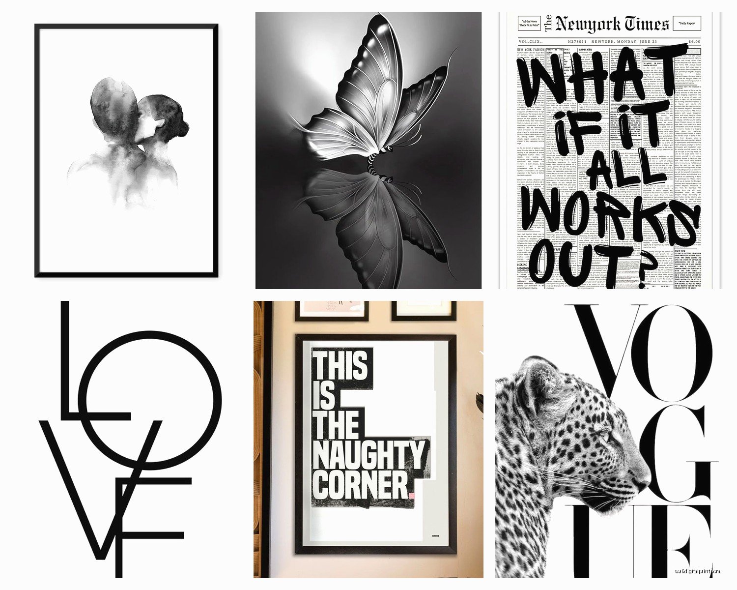
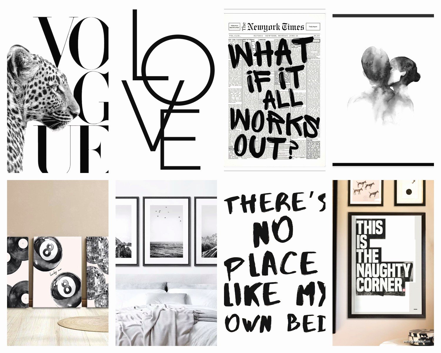
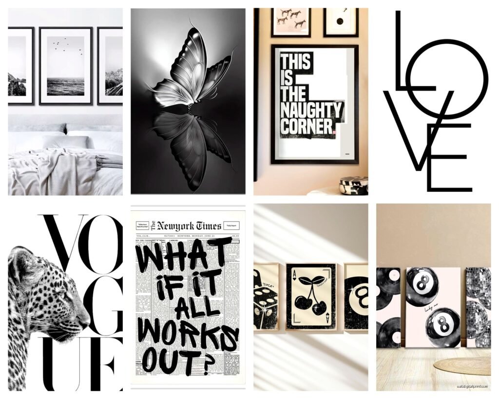
The gallery wall thing is trickier in bedrooms than people think. It works, but you need to be more restrained than you would in a living room. I did one last year with nine frames, all matching black frames, all the same size (11×14), arranged in a perfect grid. Simple geometric prints, line drawings, that kind of thing. It looked clean because everything matched. The moment you start mixing frame sizes and styles in a bedroom, it can feel too busy when you’re trying to sleep.
Wait I forgot to mention—if you’re renting or just don’t wanna commit to holes everywhere, those Command picture hanging strips actually work pretty well for lighter frames. I was skeptical forever but my apartment doesn’t allow nails in certain walls and I’ve had a 16×20 framed print up for like eight months with no issues. Just make sure you follow the weight limits, they’re not kidding about those.
Abstract black and white stuff is having a moment right now. Like brushstroke paintings, ink washes, that kind of organic texture. There’s something about the imperfection of it that feels calming in a bedroom. I’ve been seeing a lot of those Etsy prints that are like… black ink on white paper with really gestural marks. They’re everywhere but honestly they work because they’re not trying to be anything specific. Your brain doesn’t have to process a “thing,” it just reads as texture.
This is gonna sound weird but I always tell people to think about their bedding when they’re choosing black and white art. If you’ve got really graphic black and white bedding, your art should probably be softer and more tonal. If your bedding is solid or neutral, you can go bolder with the art. I had my bed in this crisp white linen phase last year and went with these really dark, moody charcoal drawings above it and the contrast was *chef’s kiss*.
Line drawings are another option that’s super versatile. Female figures, botanical stuff, architectural sketches, abstract faces—all of that works. The thin line style especially feels modern without being cold. I found this print of a woman’s back, really minimal line work, and it’s been in my own bedroom for two years. Cost me $30 printed at a local shop. Sometimes I think about changing it but then I’m like… why, it still looks good.
Okay so funny story, I was watching this documentary about mid-century design last week while framing stuff for a client and realized that a lot of the “modern” black and white art we’re all into now is just… repackaged 1960s graphic design. Which is fine! It works! But you can actually find vintage stuff on eBay and antique sites that’s the real deal and sometimes cheaper than new prints. I got this geometric print from like 1968 for $35 and it’s matted and framed and everything.
Typography and text art can work in bedrooms but you gotta be careful it doesn’t feel too “Live Laugh Love” you know? I like really simple text pieces—maybe a single word in a cool font, or a short phrase in another language. There’s this French phrase print I used in a client’s bedroom that just says “à la folie” (means “madly” or “to madness”) in thin black letters on cream paper. It’s romantic without being cheesy because most people don’t know what it means right away.
The diptych or triptych situation—where you have two or three panels that work together—is actually really good for bedrooms because it fills space horizontally which matches the bed shape. I’m seeing a lot of abstract landscape-ish pieces split across two frames. Like, a horizon line that continues across both. It’s subtle but creates movement across the wall.
Framing is where people either make it look expensive or blow the whole thing. Black frames are the obvious choice and yeah, they work great. But don’t sleep on natural wood frames with black and white art—there’s something about that warmth against the starkness that feels really balanced in a bedroom. I use those thin oak frames from Frame Bridge a lot. They’re like $60-80 depending on size which isn’t cheap but they’re solid wood and the quality shows.
If you’re on a budget, IKEA actually has decent frame options. The Ribba and Hovsta frames are like $15-30 and they’re fine. Not heirloom quality but they look clean and modern. I’ve used them in my own place and in client homes where we’re watching costs. The key is keeping all your frames the same style—all black, all wood, whatever—so it looks intentional.
Oh and another thing, you don’t always need glass. If you’re doing prints on thick paper or canvas, going without glass can actually make it feel more organic and less formal. I have this charcoal drawing in my bedroom that’s just paper in a frame with no glass and I love the texture of seeing the actual paper. Just make sure it’s not somewhere that gets direct sunlight or humidity.
Scale is something I see people get wrong constantly. Too small and it looks like you just stuck something up there without thinking. That’s why I’m a fan of going bigger than you think you need. If you’re standing there thinking “is this too big?” it’s probably actually the right size. Bedrooms can handle drama on the walls because everything else is usually pretty simple—bed, nightstands, done.
For the walls adjacent to your bed, like the side walls, I actually prefer simpler pieces or even leaving them blank. You don’t need art on every wall. Sometimes just the one big moment above the bed is enough. But if you do want something on a side wall, smaller pieces work well there—like an 8×10 or 11×14. I have this tiny ink drawing next to my window that’s only like 6×8 and it’s perfect for that spot.
Matting makes a huge difference and people underestimate it. A simple print with a wide white mat in a black frame looks approximately 10x more expensive than the same print with no mat. The white space around the image gives your eye a place to rest. I usually do 2-3 inch borders for smaller prints, up to 4 inches for larger ones.
This is probably obvious but make sure whatever you choose doesn’t stress you out. I had this really intense abstract piece in my bedroom for like two weeks—all these aggressive black brushstrokes—and I realized I was lowkey anxious every time I looked at it. Switched it for something softer and immediately felt better. Bedrooms should be calm, even if you like edgy art everywhere else.
The Desenio and Printable Wisdom websites have good black and white options if you wanna just download and print yourself. Quality varies but for like $5-15 you can try stuff out before committing to expensive prints. I do this when I’m not sure about a style—print it at home, tape it up, live with it for a week.
Texture matters more than you’d think with black and white. If everything in your room is smooth—smooth walls, smooth bedding, smooth furniture—adding art with visible texture (like charcoal, rough brushstrokes, grainy photography) adds dimension. My bedroom is pretty minimal and the art is the only place with real texture and it makes the whole room feel less flat.
Gonna be honest, sometimes the best move is just one really good piece instead of trying to fill every wall. I spent way too much time in my twenties collecting random stuff and now I’m more into the “less but better” approach. One piece you actually love that cost $200 beats five pieces you’re meh about that cost $40 each.
For actual sources, I keep going back to Etsy for independent artists, Minted for more polished stuff, and local art fairs when I wanna support people in my area. Society6 is hit or miss but they have some good stuff. Oh and museum shops online—like the MoMA store or Tate—have excellent black and white print reproductions of famous works that are surprisingly affordable.