Wall Art Guide, Wall Art Tutoriels
Simple Bedroom Wall Art: Uncomplicated Clean Sleep Space
May
So I’ve been working with bedroom wall art for like forever now and honestly the whole “less is more” thing actually works when you’re trying to sleep better. My client last week had basically turned her bedroom into a gallery wall nightmare and couldn’t figure out why she felt anxious before bed and yeah, the walls were screaming at her.
The first thing you gotta understand is that your bedroom isn’t your living room. I know that sounds obvious but people don’t really get it until they start stripping things back. You want maybe 1-3 pieces MAX for an average bedroom. I’m talking like a 12×14 space. If you’ve got a bigger room you can push it to 4 but honestly I rarely do that anymore.
The One Large Piece Approach
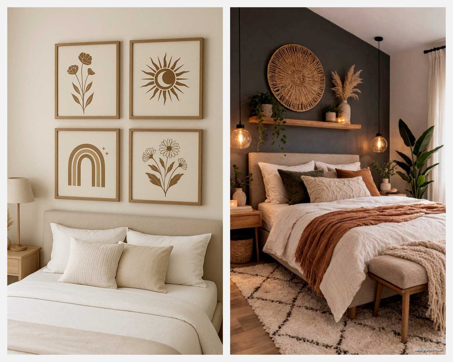
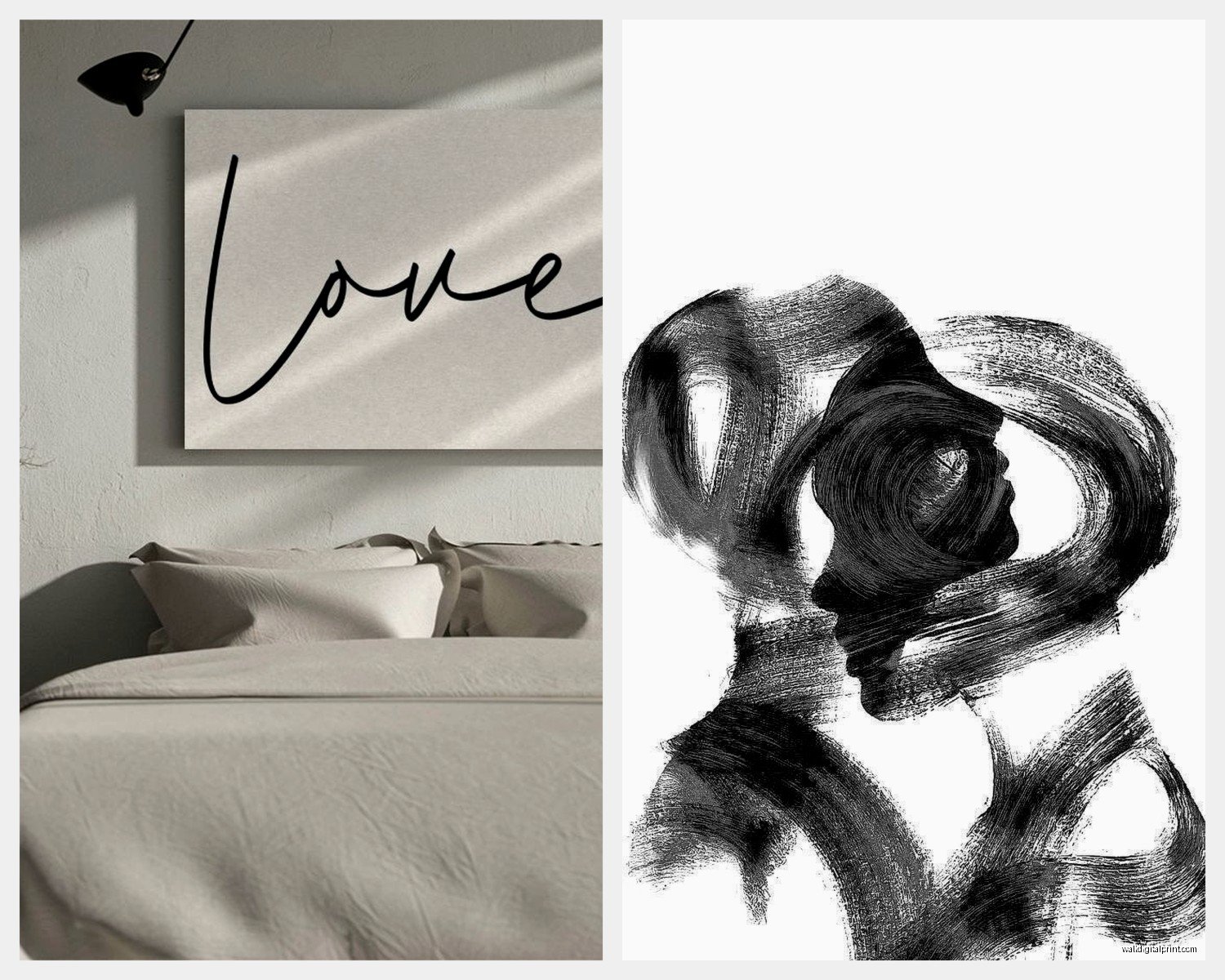
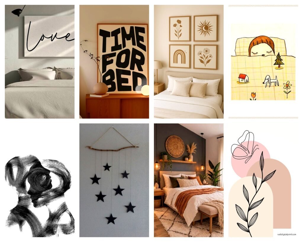
Okay so the easiest thing is one large piece above your bed. I’m talking 40×30 inches minimum or you’re gonna have this weird floaty situation that looks unfinished. The rule I use is roughly 2/3 the width of your headboard or bed frame. My own bedroom has this single abstract piece that’s mostly cream with some gray brushstrokes and it’s literally the only art in there.
For subject matter stick with abstracts, minimal landscapes, or really simple line drawings. I had someone try to put a detailed cityscape above their bed once and they told me three months later they’d wake up and their eyes would immediately start scanning all the buildings. Not relaxing. You want something your eye can rest on, not something it needs to read or figure out.
What Actually Works Above the Bed
- Abstract art in neutrals (beige, gray, white, soft blue)
- Single botanical prints – like one giant leaf or flower stem
- Minimalist line art – think one continuous line drawing
- Soft watercolor washes with barely any detail
- Black and white photography but super simple composition
What doesn’t work: anything with faces staring at you (genuinely creepy at 2am), busy patterns, text-heavy prints, anything neon or super bright, multiple frames clustered together right above where you sleep.
The Two-Piece Setup
If you’ve got a bed without a headboard or you want art on a different wall, two matching or coordinating pieces work really well. I usually do them on the wall opposite the bed so you see them when you walk in but they’re not in your sight line when you’re lying down trying to sleep.
Space them about 3-6 inches apart depending on frame size. I use 4 inches for most standard frames. And hang them at eye level which is usually 57-60 inches to the center of the piece. This is gonna sound weird but I always take a photo after hanging to check if they look level because your eyes play tricks on you when you’re standing right there.
Pairing Strategy That Works
Get two pieces that share either a color palette OR a style but not necessarily both. Like two different botanical prints in black frames. Or two abstracts in the same color family but totally different compositions. What you’re avoiding is that matchy-matchy hotel room vibe where everything is too coordinated.
I found these prints on Etsy last month for like $25 each – just simple line drawings of plants. Printed them at a local print shop on matte paper, got basic black frames from IKEA (the RIBBA frames are honestly fine for this), and boom. Costs under $100 total for both pieces framed and they look way more expensive.
Size and Scale Reality Check
Everyone buys art too small. It’s the number one mistake I see. You think something is gonna look bigger on your wall than it does in the store or online. A 16×20 inch print sounds decent but it’s actually pretty small once it’s on a wall in a room with a queen or king bed.
Here’s what I tell people: measure your wall space, then go 20% bigger than what you think you need. Your brain is lying to you about scale. I literally keep a measuring tape in my bag now because… yeah I learned that lesson the hard way with my first apartment.
For above a queen bed: 40-60 inches wide
For above a king bed: 50-70 inches wide
For side walls: 24-36 inches wide usually looks right
Frame Choices Without Overthinking
Simple frames. That’s it. That’s the advice.
Black, white, natural wood, or if you’re feeling fancy a very thin gold or brass. Nothing ornate, nothing with patterns, no thick chunky frames unless you’re going for a specific modern look and you really know what you’re doing.
I use black frames probably 70% of the time because they work with everything and don’t compete with the art. Natural wood frames are great if your bedroom has warm tones or wood furniture. White frames can look really clean but they show dust like crazy which is annoying.
oh and another thing – matte finish over glossy glass. The glare from glossy glass catches light from windows or lamps and it’s distracting. Most frame shops can do non-glare glass or acrylic if you’re getting something custom framed.
Color Palette for Actual Sleep
Okay so there’s been research on this and also I’ve just seen it work in real life. Cool tones and neutrals are better for bedrooms. Blues, greens, grays, whites, beiges, soft lavenders.
Warm tones aren’t bad but you want them muted. Like a dusty terracotta not a bright orange. A soft sage not a lime green. You get it.
I had my bedroom painted this color called “Sea Salt” by Sherwin Williams last year and I picked art that has hints of blue-gray in it. My cat knocked one of the frames off the dresser and broke it (cool, thanks Luna) so I had to find a replacement and ended up going even more minimal with the new piece and honestly liked it better.
Colors That Help vs Colors That Hype You Up
Calming:
- Soft blues and blue-grays
- Muted greens and sage tones
- Warm whites and creams
- Gentle lavenders
- Earthy beiges and taupes
Avoid for bedrooms:
- Bright reds and oranges (increases heart rate literally)
- Hot pinks and magentas
- Neon anything
- High contrast black and white (can be too stark)
Where to Actually Buy This Stuff
You don’t need to spend hundreds of dollars. I’m gonna be real with you – some of my favorite bedroom art has come from places that aren’t fancy galleries.
Etsy is great for digital downloads. You buy the file for like $5-15, download it, take it to a print shop or upload to an online printer, and get it printed on good paper. Way cheaper than buying a finished print. Search for “minimal bedroom art” or “abstract printable” or “neutral wall art digital.”
Society6 has tons of options and they do sales constantly. Wait for a 30% off sale which happens like every other week. You can get prints already framed or just the print.
Minted if you want something a bit more curated. Their stuff tends to run pricier but the quality is really good. I’ve used them for client projects where budget isn’t as tight.
Local artists on Instagram – search your city name plus “artist” and you’ll find people selling original work or prints. I found this woman in my area who does these really simple watercolor studies and bought an original for $150 which is less than some mass-produced prints cost.
Thrift stores but you gotta be selective. Sometimes you find simple landscapes or abstracts in decent frames. I strip out the art I don’t like and either keep the frame or replace with something better.
wait I forgot to mention – if you’re buying online, check the return policy. Some places charge restocking fees for art and that’s annoying if it doesn’t work in your space.
The Leaning Method
If you don’t wanna commit to hanging or you rent and don’t want holes, just lean art on furniture. I do this with a large piece on my dresser propped against the wall. It’s like 30×40 inches and it works perfectly there.
You can also lean a big piece on the floor against the wall if you’ve got the space. Makes the room feel more casual and collected rather than too designed. Just make sure it’s stable and not gonna fall over. I use those sticky museum putty dots on the back corners to keep things from sliding.
Lighting Considerations Nobody Talks About
The lighting in your bedroom changes how art looks obviously but also think about what you want to see when you turn on a lamp at night. Really detailed or high-contrast art can look harsh in lamp light. Softer pieces with subtle color variations look better in low light.
If you’ve got a piece you really love but it disappears at night, you can add a small picture light above it. They make battery-operated ones now that are pretty affordable. Just don’t go crazy with accent lighting in a bedroom because again, you’re trying to wind down in this space.
My Current Bedroom Setup
Since you asked – I have one large abstract canvas above my bed (48×36 inches), mostly cream and pale gray with some texture. Then on the wall where my dresser is, I have that leaning piece I mentioned – it’s a minimal botanical print of eucalyptus stems in a simple black frame. That’s it. Two pieces total in the whole room.
My bedroom is painted a soft gray-blue, I have white bedding, and the overall vibe is just… quiet? Like the art doesn’t demand attention, it just exists there peacefully. When I had more art up – I went through a phase where I had like 6 pieces – I noticed I felt more restless. Could be coincidence but I don’t think so.
The Actually Practical Hanging Tips
Use a level. Use a pencil to mark where the nail goes. Measure twice. All that boring stuff actually matters.
For lightweight frames under 10 pounds, regular picture hanging hooks from the hardware store are fine. For anything heavier, use proper wall anchors especially if you’re not hitting a stud.
The formula for hanging height: measure 57 inches from the floor, that’s where the center of your art should be. So if your frame is 30 inches tall, the center is at 15 inches, which means the top of the frame should be at 72 inches from the floor. Math is annoying but it works.
Quick Hanging Math
- Measure your frame height
- Divide by 2 to find center
- Add 57 inches (standard eye level)
- Subtract the distance from the top of frame to the hanging hardware
- That’s your nail height from the floor
Or just eyeball it honestly, sometimes that works too. I’ve done both methods and the eyeball method works fine if you step back frequently to check.
What If You Like Color and Pattern
You can have color, just be intentional. Pick one or two colors max and keep them soft. A piece with gentle coral and cream can work. Soft sage and gold tones together are nice. Just avoid anything that feels busy or has too much visual movement.
Patterns are trickier. Geometric patterns can work if they’re really minimal – like simple line grids or circles. Avoid dense patterns, anything with small repeating elements, or patterns with high contrast.
I was watching this show the other night about tiny homes and they had this bedroom with patterned wallpaper AND patterned art and I genuinely felt stressed just looking at it through the TV. Your bedroom shouldn’t do that to you.
The Rule Breaking Part
Okay so everything I’ve said is what works most of the time but if you genuinely love something and it makes you happy when you look at it, maybe that matters more than following rules. I have a client who insisted on hanging a vibrant sunset photograph in her bedroom even though I suggested something more muted and she says she loves waking up to it. So like, you do you.
Just make sure you’re choosing things because you actually love them, not because you think you should or because they’re trendy. Minimalism is trendy right now but if you’re naturally drawn to maximalism, fighting that is gonna make your space feel wrong.
The goal is a bedroom where you feel calm and can actually sleep. If your wall art is contributing to that, you’re doing it right. If you lie in bed and your eyes keep going to your walls because there’s too much happening, scale it back.