Wall Art Guide, Wall Art Tutoriels
Wall Art for Living Room: Main Space Decorating Ideas
May
So I’ve been staring at living room walls for like fifteen years now and honestly the biggest mistake people make is starting with “I need wall art” instead of figuring out what their room actually needs first. Like my neighbor just bought this massive abstract piece because it was on sale and now it’s leaning against her wall for six months because it doesn’t fit anywhere.
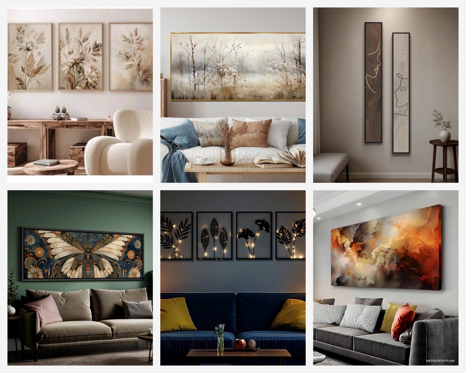
Here’s what I actually do when I’m working with a space – I look at the wall and think about scale first. Your sofa is probably around 7-8 feet long right? Whatever you hang above it should take up about two-thirds to three-quarters of that width. So we’re talking maybe 50-60 inches wide for a single piece or a gallery wall that spans that distance. I learned this the hard way in my own apartment where I hung this tiny 16×20 print above my couch and it looked like it was floating in an ocean of beige paint.
The height thing trips everyone up too. The center of your artwork should be at eye level which is roughly 57-60 inches from the floor. But – and this is where it gets weird – if you’re hanging above furniture, you want 6-8 inches between the top of the sofa and the bottom of the frame. Not the center at eye level in that case. I literally carry a tape measure in my bag now because I got so tired of eyeballing it and being off by like a foot.
What Actually Works Above the Sofa
Okay so the classic move is one large statement piece. I’m talking 40×60 inches or bigger. Abstract art works great here because it doesn’t compete with your other decor – it just fills space with color and texture. But here’s something I figured out last year when my cat knocked over my coffee onto some paperwork and I was stress-scrolling art sites at 2am… oversized photography can be even better if your room feels cold or minimal. Like a huge landscape or architectural shot adds this whole other dimension.
Diptychs and triptychs are having a moment again. Two or three panels that create one image. The spacing between panels should be 2-3 inches – any more and they read as separate pieces instead of a cohesive unit. I just installed a three-panel forest scene in a client’s space last month and the way it draws your eye across the wall is actually pretty cool.
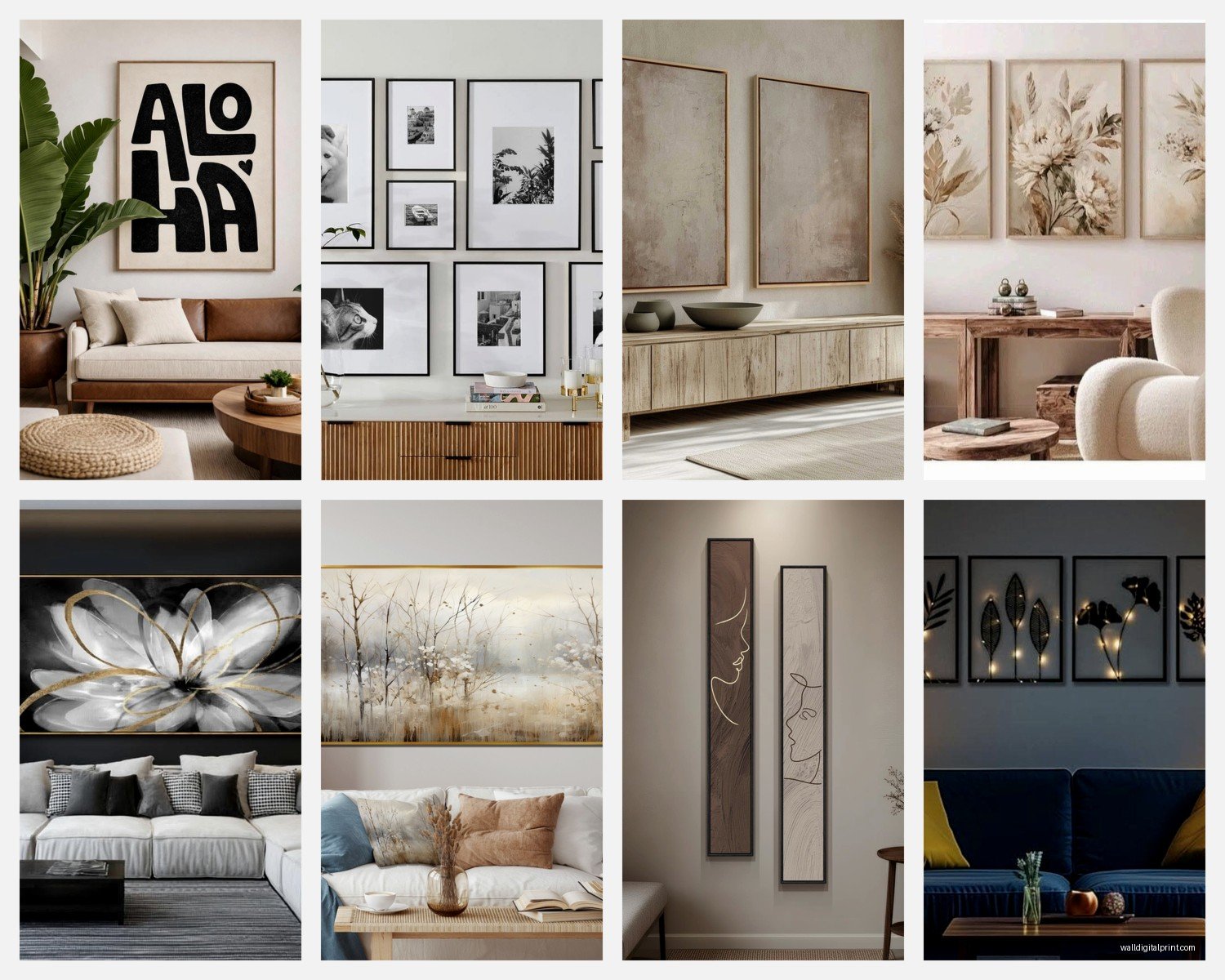
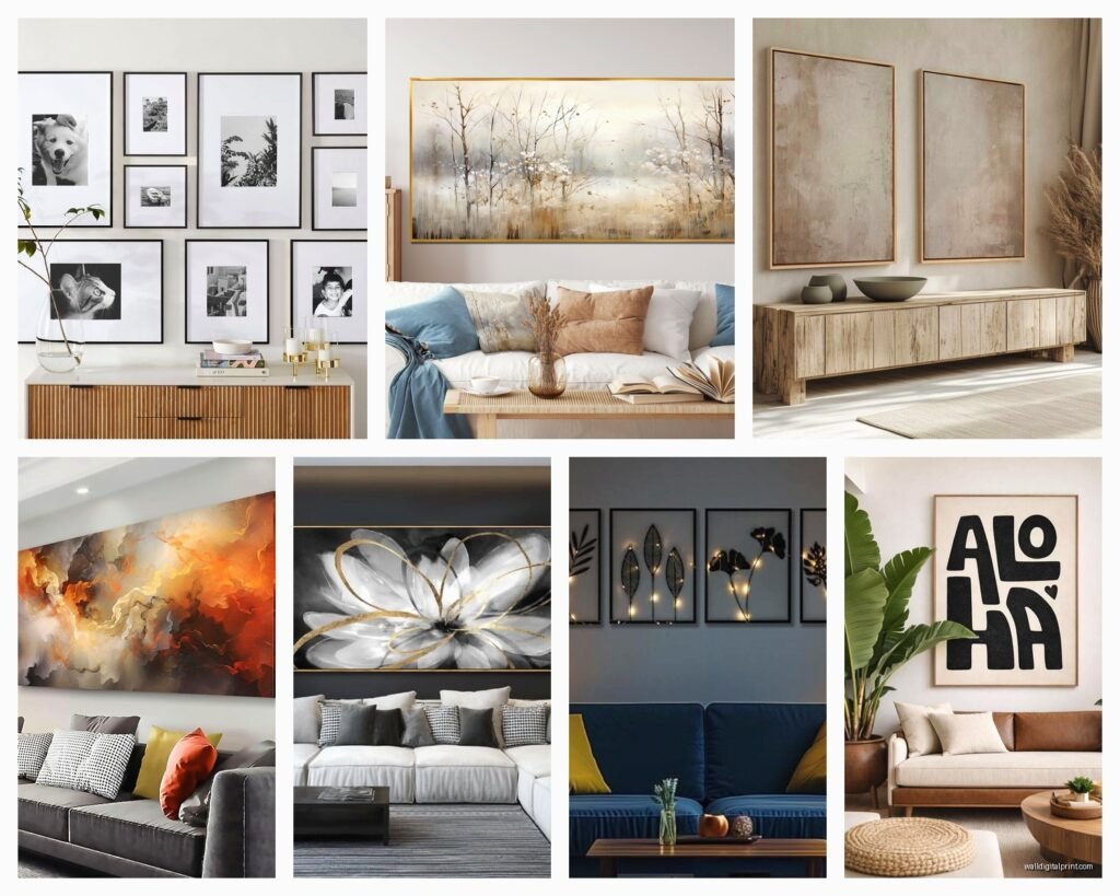
Gallery walls though… okay I’m gonna be real with you. They’re harder than Instagram makes them look. I’ve done probably fifty of these and I still lay everything out on the floor first. Every single time. You need an anchor piece – usually the largest frame – and then you build around it. The outer perimeter should form a rough geometric shape even if the interior is chaotic.
My Gallery Wall Formula That Actually Works
Start with paper templates taped to the wall. Trace your frames onto kraft paper, cut them out, tape them up with painter’s tape. Move stuff around until it feels right. This saves so many nail holes. I learned this after putting 23 holes in a rental wall in 2019 and losing part of my security deposit.
Keep your spacing consistent – I use 2-3 inches between all frames. Varying the spacing makes it look accidental instead of intentional. Also mix frame sizes but keep the style cohesive. All black frames or all wood or all white. Mixing metals and woods and colors makes it look like you just grabbed random frames from different decades which… maybe you did but we don’t want it to LOOK like that.
Color Coordination Without Being Matchy-Matchy
This is gonna sound weird but I take photos of the room on my phone and then look at art while holding my phone next to it. The screen colors aren’t perfect but it’s close enough to see if that orange abstract is gonna clash with your rust-colored pillows or complement them.
You want to pull 2-3 colors from your existing room into your art. Not match exactly – pull. So if you have navy blue curtains and cream walls and those terracotta pots everyone bought during lockdown, look for art that has some variation of those tones. It doesn’t need all three but having at least one creates visual connection.
Or go completely neutral with the art and let it be a texture thing instead of a color thing. Black and white photography, line drawings, charcoal sketches – these work in literally any color scheme. I have a client who changes her pillow colors seasonally (yes really) and her black and white botanical prints work with everything.
Mixing Art Styles
You can totally mix abstract with photography with illustrations. The trick is having a connecting element. Maybe they all have black frames. Maybe they all use a similar color palette. Maybe they’re all the same size. You need ONE thing that ties them together or it just looks confused.
I saw this setup last week where someone mixed vintage botanical prints with modern geometric art and it worked because everything was framed identically and spaced evenly. The frames created the cohesion even though the art styles were completely different.
Stuff That’s Not Traditional Art But Works Great
Okay so funny story – I was watching that design show while eating leftover pad thai and they used a vintage rug as wall art and I was like that’s ridiculous but then I tried it in a client’s space and it actually looked amazing. Textiles add softness that regular framed art doesn’t. Woven wall hangings, macramé if you’re into that, even a cool tapestry.
Mirrors. Technically not art but they function the same way on a wall and they bounce light around which makes your living room feel bigger. An oversized floor mirror leaning against the wall next to your sofa creates this whole casual layered look. Just make sure it’s secured properly so it doesn’t fall – I use these earthquake-proof straps that are meant for TVs.
Shelves with objects can replace traditional art too. Floating shelves with books, small plants, ceramic pieces, travel souvenirs. This gives you flexibility to change things seasonally without putting new holes in the wall. I do this in my own place because I get bored easily and need to move stuff around every few months.
What to Avoid
Those inspirational quote prints. I’m sorry if you have them but they rarely look sophisticated. Unless it’s like a vintage letterpress or something with actual design merit, skip it.
Hanging things too high. I see this constantly. Art floating near the ceiling like it’s trying to escape. It makes your ceilings look lower and your room feel disconnected. Remember that 57-60 inch center point.
Frames that are too small for the matting. If you’re using mats (and you should for works on paper), the mat should be at least 2-3 inches wide on all sides. Those tiny mats that are barely wider than the art look cheap.
Matching sets from home goods stores. You know the ones – three canvases that obviously came together, usually with like a dandelion or Paris theme. They’re fine if that’s your budget but they immediately read as mass-produced. Mix in at least one unique piece if you go this route.
Budget-Friendly Options That Don’t Look Cheap
Print-on-demand sites let you upload high-res images and print them on canvas or paper. I’ve used places like Printful for my own apartment. You can find free public domain art from museum websites – the Met, Rijksmuseum, National Gallery all have download options. Print a Monet for like forty bucks.
Thrift stores and estate sales for vintage frames. Buy them for the frames and replace whatever’s inside. I found these amazing gold leaf frames at an estate sale for $15 each and put my own prints in them. They look way more expensive than they were.
Your own photography if you have any decent shots. That trip to Iceland or even just interesting architectural details from your city. Print them large format and suddenly you have personalized art that’s actually meaningful to you.
Student art shows and local galleries. Emerging artists sell work for reasonable prices and you get original pieces. Plus you can say you support local artists which sounds better than “I bought this at Target.”
The Technical Stuff Nobody Tells You
You need proper hanging hardware. Those little sawtooth hangers that come with cheap frames are terrible. Use D-rings or wire for anything over 10 pounds. For heavy pieces – like over 30 pounds – you need wall anchors or studs. I carry a stud finder because drywall alone won’t hold a large framed piece and I’ve seen them fall. It’s not pretty.
Command strips work for lightweight stuff under 5 pounds but read the weight limits. And wait a week after hanging before you trust them fully – the adhesive needs time to bond properly. Found this out when a frame fell at 3am and scared me half to death.
Lighting matters more than people think. If your living room has terrible overhead lighting, add picture lights or wall sconces. Art in shadows might as well not be there. I installed these battery-powered LED picture lights in my own place because I rent and couldn’t hardwire anything – they’re actually pretty decent.
Arranging Multiple Walls
If your living room has multiple walls that need art, don’t make them all equally important. One wall should be the focal point – usually the one behind or across from the sofa. The other walls can have smaller pieces or even be left mostly blank. Too much going on everywhere creates visual chaos.
I like doing one major moment on the main wall and then maybe a single piece or small grouping on a perpendicular wall. The wall behind the TV can stay blank honestly – you’re not looking at it when the TV is on anyway.
Corner walls are tricky. If you have those awkward corners where two walls meet, you can wrap a gallery wall around the corner or just embrace the awkwardness and put a floor plant there instead. Not everything needs art.
Seasonal Swapping
This might be extra but I have clients who swap art seasonally. Lighter, brighter pieces in summer. Darker, moodier stuff in winter. You don’t need a huge collection for this – even just swapping out two key pieces changes the whole vibe. Store the off-season stuff in flat storage boxes under the bed.
wait I forgot to mention – if you have built-in shelving or a fireplace mantel, you can lean art instead of hanging it. Layer multiple pieces at different heights. This looks intentionally casual and you can change it up easily. Just use that earthquake putty underneath so nothing slides off.
The real secret is that there’s no perfect formula. I’ve been doing this professionally for years and I still sometimes hang something, live with it for a few days, then move it. Your living room should feel like you actually live there not like a furniture showroom. So if you love that weird vintage clown painting your grandma left you, hang it. Own your choices. The “rules” are really just guidelines to help things look intentional instead of random.