Wall Art Guide, Wall Art Tutoriels
Lounge Wall Art: Relaxation Sitting Room Comfortable Decor
May
So I’ve been meaning to tell you about this whole lounge wall art thing because I just finished redoing my own sitting room and honestly, it’s been such a journey figuring out what actually works versus what just looks good on Pinterest.
The Scale Thing Nobody Talks About
Okay so first thing – everyone gets the sizing wrong. Like, completely wrong. I did too until I worked with this gallery owner who literally made me hold up newspaper taped together to see the actual size before ordering anything. Your lounge wall art needs to be bigger than you think. Way bigger. I’m talking if you have a standard sofa that’s like 84 inches wide, you want art that’s at least 50-60 inches across, or a gallery wall that fills that same space.
I made this mistake in my first apartment where I hung these cute little 16×20 prints above my couch and they just… disappeared. Looked like postage stamps. My friend came over and didn’t even notice them for like an hour.
The rule I use now is the art should take up about two-thirds to three-quarters of the furniture width below it. So measure your sofa or console table or whatever, multiply by 0.7, and that’s your target width. You can fudge it a bit but don’t go smaller.
Single Large Piece vs Gallery Wall
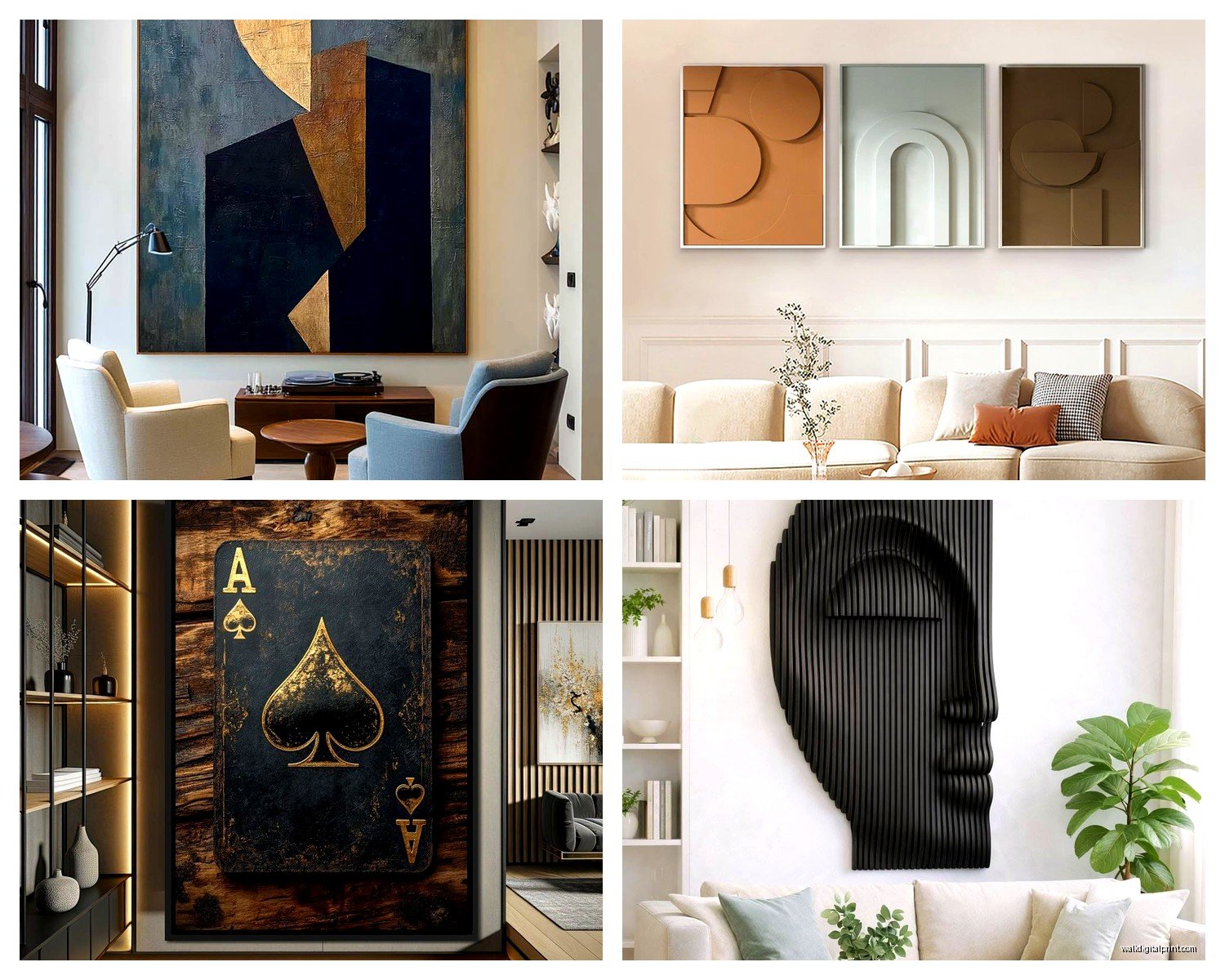
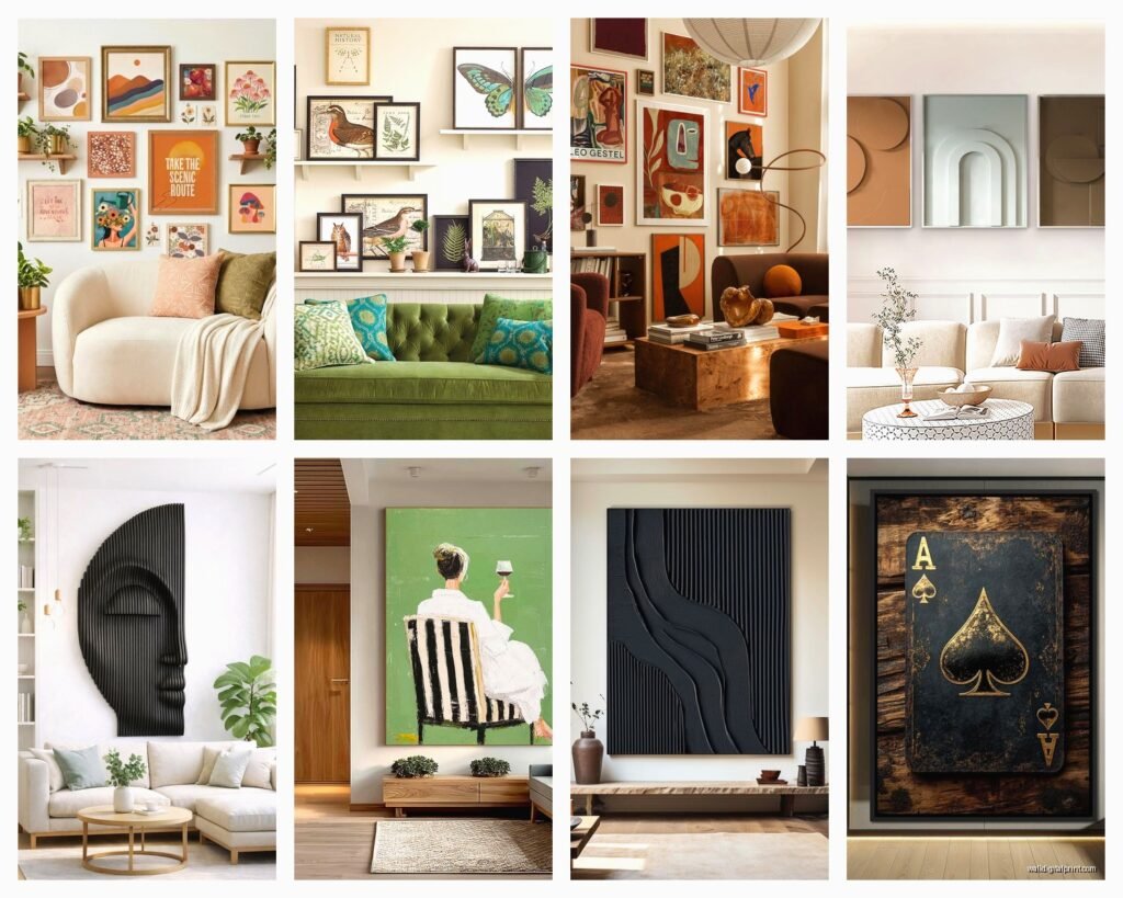
This is where people get paralyzed with indecision and honestly both work but for different reasons. A single large piece is gonna be easier – one nail, one decision, done. It creates this immediate focal point and makes the room feel more… I dunno, intentional?
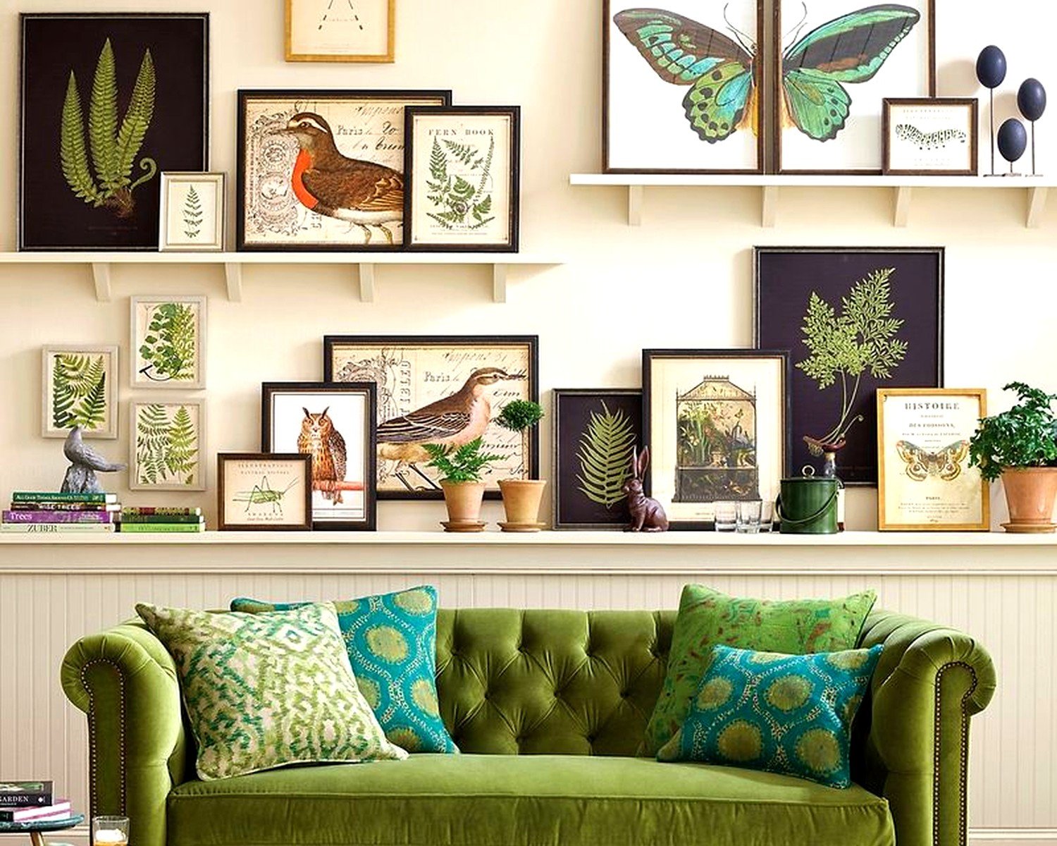
But gallery walls let you mix things you actually care about. I’ve got mine set up with two vintage botanical prints I found at an estate sale, a abstract piece my niece made (don’t judge, it’s actually good), and some black and white photography. The trick with gallery walls though is you gotta lay it out on the floor first. I cannot stress this enough. Use painter’s tape on the wall to mark where everything goes before you start hammering.
My cat knocked over my coffee while I was doing this layout last month and I had to start over but honestly it forced me to try a different arrangement that ended up working better.
What Actually Creates That Relaxation Vibe
You want your lounge to feel relaxing, right? So here’s what I’ve learned after testing this in like a dozen client spaces. Colors matter more than subject matter, which sounds obvious but people don’t really think about it.
Soft blues, greens, warm neutrals, muted terracottas – these all signal calm to your brain. I had one client who was obsessed with getting this bright red abstract piece and look, it was beautiful, but it made the room feel energetic, not relaxing. We moved it to her home office and got her this gorgeous sage green landscape instead and she literally texted me a week later saying she’d been falling asleep on the couch more easily.
Abstract art works really well in lounges because it doesn’t demand attention the way figurative stuff does. You can zone out looking at it. Same with landscapes, seascapes, anything with horizon lines. There’s something about horizontal lines that reads as peaceful.
Oh and another thing – avoid anything too busy or chaotic. I love a good maximalist moment but not in the room where you’re trying to decompress after work.
Texture and Dimension
This is gonna sound weird but textured art makes a huge difference in how comfortable a room feels. Canvas prints are fine and affordable but they’re kinda flat energy-wise. I’ve been really into woven wall hangings lately – like macrame or woven fiber art. They add this tactile quality that makes the space feel cozier.
You can also do framed art with interesting mats. I use these thick fabric mats sometimes instead of the standard paper ones and it just adds dimension. Or mix in some wood elements – carved panels, driftwood arrangements, that sort of thing.
I saw this setup at a boutique hotel last year where they had three canvas prints but they were mounted on these thick wooden frames that stuck out from the wall about two inches. Created all these interesting shadows and made the whole wall feel more architectural.
The Practical Stuff About Hanging
Okay so you’ve picked your art, now you gotta actually get it on the wall. Standard rule is 57 inches to the center of the artwork – that’s museum height or whatever. But in a lounge where people are sitting most of the time, I actually go slightly lower. Like 54-55 inches to center.
When you’re sitting on your couch, you should be able to look at the art comfortably without craning your neck up. Test this before you commit to the holes in your wall.
For heavy pieces you’re gonna need proper anchors. I learned this the hard way when a 30-pound frame crashed down at 2am and nearly gave me a heart attack. Get yourself some good wall anchors rated for the weight. Most art will tell you how much it weighs but if not, large canvases can be surprisingly heavy with the frame.
Picture hanging strips work for lightweight stuff under like 8 pounds but anything substantial needs real hardware. The Command strips are great for renters though – I use them for smaller pieces all the time.
Lighting Makes or Breaks It
You can have the perfect art but if the lighting’s wrong it won’t matter. Natural light is obviously ideal but you gotta watch for glare if you’re using glass frames. I always check how the light hits at different times of day before finalizing placement.
For artificial lighting, I’m obsessed with picture lights right now. Those little lights that mount above the frame. They’re not expensive – you can get battery operated ones for like $30 – and they make your art look so much more expensive and gallery-like. Plus they add ambient lighting to the room which helps with that relaxation factor.
If you don’t wanna do picture lights, make sure you have some kind of accent lighting. Track lighting, wall sconces, even a well-placed floor lamp that washes light across the wall. Art looks dead in poorly lit rooms.
Budget-Friendly Options That Don’t Look Cheap
Look, I work with art that costs thousands sometimes but I also know most people aren’t dropping that kind of money on their lounge. Here’s what actually works without breaking the bank.
Large format prints from places like Desenio or Minted look surprisingly good. The trick is getting them properly framed – don’t use those clip frames for anything you want to look elevated. Spend the extra $50 on a real frame. Michaels or even Target have decent affordable frames now.
I’ve also been hitting up local art schools and buying directly from students. You can get original work for like $100-300 and it’s actually original, not a print everyone else has. Plus you’re supporting emerging artists which feels good.
Thrift stores and estate sales are goldmines if you’re patient. I found this incredible vintage landscape oil painting for $40 last summer. Needed a new frame but total investment was under $100 and it looks like something that should cost ten times that.
Oh wait I forgot to mention – you can also just frame interesting things that aren’t traditional art. Vintage scarves, textile samples, pages from old botanical books, even wallpaper samples in nice frames. I did this in my guest lounge with three framed William Morris wallpaper samples and people always ask where I got the “prints.”
DIY Art That Doesn’t Look DIY
If you’re crafty at all, there are options. Large abstract paintings are actually pretty forgiving – I’ve made several just using acrylics and a big canvas. Watch like two YouTube tutorials and you can create something that works. The key is keeping it simple and using a cohesive color palette.
I also love the oversized paper technique where you get large sheets of watercolor paper and do really simple abstract washes or geometric shapes. Frame them in matching frames and suddenly you’ve got a professional looking series.
My friend who can’t paint at all made this gorgeous piece by just gluing down torn pieces of colored paper in a gradient pattern. Sounds elementary school but with the right colors and a nice frame it looked intentional and modern.
Arranging Multiple Pieces
When you’re doing more than one piece, spacing matters a lot. I keep 2-3 inches between frames in a gallery wall situation. Consistent spacing looks intentional, random spacing just looks messy.
For a three-piece horizontal arrangement above a sofa, I usually do them in a straight line with equal spacing. Sometimes people do them staggered but honestly that’s harder to pull off without it looking accidental.
There’s this app called Gallery Wall that lets you plan layouts which is super helpful. You photograph your wall and then drag and drop different sized frames to see what works. Saved me so much time compared to the old paper template method.
Oh and mix frame styles but keep them in the same color family. All black frames, all natural wood, all white – it creates unity even when the art itself is varied. I break this rule sometimes but it’s a good starting point.
What To Avoid
Okay so things that don’t work based on my experience. Those motivational quote prints – they’re fine in an office maybe but they don’t create a relaxing vibe. Your brain reads words and it’s just slightly activating rather than calming.
Really dark or moody art can work but be careful. I had someone who put up this dramatic stormy seascape and while it was beautiful, it made the room feel heavy. Sometimes you want cozy-dark but there’s a line where it becomes oppressive.
Matching sets from home goods stores that come as a package deal… they usually look exactly like what they are. Not always, but usually. Better to curate pieces individually even if they’re all affordable prints.
Also avoid hanging things too high just because you have tall ceilings. I see this all the time where people think “well the wall is 12 feet tall so I should use all that space” but then the art is floating up near the ceiling and has no relationship to the furniture. Keep it anchored to the room’s living space.
Switching Things Up
One thing I do that keeps my lounge feeling fresh is I rotate my art seasonally. Not everything, but maybe I’ll swap out one or two pieces. Lighter, airier stuff in summer, richer tones in fall. You don’t need a huge collection to do this – even just having two different options for your main wall makes a difference.
I store the off-season pieces under my bed or in a closet. Just make sure they’re wrapped properly so they don’t get damaged.
This also gives you permission to buy that piece you love even if it doesn’t quite fit right now – maybe it’ll work in your summer rotation or whatever.
Anyway, that’s basically everything I’ve figured out through a lot of trial and error. The main thing is just to make sure whatever you choose actually makes you feel relaxed when you look at it, not stressed about whether it’s the “right” choice or trendy enough or whatever. Your lounge should feel like an exhale, you know?