Wall Art Guide, Wall Art Tutoriels
Large Abstract Wall Art for Living Room: Oversized Modern
May
So I literally just helped my sister pick out this massive abstract piece for her living room last month and honestly, the whole process was way more complicated than I thought it would be. Like, you can’t just slap a huge painting on the wall and call it a day – there’s actual math involved and I’m terrible at math.
Size Actually Matters Way More Than You Think
Okay so the biggest mistake everyone makes is going too small. I see it all the time with clients and it drives me crazy. Your living room wall is probably bigger than you think it is, and that piece you’re eyeing that seems “big enough” is gonna look like a postage stamp once it’s up there.
The rule I use – and this actually works – is that your art should take up about two-thirds to three-quarters of the furniture width below it. So if you’ve got a sofa that’s 90 inches wide, you’re looking at art that’s at least 60 inches across. Maybe bigger if your ceiling is high. My living room has 10-foot ceilings and I went with a 72×48 inch piece and it still could’ve been bigger honestly.
Measuring Without Losing Your Mind
Here’s what I do and it’s gonna sound low-tech but whatever. I cut out newspaper or tape together printer paper to the exact dimensions of the art you’re considering. Tape it to the wall where you think you want it. Live with it for a day or two. Walk past it, sit on your couch, see how it feels. I learned this trick from an art curator I worked with in Chicago and it’s saved me so many returns.
The center of the piece should be at eye level, which is usually around 57-60 inches from the floor. But if you’re hanging it over furniture, you want about 6-8 inches between the top of your sofa and the bottom of the frame. This is where people mess up constantly.
Color Schemes That Don’t Make You Wanna Die
Oh and another thing – picking colors is where everyone freezes up. I get texts about this literally every week. Here’s my approach that actually makes sense.
Look around your living room right now. What colors are already there? Your throw pillows, your rug, maybe that weird vase your mom gave you that you can’t get rid of. Pick one or two of those colors and find abstract art that incorporates them. You don’t need the art to match everything – that looks weirdly coordinated and kinda boring – but having some color connection helps it feel intentional.
The Neutral Wall Situation
If your walls are white, gray, beige, any of those builder-grade neutrals, you’ve got so much freedom it’s almost annoying. This is actually when I go bold. Like really bold. My friend has all gray walls and we found this incredible abstract piece with deep teals, burnt orange, and gold. It completely transformed her space and she was so scared to do it.
For neutral rooms I usually suggest:
- Rich jewel tones if your furniture is dark or leather
- Bright primary colors if everything else is pretty minimal
- Black and white abstracts if you want drama but not color commitment
- Warm earth tones if your space has wood elements
The Colorful Wall Problem
Now if your walls are already painted some color, it gets trickier. I had navy walls in my last apartment and finding art was… a journey. You basically have two options that work. Either go monochromatic – so more navy plus white and gray – or go complementary. Navy walls? Look for art with orange, coral, or warm yellows in it. The color wheel is actually useful here which surprised me because I hated art class in high school.
Styles That Work For Different Living Room Vibes
Wait I forgot to mention – the style of abstract art matters based on what your room already looks like. You can’t just pick something you like on Instagram and hope it works.
Modern Minimalist Spaces
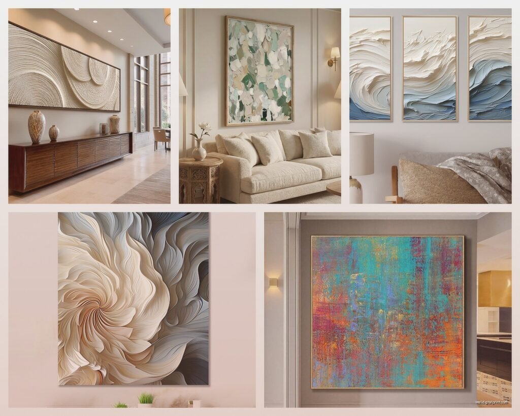
If your living room is all clean lines, probably some Scandinavian-inspired furniture, maybe a fiddle leaf fig in the corner because of course there is – you want abstract art that’s equally minimal. Think large color blocks, geometric shapes, limited color palette. I’m talking like three colors max. Mark Rothko style stuff works great here. Those pieces with just horizontal bands of color? Perfect.
Boho or Eclectic Rooms
This is where you can go wild with texture and color. Layered abstracts, mixed media pieces, stuff with gold leaf or heavy texture. My client has this maximalist boho living room and we found this abstract piece that literally has pieces of fabric embedded in it. It’s chaotic but it works because everything else is also kinda chaotic in the best way.
Traditional or Transitional Spaces
People think abstract art won’t work with traditional furniture but that’s completely wrong. You just need to pick abstracts that have some structure to them. Not totally random splatters – more like organized chaos. Pieces with defined sections or a clear focal point. And honestly, a really ornate gold frame can make even super modern abstract art work in a traditional space.
Where to Actually Buy This Stuff
Okay so funny story, I spent three months looking for a piece for above my sofa and kept finding things that were either perfect but cost like $3000 or affordable but looked like a college dorm room. Here’s where I actually find good stuff.
Online Options That Don’t Suck
Saatchi Art is probably my favorite because you can filter by size and color and actually find original pieces or limited prints. The quality is usually solid. I’ve ordered maybe six pieces from there over the years and only returned one.
Etsy is hit or miss but when you find a good artist, bookmark their shop immediately. I found this artist in Portland who does these incredible large-scale abstract landscapes and I’ve bought three pieces from her now. The key on Etsy is reading reviews obsessively and making sure they show photos of the actual product not just mock-ups.
Minted has good stuff if you want something more accessible price-wise. They’re prints but the quality is actually really good and they have huge size options. My sister got her piece there – 60×40 inches for like $400 framed.
In-Person Shopping
HomeGoods and TJ Maxx sometimes have massive abstract pieces for shockingly cheap. Like $150 for something huge. The catch is it’s totally random what they’ll have and you gotta go regularly. I stop by probably twice a month just to check. Found an amazing piece there last year that I still get compliments on.
Local art fairs and studio tours are where I find the most unique stuff. You’re paying more but it’s original and you can actually talk to the artist about customizing size or colors sometimes. Plus my dog loves coming to outdoor art fairs so it’s a whole thing.
The Frame Debate
This is gonna sound weird but I actually think most large abstract pieces look better without frames or with just a simple float frame. Traditional frames can make abstract art look like you’re trying too hard to make it “fancy” and it ends up looking stiff.
Canvas gallery wraps – where the image wraps around the edges – are perfect for modern abstracts. You can hang them straight on the wall and they have this cool dimensional thing going on. Just make sure the edges are finished nicely because you’ll see them.
If you do want a frame, keep it simple. Black, white, natural wood, or a thin metallic. I love a thin brass frame on abstract art – adds just enough polish without overwhelming the piece.
Installation Without Destroying Your Walls
Large pieces are heavy and I’ve definitely had one crash down at 2am which was terrifying. Here’s what actually works.
For anything over 30 pounds you need wall anchors, not just nails. Get the heavy-duty ones rated for at least double the weight of your art. I use toggle bolts in drywall and they’ve never failed me.
Two hooks are better than one for large pieces. It keeps them more stable and prevents that thing where the frame slowly tilts to one side over time. Space them about a third of the way in from each edge.
The Hanging Wire Situation
If your art has a wire on the back, make sure it’s rated for the weight. I’ve had wires snap and it’s not fun. For really large pieces I actually prefer D-rings on the back instead of wire because they feel more secure.
Use a level. Like actually use one. Your eye will lie to you and you’ll think it’s straight when it’s definitely not. I learned this the hard way after hanging something that looked fine until my friend came over and immediately pointed out it was crooked.
Styling Around Your Giant Art
Once it’s up, you’re not done. The area around it matters too.
Don’t put a bunch of small stuff near it. That massive abstract piece is the focal point – let it be the focal point. Maybe some simple shelving to one side or a tall plant, but don’t crowd it with gallery walls or collections of small frames.
Your furniture arrangement should acknowledge the art. If possible, arrange seating so people can actually see it. Sounds obvious but I’ve been in living rooms where the art is basically behind where everyone sits and it’s like… why is it even there.
Lighting makes such a difference. If you can add picture lights or adjust your existing lighting to highlight the piece, do it. Track lighting works great for this. My living room has recessed lights and I literally had an electrician move one so it would shine on my art properly. Worth it.
Budget Real Talk
Large abstract art is expensive, I’m not gonna lie. Original pieces start around $500 and go up to like… infinity basically. But you’ve got options.
Prints are totally fine. Nobody is inspecting your walls to see if it’s an original unless you have really pretentious friends. High-quality giclée prints on canvas can look amazing and cost a fraction of originals.
DIY is actually an option if you’re even slightly artistic. I have a friend who made her own 60×40 inch abstract piece with acrylic paints from Michael’s and it looks incredible. There are tons of tutorials on YouTube. It’s not for everyone but if you’re crafty, the savings are huge.
Buy from emerging artists. They’re still building their reputation so prices are more reasonable, but the work is often just as good as established artists. Art school grad shows are gold mines for this.
Common Mistakes I See All The Time
Hanging it too high is the number one thing. People think art should be way up near the ceiling and then you need binoculars to actually see it. Eye level, remember that.
Choosing art last is backwards. If you’re redoing your living room, pick the art early and build around it. It’s the biggest visual element – it should inform your other choices not be an afterthought.
Being too matchy-matchy with colors. You want some connection but if your art has the exact same blue as your pillows which matches your rug which matches your curtains, it looks like a showroom not a home where people actually live.
Not considering the mood. Abstract art sets a tone. Soft watercolor-style abstracts create calm, bold geometric ones add energy, dark moody pieces make things feel intimate. Think about how you want your living room to feel and pick accordingly.
Okay I think that covers most of it? The main thing is just don’t overthink it to the point where you never actually buy anything. I did that for like six months and just stared at a blank wall. Pick something you genuinely like looking at, make sure it’s the right size, hang it properly, and call it done. You can always change it later if you hate it but you probably won’t.