Wall Art Guide, Wall Art Tutoriels
Abstract Wall Art for Bedroom: Modern Sleep Space Designs
May
So I’ve been working with bedroom art for like forever now and honestly the abstract stuff is where I always end up because it’s so much easier to work with than people think. Like my client last month wanted this whole serene vibe but didn’t want anything “too boring” and abstract art literally saved that project.
Size Actually Matters Way More Than You Think
Okay so first thing – everyone gets the sizing wrong. I mean everyone. You’re probably thinking of getting something around 16×20 or maybe 24×36 and I’m gonna tell you right now that’s probably too small unless your bedroom is literally a closet.
For over the bed, you want your art to take up about 2/3 to 3/4 of your headboard width. So if you’ve got a queen bed with like a 60-inch headboard, you’re looking at 40-45 inches of art width minimum. I usually go with either one large piece (like 48×36 or 60×40) or a diptych/triptych set that adds up to that width.
The thing nobody tells you is that hanging art too small makes your whole room feel weird and unbalanced. I had this bedroom last year where the client insisted on this tiny 20×24 piece over their king bed and it looked like a postage stamp. We ended up flanking it with two more pieces to make it work but honestly just starting with the right size would’ve been easier.
The Height Thing That Everyone Screws Up
Hang your art so the center is at eye level when you’re STANDING, which is usually around 57-60 inches from the floor. But over a bed, different rules – you want about 6-8 inches between the top of your headboard and the bottom of the frame. Any higher and it looks like it’s floating away, any lower and it’s gonna feel cramped.
Color Selection Without Overthinking It
Here’s what I do and it works every single time. Take a photo of your bedroom, like right now on your phone. Look at what colors are already there – your bedding, your curtains, that chair in the corner, whatever. Your abstract art should pull 1-2 colors from what’s already in the room and then add ONE new accent color.
So if you’ve got like gray walls, white bedding, and navy pillows, your abstract piece might have navy, white, and then maybe a pop of gold or blush or sage green. That new color becomes your accent color for the whole room and suddenly everything feels intentional instead of random.
I’m personally obsessed with these color combos right now:
- Terracotta + cream + charcoal gray (warm but modern)
- Sage green + beige + soft black (so calming actually)
- Navy + blush + gold (classic but not boring)
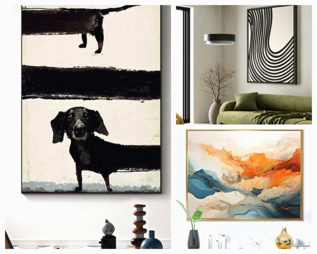
- Burnt orange + teal + cream (bold if you can handle it)
- Warm gray + mustard + white (underrated combo honestly)
Wait I forgot to mention – if your bedroom is small or doesn’t get much natural light, stick with lighter abstract pieces. Dark moody art looks AMAZING in photos but in real life in a dim bedroom it just becomes this dark blob on your wall. Found that out the hard way in my own apartment before I moved.
Styles That Actually Work for Sleep Spaces
Not all abstract art is created equal for bedrooms. Like you don’t want something super chaotic and energetic where you’re trying to sleep. I learned this when I put this really intense Jackson Pollock-style piece in a guest room and my friend who stayed over was like “I couldn’t stop looking at it, kept me awake” so yeah.
What Works:
Organic abstracts with flowing shapes and soft edges – think like watercolor bleeds, soft geometric shapes, gentle brushstrokes. The kind of stuff that doesn’t demand too much attention.
Minimalist line art abstracts are huge right now and they’re perfect for bedrooms because they’re interesting without being overwhelming. Just simple shapes, maybe some gold leaf details, very zen.
Color field abstracts – basically large blocks of color that blend into each other. Super calming and they add color without visual chaos.
What Doesn’t Usually Work:
Really geometric stuff with sharp angles everywhere can feel too energetic. Not saying never use it, but like… proceed with caution I guess?
Anything with too much black or really dark colors unless you’re specifically going for a moody dramatic vibe AND your room gets tons of natural light.
Super busy compositions with tons of different elements competing for attention.
The Actual Shopping Part
Okay so where to actually buy this stuff without spending your entire paycheck. I’ve got sources.
Minted and Artfully Walls are my go-to for affordable original-looking pieces. They’ve got tons of abstract options and you can get them framed which honestly saves so much hassle. The quality is solid – I’ve used them for client projects and never had complaints.
Etsy is amazing if you wanna support actual artists and you can find some really unique stuff, but you gotta wade through a lot of… not great options. Search for “abstract bedroom art” and then filter by your color palette. I spent like two hours last Tuesday doing this while my cat was knocking things off my desk and found some gems.
Society6 and Redbubble let you get the same design in different sizes which is super helpful if you’re not sure about scale. Plus they do sales constantly so wait for like 20% off.
For budget options, honestly Target and West Elm have stepped up their art game. The quality isn’t gonna blow your mind but for like $50-150 you can get something decent that’s already framed.
Custom Options If You Wanna Splurge
Commissioning an artist sounds scary but it’s actually not that complicated. I use Instagram to find artists whose style I like, DM them to ask about commissions, and most of them have set prices based on size. Usually runs $200-600 for bedroom-sized pieces depending on the artist.
The cool thing about custom is you can say exactly what colors you need and what vibe you’re going for. I had an artist create this gorgeous abstract piece in specific shades of blue-gray and cream to match a client’s coastal bedroom and it was literally perfect.
Framing Because It Actually Matters
Don’t skip the frame thinking you’ll do it later because you won’t. I have like three unframed canvases in my storage closet that have been there for two years so yeah learn from my mistakes.
For modern bedrooms, I usually go with:
- Natural wood frames (light oak or walnut) for warmth
- Black frames for drama and contrast
- White or cream frames for a gallery feel
- Gold or brass frames if you’re feeling fancy (works great with the right piece)
The frame should be simple – you want the art to be the star. Those ornate carved frames are gonna compete with abstract art and it’ll look confused.
Float mounting (where there’s space between the art and the frame) looks really high-end and modern. Framebridge does this well if you don’t wanna deal with a local framer.
Gallery Wall vs Single Statement Piece
This is gonna sound weird but I think single large pieces work better in bedrooms than gallery walls. Gallery walls are amazing in living rooms and hallways but in bedrooms they can feel too busy.
That said, if you’re gonna do a gallery wall over your bed, keep it to 3-5 pieces MAX and use the same frame style for everything. Mix abstract pieces with similar color palettes but different compositions.
I did this thing recently where we used three vertical abstract pieces in a row above a king bed – same size frames, same matting, but each piece was a different abstract composition in the same color family. Looked super cohesive and intentional.
The Symmetrical Layout That Always Works
Two matching abstract pieces flanking the bed on either side is foolproof. Like above the nightstands. Same size, same frame, either matching pieces or complementary abstracts from the same artist or collection. Very hotel chic without trying too hard.
Lighting Your Art Properly
Nobody thinks about this until after they hang the art and realize you can’t actually see it at night. Picture lights are kind of old-fashioned looking but they work. I prefer using adjustable wall sconces positioned to highlight the art or even just making sure your bedroom has good ambient lighting.
If you’ve got recessed lighting, you can angle the bulbs to wash light over your art. Just don’t use spotlights that are too intense – you’re not in a museum and you don’t want weird glare when you’re trying to sleep.
Natural light is obviously ideal during the day but watch out for direct sunlight hitting your art because it’ll fade over time. UV-protective glass helps but it’s expensive so maybe just don’t hang your $500 custom piece where the afternoon sun blasts it for four hours daily.
Mixing Abstract with Other Stuff
You don’t have to commit to ONLY abstract art in your bedroom. I actually think it’s cooler when you mix it up a bit. Abstract over the bed as your main piece, then maybe some photography or botanical prints on other walls.
The abstract becomes your anchor and the other art supports it. Just make sure everything shares a similar color palette or vibe so it doesn’t look like you just grabbed random things from different rooms.
Oh and another thing – abstract art pairs really well with plants. Like if you’ve got some greenery in your bedroom, abstract art with organic shapes and earth tones creates this whole natural modern thing that’s very now.
What to Avoid Unless You Really Know What You’re Doing
Matching your art exactly to your bedding. It looks too coordinated like a furniture showroom. Your art should complement your space but not match it perfectly.
Those mass-produced canvas prints from HomeGoods that everyone has. Listen I love HomeGoods for other stuff but their art selection is so overdone at this point. Your bedroom should feel personal.
Hanging art too high because you have high ceilings. The rules don’t change just because your ceiling is 10 feet up – eye level is still eye level.
Tiny frames with huge mats. This was trendy for a minute but it wastes wall space and makes the actual art too small to appreciate.
Testing Before Committing
Here’s something I do with every client – tape up paper or cardboard the size of the art you’re considering before buying anything. Live with it for a few days. See how it feels. Is it too big? Too small? Wrong placement?
You can also use apps like Artplacer to visualize art on your walls but honestly the paper method is easier and more accurate because you’re seeing actual scale in your actual space.
I gotta say, I’ve changed my mind on art placement so many times after doing this test. What looks good in theory doesn’t always work in reality and it’s way easier to move paper around than to put holes in your wall and then realize you hate it.
Making It Feel Expensive When It’s Not
Good framing elevates cheap art. Seriously. A $30 print in a $100 custom frame looks better than a $200 print in a cheap frame.
Proper spacing and installation makes everything look more intentional. Use a level, measure properly, and make sure it’s secure.
Lighting makes average art look amazing. Even just having good bedside lamps that cast some light toward your wall art makes a difference.
Keep it simple – one really good piece beats three mediocre pieces every time.
The bedroom I just finished last week used this abstract piece we found on Etsy for like $85, put it in a simple oak frame from Framebridge, hung it perfectly centered over the bed with proper spacing, and everyone who sees it assumes it cost way more than it did. It’s all about the execution honestly.