Wall Art Guide, Wall Art Tutoriels
30×30 Wall Art: Medium Square Format Gallery
May
So I’ve been working with 30×30 pieces a LOT lately and honestly they’re kind of the sweet spot nobody talks about enough. Everyone obsesses over those massive statement pieces or tiny gallery walls, but this medium square format is like… it just works in so many situations where other sizes feel weird.
Why 30×30 Actually Makes Sense
Okay so first thing – when I say 30×30 I mean centimeters, which is roughly 12×12 inches. It’s substantial enough that you’re not squinting to see it from across the room, but it doesn’t completely dominate a wall like those 100cm+ pieces do. I had this client last month who kept saying she wanted “big art” and I brought three 30×30 pieces instead of one huge canvas and she literally texted me at midnight being like “I GET IT NOW.”
The thing about this size is it’s actually super versatile for both renters and homeowners. You’re not drilling massive holes, the weight is manageable (most are under 2kg), and if you move you’re not playing Tetris trying to fit a giant frame through doorways.
Where They Actually Work Best
Living rooms above console tables – this is where I use them probably 40% of the time. A console table is usually 100-120cm wide, and you can do either a single centered piece or two 30x30s with like 15-20cm between them. The proportion just feels right, you know? Not too matchy-matchy but balanced.
Bedroom situations are interesting because people always default to putting something massive above the bed but honestly? Two or three 30×30 pieces in a horizontal line above a queen bed looks way more curated and less “I bought the first thing I saw at HomeGoods.”
Hallways – oh man, hallways. This is where the format really shines because you can create a whole moment without overwhelming a narrow space. I did this Victorian terrace conversion where the hallway was maybe 90cm wide and we hung five 30×30 pieces in a vertical line going up the stairs and it looked like something from a design magazine but cost maybe £200 total.
The Dining Room Thing
Okay so this is gonna sound weirdly specific but dining rooms are tricky with art because you’ve got furniture breaking up the wall space and you need something that holds its own but doesn’t compete with whatever’s happening on the table. A grid of four 30×30 pieces (2×2 configuration) is like… chef’s kiss. I did this in my own place actually and my sister came over and just stood there taking photos for like five minutes.
Hanging Configurations That Don’t Look Basic
The single centered piece is fine but it’s also kinda boring unless the art itself is really dynamic. Here’s what I actually do:
The asymmetric pair – hang two 30×30 pieces but NOT at the same height. One at eye level (about 145cm to the center) and one maybe 20cm lower and offset to the side. It feels more collected-over-time than deliberately matchy.
The three-piece horizontal – space them about 5-8cm apart. This works over sofas, beds, long console tables. The key is keeping the spacing consistent… I use painters tape to mark where each piece goes before I start drilling because I’ve definitely eyeballed it before and ended up with wonky spacing that haunted me for months.
The grid – four pieces in a square or six in a rectangle. Spacing should be tighter here, like 3-5cm between pieces. It reads as one installation rather than separate artworks. My dog knocked into my measuring tape while I was planning a grid last week and I had to start over three times, so maybe put your pets in another room lol.
The scattered salon wall – mix 30×30 pieces with smaller sizes. This is advanced level stuff but when it works it WORKS. You need an anchor piece (usually one of the 30x30s) positioned first, then build around it with smaller pieces. I always lay everything out on the floor first and take a photo from above so I can reference it while hanging.
What Actually Looks Good In This Format
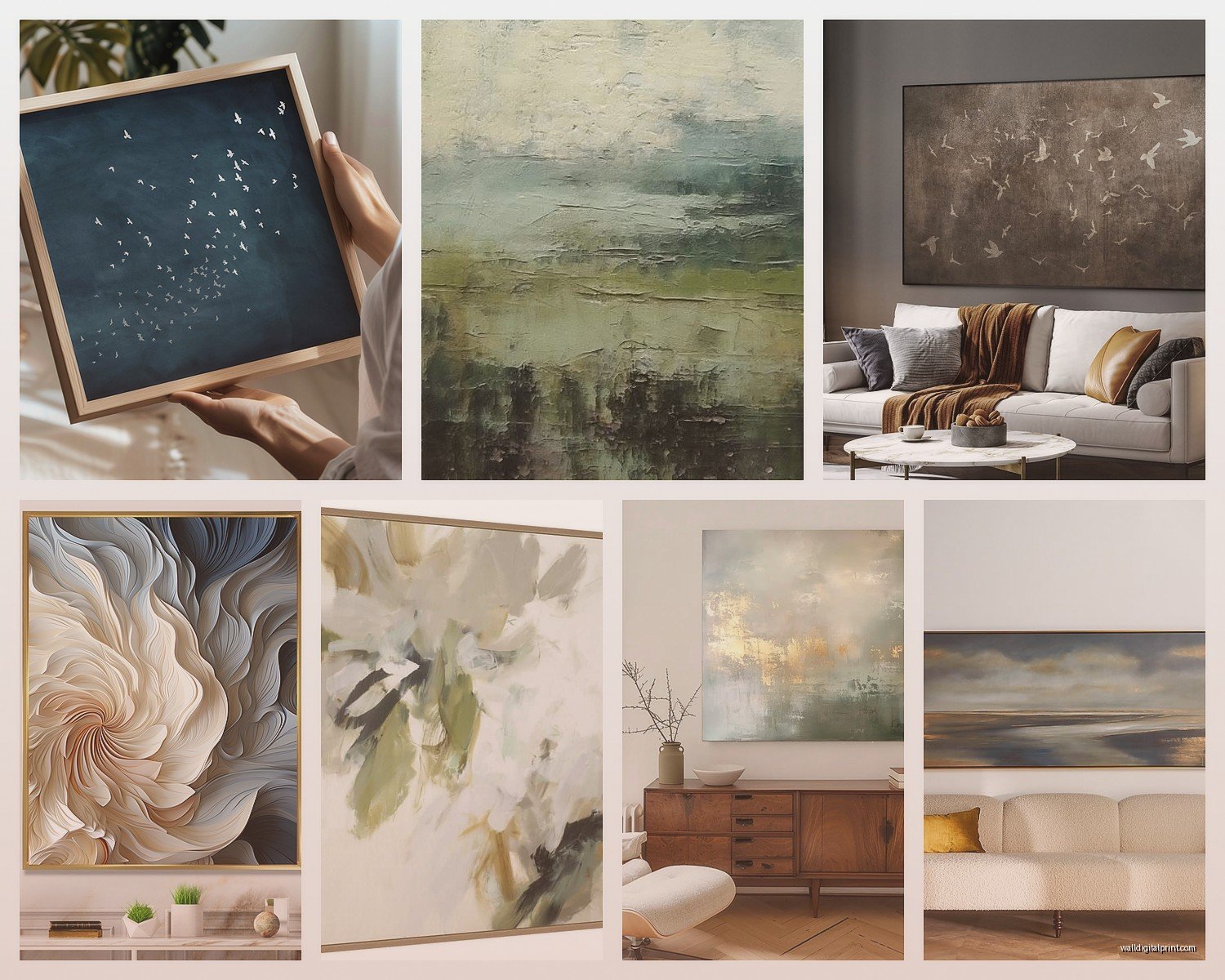
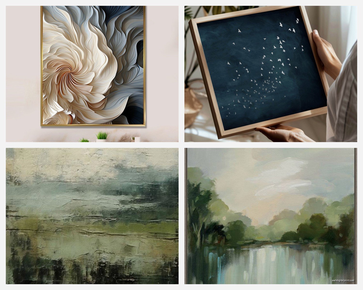
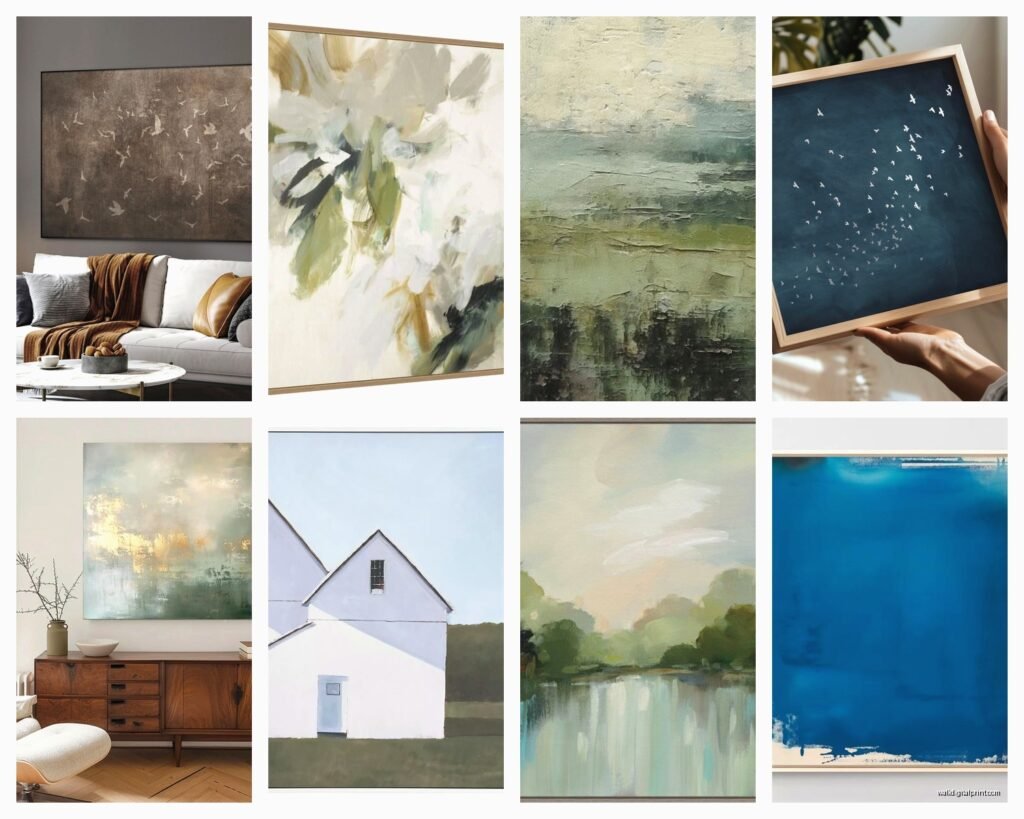
Abstract work is the obvious choice and yeah, it’s popular for a reason. The square format feels natural for abstract compositions – something about the equal proportions just lets the colors and shapes do their thing without the frame fighting for attention.
But here’s what people don’t expect to work but totally does – photography. Especially architectural details or nature close-ups. I found this series of botanical prints, super detailed fern and leaf structures, got them printed as 30x30s and hung four of them in my bathroom and people literally ask about them every time they come over.
Line drawings and minimalist illustrations also kill in this size. There’s enough space for the work to breathe but it doesn’t feel like too much empty space around a simple drawing.
Color Considerations
This is where I see people mess up… they buy art they love but don’t think about how it’ll actually sit in their space. You don’t need to match your wall color exactly (please don’t do that, it’s so 2010) but you gotta consider the overall vibe.
If your walls are white or light neutral, you can basically do whatever. Dark walls though – and I’m working with a lot of dark green and navy walls lately – you need either really vibrant colors or pieces with significant white/light areas so they don’t just disappear into the wall.
I had this whole situation where a client painted her dining room this gorgeous deep terracotta and then bought these rust-colored abstract pieces and they just… vanished. We swapped them for pieces with cream and gold tones and suddenly the whole room came together.
Framing Options Because This Matters More Than You Think
Okay so you’ve got your art, now what? Framing can literally make or break the whole thing.
Floating frames – these are the ones where the art appears to float inside the frame with a gap around it. Super contemporary look, works great with prints and photographs. They add about 3-5cm to each dimension though, so your 30×30 becomes more like 35×35 overall.
Gallery frames – simple, thin profile, usually black or white or natural wood. This is my go-to probably 70% of the time because they’re clean and don’t compete with the artwork. IKEA’s RIBBA frame in 30×30 is actually decent quality for the price, though the hanging hardware is kinda flimsy so I usually upgrade that.
No frame at all – if you’re working with canvas prints, sometimes leaving them unframed gives this more casual, studio vibe. Works better in creative spaces or bedrooms than formal living rooms though.
Wood frames in different finishes can add warmth but be careful about going too matchy with your furniture. I see people try to match their oak frames exactly to their oak dining table and it ends up looking more rigid than cohesive.
The Actually Practical Stuff About Hanging
You need a level. Like a real one, not the app on your phone (I’ve tried, it’s not accurate enough and you’ll end up with crooked art that slowly drives you insane).
For 30×30 pieces, I usually use two hooks per frame if it weighs more than 1kg. The weight gets distributed better and it’s way more stable. Those 3M command strips work for lighter pieces but honestly, just drill the hole. Spackle is like £3 and takes two seconds to fix when you move out.
The eye-level rule is your friend – center of the artwork should be about 145-150cm from the floor. This is based on average human height and how galleries hang work. BUT if you’re hanging above furniture, the bottom of the frame should be 15-20cm above whatever’s underneath it.
Wait I forgot to mention – if you’re hanging multiple pieces, treat them as one unit when you’re measuring. So like, if you’ve got three 30×30 pieces in a row with 5cm spacing between them, that’s (30+5+30+5+30) = 100cm total width. The CENTER of that 100cm span should be centered on your wall or furniture, not the center piece.
The Template Trick
This is gonna sound extra but it saves so much time – cut paper templates of your frames and tape them to the wall first. You can move them around without making holes, step back and see how it actually looks, take photos and sleep on it. I keep a roll of kraft paper specifically for this and my clients think it’s so professional but really I’m just avoiding having to patch fifteen holes because I changed my mind.
Where To Actually Get 30×30 Art
Etsy is honestly great for this size because lots of digital artists sell prints specifically formatted for standard frame sizes. You can find stuff from £15-50 depending on whether it’s a digital download you print yourself or a printed version they ship to you.
Society6 and similar print-on-demand sites have tons of options. The quality is hit or miss though – I’d stick with designs that are originally created at high resolution rather than photographs that might look pixelated at this size.
Local art fairs and markets – this size is popular with emerging artists because it’s affordable to produce and ship. I’ve found some of my favorite pieces this way and you’re supporting actual humans instead of dropship companies.
Oh and thrift stores, obviously. You gotta sift through a lot of questionable landscape paintings but sometimes you find amazing vintage prints already framed. I found four botanical prints from the 70s, all 30×30, for £8 each last month and they’re now in my guest room looking like I spent ££££.
Common Mistakes I See Literally All The Time
Hanging things too high. I cannot stress this enough. If you’re craning your neck to look at art, it’s too high. There’s this weird instinct to hang things way up near the ceiling and it just makes rooms feel off.
Picking frames that are too ornate for the space. Unless you’re going full maximalist (which, respect), keep frames simple when you’re doing multiple pieces. Let the art be the star.
Not considering lighting. Art needs light to be seen properly. If you’re hanging something in a dark corner, it’s basically decorative wallpaper. I’ve installed those battery-powered picture lights before and they make such a difference for like £20.
Buying all your art from the same place at the same time. It ends up looking like a hotel room. Mix sources, mix styles a bit, let things feel collected.
Forgetting about scale in the room overall. 30×30 works in most spaces but in a huge room with high ceilings, you might need to group more pieces together or go bigger. In a tiny room, one or two pieces max or it’ll feel cluttered.
Mixing Styles In A Gallery
This is where it gets fun but also where people freeze up. You CAN mix different styles of art in a gallery wall, but there needs to be something tying them together. Could be:
- Similar color palette across different subjects
- All black and white with one color accent piece
- Same framing even if the art is different
- Consistent level of detail/complexity
- A theme that’s loose enough to be interesting (like, “things that grow” could include botanical prints, abstract organics, landscape photos)
I did this whole thing in my studio space where I mixed vintage botanical prints with modern line drawings and abstract watercolors, all in simple black frames, and it works because the color palette is all soft greens and neutrals.
The trick is stepping back regularly while you’re planning. Like physically walk to the other side of the room and see if it reads as cohesive or chaotic.
Seasonal Swapping
Okay this might sound extra but hear me out – 30×30 is the perfect size for seasonal rotation because they’re not so big that storing them is a pain. I have a client who swaps her dining room art four times a year and it keeps the space feeling fresh without any major renovation.
You don’t need four complete sets though. Even just swapping one or two pieces in a gallery can shift the whole mood. I keep some warmer-toned pieces for fall/winter and cooler blues and greens for spring/summer.
Anyway I’m realizing this is getting super long but hopefully it helps? The main thing with 30×30 is just that it’s way more versatile than people give it credit for and you have so many options for how to use them. Start with one piece if you’re nervous, see how it feels, then build from there. You’re gonna figure out what works for your space way better by actually trying stuff than by overthinking it forever.