Wall Art Guide, Wall Art Tutoriels
Navy Abstract Wall Art: Deep Blue Modern Designs
May
So I’ve been working with navy abstract pieces for like three years now and honestly it’s one of those things where I wish someone had just told me the actual rules before I made my client’s living room look like a college dorm situation.
The Lighting Thing Nobody Tells You
Okay first thing – navy art is SUPER moody in bad lighting. Like I had this gorgeous piece with gold leaf accents and deep blue swirls, looked incredible in the gallery, got it to my client’s north-facing living room and it basically disappeared into the wall. Navy needs either really good natural light OR you gotta commit to picture lights or track lighting. I’m talking actual dedicated lighting, not just your sad overhead fixture.
The rule I use now is if the room gets less than 4 hours of direct sunlight, you need a picture light. Period. I like the brass ones from museums – they’re like $60-80 on Amazon and they make SUCH a difference. My cat knocked one off the wall last month and I replaced it within two days because the art just looked flat without it.
Testing the Actual Blue
Here’s what I do now and it’s gonna sound excessive but trust me. Get paint swatches in navy – like five different ones from Sherwin Williams or Benjamin Moore. Tape them next to where you’re planning to hang the art. Look at them morning, noon, and evening for at least two days. Navy shifts SO much depending on light. What looks like a gorgeous deep blue at 2pm can look straight up black at 7pm.
The abstract pieces with metallic elements or white accents are more forgiving because they catch light differently throughout the day. I’ve had better luck with those in spaces that don’t have perfect lighting.
Size Mistakes I Made So You Don’t Have To
Your navy piece needs to be BIGGER than you think. I don’t know why but navy reads smaller than lighter colors. That 24×36 that seems perfect? It’s gonna look tiny once it’s up. My general rule now is go one size up from what your gut tells you.
For over a sofa (the most common spot), you want the art to be 2/3 to 3/4 the width of the sofa. So if your sofa is 84 inches, you’re looking at like 56-63 inches of art width. You can do a single large piece or a diptych or triptych situation.
Wait I forgot to mention – if you’re doing multiple pieces, keep them close together. Like 2-3 inches apart maximum. I see people do these wide gallery walls with navy pieces spaced 6 inches apart and it just… loses all its impact. Navy needs to feel substantial.
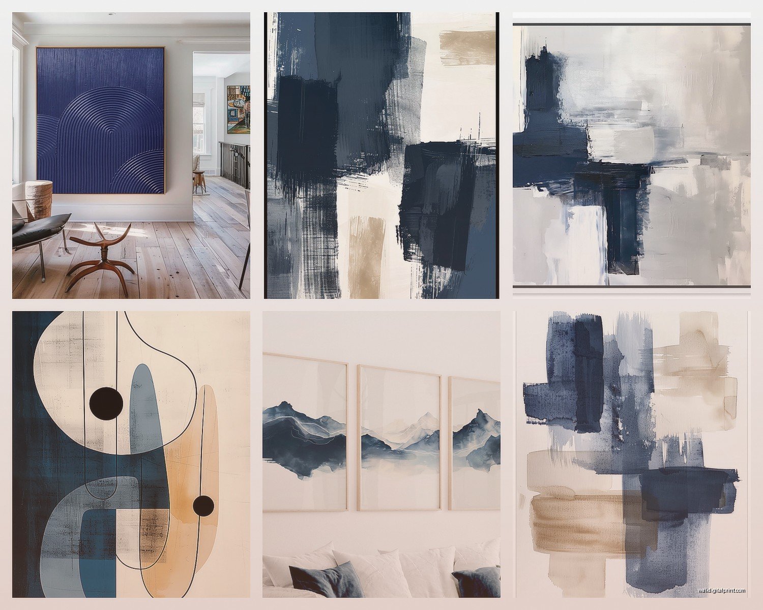
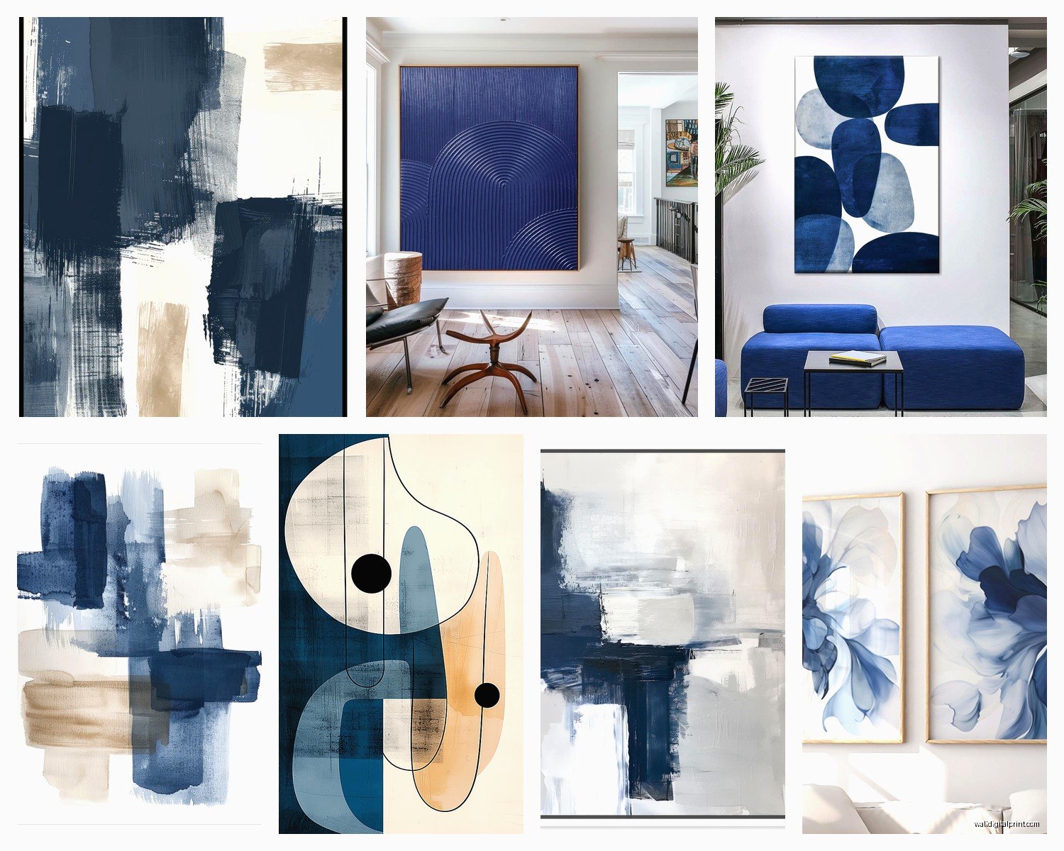
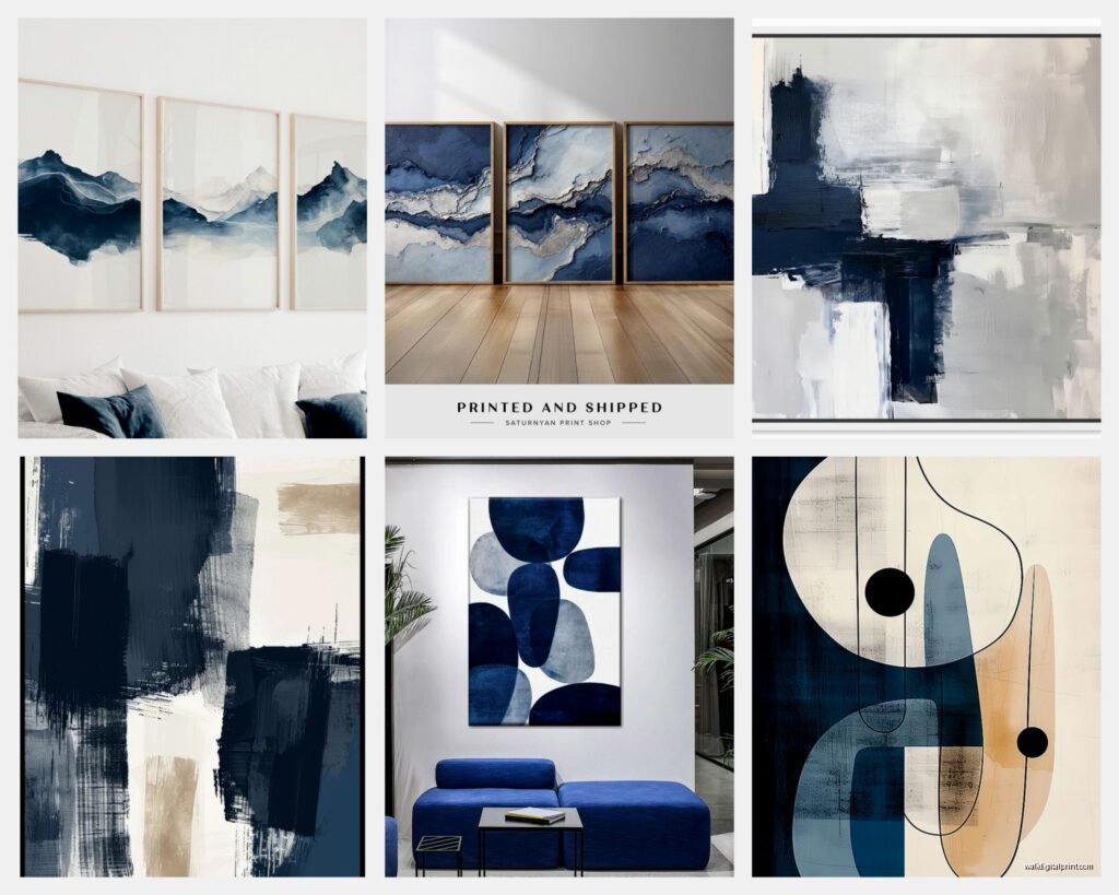
The Three Styles That Actually Work
Okay so in my experience there are three types of navy abstract that consistently look good:
Textured/impasto navy – This is where there’s actual dimension to the paint. You can see brushstrokes or palette knife marks. These work AMAZING in modern spaces because they add that tactile element. Downside is they’re usually more expensive and they collect dust like crazy. I have one in my own place and I’m out there with a soft brush every two weeks.
Minimalist navy with geometric elements – Think navy with crisp white lines or gold leaf sections. These are super versatile, work in traditional or modern spaces. They’re also easier to find at reasonable prices. West Elm and CB2 have decent options in the $200-400 range.
Fluid/marbled navy – Where the navy bleeds into other colors like teal or white or even blush pink. These are trickier but when they work they REALLY work. Best in spaces that already have a established color palette because they’ll pull multiple colors into the room.
What to Hang It With (Because Hanging Art is Annoying)
Oh and another thing – please don’t use those sawtooth hangers that come with cheap frames. They’re garbage and your art will be crooked forever. Here’s my actual system:
For pieces under 20 pounds: D-rings on the back (two of them) with picture wire. Use regular picture hangers on the wall – the ones rated for 30 pounds even if your piece is lighter.
For pieces over 20 pounds: French cleats or heavy duty wire with two wall anchors. I know anchors seem like overkill but I’ve had a 30-pound piece come down at 3am and it’s not fun.
The center of your art should be at 57-60 inches from the floor. That’s museum height and it actually works in homes too. When I’m hanging above furniture, I keep 6-8 inches between the furniture top and the bottom of the frame.
The Room-by-Room Reality
Living rooms – Navy abstract works best on the wall opposite or perpendicular to your main windows. If you put it on the same wall as a big window, it’ll be in shadow most of the day. I learned this the hard way in my old apartment.
Also consider what’s around it. Navy looks incredible with warm wood tones, brass accents, cream or white walls, even blush or terracotta. It looks… less incredible with cool grays or lots of black furniture. Too moody, ends up feeling heavy.
Bedrooms – This is actually my favorite spot for navy abstract. Super calming but still sophisticated. I always go for pieces with some lighter elements mixed in so it doesn’t feel too dark when you wake up. And definitely use bedside lamps to light it at night.
Dining rooms – Works great but you need good overhead lighting. A statement chandelier plus navy abstract art is *chef’s kiss* if you’re into that dramatic look.
Bathrooms – Okay so funny story, I put a navy piece in my powder room and the humidity made the canvas warp within like six months. If you’re doing bathroom art, make sure it’s properly sealed or go with a print under glass instead of original canvas.
Where to Actually Buy This Stuff
I’m gonna be honest about pricing because nobody else is. Original navy abstract paintings from actual artists run $800-3000+ depending on size and artist recognition. That’s just reality.
But there are solid options at different price points:
Prints from Minted or Artfully Walls – $150-400 for large sizes, good quality, they look legit from 5 feet away
Etsy originals from emerging artists – $300-800, you’re supporting actual artists and can often get custom sizes
West Elm/CB2/Crate & Barrel – $200-600, very safe choices that won’t wow anyone but won’t disappoint either
HomeGoods/TJ Maxx – $60-150, total gamble but I’ve found some gems there, just inspect the frame quality closely
The key with cheaper pieces is the framing. A $100 print in a $200 custom frame looks better than a $300 print in a $50 frame. I always tell people to budget more for framing than they think they need to.
Styling Around Navy Art
This is where people get weird and overthink it. Your navy art doesn’t need to match your throw pillows exactly. In fact it’s better if it doesn’t.
What I do: Pull ONE accent color from the art and repeat it 2-3 times in the room through accessories. So if your navy abstract has gold accents, add a gold picture frame on a shelf, maybe a gold lamp base, done. Don’t go crazy.
Navy pairs beautifully with:
- Warm whites and creams
- Camel and cognac leather
- Brass and gold metallics
- Natural wood tones (walnut especially)
- Soft blush or terracotta
- Sage green (but use it sparingly)
I usually keep walls neutral when doing navy art – white, cream, light gray, or even a soft greige. I’ve seen navy art on navy walls and it CAN work but you need professional lighting and it’s a whole thing.
The Maintenance Stuff Nobody Mentions
Canvas pieces need to be dusted regularly with a soft brush. Like I mentioned earlier with my textured piece, dust shows up on navy more than you’d think.
Keep navy art away from direct sunlight for extended periods – it WILL fade. I had a client whose gorgeous navy and gold piece faced a west-facing window and after two years it had this weird purplish cast to it.
If you’re in a humid climate, check the back of canvas pieces every few months for mold. Sounds dramatic but it happens, especially with cheaper canvases that aren’t properly sealed.
Glass-covered prints are obviously easier maintenance-wise, just clean the glass like you would a window.
The Grouping Question
Wait I forgot to mention gallery walls with navy abstract. They’re tricky because navy is such a strong color. Here’s what works:
Keep it to 2-3 navy pieces maximum in a gallery wall, fill in the rest with lighter pieces or even black and white photography. All navy pieces together can feel overwhelming unless you have like 12-foot ceilings and a huge wall.
Match your frame colors – all black frames or all natural wood or all white. Mixing frame colors with navy art looks messy instead of eclectic.
Keep the spacing tight – 2 inches between frames. Navy needs that visual weight clustered together.
My Current Favorite Combinations
Okay so after doing this for years, these are the combos that consistently work:
Large navy abstract with heavy texture + simple white/cream sofa + warm wood coffee table + brass accessories = never fails
Navy and white minimal abstract + navy velvet accent chairs + marble coffee table = super luxe without trying too hard
Small navy pieces (like 16×20) in a grid of six + all white frames + white walls = modern and clean but not boring
Navy abstract with gold leaf + emerald green velvet sofa (I know it sounds like a lot but trust me) + brass everything = maximalist but sophisticated
The TV show I was watching last night had this incredible navy piece in the main character’s apartment and my partner was like “can we please just watch without you analyzing the art” but anyway it was probably from Anthropologie based on the style.
When Navy Abstract DOESN’T Work
Real talk – navy abstract isn’t for everyone or every space. Skip it if:
Your room is already dark or gets minimal natural light and you can’t add picture lights
You have navy or dark walls (unless you’re going for that moody maximalist vibe and have the lighting to support it)
Your furniture is mostly black or dark gray (too heavy together)
You’re renting and can’t patch large nail holes – navy pieces need to be substantial to work, which means heavy duty hanging
The rest of your decor is very country/farmhouse style – navy abstract reads modern/contemporary and the mix usually feels confused
You have a small room under 100 square feet – navy will make it feel smaller (though you can sometimes get away with it if the piece has lots of white in it)
The Frame Situation
Frames matter SO much with navy abstract. Here’s my hierarchy:
Best: Floating frames in natural wood or black – these are the frames where there’s a gap between the canvas and the frame, super modern and lets the art breathe
Good: Simple black or natural wood frames, nothing ornate
Okay: White frames if your walls are white and the art has white elements
Avoid: Gold/silver ornate frames (unless you’re going for traditional and even then it’s risky), colored frames that try to match the navy
For unframed canvas pieces, make sure the edges are painted or finished nicely because you’ll see them. I’ve gotten pieces where the sides were just raw canvas with staples showing and it looks cheap no matter how nice the front is.
I gotta say, navy abstract is one of those things that elevates a space immediately when done right, but there’s definitely a learning curve and I made plenty of mistakes before figuring out what actually works in real homes versus what looks good on Pinterest.