Wall Art Guide, Wall Art Tutoriels
Abstract Coastal Wall Art: Modern Beach Interpretations
May
So I’ve been obsessing over abstract coastal art lately because honestly, those literal “starfish on weathered wood” pieces are making me twitch every time I walk into a beach house rental. Let me tell you what actually works when you’re trying to get that ocean vibe without looking like a HomeGoods exploded.
The Sizing Thing Nobody Gets Right
Okay so first mistake everyone makes – they go too small. I learned this the hard way in my own living room last year. You need to think bigger than feels comfortable at first. For above a sofa, you want something that’s at least 2/3 the width of your couch. I usually do 60-72 inches wide for a standard 90-inch sofa. But here’s the thing… abstract coastal pieces can actually go BIGGER because they’re softer and more atmospheric than like, a giant photograph of a shark or whatever.
My client last month wanted this delicate little 24×36 piece above her king bed and I had to physically show her with painter’s tape how ridiculous it would look. We ended up doing a 48×60 and it transformed the whole room. The abstract quality means it doesn’t overwhelm even at that size because your eye isn’t focused on one specific object.
Multi-Panel Situations
Oh and the triptych thing – three panels are having a moment but you gotta do it right. I space them 2-3 inches apart, not more. I see people doing like 6 inches between panels and it just reads as three separate pieces that happen to be near each other. The whole point is that coastal abstraction flows, right? It needs to feel connected.
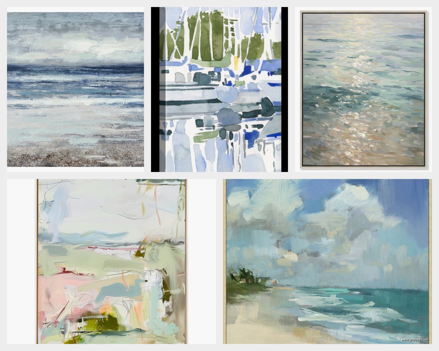
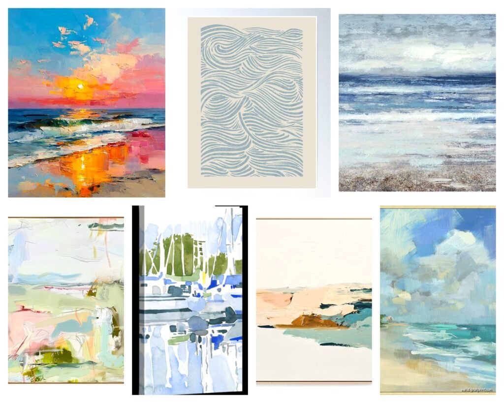
Color Palettes That Don’t Scream Tourist Trap
This is where people get stuck. They think coastal = bright turquoise and they end up with something that belongs in a dentist’s office near the beach.
The palettes I’m actually using right now:
- Dusty blue with sand neutrals and barely-there seafoam
- Charcoal gray with white and just hints of that oxidized teal
- Warm taupe with pale aqua and cream (this one’s my favorite lately)
- Deep navy with gold/bronze metallics and ivory
- Sage green with driftwood browns and soft white
The key is having one dominant neutral. Like 60% of the piece should be a color that could exist in a non-beach context. Then you bring in the ocean references through accent colors. I just finished sourcing art for a condo in Charleston and we did this gorgeous piece that’s mostly warm gray with these subtle horizontal streaks of pale blue – it suggests water without beating you over the head with it.
The Metallic Question
Metallics are tricky in coastal abstract work. Gold can read very glam-beach which works in some spaces but feels wrong in others. I’m really into tarnished silver and copper tones right now because they reference that oxidized metal you see on boat hardware. There’s this artist I follow who incorporates actual patina effects and it’s *chef’s kiss* for a modern coastal look.
Texture Matters More Than You Think
Okay so funny story – my cat knocked over a piece I was staging last week and I actually wasn’t that mad because it made me realize the texture wasn’t working anyway. Flat printed abstracts on canvas can work, but if you really want that elevated coastal feel, you need dimension.
Look for:
- Heavy gel medium that creates actual peaks and valleys
- Mixed media with plaster or modeling paste
- Resin pours that have depth (these are everywhere right now)
- Pieces with visible brushstrokes
- Layered applications where you can see the history of the painting
The texture catches light differently throughout the day and that’s very… oceanic? The way water changes constantly. A flat print doesn’t do that. I mean, if budget’s tight, a print is fine, but try to find one that’s at least printed on textured watercolor paper or has a gel overlay.
Where to Actually Source These
Let me save you some time because I’ve wasted SO many hours on this. Etsy is hit or miss – you’ll scroll through 47 pages of the same dropshipped print before finding something good. But when you find a good Etsy artist, bookmark them immediately.
I’ve had better luck with:
- Minted for affordable prints that don’t look cheap
- Saatchi Art when clients have actual budgets
- Local art fairs (I found my living room piece at a pier show in San Diego)
- Instagram artists directly – seriously just DM them
- West Elm and CB2 for the mid-range stuff that’s reliably decent
Oh and another thing – estate sales near coastal areas. I’ve found incredible vintage abstract pieces that have that authentic aged quality you can’t fake. There was this whole mid-century coastal abstract movement that people don’t talk about enough.
Commission vs. Ready-Made
If you’re gonna commission something, have reference images ready but don’t be too specific. I made this mistake with a piece for my office – gave the artist like 12 inspiration photos and exact color codes and it came out stiff and overthought. The best commissioned pieces I’ve gotten happened when I said something like “I want to feel like I’m looking at the ocean on an overcast day in November” and let them interpret it.
Budget-wise, expect $800-2000 for a quality commissioned piece around 40×50 inches, more if the artist is established. Ready-made originals from emerging artists run $400-1200 in that size range.
Framing That Doesn’t Ruin Everything
This is gonna sound weird but the frame matters as much as the art itself with coastal abstracts. I see people putting these soft, atmospheric pieces in chunky dark frames and it completely kills the vibe.
What actually works:
- Floating frames in natural wood or white
- Thin black frames (like 1 inch max) for a gallery feel
- No frame at all if the edges are painted
- Light maple or oak for warmth
- Brushed silver metal for contemporary spaces
I almost never use matting with abstracts anymore. It creates distance between you and the piece, and coastal abstraction should feel immersive. You want to fall into it, not observe it from behind a white border.
For gallery walls, I’m mixing framed and unframed pieces lately. Like two floating wood frames with one canvas that has painted edges between them. It creates rhythm without being too matchy.
Placement Strategy for Different Rooms
Living rooms are obvious but let me tell you where this style really shines – bedrooms. There’s something about waking up to an abstract interpretation of water that’s just… nice? Not too stimulating like a bold geometric would be, but more interesting than a landscape.
Over the Bed
Go horizontal and large. I’m doing 60×40 minimum for queens, 72×48 for kings. Hang it about 6-8 inches above your headboard or 57 inches on center if you don’t have a headboard (that’s standard gallery height).
The colors matter here – save the energetic pieces with bright whites and strong contrasts for other rooms. Over the bed, you want softer transitions, more tonal variations. That dusty blue palette I mentioned earlier? Perfect for bedrooms.
Dining Spaces
This is where you can go moodier with your coastal abstract. Deep blues, stormy grays, dramatic compositions. I just did a dining room with this incredible piece that’s mostly charcoal with these aggressive white marks that suggest foam or spray. It’s coastal but it’s got edge, you know?
Size-wise, if it’s going over a buffet or console, apply that 2/3 rule again. If it’s on a blank wall, you can go absolutely massive – like 6 feet wide massive.
Bathrooms Are Underrated
Okay so I was watching this design show the other night (my client canceled so I had time to actually relax) and they put this tiny sailboat print in the bathroom and I literally yelled at my TV. Bathrooms WANT abstract coastal art. The humidity, the water connection – it all makes sense.
But you gotta protect the piece. Either frame it under glass or use a canvas with a protective varnish. I’ve had good luck with resin pieces in bathrooms because they’re naturally water-resistant. And go smaller here – 20×24 to 30×40 depending on wall space.
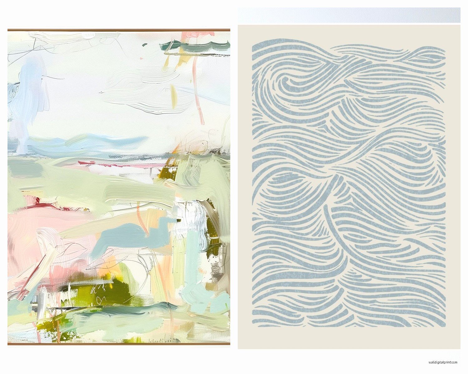
The Orientation Decision
Horizontal pieces emphasize the horizon line which is very literal-coastal, but vertical pieces can suggest those long views down the beach or the way water stretches into the distance. I’m actually preferring vertical orientations lately because they feel less expected.
For narrow walls (like between windows or next to doorways), a vertical abstract in coastal colors is perfect. I did a 20×60 piece in a hallway that’s just subtle gradations of blue-gray to white and people always stop to look at it.
Square Formats
Don’t sleep on square pieces. They’re having this moment right now and they work really well for coastal abstracts because they don’t force a horizon line. The composition becomes more about overall atmosphere than a specific view. I’m seeing a lot of 40×40 and 48×48 pieces that are just… immersive color fields suggesting water and sky without any clear division.
Mixing Coastal Abstract with Other Styles
Here’s where it gets interesting – you don’t have to commit to full coastal everything. Actually, please don’t. That’s how you end up in a themed restaurant instead of a home.
I’m mixing coastal abstracts with:
- Modern black and white photography
- Vintage botanical prints
- Minimalist line drawings
- Geometric patterns in complementary colors
- Organic sculptural elements
The trick is keeping your color palette consistent across pieces even if the styles vary. If your coastal abstract has dusty blue and taupe, your other art should pull from those same tones.
Lighting These Properly
Oh wait I forgot to mention – lighting changes everything with abstract coastal work. Natural light is obviously ideal, but if you’re working with artificial light, you want something that doesn’t skew too yellow or too blue.
I use picture lights (the kind that mount above the frame) set to 3000K for warmth without yellow. Or track lighting aimed at a 30-degree angle. The worst thing you can do is put a coastal abstract on a wall with no dedicated light – all those subtle color variations just disappear.
For rooms with lots of natural light, consider how the piece looks throughout the day. That bright white abstract that looks amazing at noon might feel harsh in morning light. I always tell clients to look at potential pieces at different times if possible.
Budget Breakdowns That Actually Work
Let me be real about costs because everyone wants to know but nobody wants to ask:
Under $200: You’re looking at quality prints, probably 24×36 or smaller, from places like Minted or Etsy. Totally fine for starting out or secondary spaces.
$200-500: Larger prints (up to 40×50), canvas prints with texture, or small originals from emerging artists. This is the sweet spot for most people.
$500-1500: Original paintings from mid-career artists, large-scale quality prints with custom framing, or really excellent canvas reproductions with hand-embellishment.
$1500+: Original work from established artists, commissioned pieces, or investment-quality art that’ll appreciate over time.
I tell clients to invest in the pieces that go in your main living areas and save on bedroom/bathroom art. But honestly, one really good piece beats five mediocre ones every single time.
What to Avoid
Okay rapid-fire list of things that look like coastal abstract but miss the mark:
- Anything with words or quotes (just no)
- Literal beach objects painted abstractly (still too literal)
- Super saturated tropical colors unless your space is very modern
- Pieces where every inch is busy – you need breathing room
- Matching sets of three that are too matchy
- Anything described as “rustic coastal” – that’s different vibe entirely
The goal is suggestion, not representation. You want someone to feel the coast, not see a specific beach.