Wall Art Guide, Wall Art Tutoriels
Black and White Nature Wall Art: Monochrome Landscapes
May
So I’ve been absolutely obsessed with black and white nature prints lately, like to the point where my living room looked like an Ansel Adams exhibition for about three weeks until I figured out what actually works. My cat knocked over two of them before I even got them hung properly, which was… a whole thing.
Why This Actually Works Better Than You’d Think
Okay so the thing about monochrome landscapes is they’re weirdly versatile? Like you’d think removing color would make them boring but it actually does the opposite. I tested this in my own space and then with like four different client projects, and black and white nature art just slides into basically any room without competing with your existing color scheme. That purple couch you’re worried about? The navy accent wall? Doesn’t matter. The artwork becomes about form and texture instead of color coordination.
Plus here’s something nobody tells you, colored landscape photography can look dated really fast. I’ve got some sunset beach prints from 2015 that already feel very… 2015. But black and white? That stuff is basically timeless. I found prints from the 1960s that still look contemporary.
Picking the Right Type of Landscape for Your Space
This is where I messed up initially and had to return like three different prints. Not all monochrome landscapes hit the same.
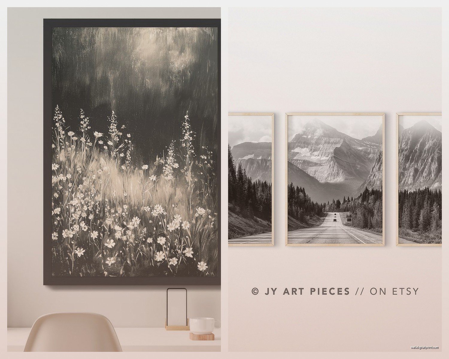
Mountains and dramatic peaks work best in rooms with high ceilings or where you want to create a sense of scale. I hung a massive Dolomites print in a client’s dining room with 10-foot ceilings and it completely transformed the space. But then I tried something similar in my bedroom which has standard 8-foot ceilings and it felt… oppressive? Like the mountains were gonna fall on me while I slept.
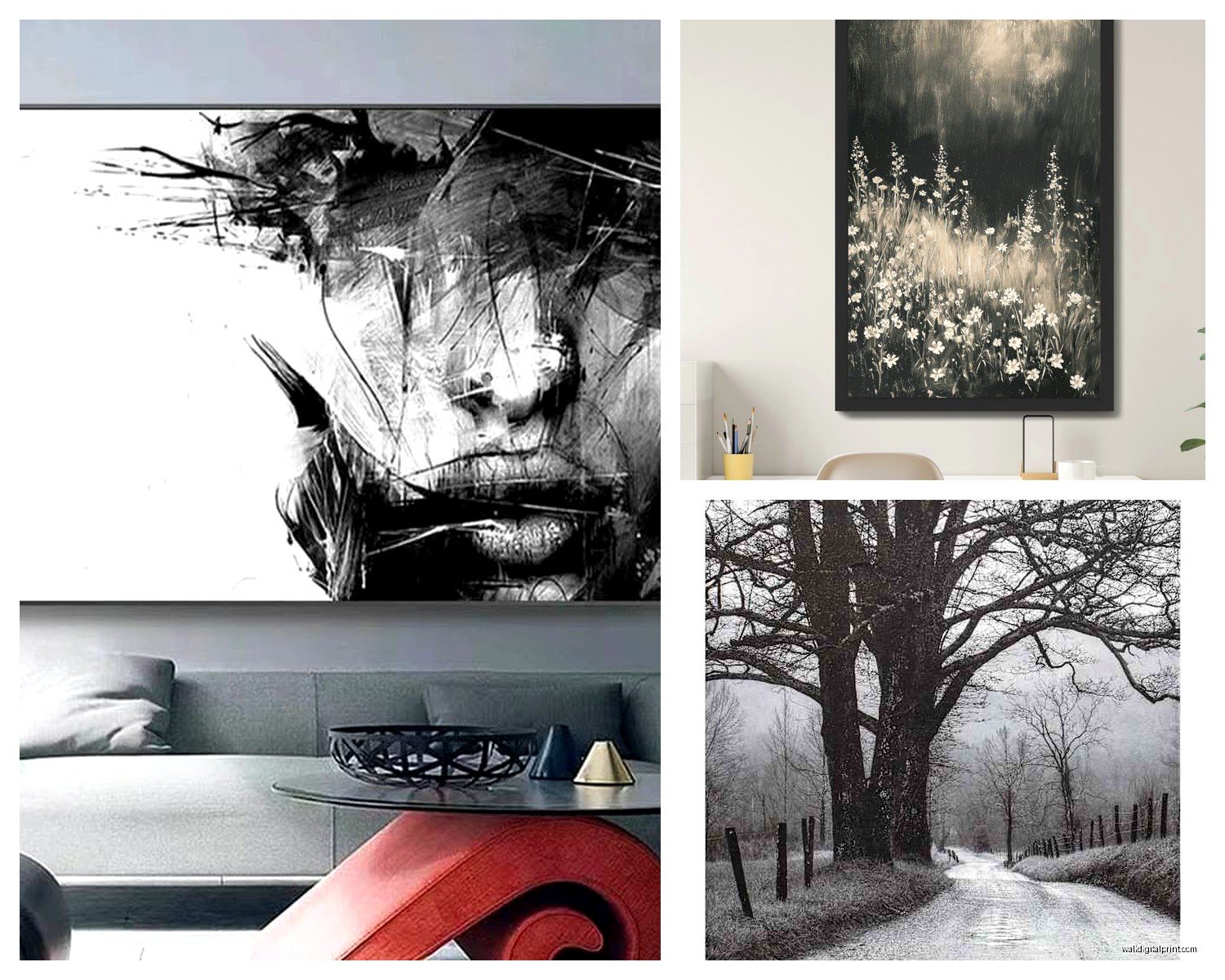
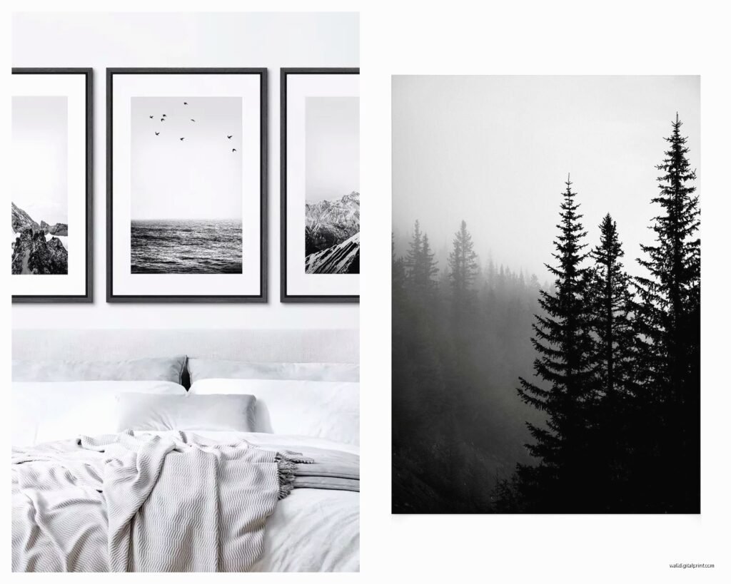
Forests and tree studies are your safe bet for bedrooms and smaller spaces. There’s something about vertical lines of trees that makes a room feel taller without being aggressive about it. I’ve got this birch forest print above my bed and it’s just calming in a way that doesn’t feel like it’s trying too hard.
Seascapes and minimalist water scenes are tricky and I’m still figuring these out honestly. They can go really zen and sophisticated or really “dentist office waiting room” and the line is thinner than you’d expect. The difference seems to be in the composition – if there’s too much empty sky or water, it reads as boring. You want some texture, some waves or rocks or something to give your eye somewhere to go.
Desert and stark landscapes are having a moment right now and I’m here for it. Sand dunes in black and white look sculptural, almost abstract. These work surprisingly well in modern spaces or anywhere you’ve got clean lines and minimal furniture.
Size Matters More Than You Think
Oh and another thing, everyone undersizes their wall art. Like, consistently. I did it, you’re probably gonna do it, we all do it.
For above a couch, you want your art to be roughly two-thirds to three-quarters the width of the couch. I know that sounds huge but trust me. I hung a 24×36 print above my 7-foot sectional and it looked like a postage stamp. Swapped it for a 40×60 and suddenly the whole room made sense.
For above a bed, similar rule but you can go a bit smaller. A 36×48 or even a 30×40 works over a queen bed. King bed, you’re looking at 40×60 or larger, or you do a diptych or triptych situation.
Here’s what I actually do now: I cut out paper templates in the sizes I’m considering and tape them to the wall. Takes like five minutes and has saved me from so many expensive mistakes. My partner makes fun of me for this but whatever, it works.
Frame Choices That Won’t Sabotage Your Artwork
This is gonna sound weird but the frame matters almost as much as the actual image. I spent $200 on this gorgeous print of Yosemite and then put it in a $15 Amazon frame and it looked… bad. Really bad. Like grocery store art bad.
Black frames are the obvious choice and they work like 85% of the time. Go for something with a slim profile, maybe half-inch to one-inch wide. Chunky black frames can overwhelm the image unless you’re going for a gallery wall situation.
White or light wood frames are actually my favorite lately for black and white nature prints. They create this really nice contrast and keep things from feeling too heavy or serious. I’ve got a white oak frame around a misty forest print and the warmth of the wood plays off the cool tones in the photo.
Mat or no mat – okay so I used to always do mats because that’s what you’re supposed to do right? But for large-scale landscape photography, I actually prefer no mat. It lets the image fill the frame edge-to-edge and feels more immersive. Save the mats for smaller prints or gallery walls where you need some breathing room.
Metal frames can work but they’re finicky. Thin black metal frames look great in modern or industrial spaces. But they’re also like twice the price of wood frames so there’s that.
Where to Actually Source Good Prints
wait I forgot to mention this earlier but it’s important – don’t just buy whatever comes up first on Amazon. I mean you can but the quality is all over the place.
I’ve had good luck with Society6 and Minted for affordable prints. The quality is consistent and they have actual photographers selling their work. Prices range from like $30 for smaller prints to $200+ for larger ones with frames.
Etsy is hit or miss but when you find a good seller, it’s great. Look for sellers who do their own photography and offer multiple sizes. Read the reviews specifically about print quality and shipping packaging.
For high-end stuff, I go to 20×200 or Artfully Walls. You’re paying more but the curation is better and the print quality is noticeably superior. The paper weight, the ink saturation, all of that matters when you’re looking at a 40×60 print on your wall every day.
Local art fairs and photography shows are underrated sources. I found my favorite piece – this incredible study of ice formations in Iceland – at a local photographer’s studio sale for half what it would’ve cost online.
The Free Option
Okay so funny story, I was watching this documentary about national parks last month and learned that the National Archives and Library of Congress have thousands of high-resolution black and white landscape photographs you can download for free. Like, actually free, public domain. You just have to get them printed yourself. I used Printique (used to be called AdoramaPix) and the quality was excellent. Whole thing cost me like $60 for a 30×40 print.
Hanging Height and Placement
The standard rule is 57 inches from floor to center of the artwork, which is supposedly average eye level. But I’m 5’3″ and my partner is 6’1″ so “average eye level” is kinda meaningless in our house.
What I actually do: hang it at a height that feels right when you’re standing in the spot where you’ll most often be viewing it. For art above a couch, that means considering seated eye level too. Generally this puts the bottom of the frame about 8-10 inches above the furniture.
In hallways or spaces where you’re mostly walking through, the 57-inch rule works pretty well. But in a dining room, consider seated eye level. In a bedroom, think about what you see when you’re lying in bed.
Mixing Multiple Prints Without Looking Chaotic
Gallery walls with black and white landscapes can look amazing or completely disjointed, and the difference is in the details.
Stick to a consistent color tone within the black and white spectrum. Some b&w prints lean warm (more browns and sepias in the blacks), others lean cool (more blue-grays). Mixing these looks off. I learned this the hard way with a gallery wall that just felt… wrong until I figured out three of the seven prints were warm-toned and the rest were cool.
Frame consistency helps a lot. You don’t have to use identical frames but keep them in the same family – all wood, all metal, or all the same color.
For a triptych or series of three, I like doing three prints from the same location or same type of landscape. Like three different mountain peaks, or three different angles of the same forest. It feels cohesive without being matchy-matchy.
Lighting Makes or Breaks It
This isn’t technically about the art itself but oh my god, lighting. I had this beautiful print of foggy mountains that looked completely flat and gray until I added a picture light above it. Suddenly all the tonal variation and detail popped.
You don’t need fancy picture lights though. A simple LED strip light mounted to the back of the frame creates a nice glow effect. Or just make sure you’ve got good ambient lighting in the room. Black and white photography needs contrast to shine, and in a dim room everything just looks muddy.
Avoid direct sunlight on your prints obviously, but especially for black and white work. The contrast will fade over time and you’ll end up with gray and light gray instead of black and white.
My Current Setup
Since you’re probably wondering what I actually ended up with in my own space – I’ve got a large format print of the Icelandic ice formations I mentioned in my living room, 40×60 in a simple white ash frame. No mat, clean and modern.
In my bedroom it’s the birch forest, 30×40, black frame with a white mat. More traditional but it works with the vintage dresser and other furniture in there.
And I’m currently debating a desert dunes print for the hallway but haven’t pulled the trigger yet. My partner thinks we have enough landscape photography at this point but like… do we though?
Common Mistakes I See All the Time
Hanging art too high. I swear every house I walk into has artwork floating near the ceiling. Lower it.
Choosing images that are too busy. Black and white photography should have strong composition and clear focal points. If you squint at the thumbnail and can’t tell what you’re looking at, it’s probably too chaotic for wall art.
Forgetting about the room’s purpose. Super dramatic stormy seascapes might not be the vibe for a bedroom where you’re trying to sleep. Save those for living spaces or offices where energy is good.
Mixing too many different landscape types in one room. Mountains, forests, deserts, and oceans all in the same space feels like a confused mood board. Pick a theme and stick with it, or at least keep things within a similar aesthetic.
Not considering the room’s existing lines and shapes. If you’ve got a lot of horizontal furniture, vertical artwork creates nice balance. If everything in your room is already tall and vertical, maybe a horizontal landscape print would ground things.
Budget Breakdown
Since you’re probably wondering what this actually costs, here’s what I typically spend:
- Small prints (16×20 to 24×30): $30-80 for the print, $20-60 for framing if you do it yourself or use a place like Framebridge
- Medium prints (30×40 to 36×48): $80-150 for print, $100-200 for framing
- Large prints (40×60 and up): $150-400 for print, $200-500 for framing
You can definitely spend less if you’re printing your own downloads and using basic frames. Or you can spend way more if you’re buying original photography or limited editions.
The thing is, this stuff lasts. I’ve had the same prints for years now and they still feel current. So spending a bit more upfront for quality you actually love makes sense.
Anyway that’s basically everything I’ve figured out through trial and error and probably more money than I should’ve spent. The TLDR is: go bigger than you think, frame it properly, and choose images with strong composition that match your room’s vibe. And maybe use paper templates before you start putting holes in your wall.