Wall Art Guide, Wall Art Tutoriels
Abstract Boho Wall Art: Free-Spirited Modern Bohemian
May
So I’ve been obsessing over abstract boho wall art lately and honestly it’s way more complicated than just slapping up some geometric prints and calling it a day. Like, I thought I had it figured out until I walked into a client’s living room last month and realized their “boho” art looked more like a corporate hotel lobby situation.
The thing with abstract boho is you’re trying to balance two kinda opposing vibes right? Abstract art can go super minimalist and cold, but boho needs that organic warmth. I spent like three hours last Tuesday (my afternoon appointment bailed) just analyzing what actually makes this combo work, and it comes down to texture and color temperature more than anything else.
Start With Your Color Story Because Everything Else Follows
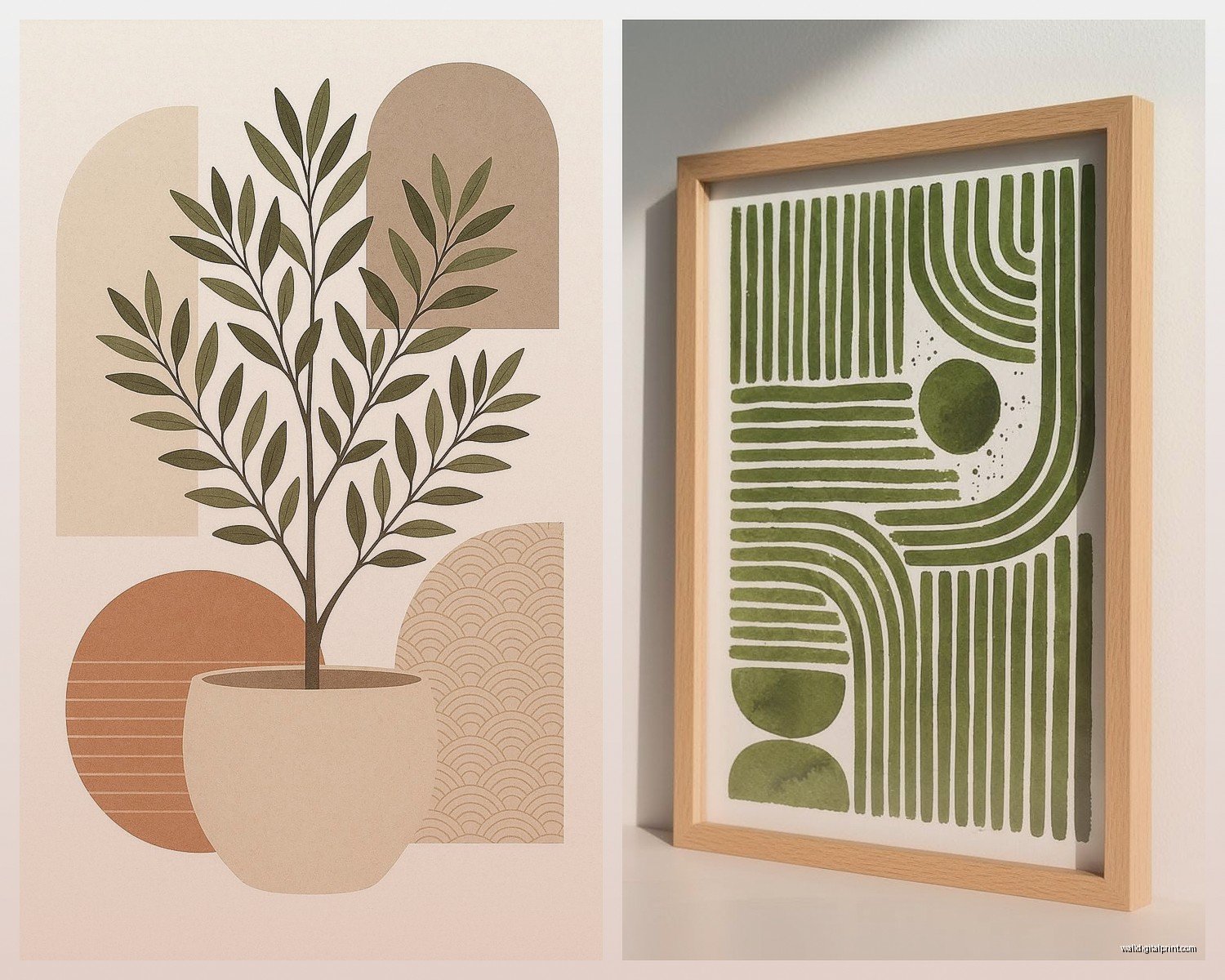
Okay so here’s where people mess up immediately. They see “boho” and think everything needs to be terracotta and mustard yellow. But modern bohemian abstract art actually works best when you pick like 2-3 base colors and then let the abstract elements add unexpected pops. I’m currently working with this palette of burnt sienna, deep teal, and cream in my own bedroom and it’s *chef’s kiss* because the abstract shapes in teal keep it from looking too desert-southwestern.
You gotta think about what’s already in your room though. If you’ve got a lot of natural wood (which, let’s be honest, most boho spaces do), warm abstracts with rust, ochre, and clay tones are gonna feel cohesive. But if your space leans more toward painted furniture or you’ve got cooler undertones happening, those sage greens and dusty blues in abstract forms work better.
My friend made this mistake where she bought this gorgeous abstract piece with hot pinks and electric oranges because it was “boho” but her apartment has all these cool gray tones and now it just screams at you when you walk in. Not in a good way.
Texture Is Non-Negotiable
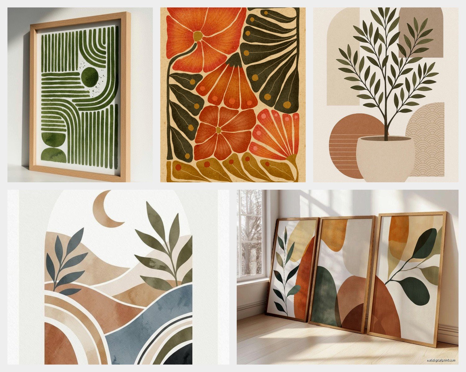
This is gonna sound weird but I literally touch wall art before I buy it now. If it’s just flat printed canvas, it’s not giving boho energy no matter how abstract the design is. You need dimension. I’m talking:
- Canvas with visible brushstrokes or impasto technique
- Woven fiber art that has actual textile texture
- Mixed media pieces with layers you can see from the side
- Anything with fringe, macramé elements, or rope details
- Wood elements integrated into the abstract design
I found this incredible piece on Etsy last month that combines abstract painting with actual jute rope woven through the canvas and it completely changed how I think about this category. The rope creates these organic lines that contrast with the painted geometric shapes. Cost me like $180 but it’s a statement piece that does the work of three regular prints.
Oh and another thing, if you’re going the print route because budget (totally valid), at least put it in a natural wood frame or a frame with texture. Those thin black metal frames everyone defaults to? They kill the boho vibe instantly and make everything look like office art.
Mixing Abstract With Other Boho Elements
So you can’t just do ALL abstract or it feels too intentional and gallery-like. The free-spirited part comes from mixing it up. I usually do a 60/40 split where abstract pieces are the anchor but then I’ll add:
- A small woven basket or two on the wall
- A vintage mirror with organic shape
- Maybe a small macramé piece
- Pressed botanicals in simple frames
The abstract stuff reads as modern and keeps things from getting too crafty-bohemian (you know what I mean, the look that screams 2016 Pinterest), but those traditional boho elements warm it up and add that collected-over-time feeling.
I’m literally looking at my living room wall right now and I’ve got a large abstract canvas with rust and cream organic shapes, then to the right there’s a small rattan mirror, and below that a framed vintage botanical print. It shouldn’t work on paper but the color repetition ties it together.
Size and Scale Matter Way More Than You Think
Okay this is where I see people struggle the most. They buy art that’s too small or they do that thing where everything is the same medium size and it all just… floats there awkwardly.
For abstract boho, you want at least one piece that’s substantial. I’m talking 30×40 inches minimum for a standard living room wall. The abstract nature of the piece means it can handle being large without overwhelming because it doesn’t have a specific subject demanding attention. It’s just shapes and colors creating a mood.
Then you can flank it with smaller pieces or go asymmetrical. Actually, asymmetry is your friend here. Bohemian style is NOT about perfect balance. I did a gallery wall last week where the main abstract piece is off-center, leaning toward the left side of the wall, and then I clustered smaller elements on the right side at different heights. It feels way more organic and collected.
My cat keeps jumping on my desk sorry, she’s obsessed with sitting on my keyboard for some reason.
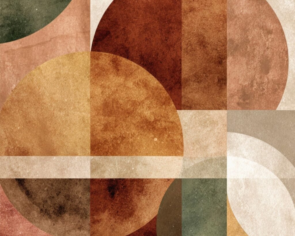
The Shapes and Forms That Actually Read as Boho
Not all abstract art works for this aesthetic and I learned this the hard way. Anything too hard-edged or geometric in a Mondrian way is gonna fight against the boho vibe. You want:
- Organic shapes that feel hand-drawn or irregular
- Circles, arches, and curved forms (very on-trend but also timeless for boho)
- Abstract landscapes that suggest horizons or natural scenes without being literal
- Gestural marks and flowing lines
- Anything that looks like it could be inspired by nature even if it’s not representational
There’s this whole category of abstract arch art that’s perfect for modern boho. It’s abstract enough to feel contemporary but the arch shape has this ancient, architectural quality that fits the global-inspired bohemian aesthetic. I’ve used these in probably five different client spaces this year.
Block prints and linocut-style abstracts also work great because they have that handmade quality even when they’re reproductions. The imperfections in the printing process add to the boho feeling of embracing the handcrafted.
Where to Actually Find This Stuff
So Etsy is obvious but you gotta dig. Search terms that work: “modern boho abstract,” “organic abstract art,” “terracotta abstract painting,” “neutral abstract canvas.” I’ve found my best pieces by searching specific color combinations like “rust and teal abstract art.”
Society6 and Minted have some good options but they can lean too polished sometimes. You want pieces that feel a little imperfect or loose. West Elm actually has some surprisingly good abstract art that works for this vibe, especially their artist collaboration stuff.
Local art fairs and markets though? That’s where I find the really special pieces. Original art from local artists gives you that one-of-a-kind element and you can often commission custom colors to match your space. I had an artist create a three-panel abstract piece for a client’s bedroom using the exact terracotta and sage colors from their bedding and it was like $400 for all three panels which honestly isn’t bad for original art.
Oh wait I forgot to mention, if you’re gonna do prints, make sure they’re large format. Nothing under 16×20 for your main pieces. Small prints just get lost and look like you were afraid to commit.
The DIY Route If You’re Feeling Brave
Not gonna lie, abstract boho art is actually one of the easier things to DIY if you have even basic artistic confidence. You’re not trying to paint realistic anything, you’re literally just putting colors and shapes on canvas in a way that feels balanced to you.
I did this for my guest room and it turned out shockingly well. Got three blank canvases from Michael’s (wait for the 50% off sale), used acrylic paint in cream, rust, and olive green, and just painted organic shapes and lines. The trick is to:
- Use a limited color palette so it doesn’t look chaotic
- Let layers dry and build up texture
- Work loose and don’t overthink it
- Add some gold leaf or metallic paint for a finished look
Even if it’s not perfect, the handmade quality actually enhances the boho vibe. And you can customize it exactly to your colors which is huge.
Hanging and Arranging Without Losing the Boho Feel
This is where technical stuff meets aesthetic. Perfect symmetry kills boho energy, but you also can’t just randomly nail things up and hope for the best (I mean you can but it might look messy instead of curated-casual).
I usually map things out on the floor first. Lay everything out how you’re thinking and live with it for a day. Take a picture and look at it on your phone because that gives you a different perspective.
For a boho gallery wall with abstract pieces, I like to start with the largest abstract piece and position it slightly off-center. Then build around it with smaller elements at varying heights. Leave some breathing room between pieces, like 2-4 inches. Too tight and it feels cluttered, too spread out and it loses cohesion.
Command strips are your friend if you’re renting or commitment-phobic like me. I’ve moved my living room gallery wall three times in the past year because I keep finding new pieces and wanting to rearrange.
Lighting Changes Everything
Okay so this seems obvious but the lighting in your space will completely change how abstract art reads. Boho spaces usually have warm, layered lighting which is perfect for abstract art in warm tones. But if your room is flooded with cool natural light, your rust and terracotta abstracts might look muddy.
I added a picture light above my main abstract piece and it was a total game-changer. It adds drama and makes the colors pop, plus it contributes to that layered lighting situation that makes boho spaces feel cozy without being dark.
Also consider what’s happening with natural light throughout the day. That gorgeous abstract piece with lots of cream and white might get completely washed out if it’s on a wall opposite a big window. I moved a piece in my bedroom three times before I found the right wall where the colors actually showed up properly.
Common Mistakes I See All the Time
Too much going on. Like, I get it, boho is about layering and abundance, but if every single element on your wall is screaming for attention, nothing gets heard. Your abstract pieces should anchor the space, and then you add quieter elements around them.
Matching everything too perfectly. If all your abstract art comes from the same Etsy shop or the same collection, it’s gonna look like you bought a set. Mix sources, mix styles a bit, vary the frame treatments.
Ignoring scale. One tiny abstract print on a huge wall isn’t boho minimalism, it’s just undersized art. Go bigger or create a larger composition with multiple pieces.
Forgetting about negative space. The wall itself is part of the design. You don’t need to fill every inch. Sometimes a single large abstract piece on an otherwise empty wall is the move.
Choosing art that doesn’t connect to the rest of your space. If your furniture and textiles are all in cool tones and your abstract art is all warm tones, there’s gonna be a disconnect. Find that bridge color that appears in both your art and your decor.
Look, I’m still figuring this stuff out too. Last week I hung a piece that I thought was perfect and lived with it for three days before realizing it was making the whole room feel off. Moved it to a different wall and suddenly everything clicked. It’s a process and that’s actually very boho if you think about it, the whole collected-over-time not-trying-too-hard thing.
The best abstract boho spaces feel like they evolved naturally, even when you’ve actually spent hours planning every placement. That’s the goal anyway.