Wall Art Guide, Wall Art Tutoriels
1920s Wall Art: Art Deco Jazz Age Vintage Decor
May
So I’ve been totally obsessed with 1920s wall art lately and honestly it started because a client wanted her living room to feel like a speakeasy but classy, not costume-y? And I went down this rabbit hole of Art Deco prints and vintage jazz posters and now I can’t stop seeing opportunities to use this stuff everywhere.
First thing – you gotta understand that 1920s art isn’t just one look. There’s the geometric Art Deco stuff with all those angular lines and metallic accents, then there’s the jazz age posters that are more illustrative and playful, and then vintage photography from that era which has this dreamy soft quality. They all work together but you need to pick a direction or it gets messy real fast.
The Geometric Art Deco Route
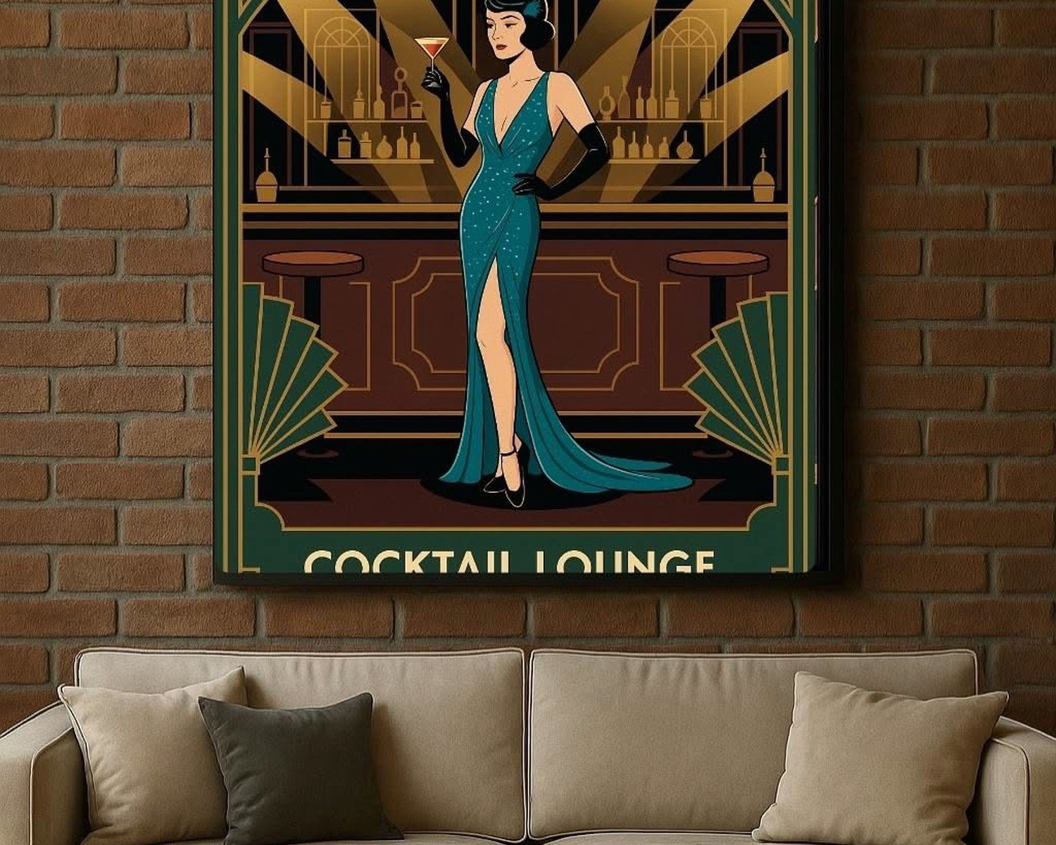
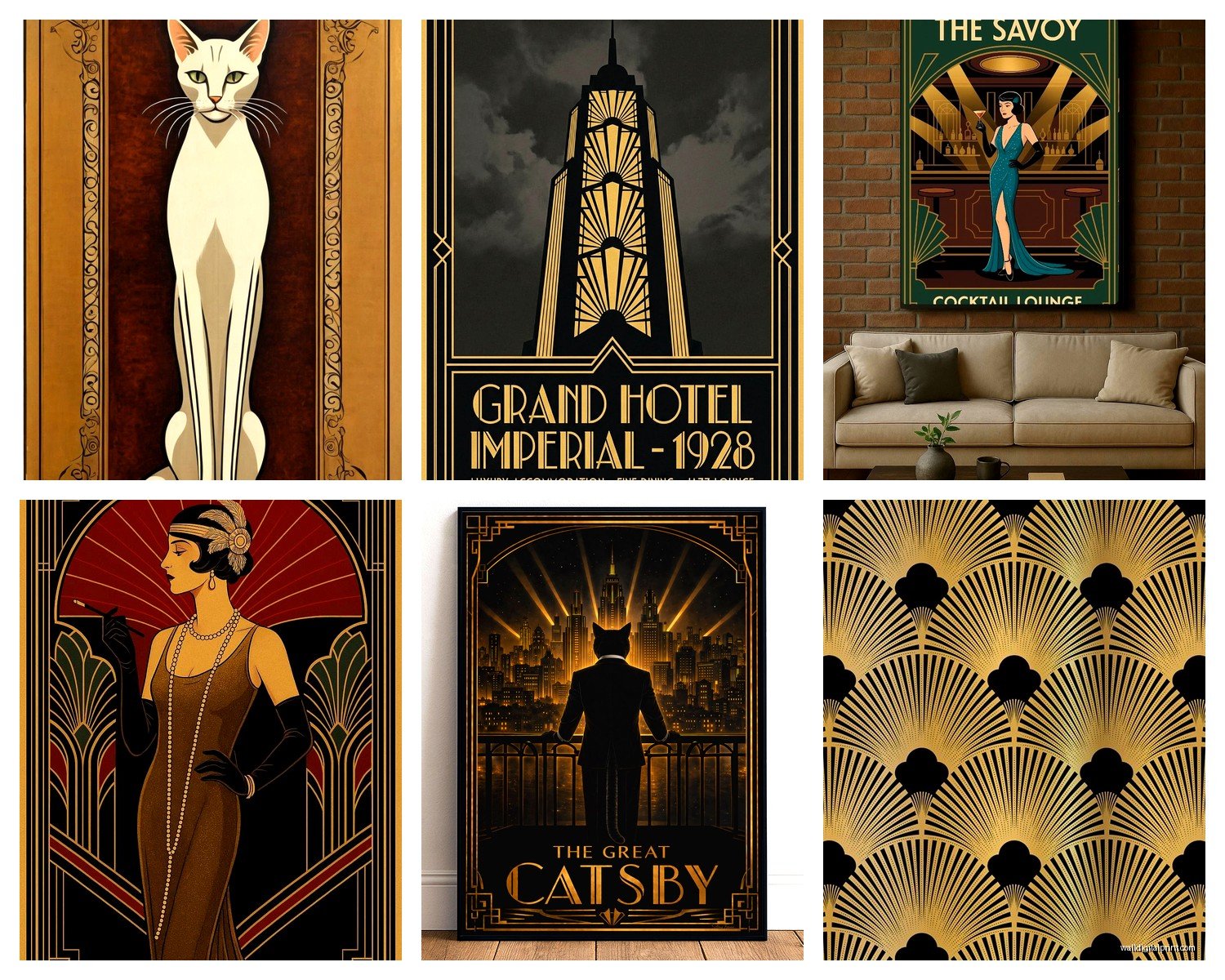
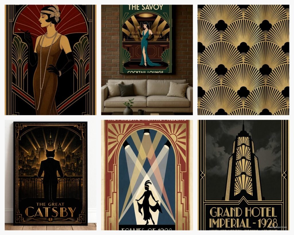
Okay so if you want that classic Gatsby vibe, geometric Art Deco prints are your best friend. I’m talking about pieces with sunburst patterns, chevrons, stepped forms, and lots of symmetry. The color palette is usually gold, black, cream, navy, and sometimes that specific shade of teal that screams 1920s.
Where I actually find good ones – Etsy has a TON of digital prints you can download and frame yourself which is honestly the most budget-friendly way to do this. Search for “Art Deco printable” or “1920s geometric wall art” and you’ll find tons. I usually go for the ones that are at least 300 dpi so they don’t look pixelated when printed large. Got a massive 24×36 print done at my local print shop for like $40 and it looks incredible.
But here’s the thing about framing these – don’t cheap out on the frames. The art itself might be affordable but if you put a geometric gold and black print in a basic black plastic frame it’s gonna look like a college dorm. I learned this the hard way with my own apartment lol. You want frames with a bit of depth, maybe brushed gold or brass finish, or even black lacquer if you can find it. Target actually has some decent options in their threshold line, and of course thrift stores are goldmines for older frames that actually match the era.
Size and Placement Tips
One big piece makes more impact than a bunch of small ones with this style. I did a gallery wall once with like eight small Art Deco prints and it just looked busy – the patterns compete with each other. Better to go with one statement piece above a sofa or credenza, or maybe a diptych or triptych if you want multiple pieces.
The height thing matters too – center of the artwork should be at eye level, which is roughly 57-60 inches from the floor. But if you’re hanging above furniture, leave about 6-8 inches between the furniture top and the bottom of the frame.
Jazz Age Posters and Illustrations
Oh and another thing – vintage jazz posters are having a MOMENT right now. These are more figurative, often featuring musicians, dancers, or stylized portraits of flappers. The illustration style is very distinct with those elongated figures and bold typography.
I found some amazing reproduction posters from the actual 1920s performances at this site called Vintage European Posters or something? They have originals from Josephine Baker performances and various jazz clubs. They’re not cheap – like $80-150 for a good quality reproduction – but they’re actual archival prints of real posters which I think is worth it if you’re going for authenticity.
My dog literally knocked over a framed jazz poster last month and I almost cried but the glass didn’t break so… anyway, the point is these look AMAZING in entryways or dining rooms. They have this energy that geometric pieces don’t.
Mixing Styles Without Looking Chaotic
You can totally mix geometric Art Deco with jazz posters but you need a unifying element. Usually that’s the color scheme – stick to a palette of maybe 3-4 colors max. Like if you have a gold and black geometric piece, your jazz poster should incorporate those colors even if it has other hues too.
Or frame them all the same way. I did a client’s home office with three different styles of 1920s art – one geometric, one jazz poster, one vintage fashion illustration – but we put them all in identical slim black frames with gold matting and it totally worked.
Vintage Photography from the Era
Wait I forgot to mention vintage photography which is actually my favorite approach if you want something more subtle. There are these incredible black and white photos from the 1920s of cityscapes, cars, fashion, everyday life… they have this soft focus quality because of the camera technology back then and it’s just gorgeous.
The Library of Congress has a massive free digital collection. You can literally download high-res scans of actual 1920s photographs and print them. I’ve done this so many times. Search their catalog for dates between 1920-1929 and you’ll find thousands of images. The quality varies but many are good enough to print at decent sizes.
For these I really love doing larger prints – like 16×20 or bigger – and keeping them simple with wide white or cream mats and thin black frames. It feels more gallery-like and sophisticated than the bolder Art Deco stuff.
The Actual Shopping List
Okay so funny story, my client canceled last week so I spent like two hours comparing different sellers and I made notes, so here’s what actually works:
For prints and posters:
- Etsy – search “1920s printable wall art” or “Art Deco digital download” – usually $5-15 per digital file
- Society6 and Redbubble – they have artists doing Art Deco inspired work, quality is hit or miss but their framing options are convenient
- eBay for actual vintage posters if you want the real deal – expect to pay $100+ and condition varies wildly
- Library of Congress digital collections – FREE but you pay for printing
- AllPosters.com has a decent vintage section with licensed reproductions
For framing:
- Framebridge if you wanna splurge – they do custom framing online and have Art Deco-appropriate options
- IKEA Silverhöjden frames in gold are shockingly perfect for this aesthetic and like $20
- Target Threshold brass frames work well
- Michael’s when they have 50% off frame sales which is basically always
- Thrift stores for vintage frames – look for anything with geometric details or metallic finishes
Creating an Authentic Look
This is gonna sound weird but the thing that makes 1920s wall art actually look period-appropriate versus just “kinda vintage” is the details around it. Like you can’t just slap an Art Deco print on a white wall with modern minimalist furniture and expect it to vibe.
You need some supporting elements – maybe a brass floor lamp, or a bar cart, or even just some stacked vintage books on a nearby shelf. The wall art needs context. I usually tell people to add at least 2-3 other elements in the room that reference the era.
Also lighting matters WAY more than people think. If you have harsh overhead LED lighting, your vintage art is gonna look flat and weird. Get some warm-toned bulbs, maybe add a picture light above your main piece if it’s a really special one. The 1920s were all about mood lighting and atmosphere.
Color Schemes That Actually Work
The traditional Art Deco palette is black, gold, cream, and maybe burgundy or navy. That’s the safe route and it works beautifully. But I’ve also done rooms with:
- Emerald green, gold, and cream – very luxe
- Dusty rose, gold, and charcoal – softer and more feminine
- Navy, copper, and ivory – less expected but still period-appropriate
- All black and white with one metallic accent – very graphic and modern
The key is keeping it limited. The 1920s aesthetic is bold but it’s not busy. Three colors plus maybe a metallic is the sweet spot.
Common Mistakes I See
Okay so things that don’t work – I’ve seen all of these and they bug me:
Mixing too many metallics. Pick gold OR silver OR copper and stick with it. Having frames in all three looks messy not eclectic.
Going too literal with the theme. You don’t need a flapper silhouette AND a jazz musician AND a vintage car AND an Art Deco pattern all in the same room. Pick one or two focal points.
Ignoring scale. Those tiny 5×7 Art Deco prints you found on Etsy? They’re gonna disappear on your wall. Size up. Most living room walls can handle 24×36 or even bigger.
Using super modern frames with vintage art. The contrast can work if you’re going for an intentional eclectic look but usually it just looks like you didn’t think about it.
Hanging everything too high. I see this constantly. People hang art way above eye level and then wonder why their room feels off.
Budget-Friendly Approach
Look, you can do this whole thing for under $200 if you’re strategic. Here’s how I’d do it:
Download 2-3 high-res Art Deco prints from Etsy – $30 total
Get them printed at Costco or your local print shop – $60 for three large prints
Buy frames from IKEA or thrift stores – $60 for three
Add one vintage accessory from a thrift store to tie it together – $20
Done. And you have money left over for coffee or whatever.
The expensive route is buying original vintage posters or commissioning custom artwork or getting everything professionally framed, and yeah that looks amazing but it’s not necessary to get the vibe.
Where to Put What
Living room – go big with a statement geometric piece or a large jazz poster above the sofa
Bedroom – vintage photography works great here, keeps it sophisticated not too loud
Bathroom – small Art Deco prints in gold frames, maybe a set of three
Home office – jazz posters or architectural drawings from the era
Entryway – one bold piece to set the tone as soon as people walk in
Dining room – vintage fashion illustrations or sophisticated geometric pieces
I’m watching this documentary about speakeasies while I type this and it’s giving me so many ideas but anyway…
The DIY Matting Trick
Oh wait, one more thing that makes a huge difference – if you buy cheap prints, custom matting makes them look expensive. You can buy pre-cut mats from Michael’s or online and they’re not that pricey. Get a mat that’s at least 2-3 inches wider than your print on all sides. For Art Deco stuff, I love using cream or gold mats with black frames, or black mats with gold frames.
There’s also this trick where you can layer two mats – like a cream outer mat with a thin gold inner mat – and it looks SO expensive but costs like $15 extra. Makes a $10 Etsy print look like a $200 gallery piece.
The thing about 1920s wall art is it’s forgiving if you commit to it. Like it’s such a strong aesthetic that even imperfect execution still reads as intentional. Just don’t go halfway – either embrace the glamour and geometry and boldness, or pick a different era. Half-hearted Art Deco just looks confused.
And honestly you can start with one piece and build from there. I did that in my own place – started with one geometric print I loved, then added a jazz poster six months later, then found a vintage photo at an estate sale. It doesn’t have to happen all at once, and actually I think it looks better when you collect pieces over time because it feels more curated and less matchy-matchy.