Wall Art Guide, Wall Art Tutoriels
Vintage Beach Wall Art: Retro Coastal Nostalgia
May
So I’ve been obsessing over vintage beach art lately and honestly it started because a client wanted their boring rental bathroom to feel less like a dentist office and more like a Cape Cod cottage, which sounds impossible but actually isn’t? The whole vintage coastal thing is having this massive moment right now and I get why—it’s nostalgic without being grandma’s house, you know?
First thing you gotta understand is that “vintage beach art” can mean like three totally different aesthetics. There’s the actual vintage stuff from the 40s-60s (expensive and hard to find), there’s reproduction prints that look old (this is probably what you want), and then there’s new art done in a vintage style. I usually mix all three because who’s gonna know the difference when it’s on your wall next to your succulent collection.
Where to Actually Find This Stuff
Okay so Etsy is the obvious answer but you have to wade through SO much garbage. I search “vintage beach poster reproduction” or “retro coastal print” and filter by shops that have actual reviews. There’s this seller BeachHouseArtPrints or something similar who does really good quality digital downloads—I’ve used them probably five times now. You download the file, take it to a print shop or use an online service, and boom. Way cheaper than buying a finished print that someone marked up 300%.
Estate sales are hit or miss but when you find something it’s amazing. I found this incredible faded photograph of a beach pavilion from 1952 for like eight dollars and it’s honestly my favorite piece in my living room. My dog knocked it off the wall twice and the glass shattered but the print was fine so… priorities I guess.
Anthropologie has reproduction vintage travel posters sometimes that work perfectly for this vibe. They’re overpriced but if you catch a sale and you don’t wanna deal with framing yourself, it’s worth it. I’m looking at their site right now actually and they’ve got this “Ventura Beach” print that’s very retro surf culture.
The Actual Aesthetic Styles Within Vintage Beach
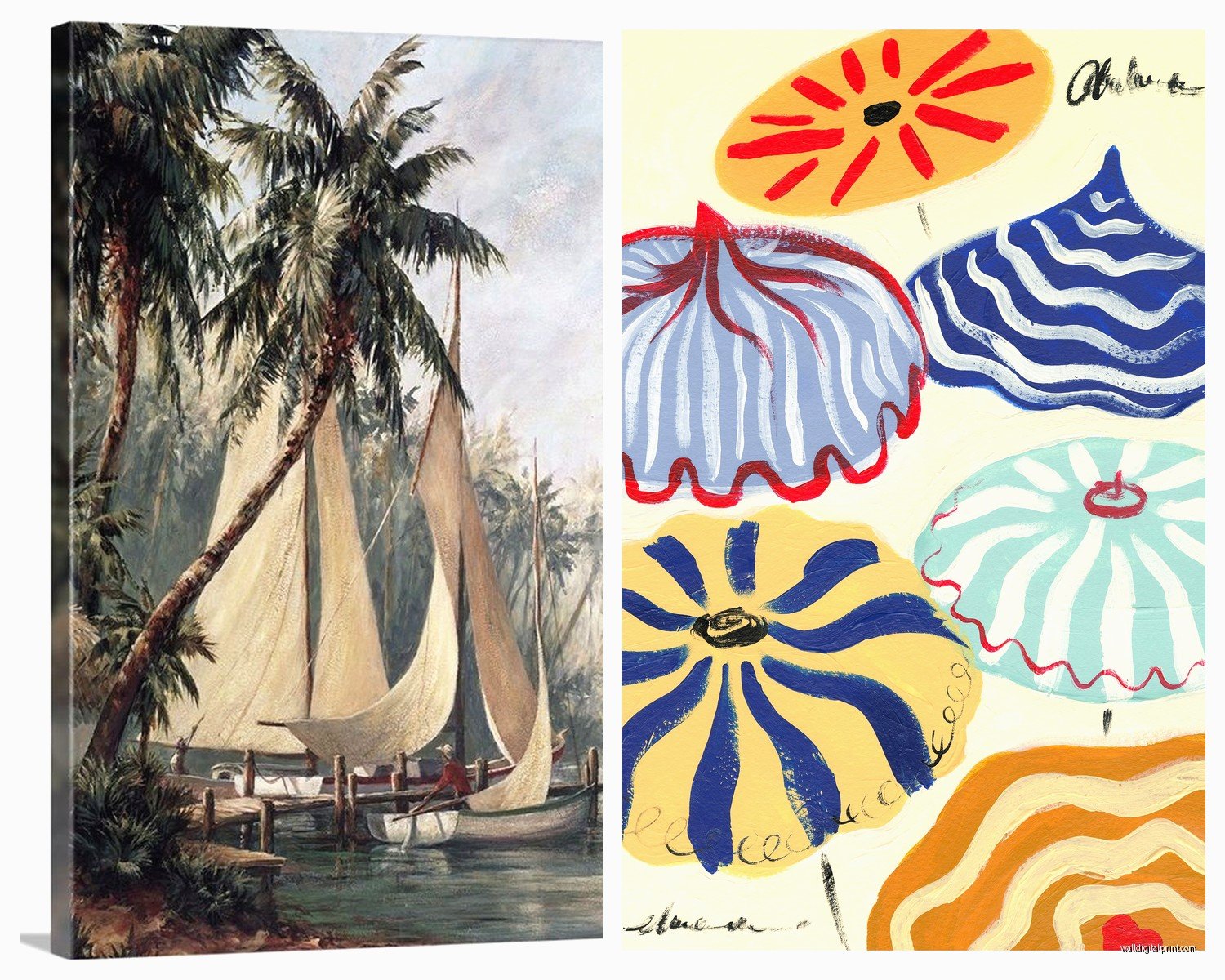
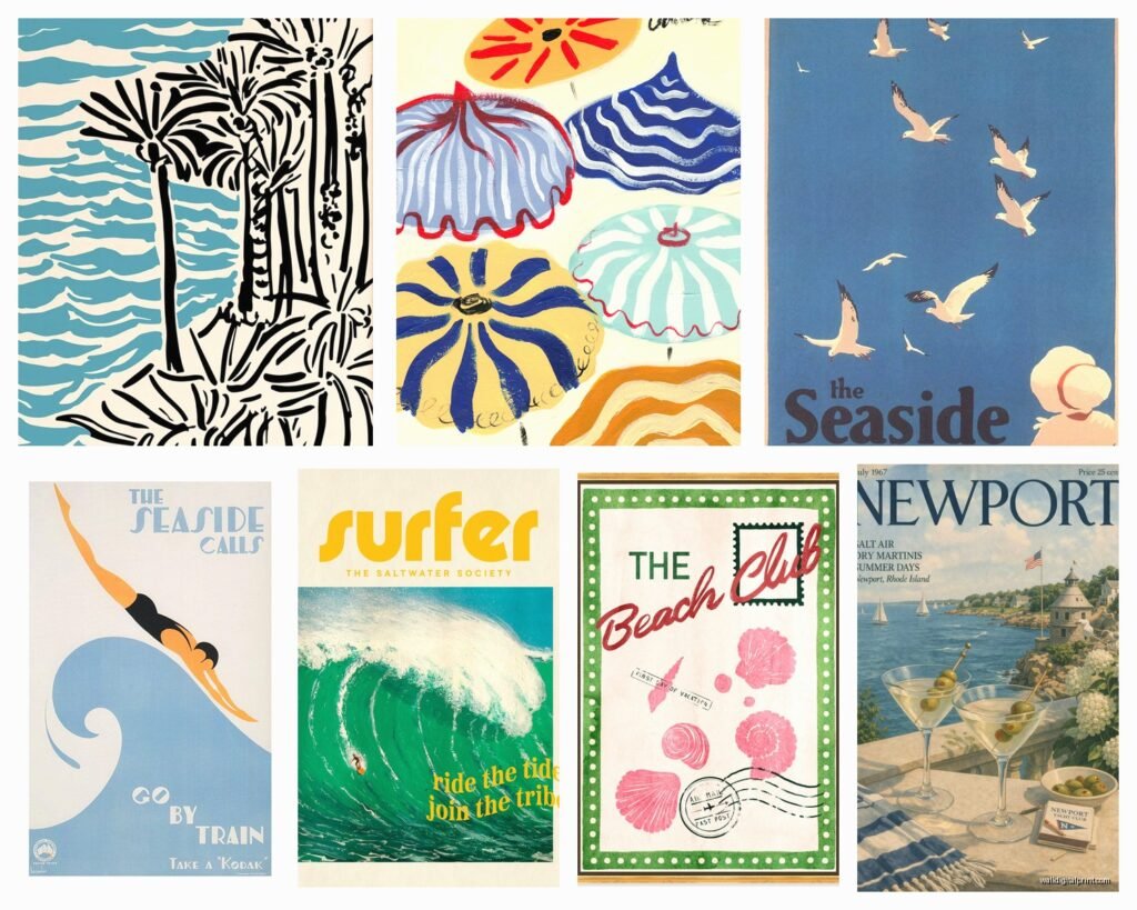
Mid-Century Travel Poster Style: Think flat colors, simplified shapes, very graphic. Like those old railway travel posters but for beach destinations. Palm trees are geometric, the ocean is three shades of blue in distinct bands, maybe a vintage car or umbrella. This style works REALLY well in modern spaces because it’s not too fussy.
Faded Photograph Vibe: Old Kodachrome-looking beach scenes. Slightly washed out colors, people in old-fashioned bathing suits, wooden lifeguard stands. This is what I use most because it feels genuinely nostalgic. You want it to look like it could’ve been your grandparents’ beach vacation in 1965.
Retro Surf Culture: Woody wagons, surfboards, that whole California/Hawaii 1960s thing. More colorful usually, kinda fun and playful. Works better in casual spaces like a kid’s room or a beach house rather than like, your formal dining room.
Nautical Chart/Map Style: Vintage coastal maps, navigation charts, that whole maritime thing. These are GREAT for filling big wall spaces and they read as sophisticated vintage rather than kitschy.
What Actually Looks Good Together
This is where people mess up the most honestly. You can’t just throw any vintage beach stuff on a wall and call it a gallery wall. I learned this the hard way in my own hallway and had to redo the whole thing.
Stick to one or two color palettes. If you’re going with sun-faded blues and sandy beiges, don’t suddenly throw in a bright orange surf poster. Or I mean you can, but it’ll look chaotic. Unless chaotic is your thing, then go off.
Mix your frame styles but keep them in the same era. So like, mix natural wood with painted white or cream frames, but don’t throw a chunky modern black frame into a collection of weathered wood ones. It’ll look wrong and you won’t be able to figure out why.
Vary your sizes but use odd numbers. Three pieces, five pieces, seven if you have a big wall. The classic “one large, two medium, two small” arrangement works every time. I literally use this formula constantly.
Framing Without Spending Your Entire Paycheck
Custom framing is insanely expensive and usually unnecessary for this style. Actually you kind of want it to NOT look too precious and perfect.
IKEA frames in natural wood or white are your friend. The RIBBA and HOVSTA lines specifically. They’re cheap, they look fine, and if you’re doing a gallery wall of like seven prints you just saved yourself $800.
Thrift stores always have frames. Always. I spray paint them if needed—that chalky finish spray paint in cream or sage green looks amazing and very vintage coastal. Just tape off the glass obviously, I forgot once and had to scrape paint off for an hour while watching Love Island.
For the actual faded vintage look, you can print on matte photo paper instead of glossy. Makes a huge difference. Or if you’re fancy, print on textured watercolor paper at a good print shop. It looks more authentic and less “I printed this at Staples.”
The Matting Question
White mats make everything look more expensive and gallery-like, but for vintage beach stuff I actually prefer no mat or a very thin mat. It feels more casual and authentic to the era. Like those prints weren’t precious art pieces, they were just… around, you know? Tacked up on beach house walls.
If you do mat, go cream or off-white instead of stark white. Way better with the vintage vibe.
Specific Pieces That Work Everywhere
Okay so these are the images/styles I use over and over:
- Vintage lifeguard stands or beach huts—always works, very photogenic
- Old beach town signs (think “Santa Monica Pier 1947” type stuff)
- Aerial beach photography from the 50s-60s with those geometric umbrella patterns
- Faded seaside boardwalk scenes
- Vintage sailboat racing posters
- Old beach resort advertisements
- Retro beach badge or parking permit collections (you can frame actual vintage ones or prints)
The beach badge thing is actually genius for small spaces. Get like nine vintage beach badges (or reproductions) and frame them together in a grid. Super unique and very “I summer in New England” energy.
Where to Put This Stuff
Bathrooms: This is like the most obvious spot but it genuinely works so well. Even a tiny powder room feels bigger and breezier with a vintage beach print. I did a client’s half-bath with three small faded beach photographs in a vertical line and it completely changed the space.
Bedrooms: Above the bed obviously, but also consider a whole gallery wall on the wall opposite your bed. That’s what you look at when you wake up anyway. Make it something that makes you feel like you’re on vacation.
Stairway walls: Perfect for this because you can do an ascending gallery wall and vintage beach stuff is casual enough that it doesn’t feel too formal for a stairway.
Kids’ rooms: The retro surf style works great here. It’s playful but not babyish, so it grows with them.
Living rooms: I prefer the more sophisticated vintage coastal here—the mid-century travel poster style or nautical charts. Keeps it from feeling too theme-y.
The Thing Nobody Tells You
Lighting matters SO much with this stuff. Vintage beach art needs good natural light or warm artificial light to look right. Under cool LED lights it looks washed out and sad. I always recommend warm bulbs (2700K) in any room with vintage coastal art.
Also the wall color matters more than you think. These prints look incredible on warm whites, soft grays, pale blues, or even a subtle sage green. They look weird on stark white or beige-beige walls. The colors need something to play off of.
DIY Options If You’re Crafty
You can make your own vintage-looking beach art pretty easily actually. Take your own beach photos and run them through filters that fade them and add grain—there are tons of apps for this. Print on matte paper and boom, instant vintage.
Or scan actual vintage postcards (estate sales, antique shops, eBay) and blow them up. The graininess from enlarging actually adds to the vintage feel.
I’ve also done this thing where I bought old beach-related book pages from the 50s and framed them. Like pages from vintage travel guides or surf manuals. Super cheap and looks really cool in a group.
The Controversial Take
Okay this is gonna sound weird but I think people go too matchy-matchy with this aesthetic. Like they want everything to be perfectly coordinated vintage beach and it ends up looking like a TJ Maxx beach section exploded. Mix in some non-beach vintage stuff. A vintage botanical print, an old map that’s not coastal, whatever. It makes the beach stuff feel more collected and personal rather than “I bought a beach themed room in a box.”
What to Avoid
Live Laugh Love but make it beachy. You know what I mean—those word art prints that say “Life’s a Beach” or whatever. Just no.
Anything too literal or cutesy. Like cartoon crabs or anchors with googly eyes. Unless it’s genuinely vintage and kitschy in an ironic way, skip it.
Too much turquoise. I know it’s tempting but vintage beach is more about sun-faded blues and sandy neutrals. That bright turquoise reads more tropical/Caribbean than retro coastal.
New stuff trying too hard to look old. There’s a difference between vintage-inspired and something with fake aging that looks obviously fake. Trust your gut—if it looks cheesy in the thumbnail, it’ll look cheesy on your wall.
Quick Room-by-Room Breakdown
Small bathroom: One medium print, simple frame, directly across from toilet. Done.
Master bedroom: Large statement piece above bed (maybe a vintage surf shop sign or faded beach photograph) or a gallery wall of 5-7 smaller prints on the wall opposite the bed.
Guest room: Go full coastal nostalgia here. Gallery wall, mix of styles, make it feel like a beach cottage. Guests love this.
Living room: Two to three larger pieces, more sophisticated style, proper spacing. Don’t crowd them.
Hallway: Perfect for a long horizontal gallery wall. Mix sizes, keep frames consistent, use the whole length.
Kitchen: Vintage beach resort advertisements or old seaside restaurant signs work great here. Keep it lighthearted.
The whole vintage beach art thing works because it’s nostalgic without being precious, you know? It reminds people of family vacations and simpler times but it doesn’t feel dated if you do it right. Plus it’s way more interesting than the generic “Home” sign from HomeGoods.
Just start with one or two pieces you genuinely love and build from there. Don’t try to do a whole gallery wall in one day—I did that once and hated half of it within a week. Let it grow organically and you’ll end up with something that actually feels personal rather than styled.