Wall Art Guide, Wall Art Tutoriels
Extra Large Abstract Wall Art: Oversized Modern Paintings
May
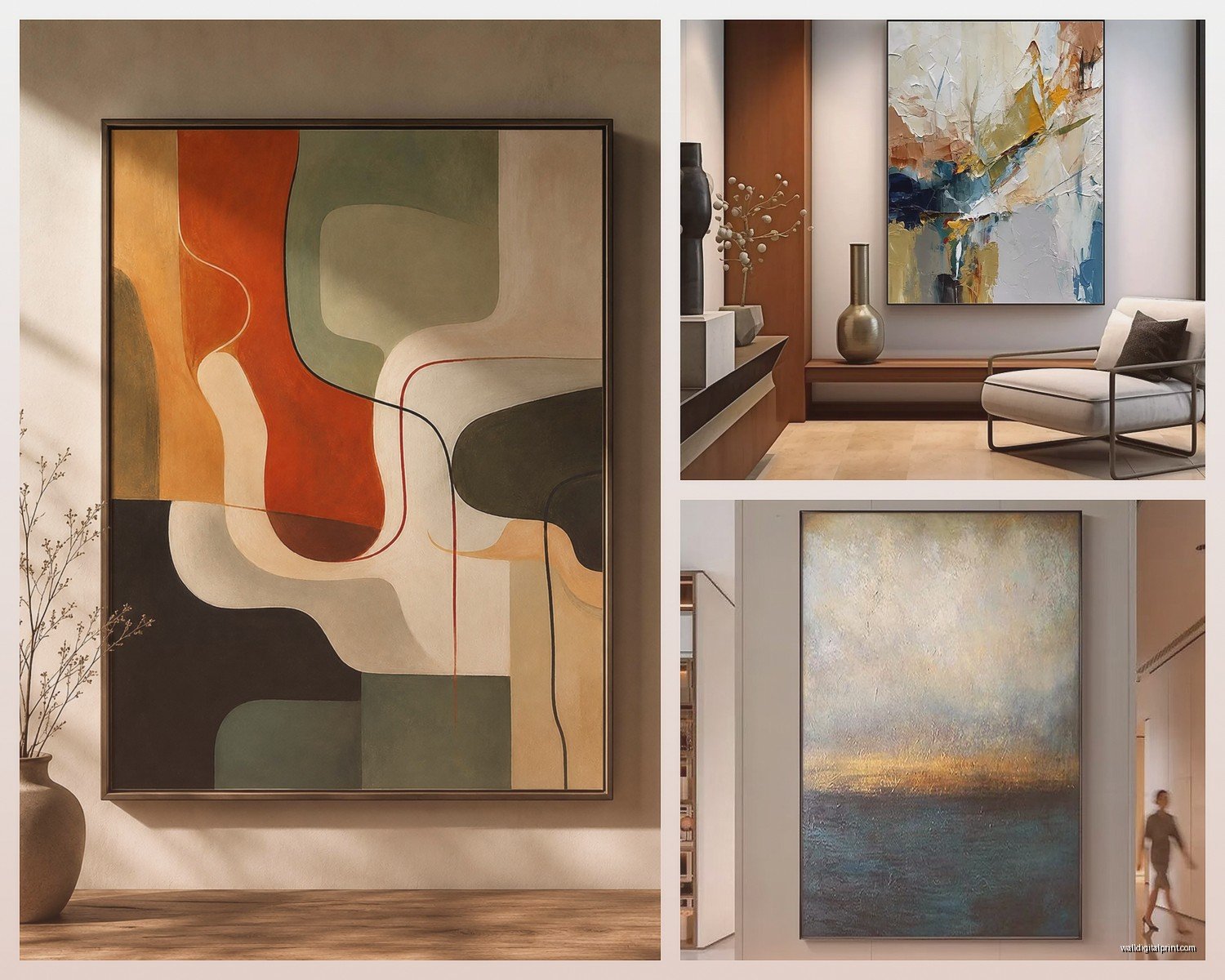
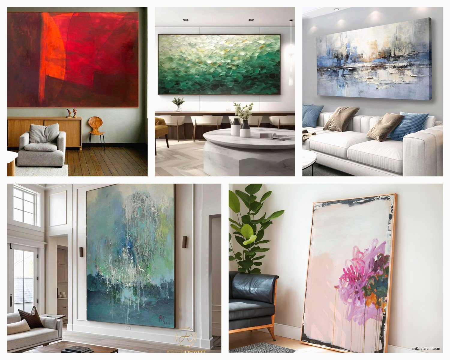
So I’ve been obsessing over these massive abstract paintings lately and honestly, figuring out what size actually works is way harder than anyone tells you. Like, I had this client last month who bought this gorgeous 80×60 inch piece and then called me practically crying because it made her living room look like a shoebox.
Getting the Size Actually Right
Okay so here’s what nobody mentions in those pretty Instagram posts – measure your wall width and multiply by 0.6 or 0.75. That’s your sweet spot for width. I learned this the hard way after hanging a 72-inch wide painting on a 96-inch wall and it just looked…lost? Like a postage stamp situation. You want the art to take up real visual space but not crowd the furniture below it.
The thing about extra large stuff – and I mean like 60+ inches in any direction – is that it needs breathing room. At least 6-8 inches from each edge of the sofa or console table underneath. I messed this up in my own dining room and had to move everything around while my dog just watched me like I was insane.
Height Placement That Won’t Make You Crazy
Center the piece at 57-60 inches from the floor. This is the museum standard and yeah it actually works in homes too. BUT – and this is important – if you’re hanging it over furniture, you want 6-10 inches between the furniture top and the bottom of the frame.
I’ve done the thing where I hung art too high so many times. It’s like our instinct is to just go higher for some reason? Last Tuesday I was watching The Bear while measuring a wall for a client (multitasking) and almost made this exact mistake again. Your eye level matters more than you think.
The Sofa Situation
For above a sofa, the painting should be about 2/3 to 3/4 the width of the sofa. So if you’ve got a 90-inch sofa, you’re looking at something in the 60-68 inch range width-wise. I had a client insist on going smaller and we ended up with three separate pieces instead, which actually looked better but cost way more.
Color Picking Without Losing Your Mind
This is gonna sound weird but don’t match your colors exactly to your room. Pick one or two accent colors from the painting that you can echo in pillows or throws. I see people try to match every single color and it ends up looking like a hotel conference room.
When I’m curating pieces, I usually go for:
- One dominant color that either complements or contrasts with your wall color
- One or two accent colors you can pull into textiles
- Neutrals that give your eye a place to rest
The best abstract piece I ever found had this deep navy, burnt orange, and cream situation going on. Put it in a room with gray walls and camel leather furniture and suddenly everything looked intentional instead of “I bought stuff at different times.”
Styles That Actually Work in Real Rooms
Okay so there’s like a million styles but here’s what I’ve seen work consistently:
Geometric Abstracts
These are great if your space is kinda busy. The clean lines and shapes give structure. I used a massive geometric piece in a room with a really eclectic vintage rug and it somehow grounded everything. Think bold blocks of color, hard edges, minimal color palette. Works amazing in modern spaces or even traditional rooms that need a contemporary punch.
Gestural/Expressionist
The big swoopy brushstrokes and energy. These need simpler rooms honestly – if you’ve got a lot of pattern happening already, this style might be too much. But in a minimalist space? *Chef’s kiss*. I put a huge gestural piece in my own bedroom with just white bedding and a single plant and people always ask where I got it.
Color Field
Massive blocks of color with subtle variations. Super calming, works in literally any room style. I’m obsessed with these for bedrooms and offices. Less chaotic than gestural stuff but more interesting than just a solid color wall.
Textured Abstracts
Where you can see the paint buildup and layers. These add dimension without being too literal. Great for spaces with a lot of smooth surfaces – like if you have sleek modern furniture, a heavily textured painting adds contrast.
Where to Actually Buy Them
I’ve spent way too much time researching this. Here’s the real deal:
Etsy has tons of options from actual artists and you can often commission custom sizes and colors. I’ve ordered probably 15 pieces for clients from there. Read reviews obsessively and ask for progress photos if you’re doing custom.
Saatchi Art is more curated, higher price point usually, but the quality is consistent. They have this thing where you can see the art in a room mockup which actually helps.
Oh and another thing – local art fairs and university art department shows. I found this incredible 72×48 piece at a student show for like $400. Same artist is now selling work for triple that.
For budget options: Target’s Project 62 line sometimes has larger pieces, Wayfair has a surprising selection, and Overstock clearance section is where I found a 60×40 for a client’s office that looks way more expensive than it was.
The Frame Question
Floating frames are having a moment and I get why – they make the painting feel more substantial. But they add like 3-4 inches to each dimension so factor that in when measuring.
Gallery wrapped canvas (where the painting continues around the edges) can be hung without a frame. Saves money and looks super contemporary. I actually prefer this look for really large pieces because frames can start to feel heavy.
If you do frame, keep it simple. A large abstract doesn’t need a ornate frame competing with it. Simple wood or metal, 1-2 inches wide max.
Installation Reality Check
Anything over 50 inches wide needs two people to hang. Just accept this now. I tried to hang a 66-inch piece by myself last year and almost put it through the drywall.
Use proper hardware – I’m talking:
- Heavy duty picture hanging wire rated for the weight
- Two D-rings on the back, positioned about 1/3 down from the top
- Wall anchors if you’re not hitting studs (and you probably won’t hit two studs perfectly spaced)
- Two hooks on the wall for balance, not just one
The wire should be taut when hanging but have some give. If it’s too tight, the painting can tilt forward at the top.
wait I forgot to mention – measure from the wire when it’s pulled taut to the top of the frame. That’s your reference point for where to place the hooks on the wall. I’ve messed this up more times than I want to admit.
The Hanging Height Test
Before you commit to drilling, tape the painting template (cardboard cutout or just tape marking the corners) to the wall. Live with it for a day. Walk by it at different times. Sit on your furniture and look at it. You’d be surprised how different it feels in morning light versus evening.
Lighting Makes or Breaks It
Natural light is gorgeous but watch for glare if the painting has any glossy areas. I had a piece that looked completely different depending on time of day because of the window placement.
Picture lights are traditional but can feel fussy. Track lighting aimed at the wall works better for really large pieces. Or if you’re doing a whole gallery wall vibe, recessed lights with adjustable trim.
The best lighting I ever did was actually just getting better ambient room lighting. Two floor lamps with LED bulbs (5000K) made this huge abstract in a client’s living room come alive.
Common Mistakes I Keep Seeing
Going too small because you’re scared. If you’ve got a big wall, own it. A tiny piece on a massive wall looks like you gave up.
Hanging multiple large abstracts too close together. They need space to breathe – like at least 3-6 inches between frames if you’re doing a grouping.
Forgetting about the ceiling height. In a room with 8-foot ceilings, a super tall vertical piece can make the room feel cramped. Horizontal orientations usually work better in standard height rooms.
Not considering the room’s purpose. A chaotic, energetic abstract might be amazing in a living room but terrible in a bedroom where you’re trying to sleep.
Budget Real Talk
Original art from emerging artists: $500-$2000 for extra large
Established artists: $2000-$10,000+
High quality prints on canvas: $200-$800
Budget prints: $100-$300
I’ve mixed all price points for clients. Sometimes a $400 print looks just as good as a $2000 original when it’s styled right. The difference is investment value and the whole “supporting artists” thing, which matters to some people more than others.
Making It Work With Your Existing Stuff
Okay so you probably already have furniture and rugs and whatever. The painting should tie things together, not match everything perfectly. I look for one color in the painting that’s already somewhere in the room, even if it’s just in a book spine or a vase.
If your room is mostly neutrals, you can go wild with color in the art. If you’ve already got a lot of color happening, consider a more neutral abstract – blacks, whites, grays, taupes with maybe one accent color.
The texture of your furniture matters too. Smooth leather or velvet furniture pairs well with textured, layered paintings. Nubby linen or woven pieces look great with smoother, more graphic abstracts.
The Return Policy Thing
Always check return policies before buying. Most online galleries give you like 7-14 days. Some charge restocking fees. Etsy varies by seller. This is crucial for large pieces because what looks good on a screen might not work in your actual space.
I had a client order three different pieces, planned to return two. Ended up keeping all three in different rooms because once you see them in person the whole vibe changes.
Take photos of the art in your space and look at them on your phone. Sometimes that perspective shift helps you decide if it’s really working.
oh and another thing – if you’re buying from an artist directly, sometimes they’ll do a mock-up of their piece on your actual wall if you send them a photo. Not all of them offer this but worth asking.