Wall Art Guide, Wall Art Tutoriels
80s Wall Art: 1980s Retro Neon Pop Culture Nostalgia
May
So I just finished redoing my friend’s basement rec room with all this 80s wall art and honestly, it was way more fun than I expected. She texted me like two weeks ago asking where to even start with the whole retro vibe and I kinda went down a rabbit hole.
Figuring Out Your 80s Aesthetic First
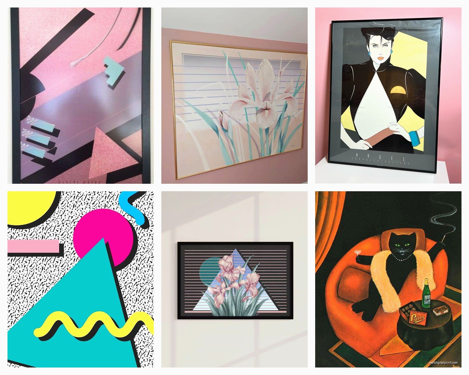
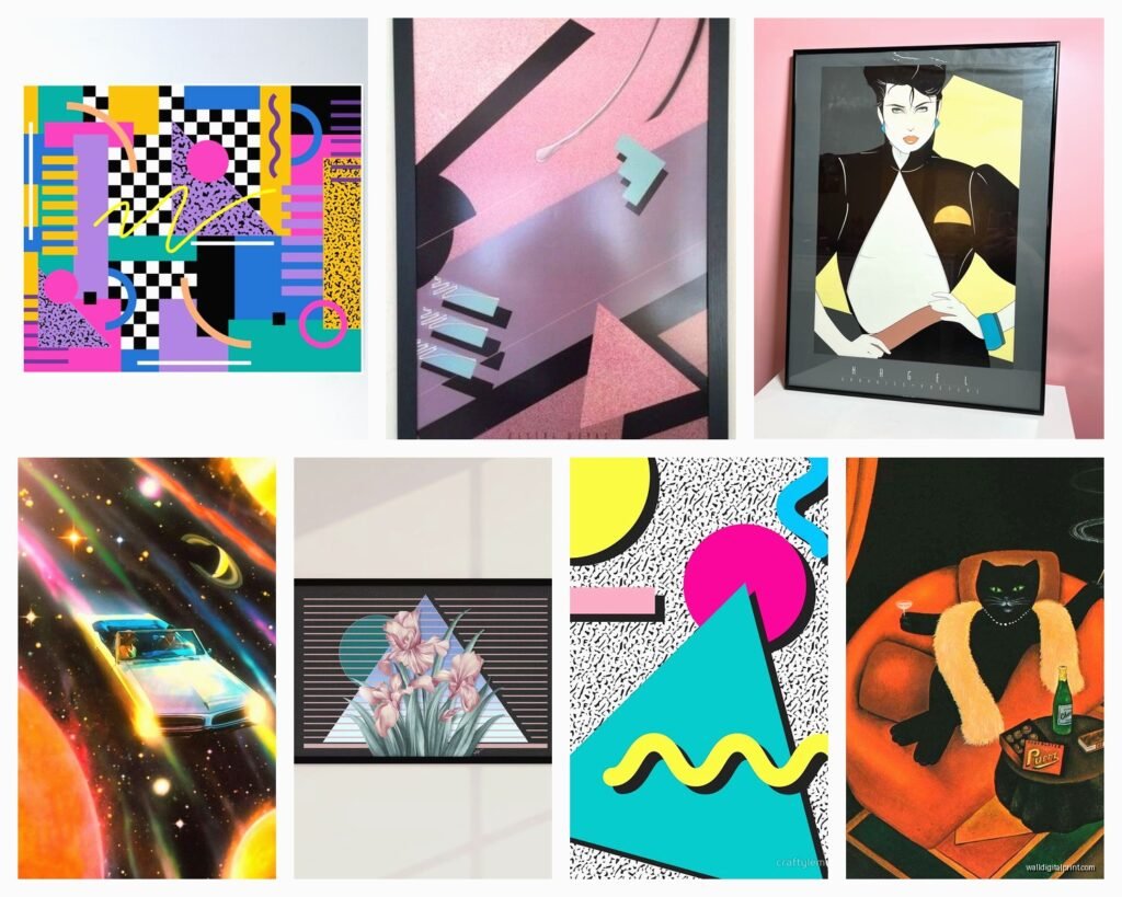
Okay so here’s the thing – the 80s had like seventeen different aesthetics happening at once, and you gotta pick your lane before you start buying stuff. There’s the neon geometric Memphis design thing, the pop culture movie poster vibe, the new wave music aesthetic, and then there’s just straight-up nostalgia with Rubik’s cubes and cassette tapes everywhere.
I learned this the hard way when I bought this amazing neon palm tree print and then a Breakfast Club poster and they looked absolutely terrible together. My cat knocked the palm tree one off the wall two days later which honestly felt like a sign.
The Neon Geometric Route
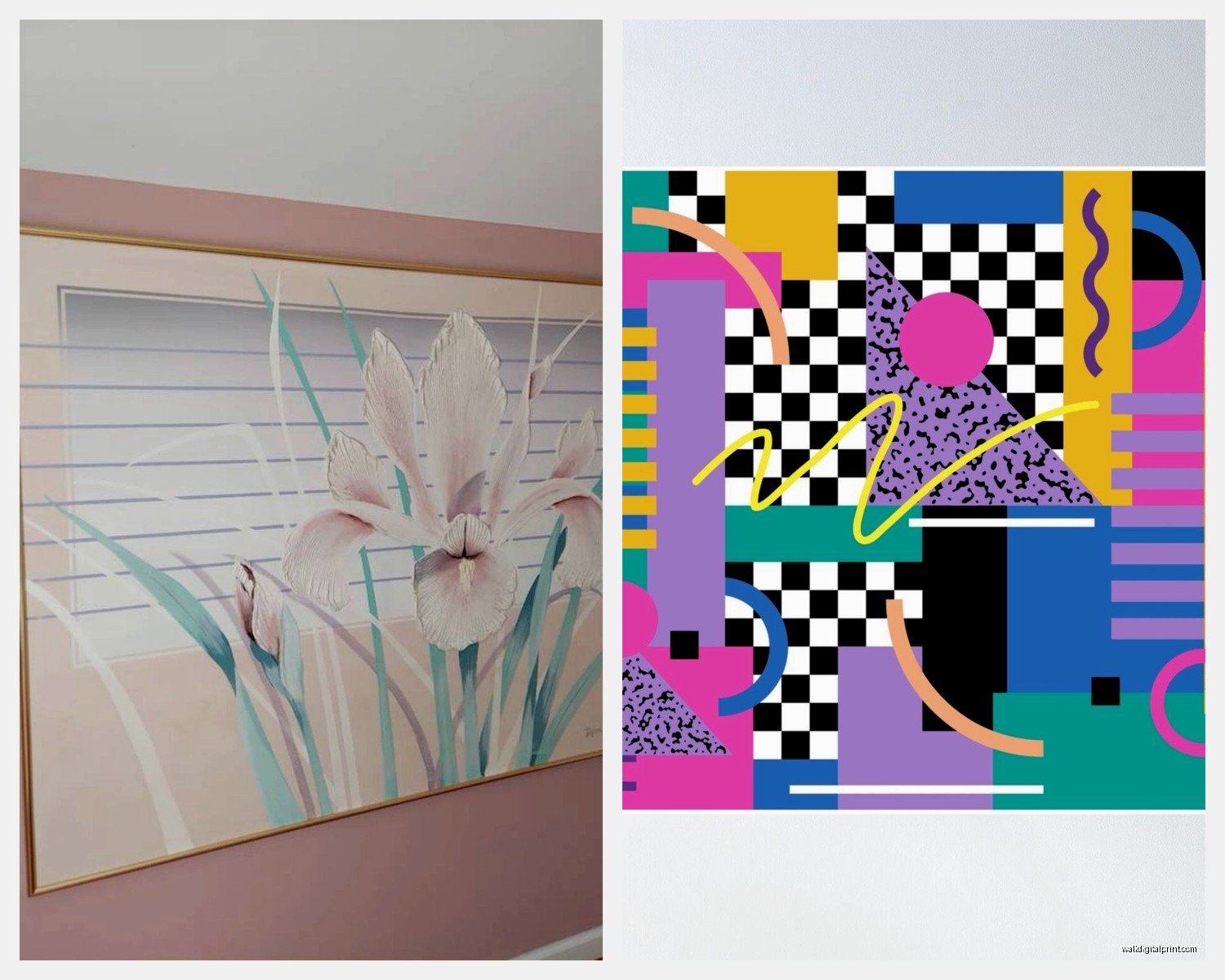
If you’re going for that Memphis Milano look – you know, the bright geometric shapes, the squiggly lines, the triangles everywhere – you want stuff that feels abstract and energetic. I found this amazing Etsy shop that does custom neon-style prints and they’re actually printed to look like real neon but they’re just regular art prints. Way cheaper than actual neon signs which can run you like $200-500 each.
For this style, think about:
- Grid patterns with bright cyan, magenta, and yellow
- Abstract shapes that don’t really mean anything
- That weird squiggle pattern that was on every bowling alley carpet
- Palm trees but make them geometric and pink
The trick is mixing sizes. Don’t just get all the same size frames – it’ll look like a dentist’s office or something. I usually do one big statement piece (like 24×36) and then cluster smaller ones around it.
Pop Culture and Movie Posters
This is where most people start because it’s the most obvious, right? But you gotta be careful because vintage original posters are stupid expensive now. I saw an original Back to the Future one-sheet going for $800 last month and I was like absolutely not.
Instead, look for officially licensed reprints or high-quality reproductions. There’s this company called Trends International that does licensed posters and they’re actually decent quality – not the flimsy ones from Spencer’s Gifts that rip when you breathe on them.
What Actually Works on Walls
Here’s what I’ve used in actual rooms that didn’t look cheesy:
- Blade Runner poster (the original theatrical one with the noir vibe)
- MTV logo stuff – there’s some really cool vintage MTV bumper art
- Album covers as art – New Order’s “Power Corruption & Lies” looks incredible framed
- Nagel prints (you know, those angular women with the severe hair)
- Trapper Keeper designs blown up as prints
Oh and another thing – if you’re doing movie posters, get them professionally framed or at least use decent frames. Those cheap plastic clip frames make everything look like a college dorm. I use simple black frames from Framebridge for most stuff and they’re worth it.
The Actual Neon Sign Thing
Okay so real talk, I was watching Stranger Things the other night (again, I know) and got obsessed with adding actual neon to a client’s game room. Real neon is gorgeous but it’s expensive and you need an electrician sometimes and it’s this whole thing.
LED neon signs are where it’s at now. They look basically the same, don’t get hot, use way less energy, and you can hang them yourself. I got one from this company called Radikal Neon – custom made it say “Totally Rad” in that classic 80s script font with a hot pink and blue color scheme. Cost like $180 which sounds like a lot but it’s the centerpiece of the whole room.
Good Neon Sign Ideas That Aren’t Cringe
- Simple geometric shapes (circles, triangles, lightning bolts)
- Single words in retro fonts
- Cassette tape outlines
- Palm tree silhouettes
- Abstract wave patterns
Skip anything that’s trying too hard to be funny. “Alexa play Depeche Mode” or whatever – it’s gonna be dated in like six months and not in a cool retro way.
The Layout Strategy
This is where people mess up the most. You can have amazing individual pieces and still have it look bad if your layout sucks.
I usually do one of three approaches:
Gallery Wall Chaos: This works if you’re mixing different types of 80s art – some geometric prints, a neon sign, maybe a framed vintage magazine cover, some album art. Keep everything within the same color family though. I did one that was all hot pink, electric blue, and purple and it worked because even though the styles were different, the colors tied it together.
Symmetrical and Clean: If you’ve got like a Memphis design vibe going, sometimes super clean symmetry looks amazing. Three identical-sized frames in a row, evenly spaced. Sounds boring but with wild geometric art inside, the contrast between the orderly layout and chaotic art is *chef’s kiss*.
The Statement Wall: One big piece, that’s it. I did this in my own apartment with a huge 4×3 foot print of that classic 80s sunset grid thing – you know the one, purple and pink sky, grid floor going to the horizon. Hung it behind my couch and called it a day.
Where to Actually Buy This Stuff
Gonna just dump my actual sources here because I spent way too long figuring this out:
Etsy: Best for custom geometric prints and Memphis design stuff. Search for “80s Memphis print” or “retro geometric poster.” Lot of it is made-to-order so you can usually request size changes. I’ve ordered from like eight different shops and quality varies but check the reviews.
Redbubble and Society6: Good for pop culture and artist interpretations of 80s stuff. The quality is pretty consistent. I like Society6 better for their framing options but Redbubble has more variety.
AllPosters and Art.com: For licensed movie and music posters. They have sales constantly so never pay full price.
Amazon (hear me out): There’s actually some decent 80s art print sets on there. I got a pack of six geometric prints for like $35 and they’re fine – not amazing but fine for a basement or kid’s room.
Depop and eBay: If you want actual vintage stuff. I found an original Nagel print on eBay for $60 which was a steal. Just be careful about condition and make sure you’re looking at actual photos not stock images.
The Color Palette Thing You Can’t Ignore
The 80s had very specific color combos and if you stray too far it just looks… wrong. Not in a way you can necessarily identify but it feels off.
The classic combos that actually work:
- Hot pink + electric blue + purple
- Teal + coral + yellow
- Neon green + magenta + black
- Cyan + orange + white
I did a room last month where the client wanted to add some green and I was like okay but it’s gotta be NEON green, not sage or emerald or whatever. That acidic, almost-yellow green. She pushed back initially but when we put it up with the hot pink and black she got it.
The Background Wall Color Matters
White walls work fine but honestly, a light gray or even black can make neon colors pop way more. I painted an accent wall in my office this dark charcoal gray and my 80s art looks ten times better against it. The neon colors almost glow.
If you’re renting and can’t paint, there’s this peel-and-stick wallpaper in geometric patterns that’s very 80s. I used one with a subtle grid pattern in light gray – gave texture without competing with the art.
Mixing Vintage and New
This is gonna sound weird but some of the best 80s walls I’ve done mix actual vintage pieces with new interpretations. Like I’ll frame an original vintage concert poster next to a modern art print inspired by 80s design. The vintage stuff has this authenticity and the new stuff is usually cleaner and more vibrant.
Found this amazing vintage Swatch watch advertisement at a flea market for $15, got it framed for $40, and it’s honestly one of my favorite pieces. The colors have faded slightly which gives it character that you can’t replicate.
The Practical Stuff Nobody Talks About
Hanging neon signs: They’re lighter than you think. Regular command strips work for most LED neon signs under 2 feet. For bigger ones, I use those command picture hanging strips rated for 16 pounds – total overkill but better safe than sorry.
Framing prints yourself: Michael’s and Hobby Lobby always have frame sales. I wait for the 50% off sales and stock up. Their gallery frames in black are perfect for this aesthetic. Just make sure your print is a standard size (11×14, 16×20, 18×24) or you’ll pay way more for custom.
Protecting your prints: If you’re spending good money on prints, use UV-protective glass or acrylic. Those neon colors will fade in direct sunlight faster than you’d think. I learned this when a client’s hot pink geometric print turned basically salmon colored after six months in a sunny room.
Command strips vs nails: I use command strips for everything under 5 pounds and in frames. For neon signs or anything heavy, just use proper picture hangers and nails. Command strips fail eventually and there’s nothing worse than hearing a crash at 2am.
Common Mistakes I See All The Time
Okay so my client last week did this and I had to basically redo her whole wall – she bought a bunch of random 80s stuff without thinking about scale. Had these tiny 5×7 prints scattered on a huge wall and it looked so bad. You need variety in sizes or everything the same size in a tight grid. No in-between.
Also people go too literal with the nostalgia thing. Like yes, we all remember Pac-Man and Rubik’s cubes, but do you really want to stare at a giant Rubik’s cube poster every day? The more abstract geometric stuff has more staying power. The pop culture stuff should be things you actually care about, not just “hey remember the 80s.”
The Typography Trap
There’s so much 80s-style typography art out there and most of it is terrible. Unless it’s actual vintage design or a really well-done modern interpretation, those “Good Vibes Only” prints in neon colors are gonna look dated real fast. Stick with actual 80s fonts used in interesting ways or just skip the text altogether.
Making It Work in Different Rooms
Living room: Go more sophisticated. Memphis design prints, maybe one neon accent piece. Skip the movie posters unless they’re really well-framed and part of a curated gallery wall.
Home office: This is where neon signs shine. The lighting is functional and cool. I have a purple neon triangle in mine and it doubles as mood lighting when I’m on video calls.
Basement/game room: Go wild. This is where you can do the movie posters, the pop culture stuff, mix in some vintage concert posters. Layer it up.
Bedroom: Softer neon colors work better here. That harsh hot pink and electric blue combo might be too energizing. I like the coral and teal combo for bedrooms – still 80s but not gonna keep you awake.
Kid’s room: Depends on the kid obviously, but the geometric stuff tends to grow with them better than character-based stuff. My friend’s daughter has a whole Memphis design wall and she’s still into it three years later.
wait I forgot to mention – lighting is huge for this stuff. You want your overhead lighting to be warm (not cool white) because it makes the neon colors look better. Cool white LEDs make everything look washed out and sad. I learned this after wondering why my friend’s 80s wall looked amazing in person but terrible in photos – she had these harsh cool white bulbs that killed the whole vibe.
The whole thing doesn’t have to be expensive either. My basement wall cost like $300 total – got prints on sale, used cheap frames, one medium-sized neon sign. Looks like I spent way more. It’s really about choosing the right pieces and laying them out well.