Wall Art Guide, Wall Art Tutoriels
Girly Wall Art: Feminine Sweet Pretty Girl’s Room Decor
May
So I’ve been doing this whole girly wall art thing for like three years now and honestly it’s gotten so much easier once I figured out what actually works versus what just looks good on Pinterest.
The biggest mistake I see is people buying those generic “Be Brave” prints from Target and calling it done. Like yeah they’re cute but they have zero personality and every other girl’s room has the exact same ones. What you actually want is a mix – some sweet stuff, some unexpected pieces, maybe something with a tiny edge to it so the room doesn’t feel like a cupcake exploded.
Starting With Your Base Layer
Okay so here’s what I tell everyone – start with 2-3 larger pieces as anchors. These should be around 16×20 inches or bigger. I’m obsessed with watercolor florals right now but not the super realistic ones… the abstract loose ones where you can barely tell what flower it is. There’s this Etsy shop called Minted that does really good ones, or honestly just search “abstract blush florals” and you’ll find a million.
The thing about these anchor pieces is they set your whole color story. If you go with blush pink and gold, everything else kinda falls into line. If you pick something with more coral or peach tones, that’s a different vibe entirely. I spent like two hours last Tuesday comparing different pink tones because a client couldn’t decide and my dog kept barking at the delivery guy so that was fun.
The Gallery Wall Situation
Gallery walls are tricky but they make SUCH a difference. Here’s my actual process that works:
- Get way more frames than you think you need – like if you want 6 pieces, buy 9
- Mix frame sizes but keep the style consistent (all thin gold, all white, whatever)
- Lay everything out on the floor first and take a picture
- Start from the middle and work outward, not top to bottom
- Keep 2-3 inches between frames, not more
I use those command strips for lighter frames because I’m terrified of putting 47 nail holes in the wall and then hating it. The medium ones hold up to 3 pounds which is enough for most standard frames with just prints.
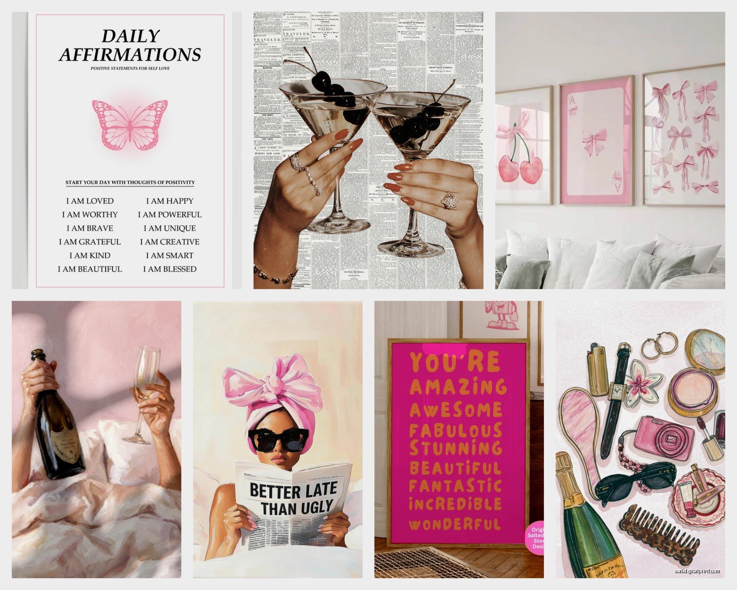
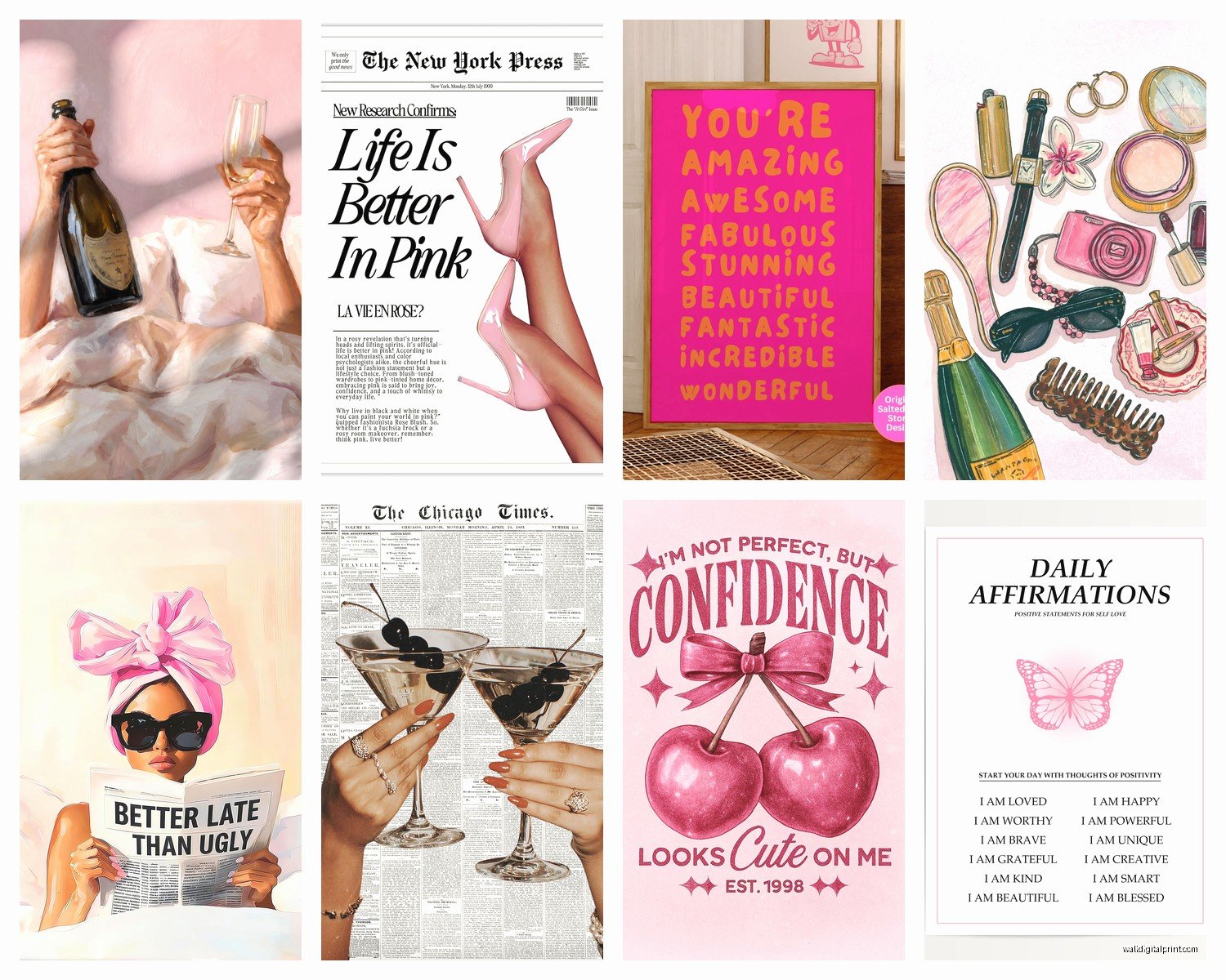
Oh and another thing – don’t make every piece the same type of art. Mix in some line drawings with your watercolors. Maybe add a vintage-looking botanical print or one of those “hello gorgeous” typography pieces if that’s your thing. The variety is what makes it interesting.
Where to Actually Find Good Stuff
Etsy is honestly my go-to for instant downloads. You can get printable art for like $5-8, download it immediately, and print it at Staples or wherever. The quality is usually pretty good if you’re getting it printed on nice cardstock or photo paper. I’ve done this probably 30 times and only had one weird pixelated disaster.
Society6 has original artist stuff and they do sales constantly. Sign up for their email list because they’ll send you 20% off codes like every other week. Their framed prints are pricier but the quality is legit – I have one in my own bedroom and it still looks perfect after two years.
For actual fancy pieces, Minted and Anthropologie have really elevated options but you’re gonna pay for it. We’re talking $150+ for framed pieces. Worth it if you want that one statement piece above the bed though.
The Instant Download Strategy
This is gonna sound weird but I keep a whole folder on my computer of printable art I’ve bought over time. That way when I need to switch things up or a client needs something last minute, I’ve got options ready. You can print the same file in different sizes too – like an 8×10 for one spot and a 5×7 for another.
Look for sellers who give you multiple file sizes in one purchase. Some will give you files formatted for 8×10, 11×14, AND 16×20 which is amazing value.
Color Schemes That Actually Work
Blush pink and gold is classic girly for a reason but it can read really young if you’re not careful. What I do is add in some dusty rose or mauve tones to mature it up. Maybe throw in one piece with sage green or soft gray.
Lavender and cream is underrated honestly. It’s feminine but feels more sophisticated than straight pink. I did a whole room with lavender watercolor pieces mixed with vintage cream botanicals and it was stunning.
If you want something less traditional, try peach and navy. Sounds random but it’s gorgeous – the navy grounds all the sweet peachy stuff and makes it feel more curated.
Frame Situations
Ikea Ribba frames are your friend. They’re cheap, they come in a million sizes, and they actually look decent. The white ones are like $5-15 depending on size. I buy them in bulk when I’m working on a project.
For something fancier, Target’s Threshold line has those thin brass frames that look way more expensive than they are. They’re around $15-25 but the quality is solid.
Wait I forgot to mention – if you’re doing a gallery wall, you can mix frame colors but you gotta be intentional about it. Like maybe do mostly white frames with 2-3 gold ones scattered throughout. All random colors looks messy not eclectic.
Actual Art Styles to Look For
Watercolor everything – flowers, abstract shapes, those dreamy cloudlike washes of color. Super feminine and soft without being too literal.
Line drawings – minimalist face profiles, simple flower stems, abstract female forms. These add a modern touch so your room doesn’t feel stuck in 2015.
Vintage botanicals – you can find tons of public domain botanical prints that you can download free and print. They add sophistication and work with literally any color scheme.
Typography prints – but here’s the thing, skip the basic motivational quotes. Look for song lyrics, poetry lines, or French phrases. Something with actual meaning not just “Live Laugh Love” vibes.
Abstract art – geometric shapes in soft colors, brushstroke patterns, marble textures. These fill space without being too busy or too specific.
The Over-the-Bed Dilemma
This is the spot everyone stresses about. You’ve got a few options that all work:
One large statement piece centered over the bed – needs to be at least 2/3 the width of your headboard or bed. This is the easiest option honestly.
A diptych or triptych – two or three matching or coordinating pieces hung in a row. Leave like 3-4 inches between them. I did this in my niece’s room with three blush abstract pieces and it looks so good.
A gallery wall above the bed – riskier because you gotta commit to the nail holes, but it can look amazing if you plan it right. Keep it contained though – don’t let it spread too far beyond the bed width.
Honestly my favorite lately is doing one medium piece centered with two smaller pieces flanking it. Creates visual interest without being too complicated.
Mixing in Non-Art Elements
okay so funny story, I accidentally ordered macrame wall hangings instead of returning them I just incorporated them into a gallery wall and it actually worked really well.
You can mix in:
- Small mirrors with decorative frames
- Floating shelves with cute objects
- Woven wall hangings or macrame
- 3D paper flowers or butterflies
- Decorative letters or monograms
- Small string lights draped around frames
The key is not going overboard. Like maybe add ONE of these elements to your gallery wall, not all of them.
Size and Spacing Rules
Hang art so the center is at eye level, which is usually around 57-60 inches from the floor. For over furniture, hang pieces 6-8 inches above the furniture top.
If you’re doing a gallery wall, the whole collection should span about 2/3 to 3/4 of your wall width. Too small looks awkward and too big feels overwhelming.
For spacing between frames, 2-3 inches is the sweet spot. Closer than that looks cramped, farther apart loses the cohesive gallery feel.
The Tape Trick
Use painter’s tape to map out where your frames will go before you hammer anything. Seriously this saves so much frustration. You can see exactly how it’ll look and make adjustments before committing.
I also cut out paper templates the size of each frame and tape those up. My client thought I was crazy but then she saw how perfectly everything hung and she got it.
Budget Breakdown
If you’re working with like $100 total, here’s what I’d do:
- $30-40 on Etsy printables (get 6-8 different prints)
- $40-50 on Ikea frames in various sizes
- $20-30 on printing at Staples or a local print shop
That gives you enough for a decent gallery wall or several different arrangements throughout the room.
If you’ve got more like $300-400 to spend, upgrade some of those Ikea frames to nicer gold or brass ones, buy a couple pre-framed pieces from Society6, and maybe get one really special commissioned piece or original print.
Themes That Work Without Being Cheesy
Garden party vibes – florals, butterflies, soft greens and pinks, maybe some vintage botanical stuff mixed in.
Parisian chic – French phrases, Eiffel tower line drawings, fashion illustrations, blush and gold colors.
Modern minimal – simple line art, abstract shapes, limited color palette of like two colors plus white.
Boho dreamer – feathers, moons and stars, watercolor dreamcatchers, warm peachy tones with cream.
Whatever you pick just commit to it. Don’t do like two Paris prints and three beach prints and a random cat poster. It’ll look confused.
Lighting Matters More Than You Think
This is something I learned the hard way – your wall art looks completely different in different lighting. Those blush pink prints might look perfect in natural daylight but then at night with warm yellow bulbs they can look kinda muddy.
If possible, get daylight LED bulbs for the room. They show colors more accurately and make everything look fresher. I switched all my bulbs to 5000K daylight ones and the difference is wild.
Also consider adding a picture light above your main statement piece if you’re fancy like that. Creates a gallery vibe and adds ambiance.
Rotating Your Art
Something I started doing that’s actually really fun – buying extra prints and rotating them seasonally or just when I get bored. Keep the frames up but swap out what’s inside them.
Store the extras in a portfolio case or even just a large envelope. Makes it easy to refresh the room without buying all new stuff or putting new holes in the wall.
What Doesn’t Work
Those stick-on wall decals that are supposed to look like art – they always peel and look cheap after a few months. Just don’t.
Putting art too high – I see this ALL the time where people hang stuff way up near the ceiling. It disconnects from the room and looks awkward.
Too many words – one or two typography pieces is cute, but if every piece has text it’s gonna feel busy and preachy.
Matching everything perfectly – this is actually worse than mixing stuff up. If every piece is the exact same style and color it looks like you bought a set from HomeGoods and hung it up without thought.
Quick Fixes for Common Problems
If your wall feels empty even with art up, you probably went too small. Add more pieces or swap for larger ones.
If it feels cluttered, you’ve got too much goin on or things are hung too close together. Remove a few pieces or spread them out more.
If colors look off, check your lighting first before you blame the art. Seriously this fixes like 60% of color issues.
If frames look crooked even when you used a level (which you should), it might be that your ceiling or floor isn’t level. Measure from the ceiling down instead of up from the floor.
The main thing is just to start and not overthink it too much. You can always move stuff around or swap pieces out. I’ve redone my own gallery wall like four times and it gets better each time because you figure out what you actually like versus what you thought you’d like.