Wall Art Guide, Wall Art Tutoriels
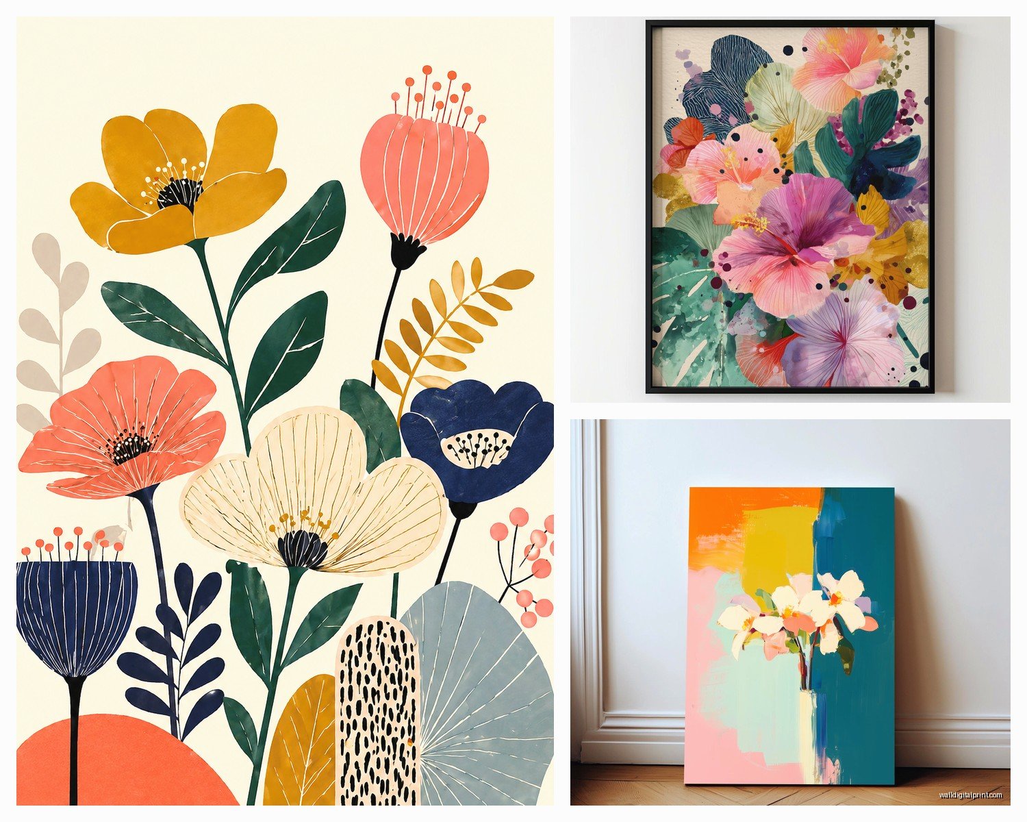
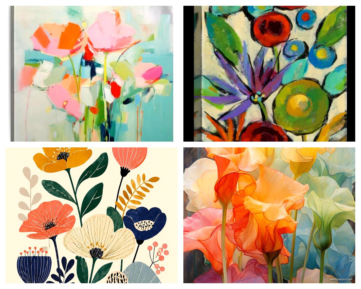
Abstract Floral Wall Art: Modern Flower Interpretation
May
So I’ve been styling abstract floral pieces for like three years now and honestly it’s one of those things that looks way easier than it actually is. Last week I hung this massive abstract poppy piece in a client’s living room and we had to move it four times because the “vibe” kept changing depending on where the light hit it.
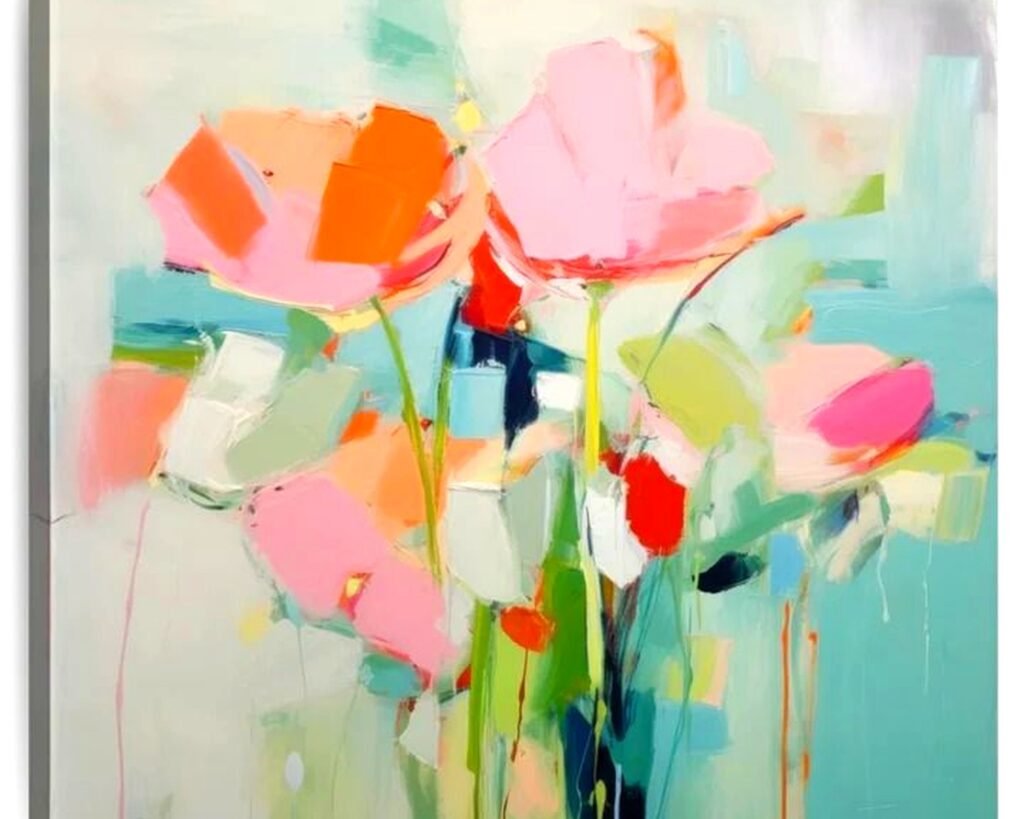
First thing you gotta know is that abstract florals are NOT the same as those realistic flower prints from HomeGoods. They’re more like… someone saw a flower, had feelings about it, and then threw paint at a canvas. Which sounds pretentious when I say it like that but actually makes them way more versatile for modern spaces.
Picking the Right Style for Your Room
Okay so there are basically three camps of abstract floral and I wish someone had told me this before I bought that hideous orange dahlia thing that’s now in my garage:
Minimalist line drawings – these are those simple one-line continuous drawings or really sparse botanical sketches. Super trendy right now, work amazing in Scandinavian or minimalist spaces. I put a set of three black line tulips in a client’s bedroom last month and her husband actually texted me to say he didn’t hate them which is like the highest compliment from that guy.
Color-field abstracts – big washes of color that vaguely suggest petals or leaves. Think Rothko but make it floral. These are HARD to style because they dominate a room but when you get it right… chef’s kiss. You need at least 10 feet of wall space and minimal competing colors.
Textured mixed-media – my personal favorite even though they’re harder to find. Actual dimension, maybe some gold leaf, impasto technique where you can see the paint strokes. These catch light differently throughout the day which is gonna sound weird but it’s like having a different piece in morning vs evening.
Size and Scale Without Losing Your Mind
This is where everyone screws up including me when I first started. You walk into a gallery, see a piece that’s like 24×36, think it looks huge, get it home and it disappears on your wall like it went into witness protection.
For above a sofa you want the art to be roughly two-thirds to three-quarters the width of the sofa. I know that sounds specific but I learned this the hard way after hanging a tiny 20×20 abstract iris above a sectional and it looked like a postage stamp. My cat literally paid more attention to it than guests did.
Living room feature walls can handle 40×60 or even bigger. Don’t be scared of large scale with abstracts because the undefined edges actually make them feel less imposing than a giant realistic photograph would.
Bedrooms are tricky – you want impact but not so much that it keeps you awake analyzing brushstrokes at 2am. I usually go 30×40 or a diptych situation above the bed. Actually just finished a client’s master with two 24×36 abstract peonies in blush and grey tones and she says she likes her bedroom more than any other room now.
The Diptych/Triptych Question
Oh and another thing – multiple panels can be amazing but you gotta commit to the spacing. 2-3 inches between panels for a cohesive look, 4-6 inches if you want them to read as separate pieces. I have a triptych of abstract cherry blossoms in my office with 5-inch spacing and it creates this nice breathing room.
But here’s what nobody tells you: hanging multiple panels level is actually harder than hanging one piece. You need a laser level or you’ll be eyeballing it and end up with a wonky situation. Trust me I’ve been there with a pencil and hope.
Color Coordination That Actually Works
So everyone says “pull colors from your existing palette” which like… duh. But with abstract florals you’ve got more flexibility because the forms are interpretive.
I recently did this whole thing where the client had a navy sofa and cream walls and wanted something with “energy” – ended up with an abstract floral that had navy, burnt orange, and gold. The navy anchored it to the sofa but the orange brought in warmth the room was missing. It shouldn’t have worked on paper but seeing it in the space it was perfect.
My rule: pick one color that matches your existing scheme, one that complements, and let the third be a wild card. Abstract florals can handle unexpected color combos because flowers themselves are weird with color. Have you seen a real orchid? Nature is already doing abstract color blocking.
For neutral rooms – go bold with the florals. Charcoal and white space? Add abstract poppies in coral or deep red. All beige everything? Abstract eucalyptus in sage and dusty blue.
For colorful rooms – honestly you can go either way. Either echo the existing colors in a different medium or go tonal with the same color family. I have a client with a jewel-tone living room (emerald velvet chair, sapphire pillows) and we did an abstract floral in all blues from navy to powder and it’s cohesive without being matchy-matchy.
Framing Decisions Because Frames Matter More Than You Think
Okay so funny story – I once spent $400 on this gorgeous abstract watercolor botanical and put it in a $30 black frame from Target and it looked like I was trying to hide it. Frames are like 40% of the final look.
Float frames work incredibly well for abstract florals especially if there’s texture or the painting goes to the edges. Creates this gallery effect and makes even affordable prints look expensive.
No frame at all – if you’re going with a canvas print, sometimes just the gallery-wrapped edge is enough. I do this mostly in modern or industrial spaces. Just make sure the sides are finished nicely.
Natural wood frames warm up abstract florals like nothing else. Light oak or walnut with a simple profile. I used this combo in a mid-century modern dining room last fall and the client literally hugged me which was awkward but also sweet.
Metal frames in brass or matte black keep things contemporary. The brass especially adds a luxe element to abstract florals with gold or yellow tones.
White frames feel a bit expected at this point unless you’re going full gallery wall with multiple pieces.
Placement Beyond the Obvious Spots
Everyone thinks sofa, bed, done. But abstract florals can go in places you wouldn’t expect.
I put a large abstract magnolia piece in a client’s dining room and it became the whole conversation starter at dinner parties. Something about the organic shapes makes dining spaces feel less formal.
Bathrooms – wait I forgot to mention this earlier but small abstract florals in bathrooms are chef’s kiss. The humidity won’t hurt a properly framed piece and it elevates the space from purely functional. I have a tiny 12×12 abstract lavender print in my powder room and guests always ask about it.
Hallways are actually perfect for a series of abstract florals. Long narrow wall? Do four or five smaller pieces in a horizontal line. Creates movement and guides people through the space.
Home offices need something that’s interesting but not distracting. Abstract florals in muted tones work better than you’d think – they’re calming without being boring like landscape photos.
The Entryway Impact
This is gonna sound weird but your entryway is prime real estate for a statement abstract floral. It’s the first thing people see and flowers (even abstract ones) are universally welcoming. I did a massive 48×60 abstract peony in shades of blush and cream in a client’s foyer and she said three different neighbors asked for my number after seeing it.
Mixing Abstract Florals With Other Art
You don’t have to commit to ONLY abstract florals unless you’re going for a very specific botanical gallery wall thing.
I mix them with:
– Black and white photography (the abstract florals add the color pop)
– Geometric abstracts (plays with different types of abstraction)
– Vintage botanical prints (creates this old-meets-new tension)
– Mirrors (helps bounce light and the florals don’t compete with reflections)
What doesn’t really work: mixing abstract florals with realistic floral art. It’s confusing to the eye and feels indecisive. Pick a lane.
Lighting Makes or Breaks It
Natural light on abstract florals is magic but you gotta watch for direct sun which can fade colors over time. I learned this when a client’s beautiful abstract iris print turned basically pink after two summers in a south-facing window.
Picture lights are having a moment and they work great on textured abstract florals – really highlights the dimension. You can get battery-operated ones now so no electrician needed.
Track lighting or adjustable spotlights let you change the mood. I have a client who dims her spotlights in the evening and the abstract floral above her console table looks completely different – the shadows create almost another layer of abstraction.
Budget Real Talk
You can do this at literally any price point which is why I love abstract florals for clients with different budgets.
Under $100: Etsy prints are honestly great. Download and print at a local print shop on quality paper, frame it yourself. I’ve done this for my own apartment and nobody knows the difference. Society6 and Minted also have good options.
$100-$500: Sites like Anthropologie, West Elm, or Artfully Walls have original-looking pieces that are actually high-quality reproductions. The frames are usually decent too.
$500-$2000: Saatchi Art, Artfinder – you’re getting actual original work from emerging artists. The quality jump is noticeable and you’re supporting actual humans.
Over $2000: Galleries, established artists, custom commissions. I’ve done a few of these for clients and honestly the piece becomes a family heirloom situation.
Common Mistakes I See Constantly
Hanging too high – the center of the artwork should be at eye level which is roughly 57-60 inches from the floor. I see so many abstract florals basically on the ceiling and it’s just wrong.
Matching too literally – if you have pink pillows you don’t need pink flowers in your art. Abstract gives you permission to interpret color loosely.
Going too trendy – those millennial pink abstract peonies were everywhere in 2019 and now they feel dated. Pick colors and styles that feel personal not just Pinterest-popular.
Ignoring the undertones – your walls have undertones (warm or cool) and your abstract floral should work with that. Cool grey walls with a warm-toned abstract floral can look muddy.
Buying before measuring – measure your wall space and painter’s tape the dimensions before buying anything. I cannot stress this enough because returns are annoying.
Where to Actually Buy
Okay so my go-to sources because my client canceled yesterday so I spent an hour comparing options for another project:
Etsy for prints and affordable originals – search “abstract floral art” and filter by your size needs. Read reviews about color accuracy because screens lie.
Local art fairs and markets – I’ve found incredible pieces at random weekend markets. Plus you meet the artist and can sometimes negotiate or request custom sizes.
Minted has a good return policy which matters when you’re buying art online. Their abstract florals tend toward the prettier/more commercial side but that’s not always bad.
One Kings Lane for vintage and unique finds – sometimes you can score original abstract florals from estate sales.
Instagram artists – I’ve commissioned three pieces from artists I found on Instagram. DM them, most are super responsive and hungry for work.
Target actually has some decent abstract floral options in their Project 62 line if you’re on a tight budget. The quality is obviously not heirloom but for a rental or first apartment they’re fine.
Look, at the end of the day abstract floral art works in modern spaces because it bridges this gap between bringing nature indoors and keeping things contemporary. The undefined edges and interpretive colors mean you’re not locked into one specific style or color scheme. Plus there’s something about abstracted organic forms that makes a room feel more human even in really minimalist spaces.
Just remember to go bigger than you think you need, pay attention to undertones, and for the love of everything hang it at the right height. That’s honestly 80% of making this work.