Wall Art Guide, Wall Art Tutoriels
Black and Gold Abstract Wall Art: Luxury Modern Contrast
Jun
So I’ve been working with black and gold abstract pieces for like three years now and honestly they’re the easiest way to make a room look expensive without actually spending a fortune. My client Sarah just texted me last week asking the exact same thing and I ended up sending her like 47 photos from different rooms I’ve styled.
The thing with black and gold is it’s basically bulletproof if you follow a few rules. I learned this the hard way when I put a massive gold-heavy piece in a room that already had brass fixtures, gold mirrors, AND a yellow-toned rug. Looked like a jewelry store exploded. Not cute.
Size Matters Way More Than You Think
Okay so first thing – and I cannot stress this enough – size is everything. I see people buying these tiny 16×20 pieces for a wall that’s like 12 feet wide and then they’re confused why it looks sad. Here’s what actually works:
Above a sofa: You want something that’s roughly 2/3 to 3/4 the width of your couch. So if you’ve got a standard 84-inch sofa, you’re looking at a piece that’s 50-60 inches wide. Or you can do a triptych which is what I usually recommend because it’s more forgiving if your measurements are slightly off.
Bedroom: Above the bed, same rule applies. Your art should be about 2/3 the width of your headboard or mattress if you don’t have a headboard. I did a client’s bedroom last month with a 60×40 inch piece and it transformed the whole space. She said her husband actually complimented the room which apparently never happens.
Dining room: This is where you can go drama. Like really big. I’m talking 72 inches wide or even bigger if your wall can handle it. The dining room is basically made for statement art.
The Gold Ratio Thing Nobody Talks About
Wait I forgot to mention this earlier but it’s super important. The ratio of black to gold in your piece needs to match your room’s vibe.
If your room is mostly neutrals and whites, you want more black in the artwork with gold accents. Think 70/30 or 80/20 black to gold. This keeps it sophisticated and stops the gold from overwhelming everything.
But if you’ve got darker walls or lots of texture already happening, flip it. More gold, less black. Or go for pieces where the gold is really integrated into the black rather than sitting on top of it, if that makes sense.
I have this one piece in my own living room that’s mostly black with these thin gold leaf veins running through it and people always ask where it’s from. Got it from this small artist on Etsy for like $340 which felt like a lot at the time but I’ve had it for two years and still love it so.
Placement Height Because Everyone Gets This Wrong
Center of the artwork should be at 57-60 inches from the floor. This is museum standard and there’s a reason for it – it’s actual average eye level.
But here’s where it gets tricky with furniture. If you’re hanging above a console table or credenza, you want 6-8 inches between the furniture top and the bottom of the frame. Above a sofa, same thing. I usually do 8 inches because it feels more intentional.
My dog knocked over a lamp while I was measuring last week and I accidentally marked my client’s wall with pencil but we covered it with the frame so all good.
The Lighting Situation
Oh and another thing – lighting will make or break this whole thing. Black and gold abstract art NEEDS proper lighting or it just looks flat and muddy.
Picture lights are your friend here. I’m obsessed with the LED ones that have adjustable color temperature. You want warm white (2700-3000K) for gold artwork because it makes the gold look richer and more luxurious. Cool white will make your gold look greenish and weird.
If you can’t do picture lights, position a floor lamp or table lamp so it casts light at an angle across the artwork. Creates dimension and makes the texture pop. Track lighting works too but make sure you’re using narrow beam bulbs, not flood.
What to Actually Pair It With
This is gonna sound weird but I keep a note in my phone of combinations that work because I was constantly forgetting and having to recreate the wheel every time.
Furniture colors that work:
- Charcoal or black leather – obvious but so good
- Cream or ivory upholstery – creates that high contrast thing
- Navy velvet – adds depth without competing
- Cognac leather – the brown-gold connection feels intentional
- Gray anything – literally cannot go wrong
What to avoid:
- Yellow anything unless it’s a really desaturated mustard
- Orange-toned wood furniture (cherry, mahogany) – clashes with the gold undertones
- Lots of silver or chrome – pick a metallic lane and stay in it
I had a client who insisted on keeping her orange-pine dining table with a black and gold piece and we tried for like an hour to make it work and finally I was just like… we gotta paint the table or change the art. She painted the table black and it was perfect.
The Frame Debate
Okay so funny story, I used to think frames didn’t matter that much and then I saw the same piece of art in two different frames and literally looked like two different price points.
For black and gold abstract art, you’ve got a few options:
Floating frame in black: This is my go-to maybe 60% of the time. It’s clean, modern, doesn’t compete with the artwork. Makes the piece look gallery-quality even if you printed it yourself.
Thin gold frame: Can work but you gotta be careful. If your artwork already has a lot of gold, a gold frame can be too much. But if it’s mostly black with gold accents, a thin gold frame ties everything together nicely.
No frame (gallery wrap): Modern and budget-friendly. The edges should be finished though – either painted black or with the design wrapped around. White canvas edges look unfinished and cheap.
Thick black frame with gold inner lip: This is fancy and I love it for traditional-leaning spaces. Adds weight and importance to the piece.
I’m watching The Bear while writing this and just got distracted for like 10 minutes but anyway.
Styling Around It
Once you’ve got your black and gold piece up, you need to style the rest of the space to support it. This doesn’t mean going crazy with gold accessories though – that’s actually the mistake everyone makes.
The Three Touch Rule
Your artwork counts as one gold touch. You need two more gold elements in the room but they should be different textures or finishes. So like:
- Artwork = shiny metallic gold
- Table lamp with brushed brass base = matte gold
- Gold-framed mirror = reflective gold
See how they’re all gold but different? This creates layers instead of looking matchy-matchy.
For the black elements, you want variety too. Black velvet pillow, black matte picture frame, black ceramic vase – different textures, same color family.
The Supporting Cast
What else goes in the room matters. I usually build around black and gold with:
Neutrals as the base: White walls, cream sofa, gray rug – this lets the artwork be the star. Or go dramatic with charcoal walls but then you need really good lighting.
One accent color: I love adding either emerald green, deep navy, or blush pink. Just one. Pick your lane. The accent color should show up in like 10-15% of the room – throw pillows, a chair, books on the coffee table.
Natural elements: Wood, plants, linen, marble – these warm up the black and gold so it doesn’t feel too glam or hotel-lobby-ish. I always add a fiddle leaf fig or snake plant near black and gold art. Always.
Where to Actually Buy These Pieces
Alright so you’re probably wondering where to get the actual art. I’ve tried basically every source and here’s the real talk:
Etsy: Best for original pieces and prints from actual artists. Price range is huge – $80 to $2000+. I filter by “ships from United States” because international shipping for large art is insane. Look for sellers with lots of reviews and photos from actual customers.
West Elm/CB2: Good for that modern gallery vibe. Usually $200-$600 for decent sizes. Quality is consistent which matters when you’re buying online. They have good return policies too.
Local art fairs and galleries: This is where I find the most unique stuff but you gotta be willing to hunt. I found an incredible black and gold piece at a local art walk for $180 that would’ve been $600 at a gallery.
HomeGoods/TJ Maxx: Hit or miss but when you hit it’s amazing. I check these places like twice a month. Found a 48×36 inch black and gold abstract for $120 once and used it in three different client photos.
Society6/Minted: Good for prints if you’re on a budget. You can get large prints for under $100 but you’ll need to frame them yourself. Quality is decent for the price.
Custom commissioning: If you have a specific size or color ratio you need, commissioning isn’t as expensive as you’d think. I have an artist I work with who does custom black and gold abstracts starting at $400 for a 30×40 inch piece. Takes 3-4 weeks but it’s exactly what you want.
Common Mistakes I See All The Time
Gonna rapid-fire these because I see them constantly:
Hanging multiple small pieces in a gallery wall around your statement piece – no. The black and gold abstract should stand alone. It’s already a lot visually.
Matching your metallics too perfectly – your gold lamp doesn’t need to be the exact same gold as the artwork. Actually better if it’s not.
Putting it in a room with no natural light – black absorbs light so you need either good natural light or excellent artificial lighting. Dark room + black art = cave.
Buying it before you paint – paint colors look different next to black and gold. Get your art first, then pick paint colors. Trust me on this.
Hanging it too high – I already mentioned the 57-60 inch rule but people still hang art way too high. It should feel connected to your furniture and the room, not floating near the ceiling.
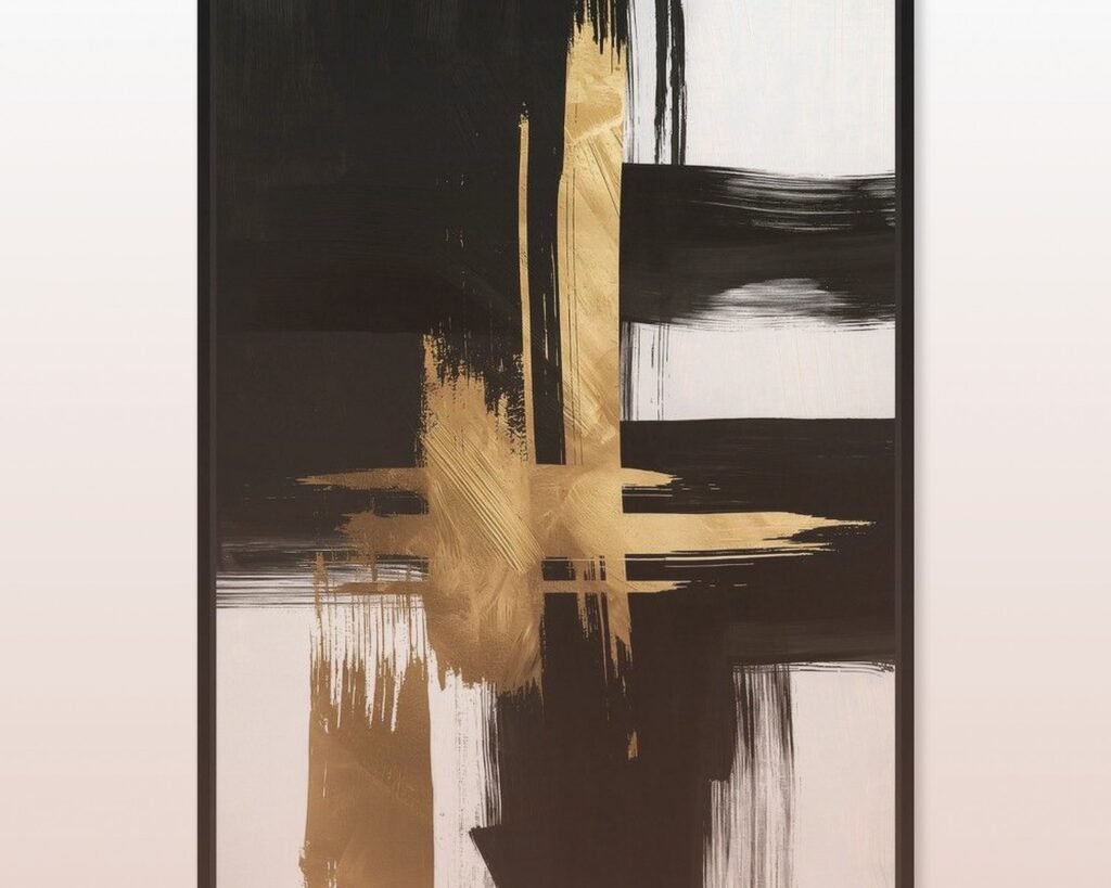
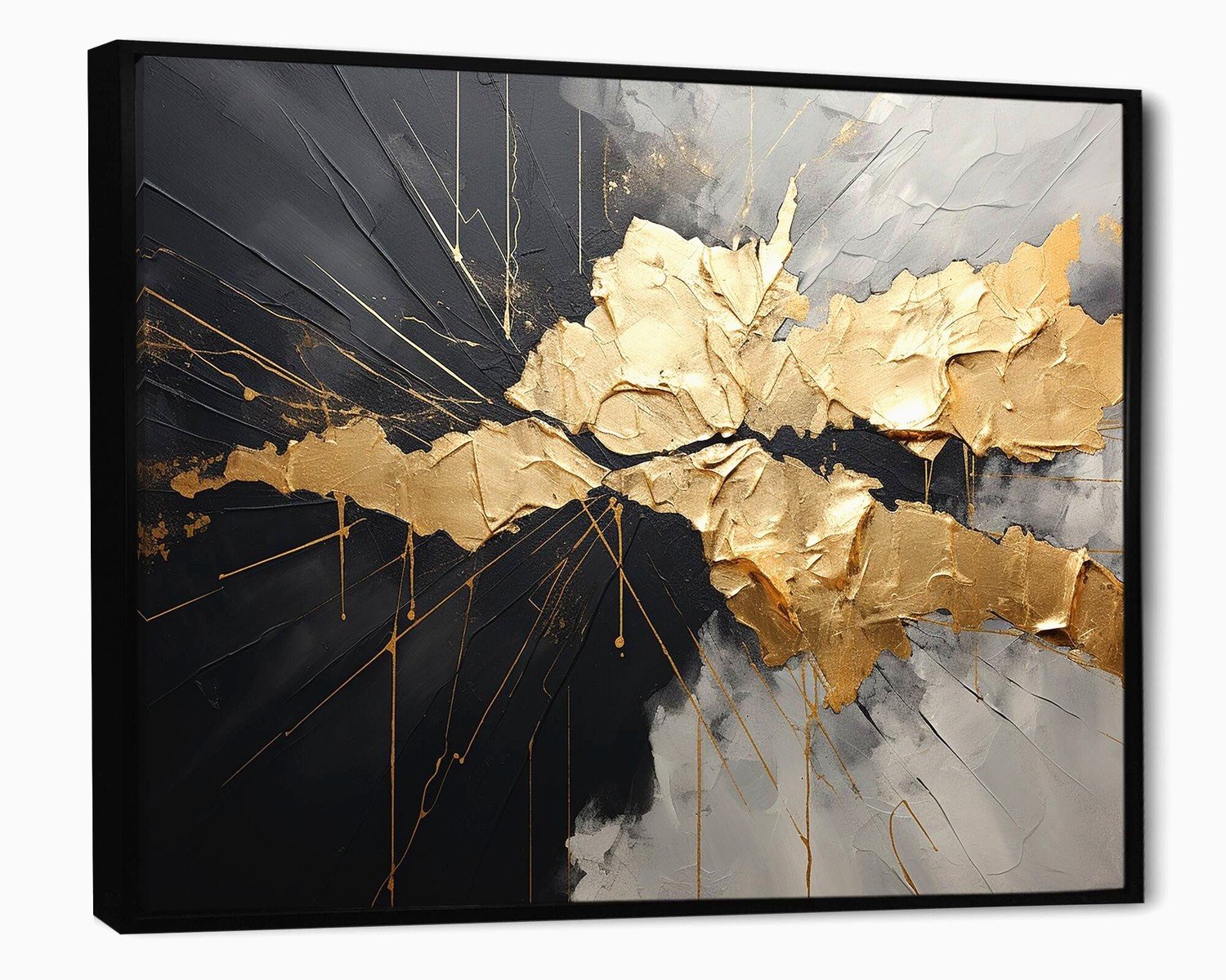
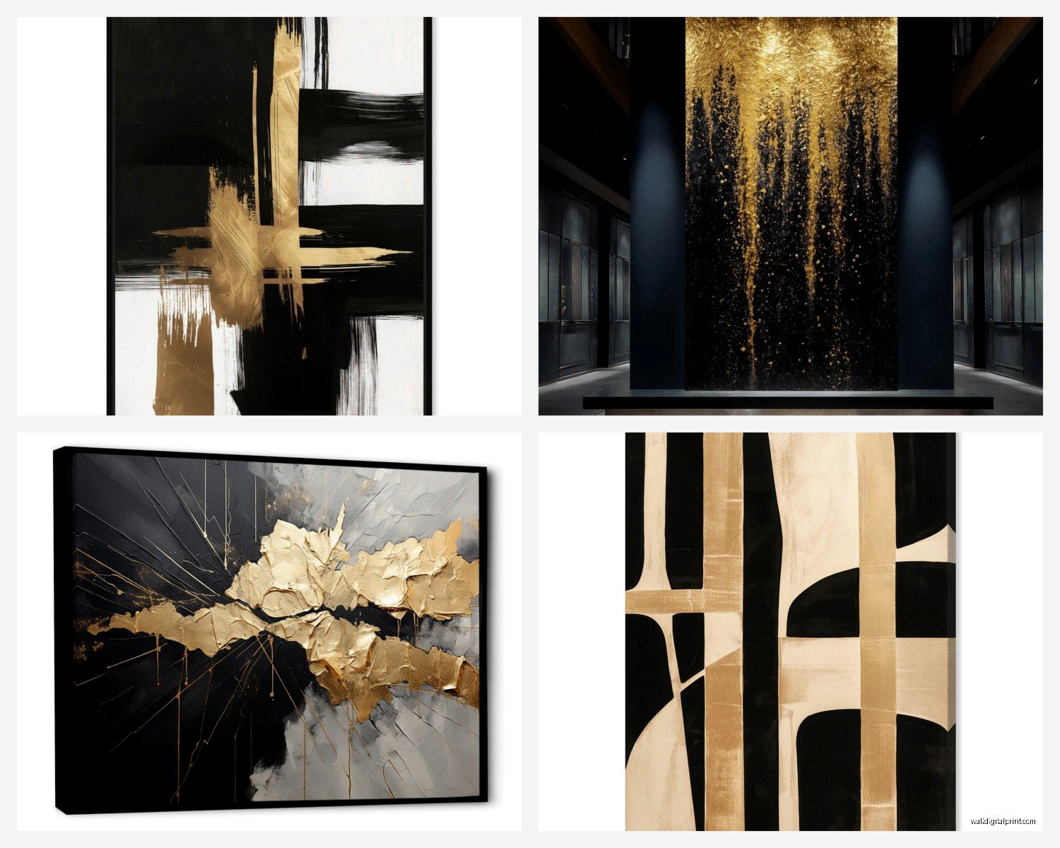
The Different Styles of Black and Gold Abstract
Not all black and gold abstract art is the same and knowing the difference helps you pick what actually fits your space.
Geometric: Sharp lines, circles, triangles. Very modern, works great in contemporary spaces. Pairs well with mid-century furniture. This is what I use in offices and dining rooms mostly.
Fluid/organic: Looks like ink in water or marble. Softer, more movement. Better for bedrooms and living rooms where you want a calmer vibe. My personal favorite.
Textured: Thick paint, gold leaf applied in layers. You can see the dimension from across the room. These need good lighting to show off the texture. Worth the extra cost if you can swing it.
Minimalist: Mostly one color (usually black) with just hints of gold. Very Scandinavian, very now. Works in smaller spaces because it doesn’t overwhelm.
Maximalist: Lots happening, busy composition, gold everywhere. Statement piece for sure. Needs a calm room around it or it’s too much.
I gravitate toward fluid and textured pieces because they photograph well for my blog and clients seem to connect with them more but honestly it depends on your existing furniture style.
Making It Work in Different Rooms
Living room: Above the sofa is classic but also consider above a console table behind the sofa if you have one. Or create a whole gallery moment on the wall opposite your seating area. I did this in my friend’s condo and it became the focal point of the entire space.
Bedroom: Above the bed is obvious but also works on the wall opposite the bed if that’s what you see when you walk in. Just make sure it’s not too stimulating if you’re a light sleeper – go for more black, less shiny gold.
Dining room: This is where you can go BIG and dramatic. The dining room is basically made for statement art. I love a huge black and gold piece here because you’re usually seeing it from a seated position so it needs impact.
Entryway: First impression situation. A black and gold abstract piece immediately sets a luxe tone. Keep it medium-sized here though unless you have a massive entryway.
Home office: Geometric black and gold pieces work great here. Feels professional and elevated. Hang it where you’ll see it during video calls – instant sophisticated background.
Bathroom: Okay this is unconventional but a small black and gold piece in a powder room is so chic. Just make sure it’s properly sealed if it’s near moisture.
My client just texted me a photo of her finished living room with the black and gold piece we picked and it looks so good I’m gonna use it in my portfolio.
Anyway, the main thing is don’t overthink it too much. Black and gold is pretty forgiving as long as you get the size right and don’t go crazy with too much gold everywhere else in the room. Start with the art, build around it, and adjust as you go.