Wall Art Guide, Wall Art Tutoriels
Neutral Abstract Wall Art: Earth Tone Modern Designs
Jun
So I’ve been living with neutral abstract art for like three years now and honestly it’s the easiest way to make a room look expensive without actually spending a fortune. But you gotta know what you’re doing because it’s so easy to pick the wrong piece and then your whole room just feels… off.
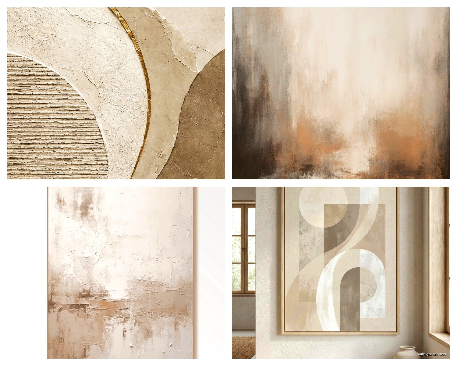
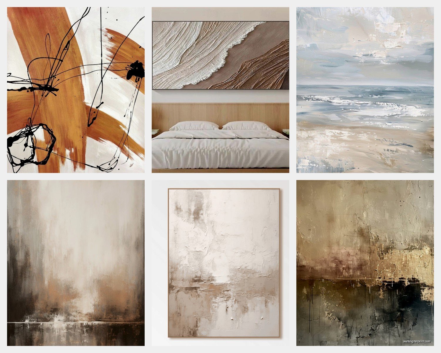
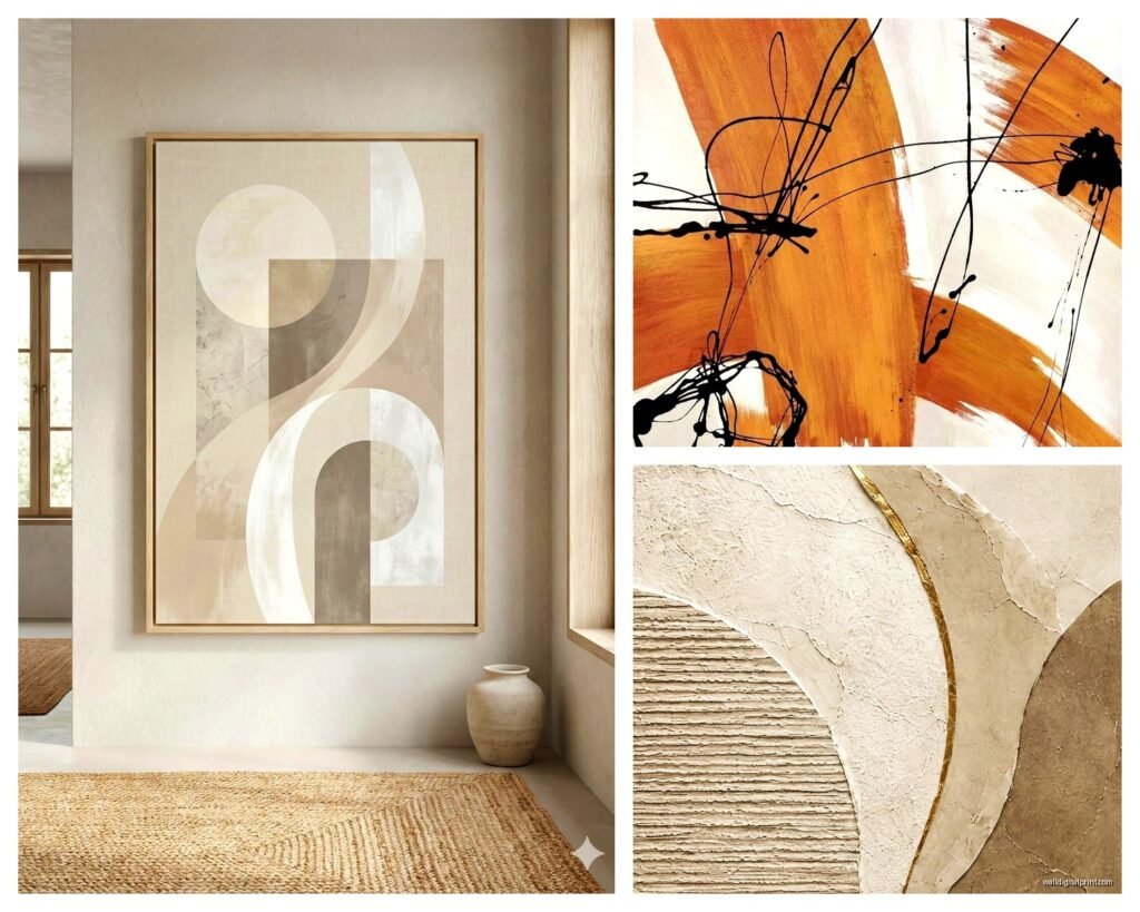
First thing – earth tones doesn’t mean boring brown blobs. I made this mistake in my own living room and had to return two pieces before I figured it out. Earth tones in abstract art means terracotta, sage green, warm grays, cream, ochre, those dusty muted blues that look almost gray. The key is they need to have enough variation in the piece itself. Like if you’re looking at something that’s just three beige rectangles, unless your room is absolutely screaming for minimalism, it’s gonna fall flat.
Sizing Is Everything and Everyone Gets This Wrong
Okay so this is gonna sound obvious but I see people mess this up constantly. Your wall art needs to be big enough. Like actually big enough. I was helping my sister pick something for her dining room last month and she kept gravitating toward these 16×20 pieces and I’m like… that’s gonna look like a postage stamp on that wall.
Here’s what actually works – if you’re putting art above a sofa, it should be roughly two-thirds to three-quarters the width of the sofa. Not the wall, the sofa. So if your couch is 84 inches, you’re looking at something around 50-60 inches wide. You can do a single large piece or a diptych or triptych situation.
For bedroom art above the bed, same rule applies to the headboard width. And please don’t hang it too high – the center of the artwork should be at eye level, which is usually around 57-60 inches from the floor. Unless you’re putting it above furniture, then it should sit about 6-8 inches above the furniture piece.
The Diptych vs Single Piece Debate
I keep going back and forth on this myself. Single large pieces feel more cohesive and modern, but diptychs give you flexibility. I have a two-panel abstract piece in my bedroom that’s mostly warm grays and terracotta with these loose gestural marks, and I love that I can adjust the spacing between panels depending on the wall.
If you go the multi-panel route, keep them close together – like 2-3 inches apart max. I see people spacing them way too far apart and then it just looks like two separate pieces that happen to be near each other instead of one unified artwork.
What Actually Goes With Earth Tone Abstract Art
This is where it gets fun because earth tone neutrals are stupidly versatile. They work with:
- Scandinavian minimalism – obviously
- Mid-century modern furniture
- Bohemian layered textiles
- Contemporary spaces with clean lines
- Even traditional rooms if you pick pieces with more subtle color variations
The trick is matching the energy of the piece to your room. If your space is calm and minimal, look for abstracts with soft color transitions and organic shapes. If your room has more personality – like you’ve got plants everywhere and textured throws and whatever – you can handle abstract pieces with more movement and stronger contrasts within the neutral palette.
I made the mistake of putting this really energetic abstract with bold brushstrokes in my client’s very zen bedroom and it was just… wrong. We swapped it for something with watercolor-style washes in similar colors and suddenly the room worked.
Framing Matters More Than You Think
Okay so funny story, I bought this gorgeous abstract print with terracotta and cream and sage tones, and I put it in this ornate gold frame because I thought it would add interest. It looked terrible. The fancy frame fought with the modern abstract style.
For earth tone modern abstracts, you want:
- Simple wood frames in natural oak, walnut, or maple
- Thin black metal frames for a gallery look
- White or cream frames if your walls are darker
- Or go frameless with a gallery-wrapped canvas
Gallery-wrapped canvas is when the image wraps around the sides of the frame, and you don’t need a traditional frame at all. This works really well for loose, painterly abstracts. But if your piece has defined edges or geometric elements, a frame helps contain it visually.
Where to Actually Find Good Pieces
I’m gonna be real with you – you don’t need to spend thousands. Yes, original art is amazing and I love supporting artists, but for most rooms, high-quality prints work perfectly fine.
Etsy has tons of independent artists selling digital downloads that you can print at your local print shop. Look for files that are at least 300 DPI. I’ve ordered from Printable Wall Decor and Abstract House and both were solid. You download the file, take it to a print shop or use an online service like Printique, and boom – custom art for under $100 usually.
For ready-made options, West Elm has surprisingly good abstract pieces in earth tones. Article does too, though their stuff skews more expensive. Anthropologie if you want something with more texture and personality. Target’s Threshold line sometimes has decent options but it’s hit or miss – I’ve seen some that look cheap in person even though they looked good online.
If you want actual original paintings, check Saatchi Art or Artfinder. You can filter by color palette and size which is incredibly helpful. I found this amazing piece with ochre and charcoal and cream for like $400 that way.
Color Coordination Without Making It Matchy-Matchy
This is where people get nervous. You don’t want your art to exactly match your throw pillows – that looks like you bought everything from the same page of a catalog. But you do want some color conversation happening.
What I do is pick art first, then pull 1-2 colors from it to echo elsewhere in the room. So if your abstract has terracotta, sage, and cream, maybe your curtains are cream, you’ve got a sage throw blanket, and there’s a terracotta pot on the shelf. Not everything needs to match – in fact my living room has navy accents even though there’s no navy in my art, and it works because the overall warmth level is consistent.
The thing about earth tones is they all have similar undertones so they naturally play well together. You can mix warm grays with terracotta with olive green with cream and it just… works. Unlike trying to mix bright colors where you really gotta be careful about undertones.
Texture Is Your Secret Weapon
Flat prints are fine but if you can get artwork with actual texture, it elevates everything. Look for:
- Canvas prints with visible brushstroke texture
- Mixed media pieces with actual paint layers
- Prints on textured paper or canvas
- Original paintings obviously have the most texture
I have this one piece in my hallway that’s technically just a print, but it’s printed on canvas with gel medium layered on top to mimic brushstrokes. From three feet away you genuinely can’t tell it’s not an original painting. Cost me like $150.
Lighting Makes or Breaks It
You can have the perfect piece of art and if your lighting sucks, it’s not gonna look right. Natural light is ideal but not always possible. If you’re putting art on a wall that doesn’t get much natural light, consider adding a picture light or track lighting.
I added these simple LED track lights in my dining room aimed at the abstract piece on that wall and the difference was insane. The colors looked richer, the texture became more visible, the whole thing just popped.
Avoid putting art in direct sunlight though – even prints will fade over time. I learned this the hard way with a piece above my couch that got afternoon sun. After a year the terracotta had faded to this weird peachy color.
My Current Favorite Combinations
Since I’m literally looking at my living room right now while my cat is attacking the corner of the rug… here’s what’s actually working in real life:
Large abstract with rust orange, cream, and charcoal above a gray linen sofa. Cream and rust pillows. Black coffee table. Tons of plants. Jute rug. The art ties it all together without being the loudest thing in the room.
In my bedroom – two-panel abstract that’s mostly soft gray with touches of terracotta and sage. White bedding, natural wood nightstands, sage green throw blanket. One terracotta ceramic lamp. Super calming.
My office has a smaller abstract that’s more geometric – rectangles and lines in taupe, cream, and soft gray-blue. It’s above my desk which is walnut wood, and it adds interest without being distracting when I’m trying to work.
Common Mistakes to Avoid
Don’t buy art that’s too small – I already said this but seriously, everyone does this
Don’t hang it too high – eye level people
Don’t match your art exactly to your pillows or rug, it looks staged
Don’t forget about the space around the art – it needs breathing room
Don’t buy something just because it’s neutral if you don’t actually like it. You’ll resent looking at it every day.
The Actually Practical Shopping Checklist
When you’re about to buy a piece, ask yourself:
- Is it big enough for the wall space I have
- Do the colors have enough contrast and interest
- Does the style match the energy of my room
- Can I see texture or is it completely flat
- Do I actually like it or am I just buying it because it’s safe
That last one is important. Neutral doesn’t have to mean boring. Some of the most interesting pieces I own are earth tone abstracts that have movement and energy and personality. They’re just not screaming at you with bright colors.
Mixing Multiple Abstract Pieces
If you want to do a gallery wall situation with multiple abstracts, keep it cohesive by sticking to a limited color palette. Like all pieces should share at least 2-3 colors even if they’re different styles.
I did this in my hallway – five different abstract pieces in various sizes, all featuring combinations of cream, terracotta, sage, and charcoal. Some are more geometric, some are loose and painterly, but they all talk to each other because of the shared colors.
Space them 2-3 inches apart and try to keep the overall arrangement somewhat balanced. I usually lay everything out on the floor first and take a photo from above to see how it looks before I start putting holes in the wall.
oh and another thing – if you’re renting or don’t want to deal with hanging, there are these great leaning floor easels now. I have a huge 40×60 abstract leaning against the wall in my entryway on one of those simple wood easels and it looks intentional and cool, not like I was too lazy to hang it.
The whole point of earth tone abstract art is that it’s supposed to make your space feel more pulled together and sophisticated without requiring you to commit to bold colors or specific themes. It’s the equivalent of having a really good neutral capsule wardrobe – everything works together, nothing fights for attention, but it still has personality. You just gotta pick pieces that actually speak to you instead of just grabbing whatever beige thing is on sale at HomeGoods.