Wall Art Guide, Wall Art Tutoriels
Vintage Floral Wall Art: Retro Antique Flower Prints
Jun
So I’ve been obsessing over vintage floral prints lately and honestly it started because I found this incredible botanical print at an estate sale for like $12 and now my entire office wall is basically a flower museum. But here’s what I’ve actually learned from styling three different client spaces with these things and redoing my own bedroom twice because I’m apparently incapable of leaving well enough alone.
Finding the Real Deal vs Reproductions
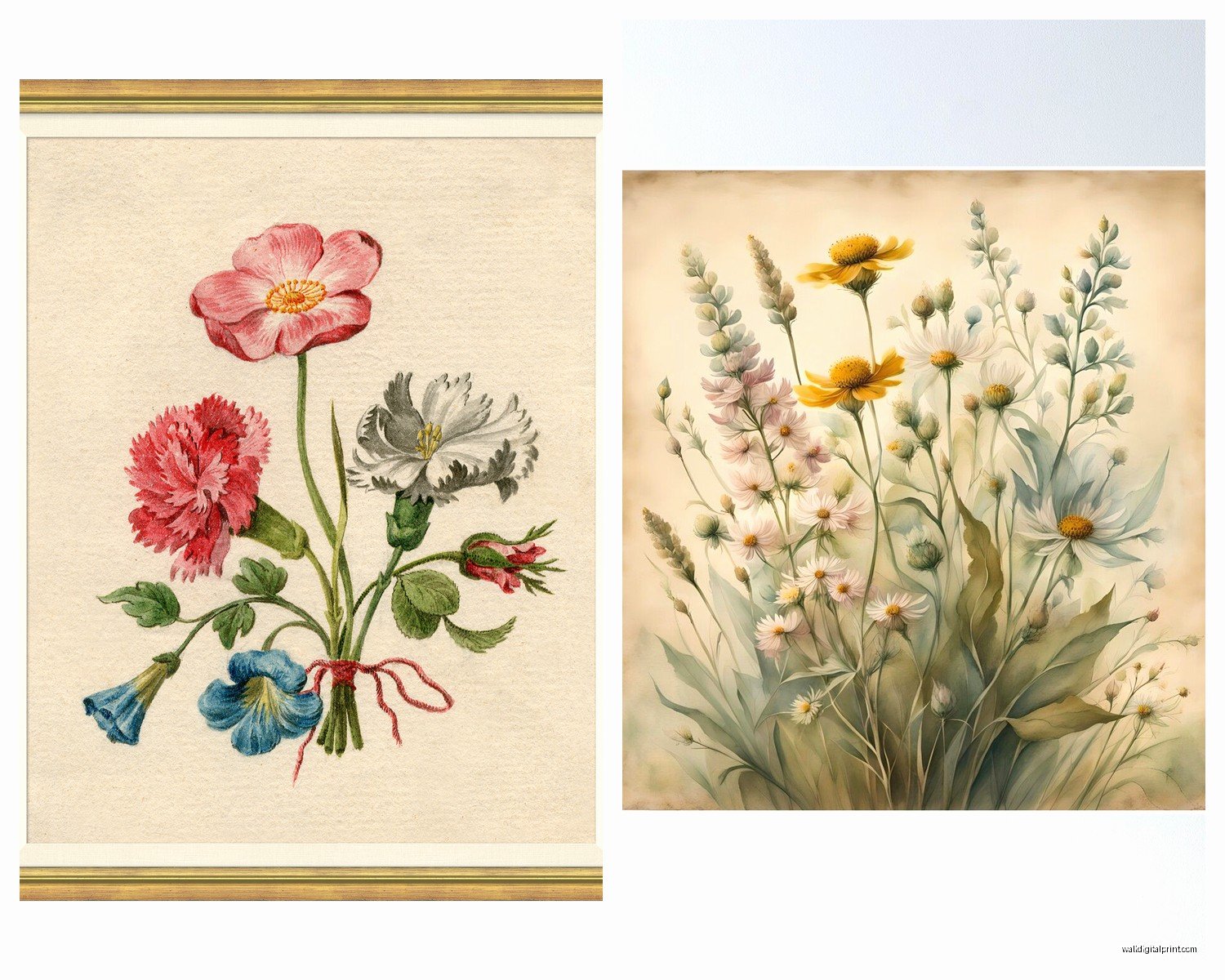
Okay so first thing – you gotta decide if you want actual vintage prints or just vintage-style. I’m gonna be real with you, most of what’s sold as “vintage” on Etsy is reproductions printed last week. Which is totally fine! They’re way cheaper and you don’t have to worry about conservation issues. But if you want the real antique stuff, you’re looking at botanical illustrations from old books, original lithographs, or those amazing chromolithograph prints from the 1920s-40s.
The actual antique prints have this texture to them that you can’t really fake. The paper yellows in specific ways, there’s sometimes foxing (those brown spots that look like freckles), and if you look close the printing technique is different. I bought what I thought was a vintage rose print last month and when it arrived I could literally see the digital printing dots. Returned that so fast.
Where I Actually Shop
Estate sales are honestly the jackpot but you gotta get there early. I set alarms for these now which my boyfriend thinks is ridiculous but whatever, I found a complete set of 1930s iris prints for $40 total and they’re worth like $200 framed. Antique stores obviously, but they’ve caught on so prices are higher. There’s this one shop in my neighborhood that charges $85 for a single unframed botanical and I’m like… I can see the same print on eBay for $25.
Online – eBay is actually great if you search specific terms. Try “antique botanical print,” “vintage chromolithograph flowers,” “1920s garden illustration.” Etsy works but filter by price and read descriptions carefully because so many sellers are vague about whether it’s original or a reproduction.
Styling Different Room Types
Living Rooms
This is where you can go big. I did a whole gallery wall for a client last spring with like 15 different floral prints in mismatched vintage frames and it looked intentional instead of chaotic. The trick is picking one or two colors that repeat across all the prints – we did everything with pink or yellow flowers so even though the styles ranged from Victorian roses to 1960s mod daisies, it held together.
For living rooms I usually go with larger prints, at least 11×14 or bigger. Those tiny 5×7 botanicals get lost unless you’re clustering a bunch together. Oh and another thing – mixing orientations is your friend. Don’t do all vertical or all horizontal. The eye needs variety or it gets boring real fast.
One weird tip that actually works: put one really bold, colorful floral print next to something more muted and detailed like a fern or herb illustration. The contrast makes both look better. I learned this accidentally when I ran out of rose prints and threw in a sage botanical and suddenly the whole wall came alive.
Bedrooms
Bedrooms are tricky because you don’t want it too busy but also not boring? I redid my own bedroom and initially put up these super detailed Victorian rose prints above the bed and I swear it gave me weird dreams. Too much visual information right before sleep apparently.
What works better – softer, more watercolor-y vintage florals or those simple line drawing botanicals from the 1950s. I found a set of four delicate wildflower prints that are just black line drawings with pale pink watercolor washes and they’re perfect. Calming but still interesting.
Size-wise for above a bed, you want something that takes up about 2/3 the width of your headboard. Or do a set of 2-3 prints that together equal that width. I see people put tiny prints above queen beds all the time and it looks like a mistake.
Kitchens and Dining Areas
This is gonna sound weird but herb and vegetable flower prints are absolutely perfect for kitchens and everyone sleeps on them. Like yes, tomato plants have flowers! Pea blossoms are gorgeous! I have a vintage print of blooming herbs in my kitchen and people always comment on it.
For dining rooms I go romantic – big cabbage roses, peonies, those lush garden flower prints. There’s something about eating dinner surrounded by flowers that feels fancy without trying too hard. Just make sure they’re behind glass because food splatters are real and trying to clean a 90-year-old paper print is not fun (learned that one the hard way with a grease splatter incident I don’t wanna talk about).
Framing and Hanging
Okay so this is where people mess up constantly. You find a beautiful vintage print and then put it in some cheap modern black frame from Target and it looks… wrong. The frame matters SO much.
Frame Styles That Actually Work
Vintage wood frames are ideal but they’re expensive. I hunt for them at thrift stores – you can find them for $5-15 if you’re patient. Even if the frame is ugly, if it’s real wood you can paint it. I’ve painted frames white, cream, sage green, even navy. Just use chalk paint or regular acrylic and don’t overthink it.
If you’re buying new frames, look for ones with some texture or detail. Those thin metal frames from the 1960s-70s work great with botanical prints. Or simple wood frames in warm tones like oak or walnut.
Mat boards – yes you need them. A vintage print without matting looks cramped and weird. I usually do cream or off-white mats, sometimes gray for more modern spaces. The mat should be at least 2-3 inches wide on all sides. My cat knocked over a print last week and honestly the mat is what kept the paper from tearing so there’s that practical benefit too.
Actually Hanging Them
Gallery walls sound intimidating but here’s my cheat method: lay everything out on the floor first. Take a picture. That’s your map. Start with the center piece and work outward.
For spacing, I do about 2-3 inches between frames. Closer than that looks crowded, further apart looks disconnected. And please use a level, I’ve seen so many almost-perfect gallery walls ruined by one tilted frame that throws everything off.
Command strips work fine for lightweight frames under 5 pounds. Anything heavier needs real picture hangers. I learned this when a frame crashed down at 3am and scared me so badly I thought someone broke in.
Color Coordinating and Mixing Styles
So you don’t have to match everything perfectly and actually it looks better if you don’t. I mix Victorian botanicals with 1950s seed packet illustrations with 1970s flower photography prints and it works because I’m intentional about color.
Pick a color story. Maybe it’s all pastels – pink roses, lavender irises, pale yellow daisies. Or maybe it’s all bold – red poppies, orange marigolds, deep purple violets. Or my personal favorite, all white and cream flowers which sounds boring but looks incredibly elegant.
You can totally mix color and black-and-white prints too. I did a client’s hallway with mostly sepia-toned botanical illustrations and then added one full-color peony print as a focal point. Gives the eye somewhere to land.
Style Mixing That Works
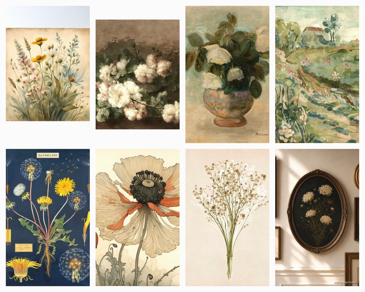
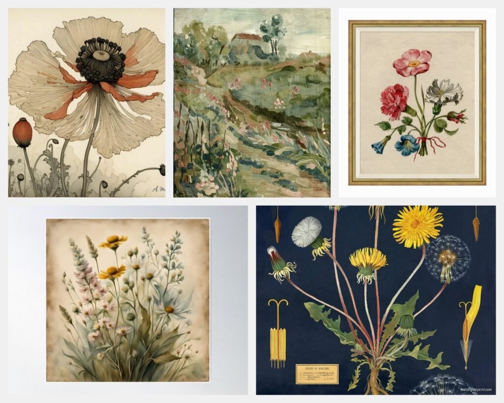
Victorian botanical illustrations (super detailed, scientific looking) + 1920s art nouveau florals (curvy, decorative) = works great
Mid-century modern flower prints (simplified shapes, bold colors) + contemporary minimalist florals = surprisingly good
Vintage seed packet labels + antique garden book illustrations = cottage core perfection
What doesn’t really work – mixing ultra-realistic photography with simple line drawings. The styles are too different and your brain gets confused looking at them together.
Caring for Actual Antique Prints
If you invest in real vintage prints you gotta take care of them properly. UV-protective glass is non-negotiable if they’re in direct sunlight. I didn’t do this initially and watched a beautiful 1930s rose print fade over like six months. So annoying.
Don’t hang them in bathrooms or anywhere super humid. The paper will warp and mold. Also not near heat vents. Basically treat them like the old paper they are – stable temperature, not too much light, moderate humidity.
If you get prints with foxing or age spots, you can have them professionally cleaned but it’s expensive, like $50-100 per print. Sometimes I just lean into the aged look. A few brown spots add character honestly, unless it’s really bad.
Budget Breakdown
Since you’re probably wondering what this actually costs:
Reproductions: $8-25 unframed (Etsy, online print shops)
Real vintage prints: $15-100+ depending on rarity and condition
Frames: $10-40 each if you’re thrifty, $50-150 for nice vintage ones
Professional framing: $75-200 per piece (honestly skip this and DIY)
UV protective glass: adds about $30-50 per frame
I’ve done entire gallery walls for under $200 by buying reproduction prints and thrifting frames. I’ve also spent $500 on a single rare botanical print because I fell in love with it and apparently have no self-control when it comes to 1920s iris illustrations.
Common Mistakes I See All the Time
Hanging prints too high – the center of your art should be at eye level, which is roughly 57-60 inches from the floor. I see people mount things like six feet up and you gotta crane your neck to see them.
All same-size frames in a grid – this can work but often looks too rigid for vintage florals. Varying sizes feels more collected and organic.
Ignoring the rest of the room – your floral prints should complement your existing colors and style. I had a client insist on pink rose prints in a room with orange and brown decor and it looked… not good.
Too many different frame colors – pick 2-3 max. Like all gold, or mix of white and natural wood, or black and brass. More than that gets chaotic.
Unexpected Places for Floral Prints
Okay so beyond the obvious walls, I’ve put vintage florals in some random spots that worked surprisingly well:
Leaning on shelves – just prop smaller framed prints on bookshelves between books. Adds visual interest and you can swap them out easily.
Inside glass-front cabinets – put a print behind your dishes or glasses. Creates a pretty backdrop.
On a dresser or nightstand with a small easel – I do this instead of a table lamp sometimes.
In the bathroom – IF you use reproduction prints and frame them with plastic fronts instead of glass. The humidity will destroy real vintage paper but a $10 print is replaceable.
Wait I forgot to mention – you can also scan vintage prints and print them larger or smaller to fit specific spaces. I’ve done this with botanical illustrations from old books. Just make sure the resolution is high enough, at least 300 dpi or it’ll look pixelated.
Seasonal Swapping
This is extra but I actually change out some prints seasonally and it’s easier than you’d think. I have spring florals (tulips, daffodils, cherry blossoms), summer (roses, peonies, wildflowers), fall (chrysanthemums, dahlias), and winter (evergreen branches, winter berries, amaryllis).
I don’t swap everything, just a few key pieces. Keeps things feeling fresh without spending money constantly. Store the off-season prints flat in an art portfolio or in the original frames stacked carefully in a closet.
The best part about vintage floral prints is they work with basically every decor style if you frame and arrange them right. I’ve used them in modern minimalist spaces, traditional rooms, bohemian bedrooms, even industrial lofts. They add that organic, timeless element that grounds a space without being too literal or theme-y.
Just start with one or two prints you genuinely love and build from there. Don’t try to do a whole gallery wall in one day because you’ll second-guess everything and end up with a bunch of nail holes to patch. Ask me how I know.