Wall Art Guide, Wall Art Tutoriels
Modern Islamic Wall Art: Contemporary Arabic Calligraphy
Jun
So I’ve been obsessing over modern Islamic wall art lately and honestly it’s completely changed how I think about gallery walls. Like, I used to default to the same abstract prints everyone has but then a client asked me to source some contemporary Arabic calligraphy and I went down this whole rabbit hole.
Why This Works When Other Wall Art Doesn’t
The thing about modern Islamic calligraphy is it hits this sweet spot between meaningful and minimalist. You’re not gonna get that generic “Live Laugh Love” vibe because the script itself is just… visually stunning? Even if you can’t read Arabic, the flow of the letters creates these organic shapes that work with literally any design style. I’ve put pieces in Scandinavian-minimal apartments and maximalist boho spaces and they just adapt.
My favorite discovery was that you don’t need to be Muslim or speak Arabic for this to work in your space. I had this whole conversation with my friend Layla about cultural appreciation versus appropriation and she basically said if you’re displaying it respectfully and you actually care about what it says, you’re good. Just maybe don’t put Quranic verses in your bathroom, you know?
The Different Styles You’ll Actually See
Okay so there’s traditional calligraphy which is gorgeous but can feel really formal. Then there’s this contemporary movement that’s more… I don’t even know how to describe it. Deconstructed? Artists are taking classical Arabic scripts and making them abstract or geometric or combining them with modern design elements.
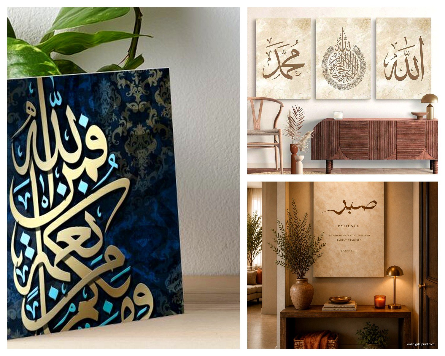
Kufic Style Goes Modern
Kufic is the angular one, super geometric. Modern artists are doing incredible things with it because it naturally lends itself to that clean, architectural look. I found this piece last month that was just the word “sabr” (patience) in Kufic script but the artist had turned it into this interlocking pattern that looked like a maze. Hung it in a lawyer’s office and it completely elevated the whole space.
The cool thing about Kufic is it reads as contemporary even though it’s one of the oldest Arabic scripts. People always think it’s some cutting-edge geometric design until you tell them it’s actually text.
Thuluth and Naskh for Flow
These are the curvy, flowing scripts. Thuluth is the fancy one you see in mosques, and modern artists are isolating single words or phrases and blowing them up to massive scale. I’m talking like 4 feet wide. The negative space becomes as important as the letters themselves.
Naskh is more readable, less ornate. It’s what most printed Arabic uses. Contemporary pieces in Naskh feel cleaner, almost Scandinavian in their simplicity.
What to Actually Buy and Where
Oh and another thing, sourcing this stuff is half the battle. Etsy has a ton but quality is all over the place. I’ve ordered probably 30 pieces this year for various projects and here’s what I’ve learned:
Look for artists who actually understand the calligraphy. There are people just running Arabic text through design software and it shows. The letterforms look… off. Like when someone who doesn’t speak a language gets a tattoo and the characters are backwards.
My go-to shops:
- Artists on Instagram who ship prints directly – honestly the best quality and you can often commission custom sizes
- Etsy shops run by actual calligraphers (check their about section, look for mentions of training in classical calligraphy)
- West Elm and CB2 occasionally have pieces but they’re hit or miss
- Local Islamic cultural centers sometimes have gift shops with incredible prints
Price-wise, expect to pay $50-150 for a quality print, $200-500 for original work from emerging artists, and like… thousands for established names. I got a stunning piece by a Jordanian artist for $180 that looks like it should cost five times that.
Digital Prints vs Originals
This is gonna sound weird but I actually prefer high-quality digital prints for most spaces. Original calligraphy on paper is beautiful but it’s delicate, needs special framing, the whole thing. A giclée print on cotton rag paper gives you 90% of the impact with way more durability.
That said, if you find an original you love and can afford it, do it. There’s something about seeing the actual pen strokes, the slight variations in ink density.
Sizing and Placement That Actually Works
So here’s where people mess up – they buy a piece they love and then have no idea where to put it or what size to get. I literally made this mistake in my own bedroom last year, bought this gorgeous print that was way too small for the wall I had in mind.
The Scale Rule I Actually Follow
Your art should take up 60-75% of the furniture width below it. So if you’ve got a 6-foot sofa, you want your art (or gallery wall) to span about 3.5-4.5 feet. For Islamic calligraphy specifically, I tend to go bigger because the negative space is part of the design. A piece that feels too large will usually look perfect once it’s up.
Single large-scale pieces work better than gallery walls for this style, honestly. The whole point is the elegance of the script, and when you cluster too many pieces together it can feel chaotic. Unless you’re doing a very intentional collection of the same artist or style.
Where to Hang What
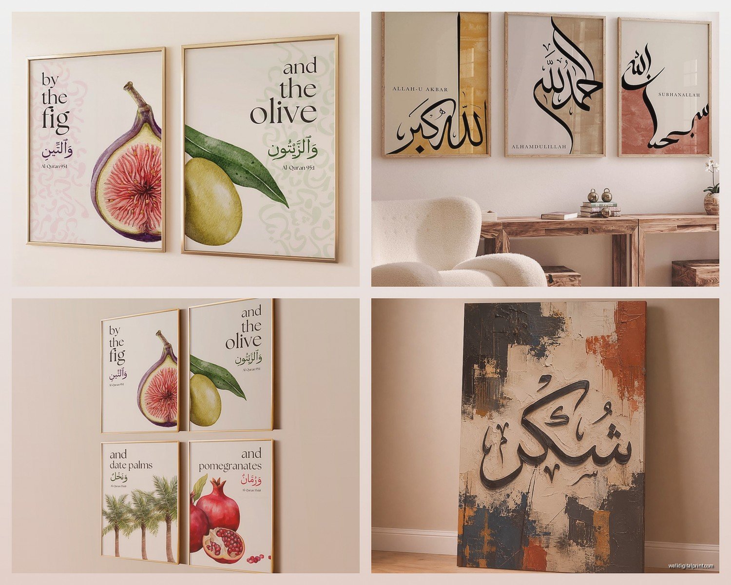
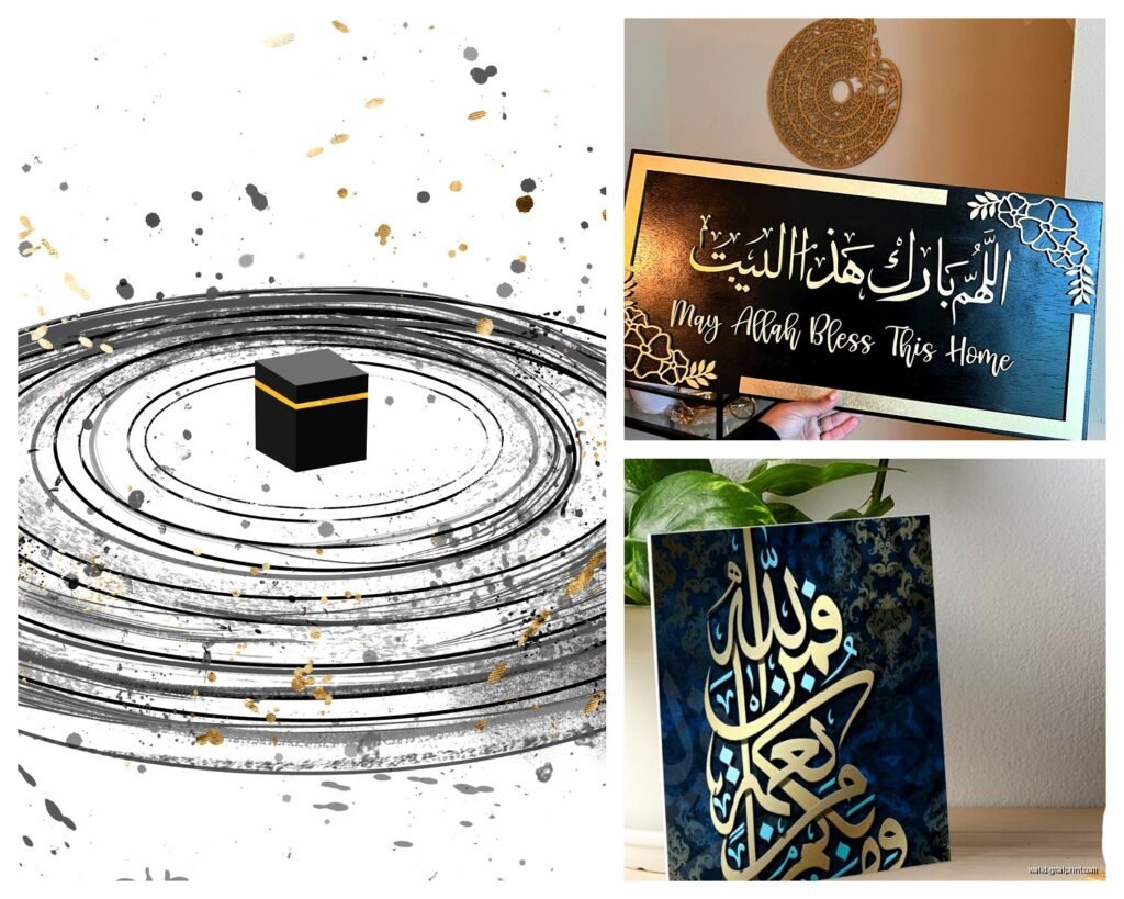
Living room: Go bold. This is where you want your statement piece, something with a meaningful phrase like “bismillah” or “alhamdulillah” or even just a word like “peace” or “joy” in Arabic. Above the sofa is obvious but also consider a large piece on the wall opposite your entry so it’s the first thing you see.
Bedroom: I love softer phrases here. “Salam” (peace) or “sukoon” (tranquility). Keep the style minimal and the color palette calm. My bedroom has this incredible piece that’s just “rest” in barely-there gray Thuluth script on cream paper.
Dining room: Honestly? Quranic verses about gratitude or hospitality work beautifully here if that’s your thing. Or words related to gathering and community. I did a dining room last month with “ta’am” (food) in this playful modern style and everyone asks about it.
Office or study: Motivational words without being cheesy. “Ilm” (knowledge), “sabr” (patience), “tawakkul” (trust/reliance on God). These read as sophisticated, not like you’re trying to hustle-culture yourself to death.
Wait I forgot to mention – bathrooms and kitchens get tricky with religious text. If you’re gonna put Islamic calligraphy in these spaces, stick to non-religious words or consult with someone knowledgeable about what’s appropriate. Just being respectful, you know?
Color and Frame Choices That Don’t Overthink It
My cat literally just knocked over my coffee while I’m writing this, anyway…
Color-wise, black on white is classic and works everywhere. But don’t sleep on:
- Navy or deep teal on cream – adds sophistication without being stark
- Gold leaf accents if your space can handle it (works surprisingly well in modern spaces, not just traditional)
- Reverse – white or cream script on charcoal or black background for drama
- Earth tones – terracotta, sage, warm grays mixed with metallic
Frames should basically disappear. Simple wood or metal, nothing ornate unless your whole space is ornate. I default to thin black metal frames or light oak for almost everything. The calligraphy is the star, the frame is just there to protect it.
Matting Matters More Than You Think
Okay so this is boring but important – mat your prints with at least 2-3 inches of border, more for larger pieces. Islamic calligraphy needs breathing room. The negative space around the letters is intentional, and a tight frame kills that.
I usually do white or cream mats, sometimes a subtle accent color that pulls from the room. But honestly white is safe and lets the art do its thing.
Mixing It With Other Art Styles
This is where it gets fun. You’d think Arabic calligraphy would only work in a Middle Eastern-inspired space but that’s so wrong. I’ve mixed it successfully with:
Scandinavian minimal: The clean lines of modern calligraphy fit perfectly with Nordic design. Stick to black and white pieces, simple frames, lots of negative space.
Boho eclectic: Go for more ornate scripts, mix with botanical prints and woven textiles. Gold accents work here.
Industrial loft: Large-scale pieces with architectural Kufic script, black frames against exposed brick. Chef’s kiss.
Contemporary glam: Metallic calligraphy pieces, lucite frames, pair with abstract art in similar color palettes.
The key is treating it like any other art – consider the style, color, and scale in relation to your space. It’s not “exotic” or “ethnic” decor, it’s contemporary art that happens to use Arabic script.
Understanding What the Words Mean
So this feels important – know what your art says. I keep a running list of common words and phrases because clients always ask:
- Bismillah – “In the name of God” (super common, beautiful script)
- Alhamdulillah – “Praise be to God” (gratitude)
- Sabr – “Patience”
- Tawakkul – “Trust/reliance on God”
- Salam – “Peace”
- Nur – “Light”
- Haqq – “Truth”
- Rahma – “Mercy/compassion”
Most artists will tell you what the piece says in the description. If they don’t, ask. You don’t wanna be that person who hung something that says “toilet” thinking it was profound. (I’ve seen it happen, not gonna lie.)
DIY Framing vs Professional
I go back and forth on this. Standard sizes (16×20, 18×24, 24×36) you can totally frame yourself with ready-made frames from Michaels or IKEA. Use proper mat board though, not the flimsy stuff.
For anything custom-sized or really special, just pay for professional framing. It’s expensive but the difference is noticeable. They’ll use museum glass that reduces glare and UV protection, proper archival materials, the mounting is perfect. Worth it for pieces you really love.
Oh and another thing – if you’re buying from an Etsy seller who offers framing, sometimes that’s the easiest option. They frame it, ship it ready to hang, you’re done.
Lighting These Pieces Properly
This is something I see people ignore and it makes such a difference. Islamic calligraphy has all these subtle details – the thickness variations in the strokes, the negative space, sometimes metallic accents. Bad lighting flattens everything.
Picture lights are my favorite for single large pieces. Those little LED bars that mount above the frame. They create this gallery effect and really make the art pop at night.
For gallery walls, track lighting or adjustable ceiling spots let you direct light exactly where you need it. Avoid overhead lighting that creates glare on the glass.
And honestly? Natural light is gorgeous for these pieces during the day. Just make sure you’ve got UV-protective glass if the piece is in direct sun, otherwise the paper will fade.
The Unexpected Places These Work
Okay so funny story – I put a large-scale calligraphy piece in a client’s mudroom and it completely transformed the space from forgettable to memorable. Something about seeing beautiful art in an unexpected place makes people pause.
Hallways are perfect for a series of smaller pieces. Staircase walls. Above built-in shelving. That awkward wall space in open floor plans where you can’t fit furniture.
I even did a powder room (non-religious text, just the word “bloom” in Arabic) with a tiny dramatic piece and guests always comment on it.
Building a Collection Over Time
You don’t need to do this all at once. I started with one piece I loved and added slowly. Now I have probably 15 pieces in my own home and I rotate them seasonally because I’m extra like that.
Start with one statement piece for your main living space. Live with it. See how it makes you feel. Then add complementary pieces in other rooms. You’ll start to figure out which styles and scripts you’re drawn to.
Follow calligraphy artists on Instagram, save posts you love, notice patterns in what appeals to you. I have a whole folder on my phone of saved Islamic art posts that I reference when sourcing for clients or myself.
The nice thing about this style is it doesn’t go out of fashion. It’s been relevant for over a thousand years, it’ll outlast whatever design trend is currently happening.
Anyway that’s basically everything I’ve learned through trial and error and way too many hours browsing art. Start with one piece you genuinely connect with, don’t overthink the “rules,” and just see how it feels in your space.