Wall Art Guide, Wall Art Tutoriels
Whimsical Wall Art: Playful Fanciful Imaginative Designs

Jun
So I’ve been totally obsessed with whimsical wall art lately and honestly it started because a client asked me to make her daughter’s playroom “fun but not babyish” and I went down this rabbit hole of playful wall designs that actually work in grown-up spaces too.
What Actually Counts as Whimsical
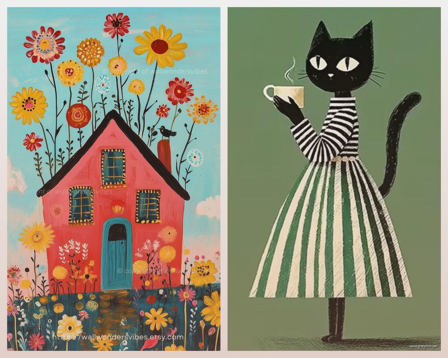
Okay so whimsical doesn’t mean childish, which is what everyone gets wrong. It’s more about unexpected elements and a sense of play. Like I found this print of a fox wearing a crown at this local art market and it’s technically an animal illustration but something about the expression and the watercolor style made it feel sophisticated and quirky at the same time. That’s the vibe you’re going for.
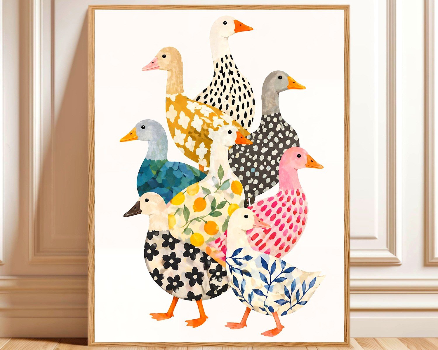
Think illustrations that have a storybook quality, abstract shapes that don’t take themselves seriously, vintage botanical prints but the weird ones with insects, typography that’s a bit wonky, animals doing human things but in an artistic way not a cartoon way. You know what I mean?
Where to Actually Find Good Pieces
My go-to spots have changed so much. I used to just hit up the usual big box stores but the quality was so hit or miss and everything looked the same.
Etsy is honestly your best friend for this. I know everyone says that but specifically look for shops that do digital downloads because you can print them at your own size and frame them however you want. I’ve gotten amazing stuff from illustrators in the UK and Australia. Search terms that actually work: “whimsical line art,” “playful botanical,” “quirky animal portrait,” “fanciful illustration.” The algorithm is weird so you gotta play around with it.
Society6 and Redbubble have independent artists too but the print quality can be inconsistent. I ordered this gorgeous cloud illustration from Society6 and the colors were way more saturated than the preview, which actually worked out but could’ve been a disaster.
Local art fairs and markets are where I find the most unique stuff. There’s an artist in my city who does these mixed media pieces with vintage book pages and botanical drawings and they’re just… chef’s kiss. Plus you can actually see the piece in person which matters more than you’d think.
Oh and thrift stores for vintage prints. I found a set of 1960s mushroom illustrations at Goodwill for like twelve dollars and framed them in simple black frames and they look insanely expensive.
Mixing Styles Without Looking Chaotic
This is where everyone freaks out because whimsical pieces are already pretty bold. But here’s what I’ve learned from trial and error, mostly error honestly.
Pick a color story first. Even if your pieces are all different styles and subjects, having a cohesive color palette ties everything together. I did a gallery wall in my own hallway with totally random whimsical prints but they’re all in shades of blue, cream, and rust. There’s a hot air balloon, a vintage bird, some abstract wavy lines, and a quirky face illustration. Shouldn’t work but it does because of the colors.
Frame consistency helps a ton. You can mix gold and wood frames but I’d stick to two frame colors max. All the same frame style is actually the easiest way to make mismatched art look intentional. IKEA’s RIBBA frames are boring but they work and they’re cheap enough that you can buy a bunch without feeling guilty.
Size variation matters but don’t go too crazy. I like having one or two larger anchor pieces and then smaller ones around them. Going from a massive 24×36 to a tiny 5×7 looks weird unless you’re doing something really specific.
The Rule I Actually Follow
At least one element should repeat across pieces. Could be a color, could be a style element like line drawings, could be a theme like all nature-based even if one’s a mushroom and one’s a mountain. Something needs to connect them or your eye doesn’t know where to land.
Placement Stuff That Actually Matters
Okay so everyone says “hang art at eye level” which is like… whose eye level? I’m 5’4″ and my husband is 6’1″ so that’s not helpful. The actual rule I use is center the piece or gallery wall so the middle point is about 57-60 inches from the floor. That’s museum standard and it actually does look right in most spaces.
For gallery walls, and this is gonna sound tedious but just do it, cut out paper templates of all your frames and tape them to the wall first. Move them around until it looks right. I use painter’s tape and old wrapping paper. My cat tries to attack the paper every time which is annoying but also hilarious.
Start with your largest piece first and build around it. Or if you’re doing a symmetrical arrangement, start from the center and work outward. I learned this the hard way after putting seventeen nail holes in my dining room wall trying to make a gallery work.
Leave 2-3 inches between frames in a gallery wall. Closer than that looks cramped, farther looks disconnected. I literally measure this with a small notebook I keep around because eyeballing it never works.
Rooms That Work Best
Honestly whimsical art can go anywhere but some spaces are easier than others.
Living rooms: Over the sofa is obvious but it works. I like doing a large-scale whimsical piece here, something that can hold its own. Abstract shapes in playful colors, an oversized botanical, a quirky landscape. Keep it relatively simple because living rooms usually have a lot going on already.
Bedrooms: This is where you can get really personal and weird with it. I have a print above my bed of a woman’s face made entirely of flowers and it’s strange but I love looking at it. Guest bedrooms are perfect for whimsical pieces that might be too bold for main spaces. Nobody’s gonna judge your cloud collection in the guest room.
Hallways and staircases: Gallery wall heaven. Seriously these spaces are made for collections of smaller whimsical prints. I did a staircase wall with vintage circus posters mixed with modern line drawings and it makes going upstairs way more interesting.
Bathrooms: Okay hear me out. Small whimsical prints in bathrooms are adorable and unexpected. Vintage botanical prints, quirky fish illustrations, abstract water-themed pieces. Just make sure they’re properly sealed or under glass because humidity is real.
Home offices: This is where I go all in on playful stuff because why should work spaces be boring? I have a whole wall of mismatched vintage book covers and whimsical typography prints and it makes Zoom calls more interesting.
DIY Options That Don’t Look DIY
Sometimes you want something specific that doesn’t exist or you’re on a budget and I get it.
Frame fabric or wallpaper samples. Sounds random but whimsical patterned fabric in a nice frame looks like expensive art. I did this with some Rifle Paper Co fabric scraps and people always ask where I bought the prints.
Kids’ book pages. Vintage children’s books from thrift stores have amazing illustrations. Take out the pages you love, mat them nicely, frame them. Instant whimsical art collection. Just don’t destroy anything valuable obviously.
Print your own from digital downloads. I use a local print shop that does high-quality prints on nice paper stock for way less than buying pre-made art. The quality is better than printing at home unless you have a really good printer.
Paint your own abstract shapes. Even if you’re not artistic, you can do simple abstract shapes in fun colors. I made three canvases with just wavy lines and dots in different color combos and they look intentional and playful. Took like an hour total while watching TV.
Lighting Makes Such a Difference
Nobody talks about this enough but lighting completely changes how whimsical art reads in a space. Natural light is obviously ideal but not always possible.
Picture lights are expensive but worth it for special pieces. The warm glow makes colors pop and adds drama. I installed one over a large whimsical landscape in my dining room and it went from nice to wow.
If you can’t do picture lights, just make sure you have good ambient lighting in rooms with art. I added a floor lamp near a gallery wall that wasn’t getting enough light and it made such a difference. Oh and another thing, avoid direct sunlight on prints because fading is real and sad.
The Matting Question
White mats are classic and safe. They work with almost everything and make pieces look more expensive. But for whimsical art, colored mats can be really fun. I did cream mats for some vintage botanical prints and it made them feel warmer and more cohesive.
Custom matting is pricey but standard sizes are affordable. Most frame shops have pre-cut mats in common sizes. If your print is an odd size, you can sometimes trim it to fit a standard mat rather than paying for custom cutting.
Mistakes I’ve Made So You Don’t Have To
Going too literal with themes. I tried to do an all-animal whimsical wall once and it looked like a zoo exploded. Mixing subjects works better.
Buying art that’s too small for the space. That tiny 8×10 over your king-size bed looks lost. Scale matters so much. When in doubt, go bigger.
Not considering the undertones in colors. I bought what I thought was a blue print but it was actually really purple-toned and clashed with everything in the room. Look at art in the actual room lighting before committing if possible.
Hanging things too high. I’ve done this so many times. It’s better to go slightly lower than you think than too high. Too high looks like the art is floating away.
Forgetting about furniture clearance. Don’t hang art so low that it hits the back of your sofa or headboard when you move things. Leave at least 4-6 inches between furniture and the bottom of the frame.
Budget Real Talk
You don’t need to spend a fortune. Some of my favorite pieces cost under twenty dollars. Mix expensive investment pieces with affordable prints and nobody can tell the difference once they’re framed nicely.
Thrift store frames are your friend. Replace the ugly art with prints you actually like. I’ve found gorgeous vintage frames for a few bucks that would cost hundreds new.
Print shops often have sales. I follow local print shops on Instagram and they’ll post discount codes pretty regularly. Also check for student discounts if you’re in school.
Start small and build over time. You don’t need a complete gallery wall on day one. I’ve been adding to my hallway collection for three years and it’s still not “done” but that’s part of the charm.
Making It Feel Intentional Not Random
The difference between whimsical and chaotic is intention. Even playful art needs some structure.
Create balance without symmetry. If you have a bold piece on one side, balance it with visual weight on the other side, even if they’re totally different pieces.
Repeat elements throughout the room. If you have whimsical art with lots of blue, echo that blue in a throw pillow or vase. Connects the art to the space.
Leave some breathing room. Not every wall needs art. Negative space makes the whimsical pieces you do have feel more special.
Anyway I gotta go because I’m supposed to meet a friend for dinner but hopefully this helps? The main thing is just start with pieces you genuinely love and build from there. Whimsical art should make you smile when you look at it, that’s literally the whole point.