Wall Art Guide, Wall Art Tutoriels
Green Abstract Wall Art: Nature Modern Non-Representational
Jun
So I’ve been obsessing over green abstract pieces lately and honestly it started because this client wanted “something nature-y but not like… a tree” and I fell down this whole rabbit hole of non-representational work that still feels organic.
The thing with green abstracts is they’re tricky because green can go really wrong really fast. Like you don’t want it looking like someone just smeared grass clippings on canvas, but you also don’t want it so modern that it feels cold. I’ve been testing different placements and let me tell you what actually works.
Why Green Abstract Even Works in the First Place
Okay so green is this weird color that our brains are literally wired to find calming because evolution or whatever, but in abstract form it does something different than like, a landscape painting. When it’s non-representational, your brain doesn’t try to identify “oh that’s a forest” or “that’s leaves” – it just processes the color and movement. Which means you get all the psychological benefits of green without it feeling too literal or cottagecore.
I tested this theory in my own bedroom actually, swapped out this blue geometric piece for a green abstract with these flowing shapes, and I swear I started sleeping better? Could be placebo but also my Fitbit data backed it up so there’s that.
The Different Types You’ll Actually Encounter
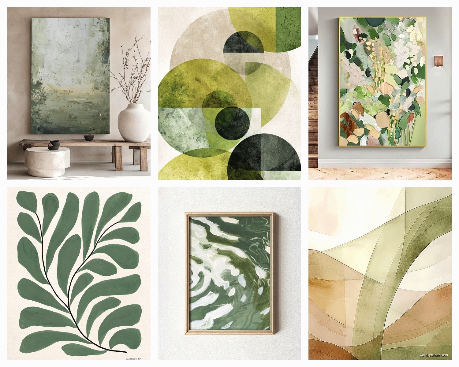
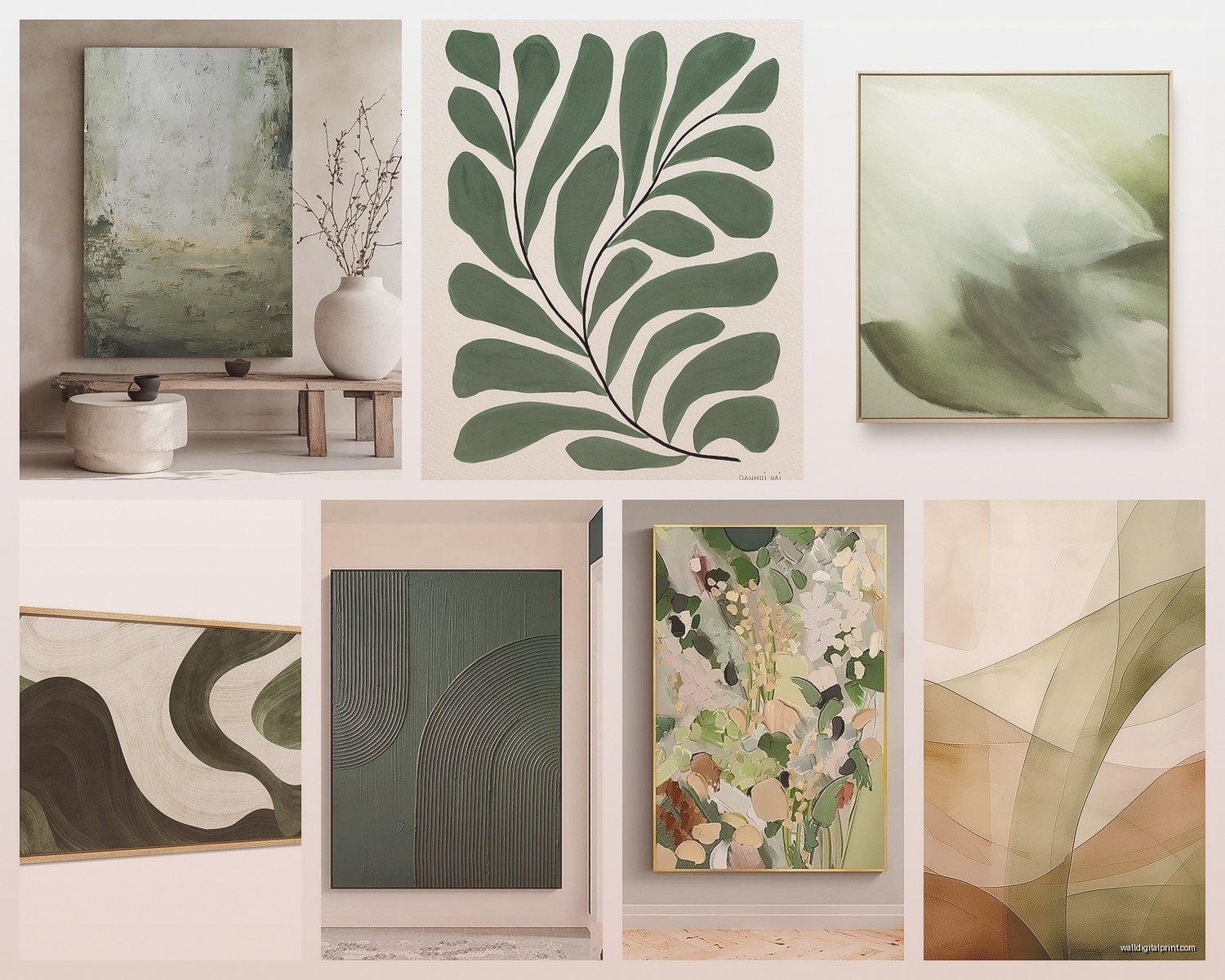
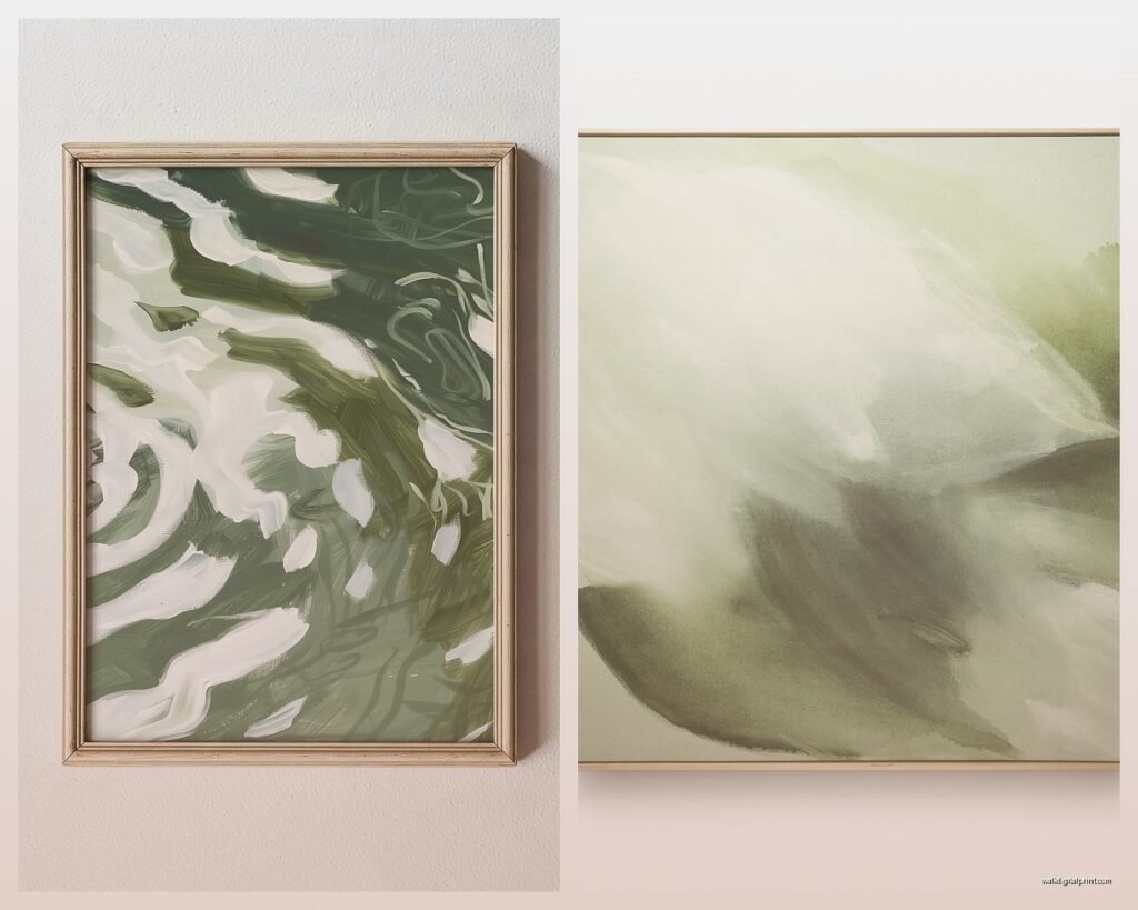
Gestural Green Abstracts
These are the ones with visible brushstrokes, lots of movement, kinda looks like someone was having feelings while painting. They work best in spaces where you want energy – I put one in a home office and it keeps things from feeling too corporate. Look for pieces where the green isn’t flat, where you can see layers and texture. The cheap ones will just be one coat of paint and they look… flat. You want depth.
Oh and another thing – gestural pieces need space around them. Don’t crowd them with other art or they lose their impact. I made that mistake in my living room and it just looked chaotic until I moved the other frames away.
Color Field Green Pieces
These are more about blocks of color, very minimal, less about movement and more about… presence? They’re having a moment right now because people are so overstimulated. I have one that’s basically three shades of green in horizontal bands and it’s the most commented-on piece in my apartment, which is weird because it’s so simple.
These work in bedrooms, meditation spaces, anywhere you want calm. But here’s the catch – they need good lighting. In dim light they just disappear into the wall. I learned this the hard way when a client called me saying the expensive piece I helped them pick looked “like nothing” and turns out they had it in a hallway with terrible lighting.
Organic Shape Abstracts
Think like… blob-ish shapes, curves, things that suggest natural forms without being them. These are my favorite for bridging modern and natural aesthetics. They work in literally any room because they’re interesting enough to look at but not so aggressive that they dominate.
The key is finding ones where the composition is actually good, not just random shapes. I look for pieces where the negative space (the parts that aren’t green) is as intentional as the shapes themselves.
Size and Scale Because Everyone Gets This Wrong
So here’s what I tell people – go bigger than you think. That piece you think is “kinda big” is probably perfect. The piece you think is perfect is probably too small. I’ve had to have this conversation like fifty times this year alone.
For over a sofa, you want the art to take up about 2/3 to 3/4 of the sofa width. Not the wall width, the sofa width. I see people buying these tiny 16×20 pieces for above a 7-foot sofa and it’s just… no. You want something like 48-60 inches wide minimum.
In a bedroom, above the bed, same rule applies. Although I actually prefer slightly smaller in bedrooms because you’re lying down looking at it and if it’s too big it can feel overwhelming. Like 36-48 inches wide usually hits right.
Wait I forgot to mention – if you’re doing a gallery wall of green abstracts (which can look amazing btw), the total collection should follow that 2/3 rule. So measure the whole grouping, not individual pieces.
The Living Room Situation
Living rooms are where green abstracts really shine because they can tie together so many different elements. If you’ve got plants (and who doesn’t right now), a green abstract creates this cool dialogue between the living plants and the artistic representation of… greenness? That sounds pretentious but you know what I mean.
I usually go large scale here – like 40×60 or bigger if the wall can handle it. And here’s something weird but it works – hang it slightly lower than you think. The center of the piece should be at eye level when you’re seated, not standing. Because that’s how you’ll actually be viewing it most of the time.
My cat knocked over a plant while I was arranging a client’s living room last week and it made me realize the art was too high because I’d been standing while planning the placement. Had to move it down 4 inches.
Pairing Green Abstracts with Other Colors
This is where people get nervous but it’s actually pretty forgiving. Green abstracts with warm wood tones – chef’s kiss. The combination feels expensive without trying too hard. I have this piece with sage and forest green against my walnut credenza and people always ask if I hired a designer. (I mean I am one but they don’t know that when they ask.)
With white walls, any green abstract works. That’s the easy mode. But don’t sleep on colored walls – green abstracts on dusty rose or terracotta walls are having a moment. The contrast makes both elements pop.
Navy or charcoal walls with bright green abstracts? Very dramatic, very moody, not for everyone but when it works it WORKS. I did this in a dining room and the clients were scared at first but now they throw dinner parties specifically to show it off.
The Whole Undertone Thing
Okay so funny story – I once spent an entire Saturday returning art because I didn’t pay attention to undertones. Green comes in warm (yellow-based) and cool (blue-based) and they do different things in a space.
Warm greens feel more energetic, more spring-like. They work with brass fixtures, warm woods, cream walls. Cool greens feel more sophisticated, more calming. They work with chrome, painted furniture, stark white walls.
If your space has mixed undertones (most do), look for abstracts that incorporate both warm and cool greens. The variation will tie everything together instead of fighting with your existing stuff.
Texture Matters More Than You Think
Flat prints behind glass are fine, whatever, they work. But if you can swing it, get something with actual texture. Canvas with visible brushwork, pieces with mixed media, anything that has dimensionality. It changes how light hits the piece throughout the day which means it’s basically multiple artworks in one.
I have this green abstract in my hallway that looks completely different in morning light vs evening light because of the texture. Morning it’s all soft and subtle, evening it’s more dramatic with shadows from the brushstrokes. My friend came over at different times and thought I’d changed the art.
DIY Texture If You’re on a Budget
This is gonna sound weird but if you buy a print and want more texture, you can actually add it yourself with matte medium and a palette knife. I did this with a $40 print from Target and now it looks like a $400 piece. Just layer the medium over certain areas to create dimension. Let it dry fully between layers. It takes patience but the result is worth it.
Lighting Because It’s Actually Critical
Natural light shows the true colors but can fade art over time, so don’t put valuable pieces in direct sunlight. I use UV-protective glass if a piece has to go in a sunny spot, but honestly it’s expensive and I usually just plan around it.
For artificial lighting, you want lights that don’t cast a yellow tone. LED picture lights or track lighting with daylight bulbs work best. I tested like eight different bulbs in my apartment and the ones labeled 5000K showed green abstracts most accurately.
Uplighting from below creates drama but can distort colors, so I only do that with pieces where the color shift adds to the effect rather than detracting from it.
Where to Actually Buy Good Pieces
Etsy has a ton of original work if you search “green abstract original painting” – filter by your size needs. I’ve found amazing pieces there, usually from artists who are building their careers so the prices are reasonable. Plus you’re getting an original, not a print everyone else has.
Society6 and Minted for prints that still look good – their printing quality is solid. Just size up from what you think you need.
Local art fairs and student shows are goldmines. Art students are incredibly talented and selling work cheap because they need space in their studios. I’ve gotten pieces for $100-200 that could easily sell for $1000+ in galleries.
Vintage stores sometimes have abstract paintings from the 70s and 80s that just need reframing. Found this amazing green piece at an estate sale for $15, put it in a simple black frame, now it looks intentional and contemporary.
The Frame Makes or Breaks It
Simple frames, always. Let the art be the statement. I default to black, natural wood, or white depending on what’s in the room already. Ornate frames make abstract art look trying-too-hard unless you’re going for that whole maximalist eclectic thing, which is valid but harder to pull off.
Floating frames (where there’s space between the art and frame) work really well with abstracts because they create this shadow that adds even more dimension. Slightly more expensive but worth it for statement pieces.
No frame, just canvas edges? Works if the edges are finished nicely. Check before you buy because cheap canvases have messy edges that look unfinished. If the sides are painted as a continuation of the front, you’re good to go.
Mixing Green Abstracts with Other Art
You can totally mix abstract with representational art, just keep the color palette cohesive. I have a green abstract next to a black and white photograph and they work together because the tones are similar even though the styles are different.
Multiple green abstracts in one space? Yes, but vary the shades and sizes. All the same size looks like you bought a set from HomeGoods. Different sizes creates visual interest and feels more collected over time.
Oh and another thing – don’t feel like you need to fill every wall. Sometimes one really good green abstract in a room is enough. I was watching The Bear the other night and noticed they do this in the restaurant scenes, just one piece per space, very intentional.
Maintenance Is Basically Nothing
Dust with a dry microfiber cloth every few months. That’s it. Don’t use cleaning products unless the artist’s care instructions specifically say to. I ruined a piece once by using glass cleaner on it like an idiot, turns out it wasn’t actually behind glass, it was just glossy varnish.
If it’s behind glass, regular glass cleaner is fine. Just spray the cloth, not the art directly, so nothing seeps behind the glass.
The Actual Shopping Process
Take pictures of your space and bring them when you’re shopping, or upload them if you’re online shopping. I use an app that lets me visualize art on my walls before buying – saved me from so many mistakes.
Consider the room’s purpose. Energetic greens with lots of movement for creative spaces. Calmer, more tonal pieces for bedrooms and relaxation areas. Sophisticated multi-toned pieces for dining rooms and entertaining spaces.
And honestly? Trust your gut. If you’re gonna be looking at this piece every day, it needs to make you feel something. Not everything has to be a carefully calculated design choice. Some of my favorite pieces in my home are ones I just connected with immediately, even if they weren’t what I thought I was looking for.