Wall Art Guide, Wall Art Tutoriels
Modern Christian Wall Art: Contemporary Faith Religious
Jun
So I’ve been totally obsessed with modern Christian wall art lately and honestly it’s such a different vibe from those traditional pieces everyone’s grandma had, you know? Like I was at this client’s house last week trying to figure out how to make their faith visible without it feeling like a Sunday school classroom and that’s when I really dove deep into this whole contemporary religious art thing.
The Scale Thing Nobody Tells You About
Okay so first thing – and I wish someone had told me this when I started – size matters SO much more with modern Christian pieces than you’d think. I made this mistake in my own living room where I got this gorgeous minimalist cross design, like really sleek black lines on white, and it was maybe 16×20. Hung it above my console table and it just… disappeared? Like the statement wasn’t strong enough.
Modern Christian art works best when you go bigger than feels comfortable. I’m talking 30×40 minimum for a main wall, or if you’re doing a gallery situation, your largest piece should be at least 24×36. The minimalist aesthetic of contemporary faith art means there’s less visual complexity, so you need that size to make the impact. Otherwise it just looks like you forgot to finish decorating.
Where to Actually Put These Pieces
Living room above the sofa is obvious but honestly I’ve been putting modern scripture art in unexpected places and it hits different. My bathroom has this simple “Be Still” print in sans serif font and guests always comment on it because it’s just… there’s something about that message while you’re getting ready in the morning.
Bedrooms are huge for this stuff. I did a client’s master bedroom last month with this abstract piece that had Philippians 4:13 worked into these flowing watercolor shapes – you couldn’t even read it unless you looked close, which she loved because it felt personal. Above the bed, flanked by simple wall sconces, chef’s kiss.
Oh and dining rooms, which people always forget about. A contemporary Last Supper interpretation or something about breaking bread and community just makes sense there. I found this one artist who does modern line drawings of biblical scenes that look almost like Picasso sketches and used one in a dining space and it became the whole conversation starter.
Mixing Styles Without It Looking Weird
Here’s where people get nervous – they think if they have modern furniture they can’t do anything too “churchy” but that’s not really how it works anymore. The key is matching the art style to your existing aesthetic, not the other way around.
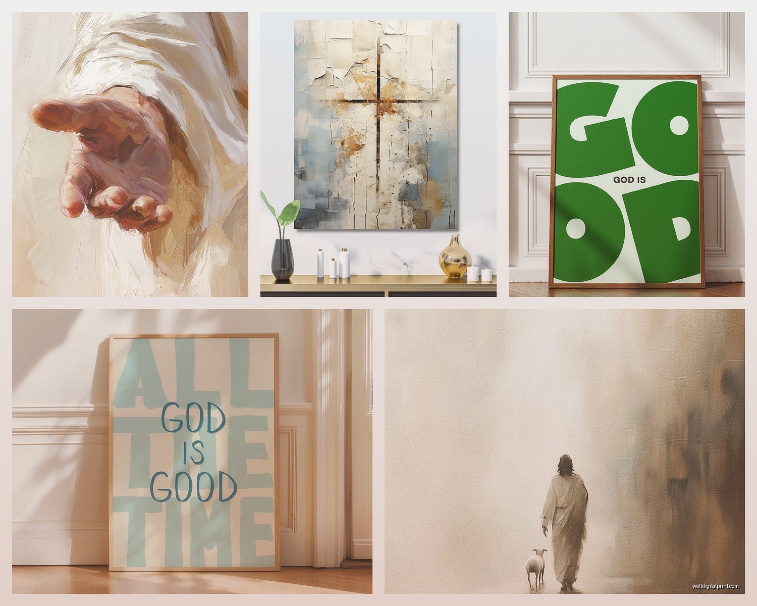
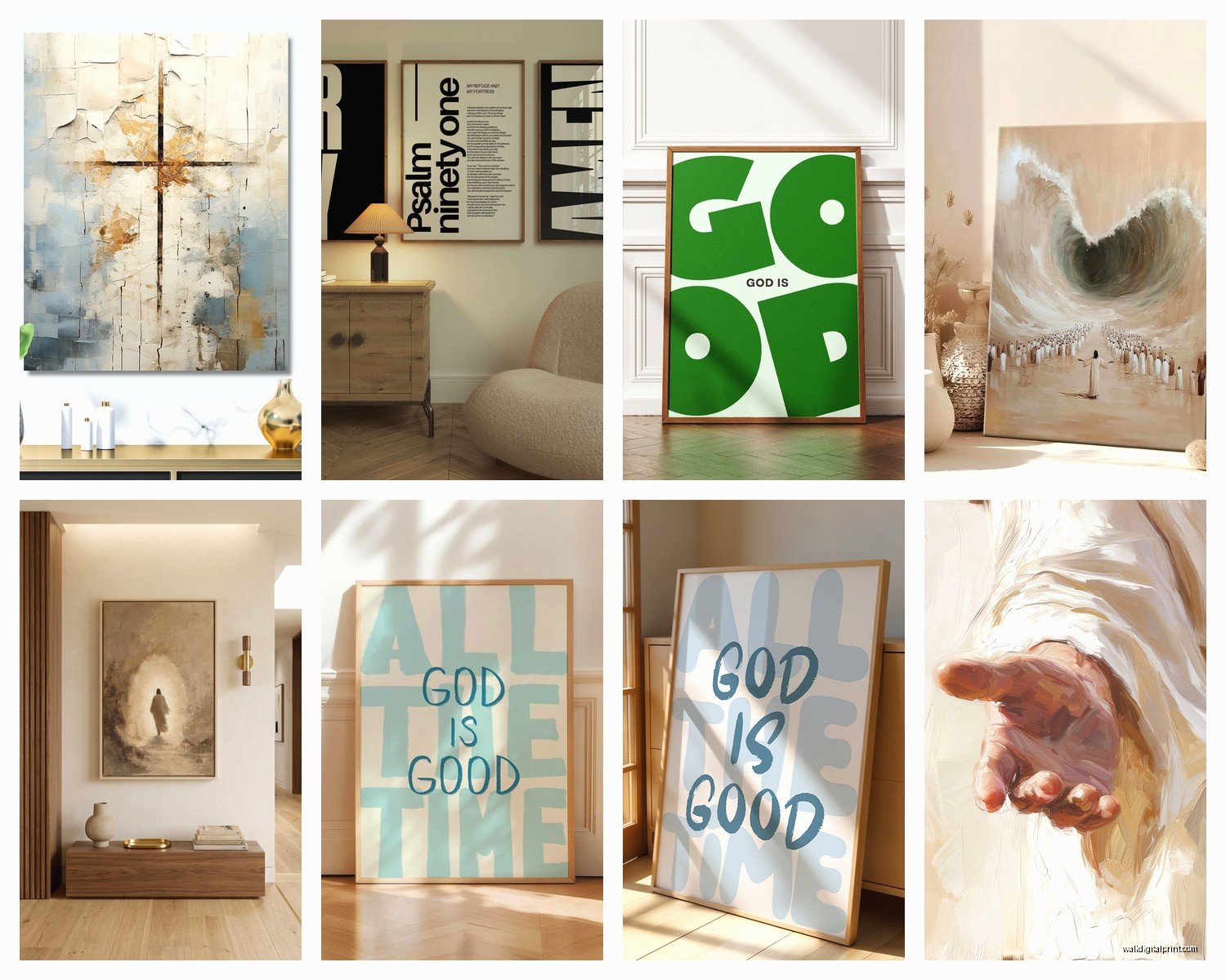
Like if you’ve got that Scandinavian minimalist thing going (which half my clients do honestly), you want Christian art that follows those same principles. Clean lines, neutral colors, maybe just black typography on white or cream backgrounds. Verses in modern fonts without any decorative elements. I’m obsessed with pieces that just have single words like “Grace” or “Beloved” in architectural lettering.
For industrial spaces with exposed brick and metal accents, I’ve been using Christian art with geometric elements or even metal cross sculptures. There’s this shop I found that does crosses made from reclaimed wood and metal that look like they belong in a loft apartment, not a church.
Mid-century modern homes can totally handle more abstract interpretations. Think Christian symbolism done in retro color palettes – mustard yellow, burnt orange, teal. The ichthys fish symbol in a mod pattern, that kind of thing.
The Color Coordination Thing
This is gonna sound weird but I actually keep a note in my phone with the paint colors of every room in my house because when I’m shopping for Christian wall art online I need to know if that “sage green” is actually gonna work with my “Silver Strand” walls. They never look the same on screen.
Neutrals are your safest bet obviously. Black and white Christian art works in literally any space. But don’t sleep on incorporating your existing color scheme into your faith art. If you’ve got navy and gold accents throughout your home, find pieces that echo that. There are so many contemporary Christian artists now doing custom colorways.
I did this thing in my office where I have three small canvas prints with different fruit of the spirit words, and I had them done in the exact coral color that’s in my curtains. Sounds matchy-matchy but it actually ties everything together without screaming “I DECORATED THIS.”
Gallery Walls vs Single Statement Pieces
Okay so I go back and forth on this constantly. Gallery walls with multiple Christian art pieces can look amazing but they’re also way harder to pull off than Instagram makes it seem. I spent like three hours last Saturday with painter’s tape and paper templates on my client’s wall before we actually hung anything.
If you’re doing a gallery wall with modern Christian art, you need a unifying element. Either:
- Same frame style different sizes
- Same color palette different designs
- Same theme like all typography or all abstract
- Mix of Christian and non-Christian art with similar aesthetic
That last one is actually my favorite approach lately. Like you’ll have a modern cross print next to an abstract botanical print next to a geometric pattern, but they all share the same color story and frame style. The Christian elements become part of the whole design rather than separate from it.
But honestly? If you’re not confident about gallery walls, just get one really good large-scale piece. I’m seeing more impact from single statement pieces right now anyway. There’s something powerful about one meaningful verse or symbol commanding a whole wall.
Frame Choices That Actually Matter
White frames are having a moment and they work great with modern Christian art but they show every speck of dust which drives me crazy. Black frames are more forgiving and add that contemporary edge. Natural wood frames in light oak or walnut can soften really minimalist Christian art if you need that.
Floating frames where there’s space between the art and frame edge look super modern and work especially well with typography prints. Canvas wraps with no frame at all give you that gallery feel and they’re usually cheaper too.
Metal frames for industrial or masculine spaces – I did a guy’s home office with scripture art in thin black metal frames and it looked sophisticated, not feminine or overly decorative.
Oh and another thing – if you’re printing stuff yourself or buying from Etsy or whatever, spend money on the frame. A $15 print in a $60 frame looks way better than a $60 print in a $15 frame. I learned this the hard way.
The Lighting Situation
Nobody thinks about this until the art is already up but lighting changes everything. Modern Christian wall art especially benefits from good lighting because a lot of it relies on subtle details or texture.
Picture lights are great for single large pieces. I use them above scripture art in bedrooms a lot. Creates this hotel-like ambiance while highlighting the piece.
Track lighting or adjustable can lights if you’re doing a gallery wall situation. You want to angle them at like 30 degrees to avoid glare but still illuminate the pieces.
Natural light is tricky – UV rays will fade prints over time so maybe don’t put your favorite piece in direct afternoon sun. I made that mistake with a beautiful watercolor Christian print that’s now like three shades lighter than it started.
Where I Actually Shop for This Stuff
Etsy is overwhelming but has the most options for modern Christian art. I filter by “digital download” a lot because then I can print it at whatever size I need. Just make sure you’re getting high resolution files – at least 300 dpi if you’re printing large.
Society6 and Minted have good contemporary Christian artists. The quality is consistent which I appreciate because I’ve been burned by random online shops before.
Local Christian bookstores are actually stepping up their art game finally. The one near me has a whole section of modern faith-based wall art now that doesn’t look like it’s from 1987.
HomeGoods and Hobby Lobby rotate stock constantly so it’s hit or miss but I’ve found some great pieces there. You gotta go frequently though, my cat knocked over my coffee while I was writing this sorry, anyway you have to check often because stuff sells out.
DIY Options That Don’t Look DIY
If you’re even slightly crafty you can make modern Christian wall art that looks professional. I’m not talking about those vinyl letter stickers though – those always look cheap to me.
Canvas and acrylic paint with scripture in your own handwriting can look really personal and modern if your handwriting doesn’t suck. Use a projector to trace letters if you need to.
Digital prints designed in Canva then printed at a local print shop. I do this for clients sometimes when we need specific colors or sizes. Just use clean fonts and lots of white space.
Wood signs with routed or painted letters – there are tutorials everywhere for these. Stain the wood, use a modern font, keep it simple. These work great in farmhouse or transitional style homes.
The Typography Debate
Sans serif fonts feel more contemporary but can sometimes feel cold for religious content. Serif fonts add warmth but can skew traditional quickly. I usually go with clean serifs like Playfair or modern sans serifs like Montserrat.
Script fonts are dangerous territory. They can look really dated really fast. If you’re using script, make sure it’s a modern brush script not some curly 2010 wedding invitation font.
Letter spacing matters more than you think. Increased letter spacing (tracking in design terms) automatically makes text feel more modern and intentional. Tight letter spacing can feel cluttered even with a good font.
Mixing Christian Art With Other Decor
This is where people get most nervous but you really don’t need to overthink it. Your Christian wall art should fit into your overall design scheme, not dominate it unless that’s specifically what you want.
I have a client who collects vintage cameras and we incorporated modern Christian art into her gallery wall with her camera collection. The styles worked together because everything had a cohesive color palette.
Bookshelves are great for leaning smaller Christian art pieces between books and decorative objects. It feels curated rather than preachy.
Mantels can handle a statement Christian piece as the focal point with other decor around it. Just apply normal styling rules – vary heights, use odd numbers, balance visual weight.
What to Avoid
Okay gonna be honest here – some modern Christian art is just bad design with a Bible verse slapped on it. Avoid anything that feels more focused on being trendy than being meaningful. Like if it’s got too many design trends happening at once (watercolor AND hand lettering AND geometric shapes AND…) it’s probably gonna look dated in two years.
Also watch out for pieces that are too busy. Modern Christian art should have breathing room. If every inch is filled with text or design elements, it’s not really modern aesthetic anymore.
Overly literal imagery can feel childish. You don’t need a cross AND a dove AND praying hands all in one piece. Contemporary faith art is more about suggestion and symbolism than showing everything.
The “Live Laugh Love” equivalents in Christian art – you know what I mean. “Blessed” in cursive with fake gold foil. It’s been done to death and doesn’t feel authentic anymore.
Anyway I think that’s most of what I’ve figured out through trial and error. The main thing is making sure your Christian wall art actually reflects your personal faith and aesthetic rather than just filling wall space with religious stuff because you think you should, you know?