Wall Art Guide, Wall Art Tutoriels
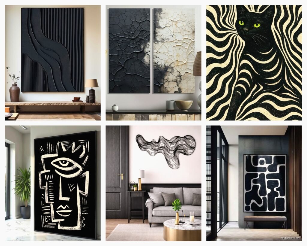
Black Abstract Wall Art: Dark Modern Non-Representational
Jun
So I’ve been working with black abstract art for like three years now and honestly it’s one of those things where people either get it immediately or they’re terrified of making their room look like a cave. But here’s the thing – dark abstract pieces are actually way more versatile than those safe beige neutrals everyone defaults to.
Why Black Abstract Actually Works Better Than You Think
Okay so first off, black isn’t just black when we’re talking about abstract art. I had this whole revelation when I was staging a condo in Brooklyn last month – my dog had eaten through my favorite boots that morning so I was already in a mood – but I brought in three different “black” abstract pieces and they all read completely different. One had these deep charcoal undertones, another was more blue-black, and the third had subtle metallic threads that caught light. The blue-black one made the whole room feel moody and sophisticated, while the metallic one actually brightened things up because of how it reflected light.
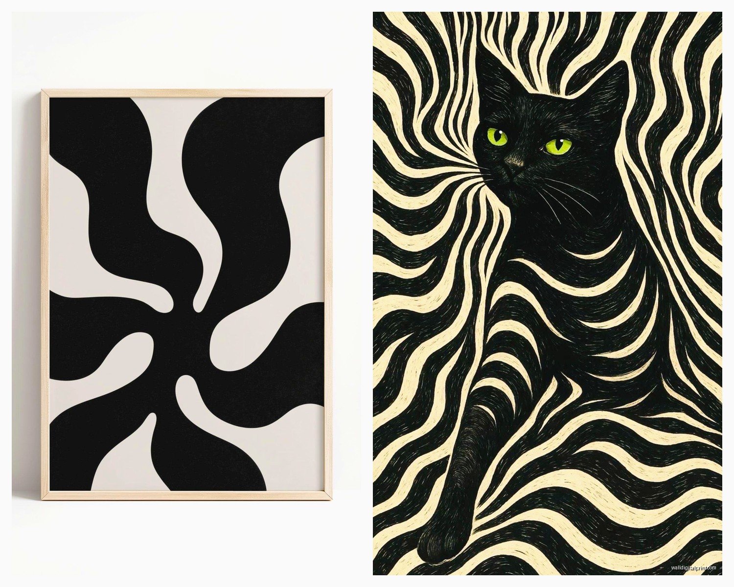
The non-representational part is key here because you’re not asking guests to interpret what they’re seeing. It just… exists as texture and form and movement. Way less pressure than hanging something where people tilt their heads and ask “is that a horse?”
Sizing This Stuff Right (Because Everyone Gets This Wrong)
I’m gonna be real with you – most people buy abstract art too small. Like way too small. I see it constantly and it drives me nuts.
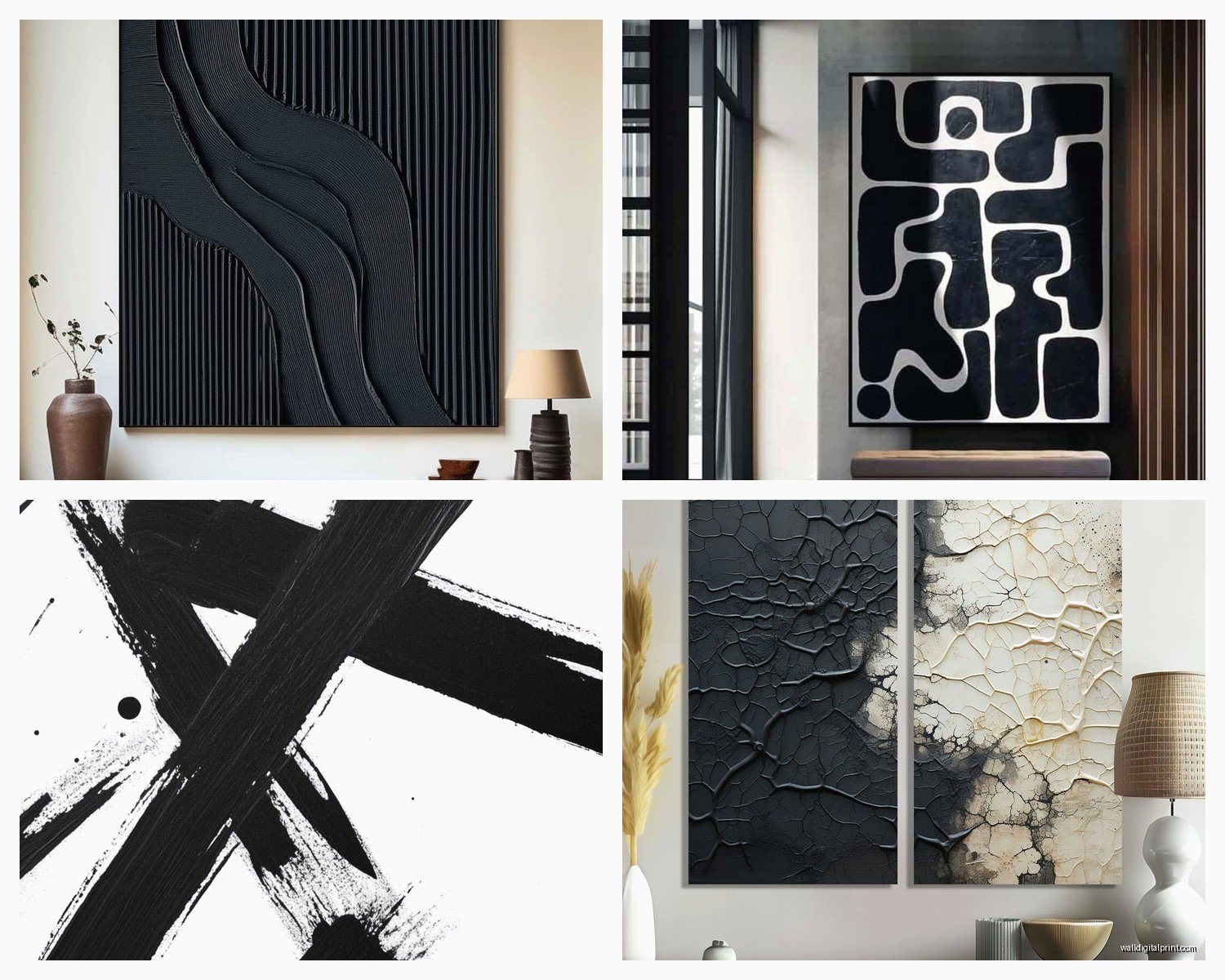
For black abstract specifically, you need presence. A tiny 16×20 black piece on a big white wall just looks like you forgot to finish decorating. Here’s what actually works:
- Above a sofa: go at least 2/3 the width of your couch, preferably 3/4
- Statement wall: think 40×60 inches minimum, or go with a multi-panel situation
- Bedroom: 36×48 works over a queen bed, but honestly I’d go bigger if your ceilings are over 9 feet
- Dining room: you can get away with slightly smaller here, maybe 30×40, because there’s usually other stuff competing for attention
I learned this the hard way when I bought this gorgeous black and grey abstract piece for my own living room – spent like $400 on it – and it looked like a postage stamp on my wall. Had to move it to the hallway and start over.
Living Room Placement (Where It Gets Interesting)
Okay so living rooms are where black abstract art really shines because you’ve got multiple wall options and different lighting throughout the day.
The focal wall approach is obvious but here’s what nobody tells you – if you’re putting a large black abstract piece above your sofa, you gotta consider what’s happening with your throw pillows and blankets. Not matching, but like… acknowledging. I did a client’s space last fall where we hung this massive black abstract with subtle white gestural marks, and we pulled in pillows with similar white linear details. Not matchy-matchy, just cohesive.
Wait I forgot to mention – corners are your friend with dark abstract art. If you’ve got an awkward corner where two walls meet, a large black piece actually makes that corner feel intentional instead of leftover. I put a 48×60 black abstract with bronze undertones in a corner next to a floor lamp and suddenly that dead space became the most interesting part of the room.
The Light Situation You Can’t Ignore
This is gonna sound weird but black abstract art needs light the way plants need water. Not direct sunlight – that’ll fade it – but you need dedicated lighting. Track lighting, picture lights, or even a well-placed floor lamp that washes up the wall.
I was watching The Bear the other night (so good btw) and kept getting distracted by the lighting in the restaurant scenes, but anyway – that same principle applies here. Black art without proper lighting just becomes a dark hole on your wall. With lighting, all those subtle variations in texture and tone come alive.
Bedroom Strategies That Actually Work
Bedrooms are tricky because you don’t want it to feel heavy or oppressive, but black abstract art can actually be really calming. I’ve got a charcoal abstract piece with soft grey washes in my bedroom and it’s like… meditative?
Here’s what works:
Keep your bedding lighter to create contrast. I’m not saying go all white sheets – that’s unrealistic if you’re a normal human – but cream, light grey, even a soft blush creates visual breathing room. The black art becomes this grounding anchor instead of making everything feel dark.
Behind the bed is the obvious spot but consider the wall opposite your bed too. That’s what you see when you first wake up, and a strong black abstract piece there can be really striking. Just maybe not something too chaotic – save the aggressive brushstrokes for other rooms.
I had a client who was nervous about putting black art in her bedroom because she thought it would mess with her sleep, which honestly I thought was gonna be nonsense, but we did it anyway and she said it actually helped her brain quiet down at night. Something about the abstract nature being non-stimulating? Who knows.
The Nightstand Situation
Oh and another thing – if you’re doing a large black piece above your bed, your nightstands and lamps matter more than usual. You need something to break up all that visual weight. I like light wood nightstands or even lucite/glass ones with the bases visible. Creates this nice floating effect that balances the darkness above.
Dining Rooms and Unexpected Spaces
Dining rooms are perfect for black abstract art because you’re usually in there during evening hours anyway when lighting is more controlled. Plus there’s something about eating with a dramatic dark abstract piece on the wall that makes dinner feel more like an event.
I did this whole dining room last spring where we hung a triptych – three black abstract panels with gold leaf accents – and the clients literally said their kids behave better at dinner now. Probably coincidence but I’ll take the credit.
Hallways and Transitional Spaces
Okay so funny story – hallways are where I actually started using black abstract art first. Had this narrow hallway in a flip property that felt like a bowling alley, and I hung a series of smaller black abstract pieces (like 20×20 each) in a horizontal line down the length of the wall. Made the hallway feel intentional and gallery-like instead of just… a hallway.
The thing about transitional spaces is people move through them quickly, so black abstract art creates these moments of visual interest without requiring interpretation. Your brain just registers “oh that’s cool” and moves on.
What to Pair It With (The Stuff Around the Art)
This is where people get paralyzed. You’ve got your black abstract piece and now you’re like “okay but what about everything else?”
Furniture that works:
- Light wood tones – oak, ash, light walnut
- Cognac leather (creates this moody masculine vibe)
- Brass or gold metal accents
- White or cream upholstery
- Even black furniture works if you break it up with texture
What doesn’t work: dark wood furniture plus black art usually feels too heavy unless you’ve got really high ceilings and tons of natural light. Also avoid matching your frame to your furniture too exactly – it looks calculated in a bad way.
Color Accents That Make Sense
People always ask me what colors work with black abstract art and honestly? Most of them. But here’s what I reach for most:
Warm whites and creams as your base. Then layer in either cool tones (dusty blue, sage green, soft grey) or warm tones (terracotta, ochre, rust) depending on the undertones in your black piece. I had a client whose black abstract had these hidden purple undertones – you couldn’t really see them until you put a lavender pillow nearby and suddenly the whole piece came alive.
Metallics are your friend here too. Gold, brass, copper, even silver – they all play well with black abstract art because they catch light and create movement.
Framing Choices (Yes This Matters)
So about frames – this is gonna sound contradictory but sometimes you want a frame and sometimes you don’t. Canvas abstracts can go frameless if they’re gallery-wrapped (where the image continues around the sides). Actually looks more modern and less stuffy that way.
But if you’re doing a print or paper-based piece, frame it. I usually go with simple black frames or natural wood frames depending on the room. Avoid ornate frames unless you’re specifically going for that eclectic maximalist vibe, which… could work but it’s a whole different conversation.
Float mounting (where there’s space between the art and the mat) looks really good with black abstract pieces because it creates this layered effect. More expensive though, so there’s that.
Multi-Panel vs Single Large Piece
I go back and forth on this. Multi-panel (diptych or triptych) gives you more flexibility – you can space them out or cluster them together, and if you move you have options. But a single large piece makes more of a statement and feels more cohesive.
For black abstract specifically, I lean toward single pieces because you want that impact. Multiple panels can sometimes fragment the visual weight too much. But like… I’ve also done some really successful three-panel installations so don’t take that as a hard rule.
Where to Actually Buy This Stuff
Okay practical stuff – where do you find good black abstract art that doesn’t cost your entire rent?
Etsy has a ton of independent artists selling prints and originals. I’ve found some really good pieces there in the $100-300 range for large prints. Just make sure you’re reading the reviews and checking if it comes framed or not.
Minted and Society6 are solid for prints. The quality is consistent and they often have sales. West Elm and CB2 have decent abstract art but it’s def more commercial-looking. Sometimes that’s fine – not everything needs to be a gallery piece.
For originals, local art fairs and student shows at art schools are goldmines. I’ve bought several pieces from recent grads for like $200-500 that would cost thousands in a gallery setting. The art is just as good, they just don’t have representation yet.
Oh and estate sales sometimes have amazing abstract pieces from the 70s and 80s. Found a huge black and white abstract at an estate sale for $75 last year that’s now in my entryway.
The Mistakes I See All the Time
Real talk – here are the things that make me cringe:
Hanging it too high. The center of your art should be at eye level, which is usually around 57-60 inches from the floor. I see so many black abstract pieces hung way up near the ceiling like they’re trying to escape.
Not committing to the darkness. If you’re gonna do black abstract art, commit. Don’t try to “lighten it up” with a bunch of colorful clutter around it. Let it be dark and dramatic.
Putting it in a room with no contrast. Black art on a dark grey wall with dark furniture is just… a void. You need some light elements to make the black read as intentional.
Buying it just because it matches your couch. Art should stand on its own, not coordinate with your furniture like you’re putting together a catalog spread.
Maintenance and Long-term Stuff
Nobody talks about this but black abstract art shows dust like crazy, especially if it’s got texture. I dust mine with a soft brush attachment on my vacuum like once a month, very gently. For framed pieces under glass, regular glass cleaner works but avoid getting it on the frame.
Keep it out of direct sunlight – UV rays will fade even black pigments over time. And if you’re hanging it in a bathroom or kitchen, make sure it’s properly sealed or framed because humidity and grease are not your friends.
My client canceled this morning so I spent an hour just staring at the black abstract piece in my office trying to figure out if it needs better lighting, and honestly I think it does. Gonna order a picture light this week because even after three years I’m still tweaking things. That’s kinda the fun part though – these pieces evolve as your space changes and as the light shifts throughout seasons.
Just start with one piece that genuinely speaks to you, even if you can’t articulate why. Black abstract art is forgiving in a weird way – it works with more styles than you’d think and it’s one of those investments that actually gets better over time as you figure out how to style around it.