Wall Art Guide, Wall Art Tutoriels
Bridge Wall Art: Architectural Landmark Photography
Jun
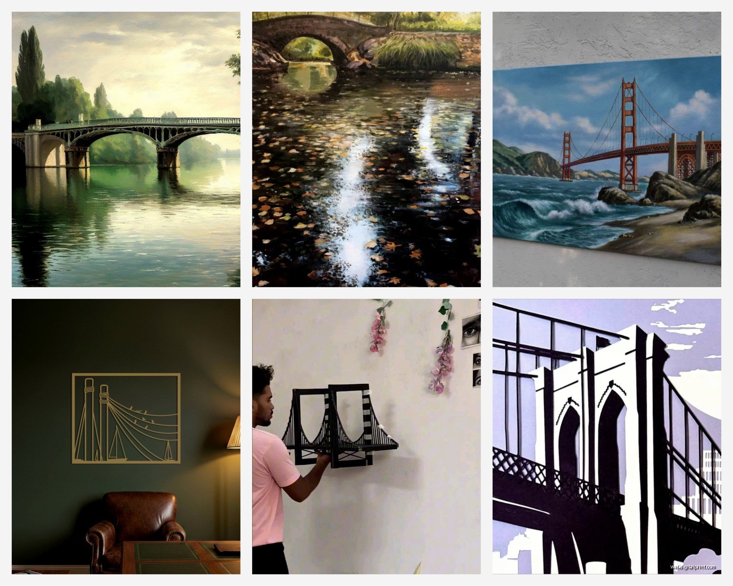
So I’ve been obsessing over bridge photography for wall art lately and honestly it started because a client wanted something “architectural but not boring” for their loft space and I went down this whole rabbit hole. Let me tell you what actually works because I’ve hung probably 15 different bridge pieces in the last six months alone.
Why Bridge Photography Actually Works in Spaces
The thing about bridge images is they’re structured enough that they don’t feel chaotic but they’ve got these amazing leading lines that pull your eye through a room. I hung this massive Golden Gate Bridge shot in a narrow hallway last month and it literally made the space feel twice as wide because of the perspective. Your eye follows the bridge cables or the roadway and suddenly the room has depth it didn’t have before.
Plus bridges photograph well in literally any lighting condition which means you’ve got options. Moody fog shots, golden hour warm tones, dramatic black and white, even those crazy blue hour twilight images where the city lights are just coming on. I’ve got a Brooklyn Bridge piece in my own dining room that’s shot right at dusk and the way it picks up the ambient light in the evening is just *chef’s kiss*.
Choosing the Right Bridge for Your Space
Okay so this is gonna sound weird but the bridge you pick should kinda match the personality of your room. Like, Golden Gate Bridge shots are inherently romantic and a bit dramatic with that orange-red color and the fog. I use those in spaces that can handle some warmth and nostalgia. Tower Bridge in London has this Victorian elegance that works amazing in traditional or eclectic spaces.
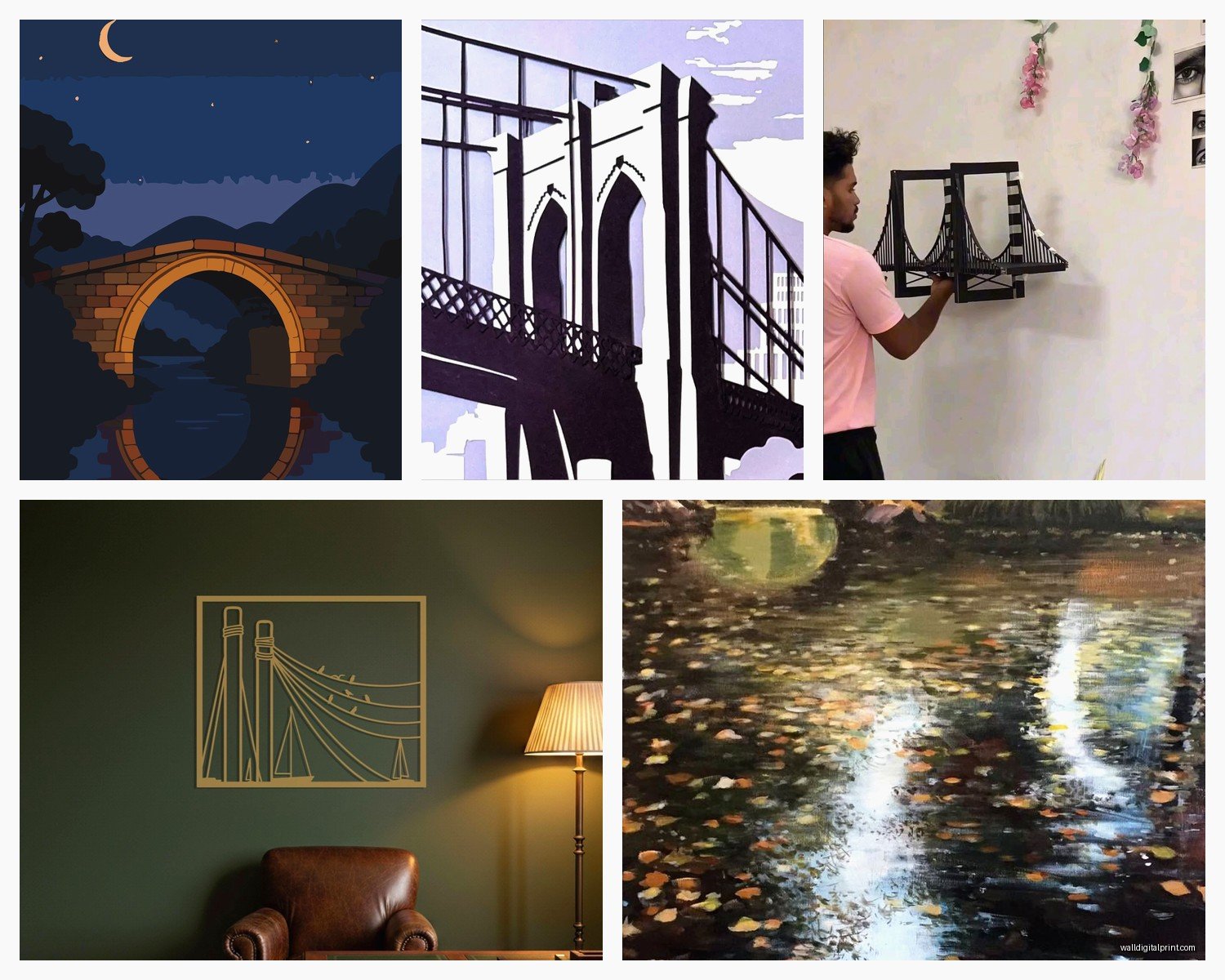
Brooklyn Bridge though? That’s my go-to for industrial lofts, modern spaces, anything with exposed brick or metal elements. The stone towers and steel cables photograph with this perfect grit that complements urban interiors.
For really modern minimalist spaces I’ve been loving the Millau Viaduct in France or the Øresund Bridge between Denmark and Sweden. Super clean lines, almost futuristic. My cat knocked over a frame sample of the Millau last week and I’m still mad about it but anyway.
Lesser-Known Bridges That Photograph Beautifully
Everyone does Golden Gate and Brooklyn Bridge but lemme tell you about some alternatives that make your space feel more curated:
- Rialto Bridge in Venice – all that ornate stonework photographs like a dream, especially in black and white
- Henderson Waves Bridge in Singapore – this wavy pedestrian bridge has these incredible organic curves
- Chengyang Wind and Rain Bridge in China – covered bridge with traditional architecture, adds texture
- Pont Alexandre III in Paris – super ornate with those gilt sculptures, very opulent
- Langkawi Sky Bridge in Malaysia – curves through the mountains, great for spaces that need some drama
Size and Scale Decisions
This is where people mess up constantly. They either go too small and the image looks timid or they go oversized and it overwhelms everything else. Here’s what I’ve learned actually works:
For a standard living room with 9-foot ceilings, you want your bridge art to take up about two-thirds to three-quarters of your available wall width. So if you’ve got a 10-foot wall section above your sofa, you’re looking at a 60-80 inch wide piece or a multi-panel setup that spans that distance.
I did a three-panel Brooklyn Bridge triptych last fall that was 24×36 inches per panel and when you hang them with just 2-3 inches between panels, you get this cinematic panoramic effect that’s absolutely stunning. The client was worried it would be too much but it ended up being the focal point of the whole room.
Hallways and narrow spaces can actually handle taller, narrower compositions. I’ve got a vertical shot of the Manhattan Bridge looking up at the tower that’s 24×60 inches and it works perfectly in a stairwell where a horizontal piece would’ve felt wrong.
Color Palette Considerations
Okay so funny story, I once hung a super vibrant sunset Golden Gate piece in a room with burgundy walls and it was a disaster. The reds competed with each other and the whole thing felt chaotic. Had to swap it for a black and white version and suddenly the room worked.
If your space has warm tones – terracotta, rust, warm woods, amber lighting – you want bridge photography that either complements that warmth (golden hour shots, warm black and white with sepia tones) or provides cool contrast (blue hour shots, steel and concrete close-ups).
Cool-toned spaces with grays, blues, whites, chrome finishes? Those can handle pretty much anything but they especially shine with:
- Foggy atmospheric shots where the bridge emerges from mist
- Night photography with city lights
- High-contrast black and white
- Winter scenes with snow or ice
I’m personally obsessed with those misty morning shots where you can barely see the bridge through the fog. There’s something about that mystery that works in so many different spaces.
Black and White vs Color
Real talk? Black and white is easier to work with. It goes with everything, it feels timeless, it doesn’t compete with your throw pillows or that artwork your mom gave you that you feel obligated to display.
But color bridge photography has this impact that black and white can’t match when done right. The rust-orange of the Golden Gate against blue sky and water creates this complementary color scheme that’s textbook design theory. Sydney Harbour Bridge photographs with these beautiful blue-green harbor tones that bring coolness into warm spaces.
My rule: if your room is already pretty neutral (grays, whites, blacks, natural wood), add a color bridge photograph to inject some life. If your space already has a strong color story happening, black and white is your friend.
Framing and Presentation Styles
So I spent an entire afternoon last month when my client canceled just comparing framing options and here’s what actually matters:
Float mounting (where the print appears to float inside the frame with a gap around it) works incredibly well for bridge photography because it emphasizes that these are architectural subjects worth showcasing. It’s a bit more expensive but the effect is worth it for statement pieces.
Gallery-style thin black or white frames keep the focus on the image itself. I use these constantly because they’re versatile and they don’t distract. Match the frame color to your predominant trim color usually.
Metal frames – aluminum or steel – are perfect for bridge photography because there’s this nice echo between the frame material and the bridge materials. I did a Manhattan Bridge piece in a brushed steel frame and it was like the frame was made for that specific image.
Canvas prints without frames can work but honestly I think bridge photography loses some of its impact without that defined edge. The one exception is really large-scale pieces where you’re going for that gallery wall look.
Multi-Panel Installations
Oh and another thing – multi-panel bridge installations are having a moment and I’m here for it. You can do:
- Triptych (three panels) showing different views or sections of the same bridge
- Diptych (two panels) for a before-and-after effect or day-to-night comparison
- Five-panel panoramic spreads that really stretch across a wall
- Grid arrangements with multiple bridges from the same city
The key with multi-panel is keeping consistent spacing. I use 2 inches between panels as my standard but you can go up to 4 inches for a more separated look. Just keep it consistent or it’ll feel sloppy.
Placement and Hanging Height
Center your bridge art at eye level, which is typically 57-60 inches from the floor to the center of the image. This is gallery standard and it just works. If you’re hanging above furniture, leave 6-8 inches between the furniture top and the bottom of the frame.
For really large bridge panoramas, you can go a bit lower because the composition itself has horizontal movement that your eye follows naturally. I’ve hung 40×80 inch pieces with the bottom edge at 50 inches from the floor and it felt right.
Dining rooms can handle slightly lower placement because people are seated, so you’re viewing from a lower sightline. I usually go about 3-4 inches lower than I would in a living room.
Mixing Bridge Photography with Other Art
This is where it gets fun. Bridge photographs play really well with:
- Abstract art that picks up colors from the bridge image
- Other architectural photography (buildings, staircases, urban scenes)
- Vintage maps of the city where the bridge is located
- Industrial metal sculptures or wall art
- Botanical prints if you want contrast between natural and manmade
What doesn’t work? Mixing bridge photography with beach scenes or pastoral landscapes. The vibe is too different and it feels confused. Unless you’re going for some kind of juxtaposition statement, which can work in really eclectic bohemian spaces but it’s risky.
Lighting Your Bridge Art
Picture lights are my preferred option for dramatic bridge photography, especially black and white pieces. The focused light creates this gallery effect and if the bridge image has strong shadows and contrast, the directional lighting enhances that.
Track lighting or adjustable spotlights work great for larger installations where you want to highlight the entire piece evenly. Aim for about 30-degree angle from the wall to avoid glare.
If you’ve got a bridge photograph with lots of metallic elements or water reflections, watch out for glare from overhead lighting. Sometimes you gotta adjust your angles or switch to non-reflective glass.
Natural light is trickier because you don’t want direct sun fading your print over time, but indirect natural light can make bridge photography really come alive, especially color pieces. That blue hour bridge shot I mentioned earlier? It absolutely glows when late afternoon light hits it indirectly.
Where to Source Quality Bridge Photography
Okay so you’ve got options at every price point and quality level. Fine art photography galleries are gonna give you limited edition prints with archival quality but you’re paying $500-$3000+ for a single piece. Worth it if it’s a statement wall in a main living area.
Online marketplaces like Etsy have tons of bridge photography prints from independent photographers. Quality varies wildly so check reviews and ask about print specifications. I’ve found some absolute gems for $100-200 that look way more expensive once framed.
Sites like Society6 and Redbubble let artists upload their work and you can order it in various sizes and formats. The quality is decent for the price point but it’s not gonna be archival museum-grade stuff.
Local photographers in bridge cities often have stunning work that hasn’t been seen everywhere. I bought a Philly photographer’s Ben Franklin Bridge series and it’s some of my favorite art I own because it’s not the same Golden Gate shot everyone has.
Wait I forgot to mention – some museums and historical societies sell reproduction prints of vintage bridge photography from their archives. These can be really cool for adding historical context to a space.
Print Quality and Materials
This matters more than people think. You want at minimum:
- Giclée printing on archival paper or canvas
- Acid-free materials so your print doesn’t yellow
- UV-protective glass or acrylic if framing
- Pigment-based inks rather than dye-based for longevity
Metallic paper prints can look incredible for bridge photography because they add this subtle shimmer to water reflections and metal surfaces. I’ve used them for Sydney Harbour Bridge and Tower Bridge pieces and the effect is really special.
Canvas prints should be gallery-wrapped (where the image continues around the edges) if you’re not framing them. It just looks more finished.
Styling Around Bridge Art
Once you’ve got your bridge piece up, you’re gonna want to style around it. Keep it simple – let the bridge be the star. I usually add:
A console table or credenza below with maybe one sculptural object and a plant. Nothing too cluttered.
If the bridge photo is black and white, you can echo that with black and white photography books or monochrome accessories.
For color bridge pieces, pull one accent color from the image and repeat it in small doses around the room. Like if you’ve got a Golden Gate piece with that orange-red, maybe some rust-colored throw pillows or a terracotta pot.
This is gonna sound weird but I sometimes add vintage suitcases or travel-themed accessories near bridge art because bridges are inherently about connection and travel. It reinforces the theme without being too literal.
Anyway I need to finish watching this documentary about urban planning but hopefully this helps you figure out what bridge art actually works for your space. The main thing is just making sure the scale is right and the vibe matches your room personality. Don’t overthink it too much but also don’t just grab the first Golden Gate poster you see at HomeGoods you know?