Wall Art Guide, Wall Art Tutoriels
Corgi Wall Art: Welsh Dog Breed Portrait Decor
Jun
So I’ve been deep in the corgi wall art rabbit hole lately because honestly, three different clients asked about it in the same week and I figured the universe was telling me something. Plus my neighbor’s corgi, Winston, is literally the cutest thing and I may have taken like 47 photos of him last weekend which… anyway.
Finding the Right Style Without Looking Like a Crazy Dog Person
Okay so the first thing is figuring out what vibe you’re going for because corgi art ranges from “sophisticated dog lover” to “my entire personality is this dog breed” and you gotta know where you fall on that spectrum. I tested a bunch of different styles in my own place and in client spaces and here’s what actually works.
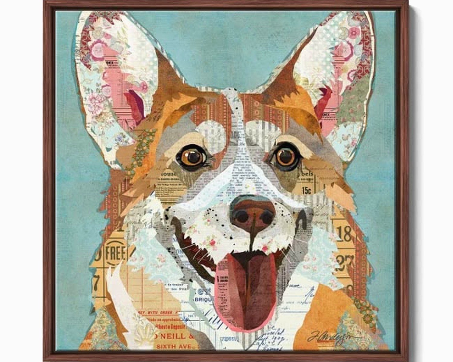
The minimalist line drawings are honestly my favorite for most spaces. They’re these simple, continuous line portraits that look way more expensive than they are. I found some on Etsy for like $25-40 as digital downloads, printed them at a local print shop on nice cardstock, and they look like $200 art. The key is getting them professionally printed though – I tried printing one at home on my regular printer and it looked like garbage, don’t do that.
Watercolor portraits work really well in lighter, more feminine spaces. I put a set of three in a client’s breakfast nook and they’re perfect there. But heads up, the colors can be tricky. I ordered one that looked soft and muted online and when it arrived it was like… neon orange and turquoise? Had to return it. Always check reviews with actual photos.
Size and Placement That Actually Makes Sense
This is where people mess up constantly. They buy art they love and then just… stick it somewhere random.
For over a sofa or console table, you want the art to take up about two-thirds to three-quarters of the furniture width. So if your sofa is 84 inches, you’re looking at art that’s roughly 56-63 inches total. With corgi art, I usually do a three-panel setup – like three 16×20 frames side by side gives you about 60 inches including the gaps between frames.
Oh and another thing, hang it at eye level, which is usually around 57-60 inches from the floor to the center of the artwork. I see SO many people hang stuff way too high. Your art should feel connected to your furniture, not floating up near the ceiling like it’s trying to escape.
For smaller spaces like bathrooms or hallways, a single 8×10 or 11×14 works great. I have a tiny corgi print in my powder room and guests always comment on it. It’s just this simple profile silhouette in black on cream paper, nothing fancy, but it’s unexpected there which makes it work.
Gallery Wall Configurations
If you’re gonna do a gallery wall with corgi art mixed with other pieces, odd numbers look better. Three, five, seven pieces. I did a five-piece gallery wall last month that had two corgi portraits, two botanical prints, and one abstract piece. The key was keeping the frame style consistent – all black wood frames – while varying the mat colors.
Start with your largest piece and place it slightly off-center, then build around it. Don’t do the thing where you try to make a perfect grid unless your space is super modern. Organic arrangements look more collected and intentional.
Frame Choices That Don’t Look Cheap
Okay so funny story, I spent like six months buying expensive custom frames before I realized you can get the same look with ready-made frames if you know what to look for.
Black frames are the safest choice and work with literally any corgi art style. I buy the simple gallery frames from Michael’s when they’re 50% off (which is like every other week) and they look completely fine. The 11×14 size with an 8×10 mat is my go-to.
Natural wood frames work beautifully in modern farmhouse or Scandinavian-style spaces. Light oak or ash frames with corgi line drawings? *Chef’s kiss*. But skip the really orangey wood tones unless your whole room has warm undertones, otherwise it’ll look dated.
White frames can work but they’re tricky. They tend to disappear against white walls, which might be what you want? I used white frames in a nursery with corgi art and it was perfect there because we didn’t want the frames to compete with all the other stuff going on in the room.
Where to Actually Buy This Stuff
I’ve ordered from probably 20 different sources at this point and here’s what’s worth your time.
Etsy is my main source for digital downloads and custom work. Search for “corgi line art printable” or “corgi watercolor print” and filter by reviews. I always read the one-star reviews first to see what went wrong. Some sellers take forever to deliver the digital files, which is annoying when you need something quickly. My current favorite shop is… wait let me check my orders… okay I can’t remember the exact name but it has “Nordic” in it and they do these gorgeous minimal corgi silhouettes.
Society6 has a huge selection and the quality is consistent. You can get the same design on different products which is cool if you want matching stuff, but also kinda weird? Like do you need a corgi throw pillow AND wall art AND a tote bag of the same image? Maybe you do, no judgment.
For higher-end stuff, I’ve found some incredible pieces on Saatchi Art. These are original paintings or limited edition prints, usually $300-800 range. Only worth it if you’re really committed to the corgi life or if you’re working with a bigger budget.
Custom Portraits Are Hit or Miss
I’ve commissioned custom corgi portraits for clients who want their actual dog painted and it’s always a gamble. Even with good reviews, artists interpret things differently. I had one artist who made my client’s corgi look… demonic? The eyes were just wrong. We had to ask for revisions twice.
If you go custom, send MULTIPLE reference photos from different angles in good lighting. And be specific about the style you want – show them examples of other work you like. Don’t just say “make it look realistic” because everyone’s definition of realistic is different.
Color Schemes That Don’t Fight Your Space
This is gonna sound obvious but match your art colors to your existing palette or it’ll look like you just slapped random stuff on the wall.
For neutral spaces (grays, whites, beiges), go with black and white corgi art or very muted watercolors. I did an all-gray palette in a living room and added these soft blue-gray corgi prints that were perfect. They added personality without disrupting the calm vibe.
If your room has a lot of color already, you can either match it or go monochrome with the art. I would NOT add more competing colors. Like if your room is navy and mustard yellow, your corgi art should incorporate those colors or stick to black and white.
One trick I use is pulling a minor accent color from your space and featuring it in the art. If you have terracotta pots or a rust-colored throw, find corgi art with those warm tones. It creates this subtle connection that makes the whole room feel cohesive.
Matting and Spacing Details Nobody Tells You
White or cream mats are standard and work 90% of the time. I use white mats for crisp modern looks and cream/ivory for warmer traditional spaces.
The mat should be wider than the frame molding – so if your frame is 1 inch wide, your mat border should be at least 2-3 inches. I usually do 3-inch mats for 8×10 prints in an 11×14 frame. Looks professional and gives the art breathing room.
When you’re spacing multiple frames, leave 2-4 inches between them. Closer spacing (2 inches) makes it feel like one cohesive unit. Wider spacing (4 inches) gives each piece more independence. I typically go with 3 inches because I’m indecisive like that.
Lighting Makes or Breaks It
Natural light is obviously ideal but you gotta watch for direct sunlight which will fade your prints over time. I learned this the hard way when a beautiful watercolor corgi print got completely washed out after six months in a south-facing window. Now I always use UV-protective glass for anything in bright spots or just avoid those locations entirely.
Picture lights are worth the investment if you’re featuring a larger piece or a gallery wall. Those little brass ones from Pottery Barn are like $80 but they make your art look gallery-quality. Battery-operated ones exist too if you don’t wanna deal with wiring.
I’m currently watching The Bear while writing this and just got distracted for like ten minutes… okay back to it.
Avoiding the Cluttered Look
Less is more with themed art. If every wall has corgi stuff, it becomes overwhelming. I usually limit corgi art to one main wall or area in a room, then incorporate the dog theme more subtly elsewhere – maybe a small corgi figurine on a shelf or a throw pillow.
One client wanted corgi everything and I had to gently steer her toward a feature wall in her office with a gallery arrangement, then just hints of the theme in other rooms. It turned out way better than if we’d gone full corgi in every space.
Mixing Corgi Art with Other Decor
Corgi portraits work surprisingly well mixed with:
- Botanical prints – especially wildflowers or ferns
- Landscape photography – particularly Welsh or British countryside scenes which feels thematic
- Abstract geometric art in similar colors
- Vintage maps or book pages
- Other animal portraits if you style them consistently
What doesn’t work is mixing corgi art with random unrelated stuff like sports memorabilia or movie posters. Keep some visual connection between pieces whether that’s color, frame style, or subject matter.
The Digital Download Route
This is the most budget-friendly option and honestly what I recommend unless you have money to burn. You buy the digital file, download it, and print it yourself or through a print service.
For printing, I use my local print shop because I can see paper samples and they do same-day service. But Printique (formerly AdoramaPix) is great for online orders. Their quality is consistent and shipping is fast.
Paper choice matters more than you’d think. Matte cardstock looks sophisticated and minimizes glare. Glossy can work for photographic styles but shows fingerprints and glare like crazy. I almost always go matte.
Seasonal Rotation Strategy
Okay this is gonna sound extra but if you’re really into decorating, having seasonal corgi art is actually fun? I have a client who swaps her corgi prints quarterly – spring florals with corgis, beach scenes in summer, autumn leaves, winter/snow themes. She stores them in a portfolio case and it takes like 15 minutes to switch them out.
You don’t need different frames for this, just different prints in the same size. It keeps things fresh without requiring a complete redesign.
Common Mistakes I See All the Time
Buying art before measuring your space. Measure first, then shop. I cannot stress this enough.
Choosing art you love without considering your wall color. That gorgeous colorful corgi painting might disappear against your burgundy accent wall.
Hanging everything perfectly level and centered. Sometimes slightly organic placement looks better, especially in casual spaces like mudrooms or kitchens.
Using command strips for anything over 2 pounds. Just use proper picture hangers, seriously. I’ve seen too many pieces crash down at 3am and it’s never fun.
Forgetting about the rule of thirds. Your art should generally be positioned in the upper two-thirds of your wall space, not smack in the middle of a huge empty wall.
Anyway, that’s basically everything I’ve figured out through way too much trial and error. The main thing is just starting somewhere and adjusting as you go. Your first placement probably won’t be perfect and that’s totally fine, just move stuff around until it feels right.