Wall Art Guide, Wall Art Tutoriels
Western Wall Art: Cowboy Ranch Southwest Decor
Jun
So I just finished redoing this client’s living room with western wall art and honestly it’s way less complicated than Pinterest makes it look but there’s definitely some stuff you gotta know before you start buying random cowboy prints off Etsy at midnight.
The Actually Important Size Thing Everyone Gets Wrong
Okay so here’s what I learned the hard way – that cute 16×20 longhorn print you’re eyeing? It’s gonna look like a postage stamp on your wall. I did this in my own dining room and had to completely start over. For western art you actually want to go bigger than you think because the whole vibe is supposed to feel expansive and open like the actual Southwest.
Over a couch you need minimum 30 inches wide, but honestly I usually go 40-60 inches. Like that’s the range where it actually makes a statement. If you’re doing a gallery wall situation then yeah smaller pieces work but they need to be grouped tight – I’m talking 2-3 inches between frames max.
And vertical vs horizontal matters more with western stuff than other themes. Horizontal pieces (landscape orientation) work better for that sweeping desert vista feel. Vertical is good for cowboy portraits or those tall cactus prints but you need higher ceilings to pull it off or it just looks awkward.
The Color Palette Nobody Talks About
This is gonna sound weird but the biggest mistake I see is people going too brown. Like yes it’s western and yes there are lots of earth tones but if everything is brown and tan and beige your room will look muddy and honestly kinda depressing.
What actually works is picking ONE warm neutral as your base (I usually do a warm tan or that terracotta color) and then you need some contrast. The best western rooms I’ve styled have:
- Deep turquoise or teal as an accent – this is literally traditional Southwest color theory
- Black for grounding – black frames, black metal accents, even some black in the art itself
- One burnt orange or rust moment
- Cream or off-white to keep it from feeling too heavy
I was watching Yellowstone the other night (my dog kept barking at the horses lol) and noticed they actually do this in the set design. It’s never just brown on brown on brown.
What to Actually Buy and Where
Okay so real talk about the art itself. You’ve got basically four categories and they don’t all work in the same space:
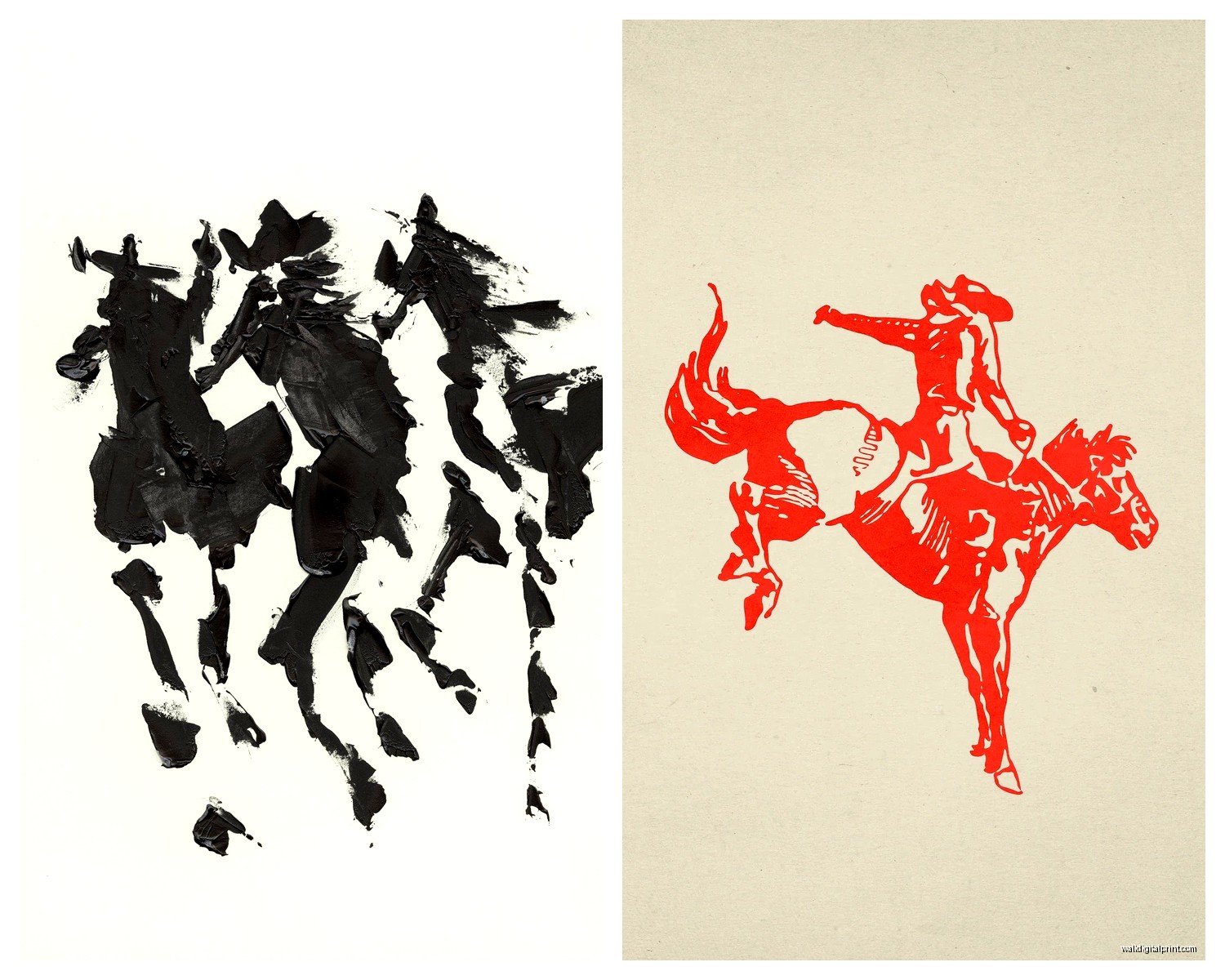
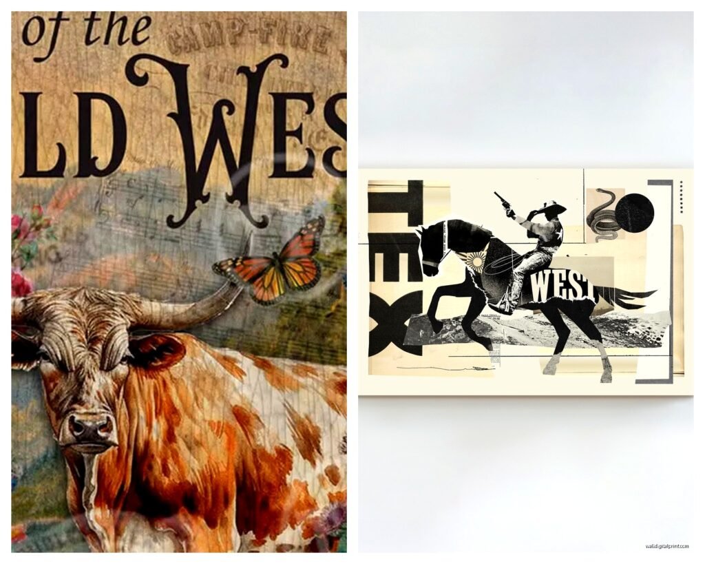
Longhorn and Cattle Skulls
These are like the most obvious choice but they can go wrong fast. A realistic cattle skull photograph looks amazing in a modern farmhouse situation – I’d do a black and white print in a simple black frame. But if your room already has a lot going on it can read as too edgy or trying too hard.
The illustrated or watercolor versions are safer. There’s this artist on Etsy (god I wish I could remember the shop name, it’s in my favorites somewhere) who does these soft watercolor longhorns and they’re perfect for bedrooms or spaces where you want the theme but not aggressive about it.
Don’t do the literal mounted skull thing unless you’re really committing to full ranch house vibes. I had a client insist on it and it dominated the entire room in a weird way.
Landscape Desert Scenes
This is my personal favorite category because it’s the most versatile. You can go photography or painting, realistic or abstract. The key is looking for pieces with good depth – like you want foreground, middle ground, background. Flat desert scenes just sit there doing nothing.
I’ve gotten really good pieces from Society6 and surprisingly Amazon has some decent canvas prints if you filter carefully. Search for “Sedona landscape” or “Joshua Tree print” rather than just “desert art” – you get better results.
The vintage national parks posters are having a moment right now and they work great for this theme. I just used three of them in a kid’s room actually (Big Bend, Grand Canyon, Zion) and the parents loved it because it felt educational but still cool.
Cowboy and Ranch Life Stuff
This is where it gets tricky because it can veer into kitsch territory real fast. Like those romanticized paintings of cowboys on horses at sunset… they have a very specific energy and you gotta own it fully or skip it.
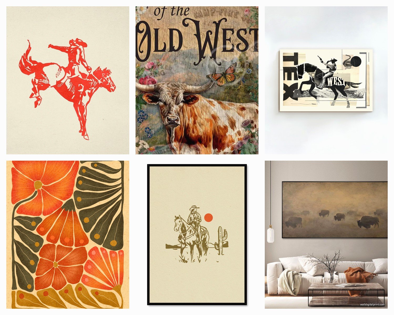
What I’ve found works better is vintage photography or prints that look like vintage photography. Black and white rodeo shots, old ranch scenes, that kind of thing. They feel more authentic and less theme-park-y.
There’s also this whole category of line art cowboy boots and hats that’s very minimalist and modern – works great if your space is contemporary but you want a subtle western nod. I did a whole wall of these in different sizes for a client’s entryway and it was perfect.
Native American and Southwestern Patterns
Okay so this is the one where you gotta be actually thoughtful. I only use authentic Native artists or very clearly geometric abstract pieces that aren’t trying to appropriate specific tribal designs.
There are several Native-owned shops on Etsy and some galleries that represent Indigenous artists. It costs more but it matters. If you’re gonna put someone’s cultural art on your wall you should probably make sure they’re actually benefiting from it.
The geometric stuff – like just abstract shapes in Southwest colors – is a safer route if you’re unsure. Think mid-century modern meets desert vibes.
Frame Choices That Actually Matter
So I used to think frames didn’t matter that much but with western decor they really do. The wrong frame makes everything look cheap or confused.
Wood frames in natural or dark walnut tones are your safest bet. They reinforce the organic western feel without being too literal. I avoid anything distressed or whitewashed because it starts reading farmhouse instead of western and those are different vibes.
Black frames work great for a more modern take – especially with black and white photography or line art pieces. They create this cool contrast that keeps the space from feeling too rustic.
Metal frames in bronze or copper tones are underrated for this theme. I found these amazing thin bronze frames at Target last month and they’re perfect for desert landscape prints.
Oh and another thing – float mounting can look really good with western art. It’s where the print appears to float inside the frame with space around it. Makes even affordable prints look more expensive and gallery-like.
The Gallery Wall Approach vs Statement Piece
You gotta decide early which route you’re going because it changes everything.
For a gallery wall I usually do 5-9 pieces in varying sizes. The trick is starting with your largest piece and building around it – don’t try to make everything the same size because it looks too rigid for the western theme which is supposed to feel a bit wild and natural.
I use painter’s tape on the wall to map it out before I start hammering. Takes forever but saves you from having 47 holes in your wall. My client last week skipped this step and… yeah don’t skip it.
With a statement piece you want something really striking – like a 48×36 inch desert landscape or a dramatic longhorn photo. Center it on the wall and maybe flank it with two smaller pieces or wall sconces. Keep it simple though. The statement piece should be doing all the work.
Mixing Western with Your Existing Stuff
This is probably what you’re actually worried about right – how to add western art without making your whole house look like a dude ranch.
The secret is treating it like an accent rather than the entire personality of the room. If you’ve got a modern space, add one or two pieces of western art but keep your frames and colors consistent with the rest of your decor.
I mixed western prints with abstract art in my own hallway and it totally works because the color palette is cohesive. Everything has those warm terracotta and cream tones even though the subjects are completely different.
Also you can balance western art with contemporary furniture and it creates this cool eclectic vibe. Like a sleek modern couch with a vintage cowboy photograph above it? That’s actually a really sophisticated look.
Rooms Where Western Art Works Best
Living rooms are obvious but I’ve also done:
- Dining rooms with vintage map prints of western territories
- Bedrooms with soft desert landscapes – super calming
- Home offices with black and white ranch photography
- Mudrooms with cowboy boot line art
- Bathrooms with small cactus prints (sounds weird but it’s cute)
The one place I’d be careful is kitchens because western art tends to be large and kitchens have limited wall space with all the cabinets and stuff.
Lighting Considerations Nobody Mentions
Your western art is gonna look completely different depending on your lighting. Warm bulbs (2700-3000K) make the whole thing feel cozier and more authentic. Cool white bulbs make it look washed out and weird.
If you’re serious about a statement piece, consider adding a picture light above it. I installed these battery-operated LED picture lights from Amazon (like $25 each) and they made such a difference. Suddenly the art looked intentional and curated instead of just… there.
Natural light is tricky – don’t hang valuable prints in direct sunlight because they’ll fade. But if you’ve got prints you’re okay with fading over time, that warm afternoon light actually looks beautiful on desert landscapes.
Budget Real Talk
You can totally do this on a budget, you just gotta be strategic. I mix price points all the time:
Affordable options that don’t look cheap:
- Printable art from Etsy – like $5-8 per print then you frame it yourself
- Amazon canvas prints – some are actually decent quality
- Society6 sales – they do 20% off constantly
- Target’s Threshold collection has some good western-adjacent pieces
- Thrift store frames that you spray paint
Where I spend more:
- One really good statement piece – like $200-400 range
- Work from actual artists if it’s going in a prominent spot
- Custom framing for special pieces
The middle ground is buying nice prints online and getting them framed at Michael’s with a coupon. Their framing is overpriced at full price but with 50% off it’s reasonable and looks professional.
Common Mistakes I See Literally All The Time
Hanging stuff too high – the center of your art should be at eye level which is like 57-60 inches from the floor. Everyone hangs things too high and it makes the room feel off.
Buying everything from the same collection – it looks too matchy and catalog-like. Mix different artists and styles within your color palette.
Ignoring the undertones – if your walls are cool-toned gray and you add warm terracotta western art it’s gonna clash. You need either warm walls or cooler-toned western pieces.
Going too literal with the theme – you don’t need cowboys AND cacti AND longhorns AND desert landscapes all in one room. Pick 1-2 elements and commit to those.
Forgetting about scale in relation to furniture – your art should be roughly 2/3 to 3/4 the width of the furniture below it. This is just a guideline but it helps things feel proportional.
wait I forgot to mention – if you’re renting and can’t put holes everywhere, those Command picture hanging strips actually work pretty well for lighter frames. I’ve used them in staging situations and they hold up fine. Just follow the weight limits.
The whole western wall art thing is really about creating that feeling of open space and natural beauty without being too theme-y about it. Start with one piece you genuinely love, build your color palette around it, and don’t overthink it too much. I’ve redone so many rooms because I overthought the whole thing when really it just needed to feel good, you know?