Wall Art Guide, Wall Art Tutoriels
Cow Wall Art: Farmhouse Highland Cattle Decor
Jun
So I’ve been obsessing over cow wall art lately and honestly it started because a client wanted to redo their dining room with farmhouse vibes but didn’t want the usual “Live Laugh Love” situation. Highland cattle specifically have this whole thing going on that’s way more interesting than regular farm animals.
Why Highland Cows Hit Different
Okay so here’s the thing about highland cattle art versus regular cow prints. The shaggy hair, those horns, the way they photograph in misty Scottish fields… it’s moody? Like you can go rustic farmhouse but also kinda modern and dramatic. I spent way too long one night (my dog kept wanting to go out every 20 minutes so I was just scrolling) looking at different cow art styles and the highland ones just have more personality.
Regular Holstein dairy cows are cute but they read very “country kitchen” and specifically grandma’s country kitchen. Highland cattle can work in a loft apartment if you style it right. Which sounds weird but I’ve done it.
The Main Styles You’ll Actually See
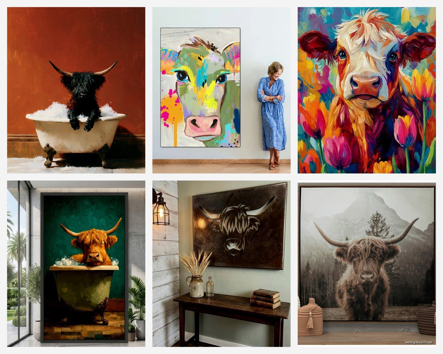
Black and White Photography Prints
These are everywhere right now and for good reason. The monochrome thing makes the texture of the fur really pop and it feels more gallery-like than cutesy. I’ve used these in modern farmhouse spaces where color would’ve been too much. They work especially well in black frames obviously but also natural oak if you want it softer.
The best ones have good contrast and you can actually see the individual strands of hair. Avoid the ones where everything looks muddy or gray. You want crisp blacks and true whites.
Warm Sepia or Brown Tones
This is more traditional farmhouse territory. The warm tones play nice with wood furniture, cream walls, that whole neutral palette everyone’s been doing. I had a client who wanted her breakfast nook to feel cozy and we did a sepia highland cow print above the built-in bench and it just… worked. Made the space feel lived-in immediately.
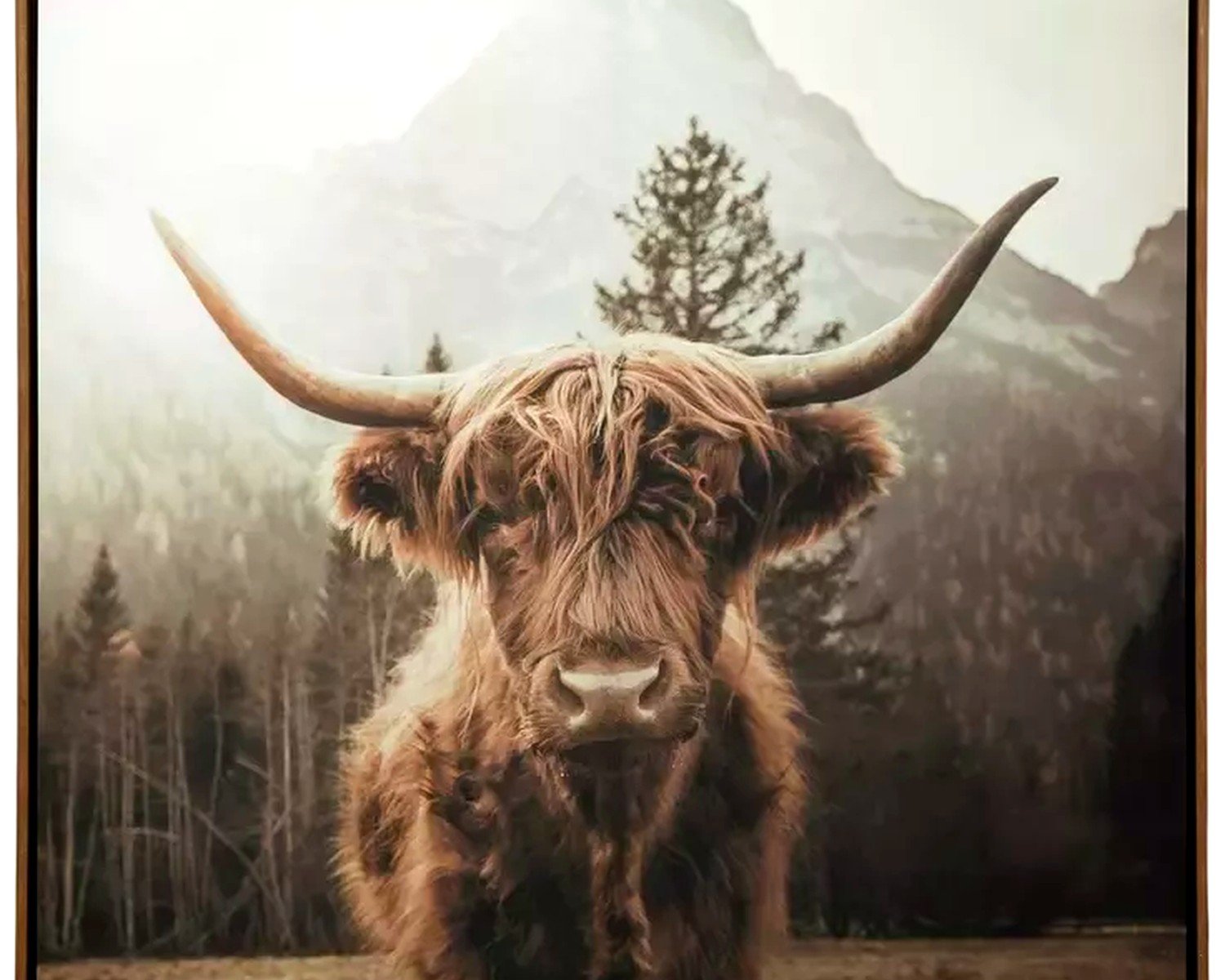
Color Photography
The reddish-brown fur against green Scottish highlands or gray skies. This is trickier because you’re introducing specific colors that need to work with your room. But when it works it WORKS. I’ve seen these look amazing in rooms with sage green or dusty blue accents. The natural colors are muted enough that they don’t scream at you.
Minimalist Line Art
For people who want the concept without the photorealism. Simple black line drawings of highland cattle faces or profiles. These feel more modern and can go in smaller spaces or gallery walls where a big dramatic photo would be too much. They’re also way cheaper usually which is nice when you’re doing a whole wall of frames.
Watercolor or Painted Styles
Hit or miss honestly. Some look really artistic and elevated, others look like they belong in a craft fair booth (not judging, just different vibes). If you go this route, make sure the painting style matches your overall aesthetic. Loose watercolors work better in bohemian or eclectic spaces, while more realistic paintings can go farmhouse.
Sizing This Stuff Out
Okay so this is where people mess up all the time. They either go too small and it looks like an afterthought, or they panic and go huge when the space can’t handle it.
For above a sofa or bed: You want the art to be roughly 2/3 the width of the furniture. So if your couch is 90 inches, you’re looking at around 60 inches of art width. This can be one large piece or a diptych or triptych. I did a three-panel highland cow set above a king bed once and used 24×36 inch prints for each panel – looked cohesive but not boring.
For dining rooms: Above a sideboard or console, go bigger than you think. Like 40×60 inches isn’t too big if your sideboard is 60+ inches long. The drama of a large highland cow print in a dining room is honestly *chef’s kiss*. Makes it feel intentional.
For smaller spaces: Don’t automatically go tiny. Sometimes one good 24×36 or 30×40 piece is better than a bunch of small scattered frames. Depends on the wall though.
Framing Options That Actually Matter
The frame changes everything and this is gonna sound obvious but I’ve seen people pick the wrong frame and ruin a perfectly good print.
Black frames: Modern, crisp, work with literally any cow art style. Can’t go wrong. I default to black when I’m not sure.
Natural wood frames: Oak, walnut, whatever. These warm everything up and feel more traditionally farmhouse. But make sure the wood tone doesn’t clash with your other furniture. I learned this the hard way when I put honey oak frames in a room with dark walnut tables and it looked… off.
White or cream frames: Softer, more cottage-like. Good for nurseries or bedrooms where you want it gentle. Can wash out black and white photos though so be careful.
No frame/canvas prints: The stretched canvas look is fine but reads less elevated to me? Like it’s more casual. Which might be what you want. I use these in family rooms and basements more than formal spaces.
Mat or No Mat
If you’re doing a print behind glass, a mat (especially white or cream) gives it breathing room and feels more gallery-like. Without a mat it’s more casual and direct. Both work, just different vibes.
Where to Actually Buy This Stuff
I’ve ordered from basically everywhere at this point so here’s the real talk.
Etsy: Huge selection, lots of independent photographers and artists. Quality varies wildly so read reviews. You can find digital downloads which are cheap but then you gotta print them yourself. Or you can buy physical prints. I’ve had good luck with shops that have thousands of sales and consistent reviews. Just watch the shipping times because some print-on-demand.
Amazon: Fast shipping, easy returns, but the art can feel generic. Good for getting something up quickly while you figure out what you really want. I’ve bought canvas prints here for staging homes before selling them.
Society6 and Redbubble: Print-on-demand sites with artist designs. The quality is decent, not amazing. Good if you want something specific like a watercolor style you found. Framing options available but add up cost-wise.
Local print shops: If you have a photo you love (check licensing if it’s not yours), local print shops can do really high-quality prints on nice paper. More expensive but the quality difference is noticeable. I do this for clients who want something special.
HomeGoods/TJ Maxx type stores: Hit or miss but when you hit you HIT. I’ve found gorgeous highland cow art for like $40 that would’ve been $150+ elsewhere. You gotta go regularly though because inventory changes constantly.
Styling It In Your Space
Okay so you bought the art, now what. Just slapping it on a wall isn’t gonna cut it.
The Solo Statement Piece
One large highland cow print centered above a sofa, bed, or console. Keep it simple. Maybe add two small wall sconces on either side if it’s above a console, or just leave it alone. The cow is the moment. Don’t crowd it with other stuff.
I did this in a client’s entryway – huge black and white highland cow face right when you walk in. Nothing else on that wall. Everyone comments on it.
Gallery Wall Integration
You can mix cow art into a gallery wall but be thoughtful. I usually do the cow print as the largest piece and then surround it with smaller frames of complementary stuff – landscapes, botanical prints, abstract art in similar tones.
Don’t do like all farm animals. A cow, a chicken, a pig, a horse… that’s too theme park. One cow print with other art looks curated. Multiple farm animals looks costume-y unless you’re really committing to a barn aesthetic.
Paired Sets
Two matching or complementary highland cow prints side by side. Could be two different cows, or the same cow in different poses, or one close-up face and one full body shot. This works well above longer furniture like sofas or sideboards. Keep the frames identical.
Leaning vs. Hanging
Oh and another thing – you don’t have to hang everything. Large framed prints leaning on a mantel or console can look really effortless and cool. I do this when I don’t wanna commit to holes in the wall or when the space feels too formal otherwise. Just make sure it’s stable and not gonna tip over if someone bumps it.
Color Palette Stuff You Gotta Consider
Highland cow art works best in neutral rooms but you can definitely add color. Here’s what I’ve seen work:
All white/cream: The cow art adds texture and interest without color. Very Scandinavian farmhouse. Clean and calm.
Warm neutrals: Beiges, tans, warm grays, natural wood. This is classic farmhouse and highland cows fit right in. The brown tones in their fur echo the warmth.
Cool neutrals with contrast: Gray walls, white trim, black accents, then a black and white cow print. More modern farmhouse. Feels less country, more sophisticated.
With color accents: If you have sage green, dusty blue, terracotta, or even mustard yellow accents, color highland cow photos can tie it together. The natural landscape colors in the photos (green grass, blue-gray skies) complement these tones.
What doesn’t really work is super bright or saturated colors. Like hot pink and highland cows? Nah. Unless you’re doing something really intentionally eclectic and you know what you’re doing.
Room by Room Real Talk
Living room: Above the sofa is obvious but also consider above a fireplace if you have one. Large scale works here. This is your public space so you can go bold.
Dining room: I love highland cow art in dining rooms. There’s something about the rustic elegance that works with gathered meals. Above a sideboard or buffet, or on a feature wall if you have one.
Bedroom: Go softer here usually. Maybe a sepia tone or a gentler color photo rather than stark black and white. Above the bed or on a wall you see when you wake up. I’ve done nurseries with sweet highland cow prints and they’re adorable without being baby-ish.
Kitchen: Sure, if your kitchen is eat-in and has wall space. Keep it away from cooking zones where grease might be an issue. Better for a breakfast nook wall.
Office/study: Actually works great. Feels grounded and calm. A nice black and white highland cow portrait can make a home office feel more pulled together.
Bathroom: I mean… you can? I’ve seen it in powder rooms. Just make sure the humidity won’t damage your print if it’s a full bathroom with a shower.
The Trendy vs. Timeless Question
Look, highland cow art is having a moment right now, no question. But I think it’s got staying power if you do it right. The key is not going too theme-heavy. One really good piece of highland cow art reads as artistic choice. Ten cow-related items in one room reads as trend-chasing.
Also the style you choose matters. A well-done black and white photograph is pretty timeless. A cartoon-y highland cow with a flower crown is gonna date itself faster. Not that there’s anything wrong with trendy if you’re okay changing things out in a few years.
wait I forgot to mention – if you’re renting or don’t wanna deal with hanging, there are peel-and-stick options now. Removable wall decals of highland cows. I haven’t personally used these for clients but I’ve seen them online and they could work for temporary situations or kids’ rooms where you might want to change things up.
Budget Considerations Real Quick
You can do this at basically any price point which is nice.
Under $30: Digital downloads you print yourself at Staples or wherever, or small ready-made prints from Amazon. Frame from Target or IKEA.
$50-150: Quality prints from Etsy sellers, framed prints from online retailers, or lucky finds at HomeGoods. This is the sweet spot for most people.
$200+: Large custom prints, high-quality framing, or original artwork. Worth it if this is a key piece in an important room and you’re gonna live with it for years.
I’ve mixed price points in the same house and nobody can tell which pieces cost what if they’re styled well. The $40 HomeGoods find next to the $200 custom print? They look equally intentional if they’re the right size and framed nicely.
Common Mistakes I See People Make
Going too small for the space – this is number one. Measure your wall and furniture before buying.
Hanging it too high – art should generally be at eye level, which is around 57-60 inches from the floor to the center of the piece. Above furniture you want 6-8 inches between the furniture top and the bottom of the frame.
Mixing too many different frame styles in one space – pick a frame style and commit, at least for one wall or room.
Getting too literal with the farmhouse theme – you don’t need cow art AND chicken art AND pig art AND a “Farm Fresh” sign. Pick one animal and make it the star.
Not considering the existing colors in the room – that color highland cow photo might be gorgeous but if the orange tones clash with your purple-gray walls it’s not gonna work.
Buying before measuring – I can’t tell you how many times people buy art they love and then it doesn’t fit their space. Measure first, then shop with those dimensions in mind.
Okay I think that covers most of what I’ve learned from doing this a bunch of times. Highland cattle art is honestly one of those things that seems specific but is actually really versatile if you approach it right. The key is treating it like real art, not just a theme decoration, and making sure it fits your actual space and lifestyle rather than just copying what you saw on Pinterest.