Wall Art Guide, Wall Art Tutoriels
Positive Wall Art: Uplifting Affirmation & Quote Designs
Jun
So I’ve been doing this whole positive wall art thing for about three years now and honestly it started because a client asked me to find something “motivational but not cheesy” and I was like…okay that’s gonna be impossible. But it wasn’t? And now I literally have a whole system for this.
The Actually Good Stuff vs The Stuff That Makes People Cringe
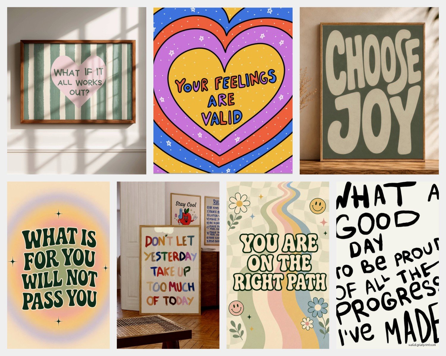
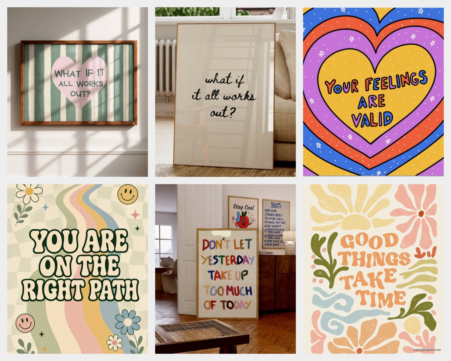
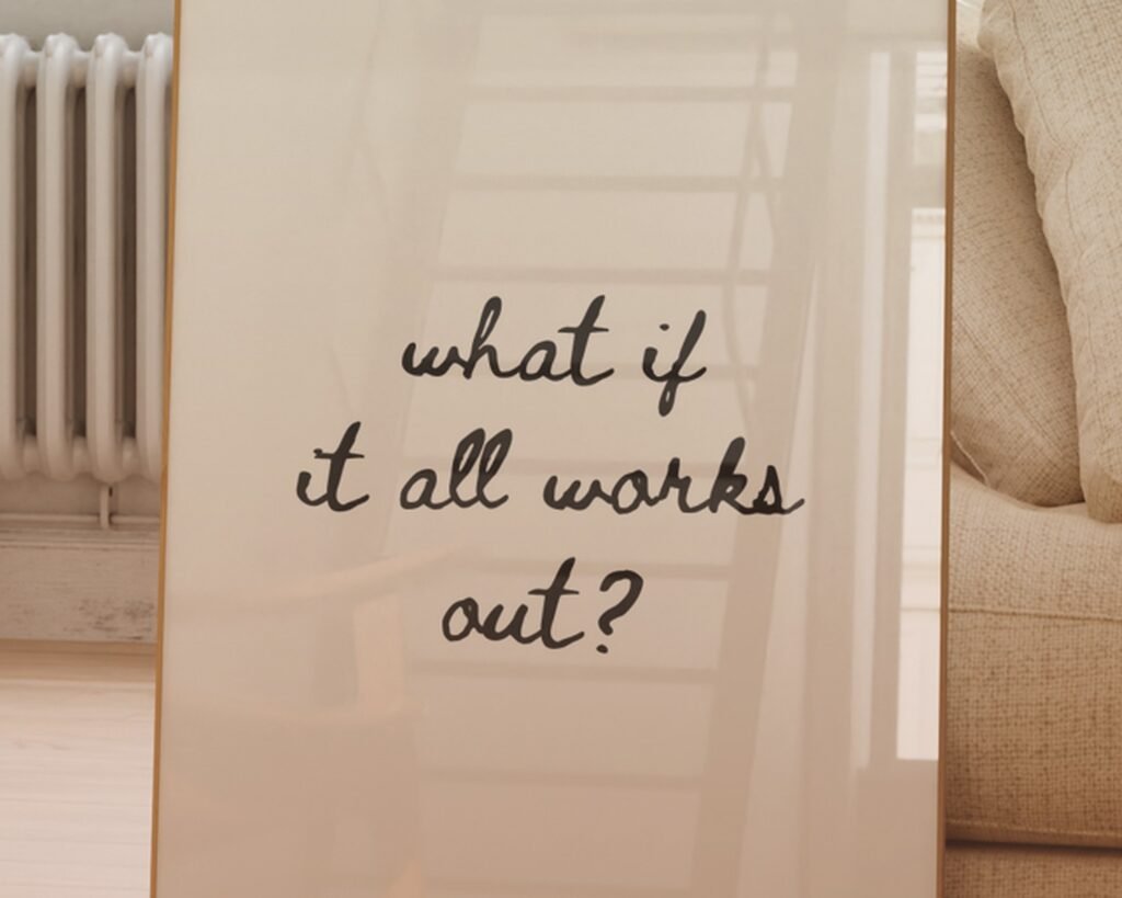
Here’s the thing nobody tells you – most affirmation art looks like it came from a 2014 Pinterest board and not in a good way. You know what I mean. The super scripty font over a blurry beach photo with “Live Laugh Love” or whatever. Your goal is to find pieces that feel more like art that happens to have words, not words that someone slapped onto clip art.
I usually tell people to look for designs where the typography IS the design. Like when the letters themselves are interesting shapes or colors. My friend Sarah has this piece in her office that just says “Keep Going” but the letters are made from these bold geometric shapes in rust and navy and it looks expensive even though she got it on Etsy for like forty bucks.
Typography Matters More Than You Think
Okay so this is gonna sound weird but spend like ten minutes learning basic font categories. You don’t need to be a designer but knowing the difference between serif and sans-serif will save you so much time. Serif fonts (the ones with little feet on the letters) tend to feel more classic and formal. Sans-serif is cleaner and more modern. Script fonts can go either way but they’re SO easy to overdo.
For positive affirmations I usually stick with:
- Bold sans-serif for short punchy phrases like “You Got This” or “Begin”
- Elegant serif for longer quotes that are more literary
- Minimal script ONLY if the rest of the design is super simple
I made the mistake once of buying this beautiful script piece that said something lovely but literally nobody could read it from more than two feet away. It’s in my closet now because I can’t bring myself to donate it but also can’t hang it anywhere.
Color Psychology But Make It Practical
Everyone talks about color psychology like you need a degree to pick colors but honestly just think about how you want to feel in that room. My bedroom has this soft sage green print that says “Rest is Productive” and it genuinely helps me chill out at night. Meanwhile my home office has this energetic yellow and black piece with “Make It Happen” because I need that kick in the morning.
The actual practical part is matching your existing decor though. I take photos of my walls on my phone and then when I’m browsing online I hold my phone up to the screen to see if colors work together. Low-tech but it works.
What Actually Works in Different Rooms
Living room – This is where you want stuff that’s more universal and guest-friendly. Nothing too personal or intense. I like abstract pieces with single words like “Gather” or “Home” or even just “Hello.” Keep it welcoming but not preachy.
Bedroom – This is YOUR space so you can get more personal. I have clients who do really vulnerable affirmations here like “I am enough” or “Tomorrow is a new day.” One client has “You are loved” above her bed and she told me she reads it every morning and it genuinely shifts her whole day.
Office/workspace – Motivational but not toxic positivity vibes. “Progress over perfection” is huge right now. “Done is better than perfect.” Stuff that reminds you to actually DO the work but also gives you permission to not be perfect. I’m personally obsessed with “Start before you’re ready” because I’m a chronic over-planner.
Bathroom – okay this might sound random but bathroom art is underrated? You’re in there every morning doing your routine…why not have something positive to look at. Keep it simple though. “Breathe” or “Today is yours” or something short.
Size and Placement (This Is Where People Mess Up)
Real talk – most people buy wall art that’s too small. Like WAY too small. Your eye level should hit roughly the middle of the piece, and it should take up about two-thirds to three-quarters of the wall space you’re filling.
I use painter’s tape to map out dimensions before buying anything. Cut tape to the exact size of the piece you’re considering and stick it on the wall. Live with it for a day or two. You’ll know pretty quick if it’s right.
Gallery walls with multiple affirmation pieces can work but they’re tricky. You gotta have a cohesive color palette and similar frame styles or it looks chaotic. I did one for myself with five different quotes all in black frames with white mats and varying sizes…took me three attempts to get the spacing right and my cat knocked one off the wall during attempt number two which was honestly devastating.
Mixing Affirmations with Other Art
This is actually my favorite approach. Don’t make EVERYTHING on your walls be quotes. Mix in abstract pieces, photography, regular art. The affirmation pieces will stand out more and feel more intentional.
In my living room I have two abstract prints, one landscape photo, and ONE piece that says “Seek Magic in the Ordinary” and because it’s surrounded by non-text art, people actually stop and read it. When every piece has words, people tune it all out.
Where to Actually Buy This Stuff
Etsy is obvious but you gotta filter through so much garbage. Search for “minimalist affirmation print” or “modern typography quote” to avoid the cheesy stuff. Look for shops that offer instant downloads so you can print it yourself at whatever size you need – way more flexible.
Society6 and Redbubble have good options and the quality is consistent. More expensive than Etsy downloads but you don’t have to deal with printing and framing yourself.
Target and HomeGoods actually have decent options now? I’ve found some surprisingly good pieces there. The trick is going frequently because their inventory changes constantly.
oh and another thing – independent artists on Instagram. I’ve commissioned three custom pieces from artists I found through hashtag searches. Usually costs between $50-150 depending on size and detail but you get something nobody else has.
DIY Route If You’re Into That
Canva makes this so easy it’s almost too easy? They have templates for literally everything. You can customize colors, fonts, sizes. Then just download and get it printed at a local print shop or even FedEx.
I made a series for a client’s daughter’s room – four 8×10 prints with different affirmations in her favorite colors. Total cost including frames from IKEA was maybe $60 and it looked like we spent way more.
Framing Matters
Please don’t use those cheap black plastic frames unless you’re going for a very specific dorm room aesthetic. Even inexpensive wood frames look better. IKEA’s Ribba frames are like $10-15 and look fine.
I’m personally a fan of floating frames or the ones with thin metal edges for modern spaces. Thicker wood frames work better for traditional or farmhouse vibes.
White mats make everything look more expensive and professional. This is my number one tip. A $5 print in a frame with a white mat looks way better than a $50 print with no mat.
The Actual Words That Work
Short is usually better. Three to five words max for primary pieces. Longer quotes work if they’re really meaningful but they need excellent typography to pull it off.
Words that I see working really well:
- “Begin” – so simple but so good
- “You are capable”
- “Keep going”
- “This too shall pass” – cliché but genuinely comforting
- “Brave” – single word pieces are having a moment
- “Almost there” – I have this in my kitchen for some reason and I love it
- “Not all who wander are lost” – overdone but people still love it
Avoid anything that feels like it’s yelling at you. “HUSTLE HARDER” or “NO EXCUSES” or whatever – that’s not uplifting, that’s just stressful. We’re going for gentle motivation not aggressive productivity culture.
Seasonal Rotation
This is extra but some people rotate their affirmation pieces seasonally? Like lighter, breezier quotes in summer (“Sunshine state of mind”) and cozier stuff in winter (“Slow down”). I don’t personally do this because I’m lazy but I have a client who swears by it and her house always feels really intentional.
What to Do When You’re Sick of Looking at It
Real problem nobody talks about – you WILL get tired of reading the same affirmation every day. It loses impact after a while.
Options:
- Move it to a different room for fresh eyes
- Swap with a friend who’s also into this stuff
- Store it and bring it back out in six months
- Donate it and get something new
I have like a rotation system now where I keep 5-6 pieces and swap them out every few months. Keeps things feeling fresh without spending a fortune constantly buying new art.
Custom Affirmations That Actually Mean Something to You
Generic quotes are fine but the really powerful stuff is personal. Inside jokes, phrases from your family, lyrics from songs that got you through hard times, words someone important said to you once.
I have “We’ll figure it out” in my hallway because that’s what my mom always said growing up and it just…hits different than some generic motivational quote, you know?
You can get custom pieces made pretty easily now. Lots of Etsy sellers do custom typography. Send them your phrase and color preferences and boom, done.
The Practical Stuff Nobody Mentions
Lighting affects how your piece looks WAY more than you’d think. That print that looked perfect in the store might look washed out on your wall if the lighting is different. I always check pieces in both natural light and evening lamp light before committing to a spot.
Glare is real – if you’re using glass frames, position them where they won’t reflect windows or lamps directly. Or use non-reflective glass which costs more but solves the problem.
Humidity matters for bathrooms and kitchens. Use sealed frames or acrylic prints in those spaces instead of paper prints that might warp.
Wait I forgot to mention – command strips are your friend for renters or if you change your mind a lot. They hold more weight than you’d think and don’t damage walls. Just follow the instructions exactly or they won’t work right.
When Positive Art Actually Helps vs When It’s Just Decoration
Real talk – sometimes this stuff genuinely helps your mindset and sometimes it’s just pretty words on your wall. The difference usually comes down to whether you actually LOOK at it and think about it or if it just fades into background noise.
I try to position pieces where I naturally pause during my day. Above the coffee maker, by the door I use to leave the house, across from my desk chair. Places where my eyes naturally land during transitions in my day.
One of my clients puts a different small affirmation card on her bathroom mirror each week – just a printed 4×6 card she changes out. She says seeing something NEW every week keeps her actually reading them instead of tuning them out. Smart.
Look, at the end of the day this is just about putting words on your walls that make you feel something good. It doesn’t have to be deep or perfect or Instagram-worthy. If “Tacos are life” makes you smile every time you see it, hang that up. Who cares. Your space should work for you, not for some imaginary interior design judge.
The pieces that work best are the ones you actually chose intentionally, not just bought because they looked nice in someone else’s house or were on sale. Take your time, think about what you actually need to hear on your bad days, and go from there.