Wall Art Guide, Wall Art Tutoriels
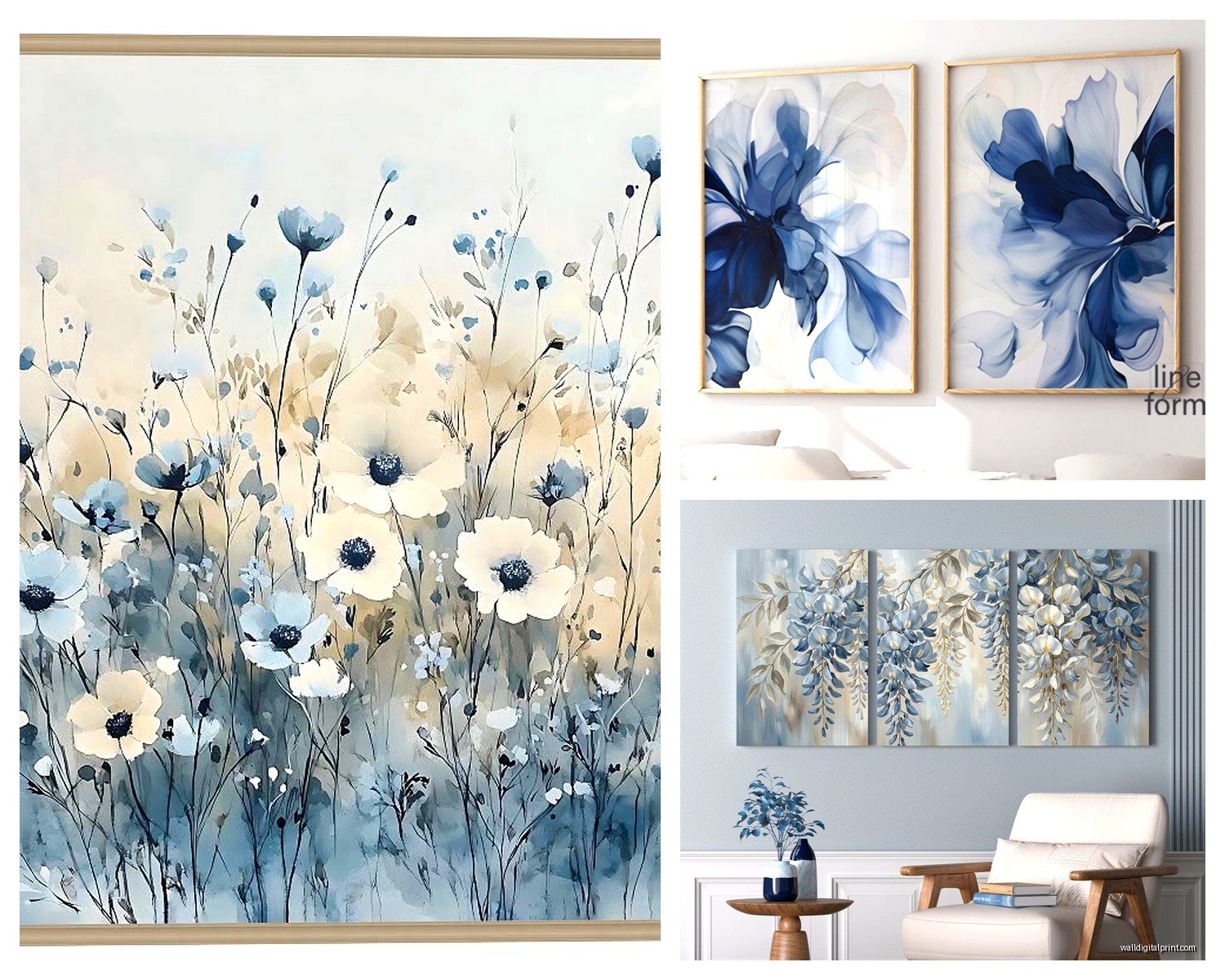
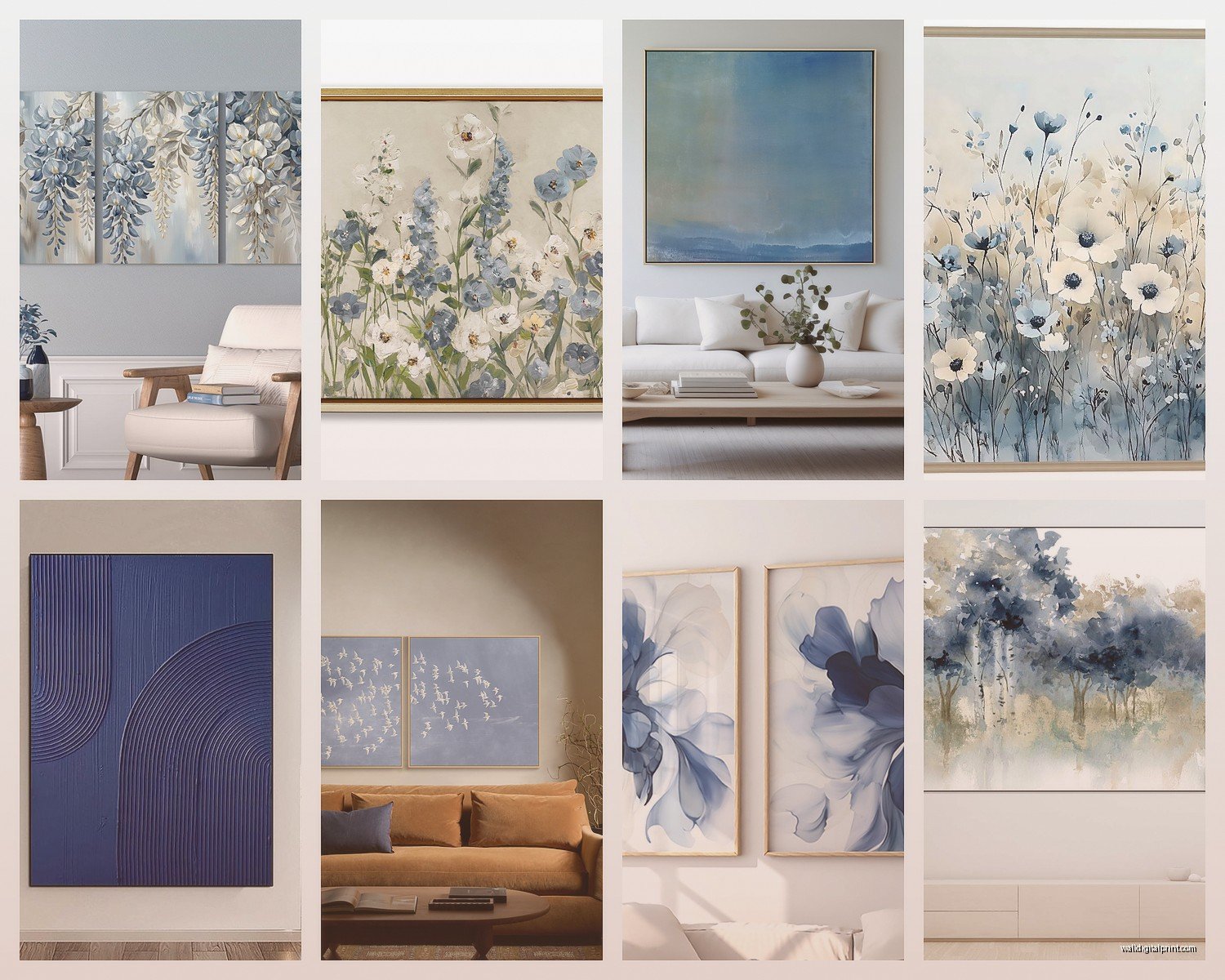
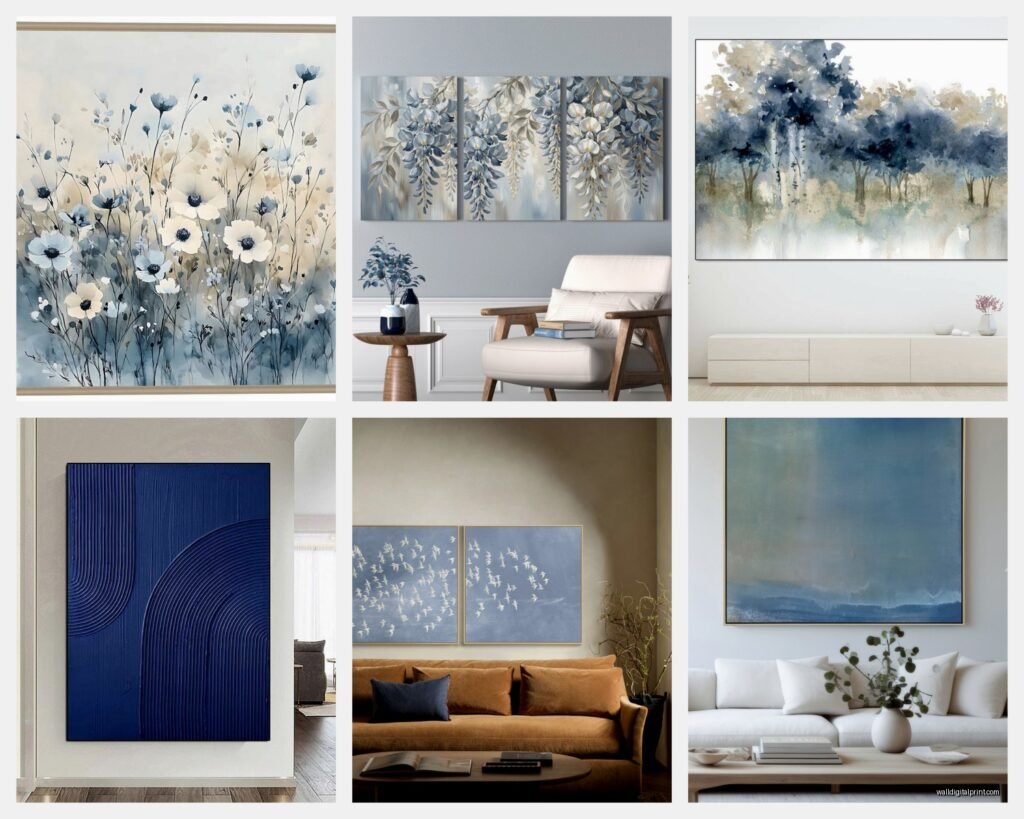
Blue Wall Art for Living Room: Ocean Sky Main Space Decor
Aug
So I’ve been dealing with blue wall art in living rooms for like three years now and honestly it’s one of those things that sounds super simple until you’re standing in your space with seventeen different shades of blue wondering why nothing looks right.
Why Blue Actually Works (And Why It Doesn’t Sometimes)
Okay so here’s the thing about blue – it reads completely different depending on your light. I had this whole situation last month where a client bought this gorgeous ocean wave print, looked amazing in the store, got it home and it turned straight up purple in her north-facing living room. We ended up moving it to a different wall that got afternoon light and suddenly it was perfect again.
The trick is you gotta think about your existing light temperature. Warm light (like those Edison bulbs everyone’s obsessed with) makes blues look more teal or greenish. Cool light keeps them crisp. I literally take my phone and photograph the wall at different times of day now before recommending anything because I got burned too many times.
Picking the Right Blue Shade
This is gonna sound weird but I divide blue art into like four categories based on what they actually do to a space:
Navy and Deep Blues – these ground a room but can make it feel smaller if you go too big. I use these in living rooms that are actually pretty large or have tons of natural light. My favorite trick is pairing a large navy abstract piece with lighter furniture so the art becomes this anchor point.
Ocean/Turquoise Blues – this is what most people think they want when they say “ocean sky decor” but it can go coastal grandma real fast if you’re not careful. Works best when you mix it with unexpected elements like black frames or industrial shelving instead of all that whitewashed wood stuff.
Sky/Powder Blues – super calming but can wash out if your walls are already light. I did a whole living room last year where we used pale blue art on a greige wall and it just… disappeared. Needed way more contrast than we thought.
Cobalt/Bright Blues – these are statement pieces and you gotta commit. Can’t do a tiny 8×10 cobalt print and expect it to do anything. Go big or skip it entirely.
Size and Placement Because Everyone Gets This Wrong
Okay so funny story, I watched my neighbor hang a beautiful blue seascape print and she put it like six inches above her couch and it looked like it was trying to escape the room. The standard rule is 6-8 inches above furniture but honestly I go more like 5-6 for living rooms because people are usually viewing from seated position.
For sizing over a sofa you want the art to take up about two-thirds to three-quarters of the sofa width. I know that sounds huge but anything smaller looks like you just… gave up halfway through decorating. If you can’t afford one big piece do a gallery wall but make sure the overall arrangement hits that proportion.
Gallery walls with blue art – oh man I have thoughts. The biggest mistake is doing all ocean themed stuff in similar shades. It becomes visual mush. What actually works is mixing your blues with:
- Black and white photography or line drawings
- Warm toned abstracts (just one or two pieces)
- Different blue shades at different saturation levels
- Mixed frame colors instead of all matching
I did one last month where we mixed navy abstracts with cream textured pieces and just two turquoise accent prints and it actually looked intentional instead of “I bought everything from the beach section at HomeGoods.”
Types of Blue Art That Actually Work in Living Rooms
Abstract Ocean Pieces – these are everywhere right now and for good reason. The ones with resin finishes or actual texture are worth the extra money because they catch light differently throughout the day. But watch out for the really glossy ones if you have windows directly across from where you’re hanging them. Glare city.
I’ve been recommending alcohol ink pieces lately because they have that organic ocean feel without being literal waves and fish. More sophisticated somehow.
Landscape Photography – coastal scenes, sky photos, that whole vibe. These work best in larger formats, like 30×40 minimum. Small landscape photos just look like you raided a calendar. Mount them in simple frames, none of that ornate gold stuff unless your whole room is leaning traditional.
Geometric and Modern – blue geometric art is having a moment and I’m here for it. It gives you that color without committing to a theme. Works especially well in living rooms that are more contemporary or eclectic. Just installed three blue geometric prints in a client’s space last week and they totally changed the energy without making it feel themed.
Mixed Media and Textured – anything with actual dimension. Fiber art, layered canvas, wood and resin combos. These add so much more interest than flat prints and they’re conversation starters. My cat knocked over a glass of water near one once and I almost cried but it was fine.
Framing Decisions Nobody Tells You About
White frames with blue art – classic but can feel basic if everything else in your room is also white. I like doing white frames when the walls are darker or when there’s wood tones in the furniture.
Black frames – make blues pop like crazy and add instant sophistication. This is my go-to for most living rooms honestly. Works with literally any shade of blue.
Natural wood frames – tricky with blue because it can go coastal real fast. Light oak or maple frames work better with powder blues. Walnut or darker woods pair well with navy and deep blues.
No frame/canvas wraps – fine for abstract pieces but landscape photography really needs a frame to feel finished. Just my opinion but I’ve tested this a lot.
Mixing Blue Art with Your Existing Stuff
If you already have a lot going on in your living room, blue art needs to either complement or contrast, can’t just sit in the middle. Like if you have warm-toned furniture (browns, tans, warm grays), go for blues with some green undertones or mix in some warm accent colors in your art selection.
Cool-toned rooms (grays, whites, blacks) can handle pure blues and even lean into cooler teals and cyan shades.
Wait I forgot to mention – if you have a lot of patterns already happening in your space, your blue art should be more simple and solid. If your room is pretty minimal, that’s when you can go crazy with detailed ocean scenes or complex abstracts.
Lighting Your Blue Art
This makes such a difference and most people skip it entirely. Picture lights are having a renaissance and they actually work great with blue art because they add that warm glow that balances the cool tones.
Track lighting or adjustable ceiling spots – angle them at like 30 degrees to avoid glare. I learned this the hard way after installing art under existing lighting that created this weird hot spot right in the center.
Natural light – already covered this but seriously, test your art placement at different times before you commit to drilling holes. My client canceled last Tuesday so I spent an hour just moving a blue abstract around someone’s living room at different times and the difference between morning and afternoon light was wild.
Budget Options That Don’t Look Cheap
Okay so you don’t gotta spend a fortune. Here’s what actually works:
Society6 and similar sites – quality varies but their larger prints on good paper stock look legit when properly framed. Just avoid the super trendy stuff that’ll feel dated in six months.
Etsy digital downloads – you download and print locally at a print shop. The secret is getting them printed on quality paper or canvas and framing them properly. A $15 digital download in a $50 frame looks way better than a $200 print in a cheap frame.
Thrift stores – I find amazing blue art at thrift stores all the time. Sometimes it’s in ugly frames but you just reframe it. Found this incredible blue abstract last month for $12 that probably cost someone $300 originally.
DIY if you’re remotely artistic – abstract blue art is super forgiving. Get some canvas, decent acrylic paints in various blues, and just layer and blend. Literally watched a YouTube tutorial while eating dinner and made something that looked intentional enough to hang.
Common Mistakes I See Constantly
Matching your blue art exactly to one throw pillow – this isn’t how design works and it looks forced. Your blues should coordinate, not match perfectly.
Hanging everything at the same height in a gallery wall – mix it up or it looks like a grid which is fine if that’s your vibe but usually feels stiff in a living room.
Choosing art last – I know you’re supposed to do this technically but in reality if you fall in love with a piece of blue art, build around it. It’s easier than finding art to match everything else.
Going too literal with the ocean theme – waves, anchors, “seas the day” quotes… it’s a lot. One or two literal pieces mixed with abstracts feels more curated.
Seasonal Swapping
Something I’ve started doing in my own place and recommending to clients – having a few different blue pieces to rotate seasonally. Lighter, brighter blues in spring and summer, deeper navies and stormy blues in fall and winter. You don’t gotta change everything, just swap the main focal piece. Makes the room feel fresh without redecorating entirely.
Working with What You’ve Got
If you’re renting or can’t paint, blue art becomes even more important because it’s your main color injection. Go bigger and bolder than you think you should. Removable hanging strips have gotten so much better – I use them for anything under 15 pounds now and they actually hold.
For awkward walls or spaces above furniture that’s not quite centered, asymmetrical arrangements with blue art work really well. Three pieces in different sizes clustered to one side, balanced by a plant or lamp on the other side of the furniture.
The spot above the TV is controversial but if you’re gonna do it, make sure the art is wider than the TV and hung high enough that you’re not constantly looking at it while watching. Blues work here because they’re not super distracting.
Oh and another thing – if you have a fireplace, blue art above it is classic but make sure it can handle some heat exposure if you actually use the fireplace. Some prints and especially photographs can fade or warp. Canvas is usually safer.
Just remember the whole point is making your living room feel like your space, not like a beach resort lobby, so mix in your personality with the blue stuff and don’t overthink it too much.