Wall Art Guide, Wall Art Tutoriels
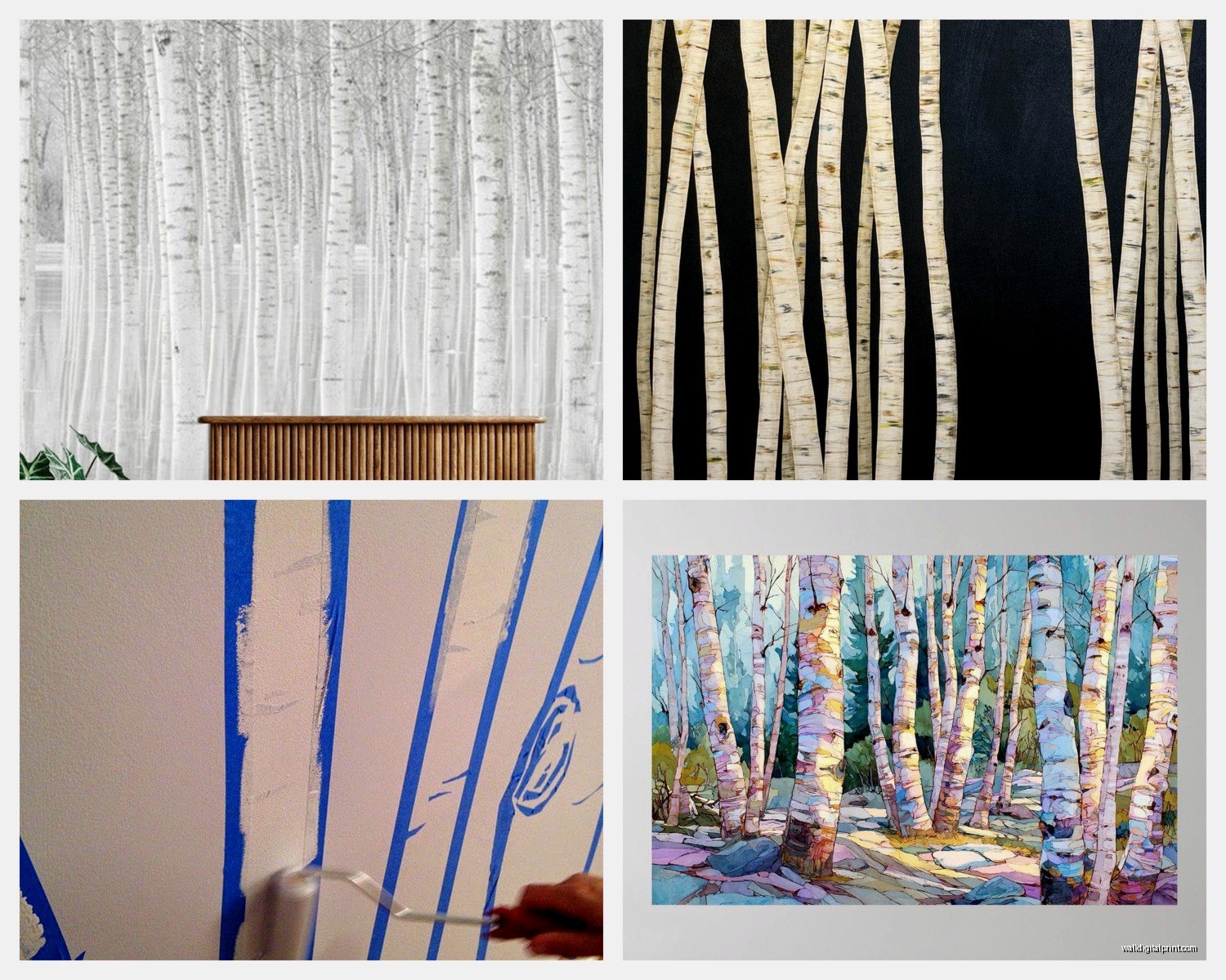
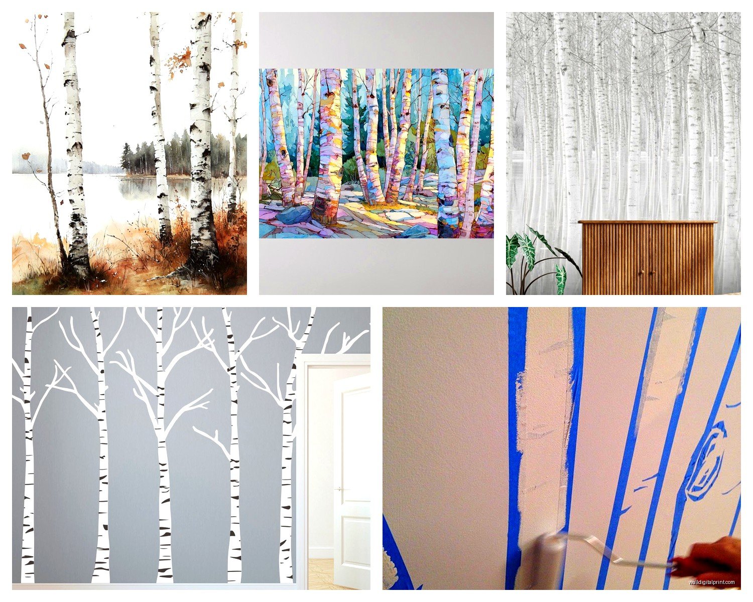
Birch Tree Wall Art: White Bark Forest Winter Landscape
Sep
So I’ve been obsessing over birch tree wall art lately and honestly it started because a client wanted to do this whole winter cabin vibe without making their downtown loft look like a ski lodge threw up everywhere. Birch trees are kinda perfect for that because they’re elegant but still have that nature thing going on.
Picking the Right Type of Birch Art
Okay so first thing, you gotta decide what kind of birch art actually works for your space. I’ve tested like way too many versions of this in my own place and client spaces and here’s what I’ve learned.
The photography prints are probably the easiest to start with. You want high-resolution ones where you can actually see the texture of the bark, those little black marks and everything. I got one from this Etsy shop last year and the detail was insane, you could see every peel of bark. The cheaper ones look flat and boring, trust me. Spend at least 40-50 bucks if you’re going the print route.
Canvas prints are more forgiving if your walls aren’t perfectly smooth. They hide imperfections better and they have this gallery feel without being pretentious. I usually go for canvas when I’m working with textured walls or older buildings. The wrapped edge thing where the image continues around the sides looks way more expensive than it is.
What About Original Paintings
Original acrylic or oil paintings are gonna cost you more but they add actual texture to the room. I have this one piece in my hallway where the artist layered the white paint so thick you can see the brushstrokes from across the room. My dog ran into it once and I had a minor heart attack but it was fine.
The thing with paintings is you need good lighting. Natural light washes them out sometimes, so I usually put them on walls that get indirect light. LED picture lights are like 30 bucks on Amazon and make such a difference.
Size Actually Matters More Than You Think
This is where everyone messes up, including me the first time. A tiny birch print on a huge wall looks sad and lost. I did this in my living room initially and my friend came over and was like “is that art or a window?”
For above a sofa or bed, you want the art to take up about two-thirds to three-quarters of the furniture width. So if your couch is 84 inches, you’re looking at around 56-63 inches of art width. You can do one big piece or a triptych situation with three panels.
I’m obsessed with triptychs for birch trees actually because you can create this forest effect where it feels like you’re looking through actual trees. I did a three-panel setup in a client’s bedroom last month, each panel was 16×48 inches, and it completely transformed the space. The vertical format makes ceilings look higher too which is a bonus.
Going Oversized
If you have a really big wall like behind a dining table or in a stairwell, don’t be scared of oversized pieces. I’m talking 40×60 inches or bigger. The impact is totally different. But here’s the thing, you gotta make sure the image quality can handle being blown up that large or it’ll look pixelated and weird.
Color Palette Considerations
Okay so funny story, I thought all birch art was just black and white and called it a day. Wrong. The background color changes everything about how the piece feels in your room.
White or light grey backgrounds keep things minimal and Scandinavian. This works if you have a lot of color elsewhere in the room or if you’re going full minimalist. I use these in spaces with bold furniture or colorful textiles.
Dark backgrounds, like charcoal or black, make the white birch bark really pop and add drama. These work amazing in modern spaces or if you want moody vibes. I have one with an almost-black background in my office and people always comment on it. The contrast is just chef’s kiss.
Then there’s the actual winter landscape ones with blue-grey skies or snow on the ground. These read more seasonal which can be good or bad depending on what you want. I usually steer clients away from super snowy scenes unless they’re okay with it feeling Christmas-y. A light dusting of snow is fine, but when there’s like snowdrifts and stuff it feels very December specific.
Wait I Forgot to Mention Color Accents
Some birch art has subtle color accents, like hints of gold leaf or touches of blue in the shadows. These can tie into other colors in your room. I did a piece with copper accents that picked up the copper light fixtures in the space and it felt so intentional even though it was kind of an accident.
Framing Options That Don’t Suck
The frame literally makes or breaks birch art, I’ve learned this the hard way.
Black frames are classic and work with pretty much everything. They add definition and make the art feel more formal and gallery-like. I use black frames probably 60% of the time.
White or light wood frames keep things airy and Scandinavian. These are great for smaller spaces or rooms that are already dark. The light frame doesn’t add visual weight.
Natural wood frames in walnut or oak tones add warmth. This is my go-to when the space needs to feel cozier. The wood grain next to the birch bark creates this nature-on-nature thing that works.
Floating frames where there’s a gap between the art and frame are super modern and let the piece breathe. More expensive usually but worth it for the right space.
Oh and another thing, you can also skip the frame entirely if you’re doing canvas. The gallery wrap look is clean and contemporary. Just make sure the sides are finished nicely.
Where to Actually Buy This Stuff
I’ve ordered from basically everywhere at this point so here’s my breakdown.
Etsy is great for unique pieces and you’re supporting actual artists. The quality varies wildly though so read reviews carefully. I look for shops with at least 100 sales and 5-star ratings. Shipping can take forever with international sellers so plan ahead.
Society6 and Redbubble let you get the same design in different formats which is convenient. The quality is pretty consistent. Not amazing but reliable. Good for renters who might want to switch things up.
Local art fairs and galleries are where I find my favorite pieces. Yeah it’s more expensive but you get something nobody else has. Plus you can see it in person which matters way more than people think.
For budget-friendly options, HomeGoods and TJ Maxx sometimes have birch prints. It’s hit or miss and you gotta check regularly. My assistant found this amazing piece there for like 40 bucks that I’m still jealous about.
Custom Printing Route
If you find a photo you love online, you can get it custom printed. Mpix and Nations Photo Lab do good quality large format prints. Just make sure you have rights to the image or it’s from a stock photo site. Resolution needs to be at least 150 dpi at the size you want to print, preferably 300 dpi.
Hanging Tips Because Everyone Asks Me This
The center of the art should be at eye level, which is roughly 57-60 inches from the floor to the center of the piece. But this is more of a guideline because everyone’s different heights and furniture changes things.
For art above furniture, leave 6-8 inches between the furniture and the bottom of the frame. More than that and they look disconnected, less and it feels cramped.
Use proper hardware, please. I’ve seen too many pieces crash down because someone used a tiny nail. For anything over 20 pounds, use wall anchors or find a stud. Command strips work for lightweight pieces under 16 pounds but read the weight limits carefully.
Level is non-negotiable. Get a small level, they’re like 5 bucks. Your phone has a level app too. Eyeballing it never works, you’ll notice it’s crooked every single time you look at it and it’ll drive you insane.
Gallery Wall Configuration
If you’re doing multiple birch pieces together, lay them out on the floor first. Take a picture to remember the arrangement. I use painter’s tape to mark where frames will go on the wall before I start making holes.
Keep spacing consistent between frames, usually 2-3 inches. Closer than that feels cluttered, farther apart and they don’t read as a cohesive group.
Styling Around Birch Art
This is gonna sound weird but birch art works with way more styles than you’d think. Obviously it’s perfect for Scandinavian and modern farmhouse looks, but I’ve used it successfully in industrial spaces, traditional rooms, even boho settings.
The key is balancing it with your other elements. If the art is busy with lots of trees, keep the surrounding area simpler. If it’s more minimal, you can add texture with throws and pillows nearby.
Metallic accents look amazing with birch art. Brass, copper, or black metal side tables or lamps create nice contrast against the organic tree forms. I’m working on a space right now with birch art and all brass accents and it’s looking really sophisticated.
Plants near birch art create this indoor-outdoor connection that feels intentional. I usually do eucalyptus or anything with interesting branches to echo the tree shapes.
Lighting Considerations
Natural light can be tricky with birch art because glare is real. If you’re hanging it opposite a window, you might get reflections on the glass or glossy canvas. Matte finishes help with this.
For artificial lighting, I usually do recessed lights or track lighting aimed at the art. Picture lights work too but make sure they’re the right size for your piece. Too small looks dinky.
Avoid direct sunlight hitting the art for extended periods because it’ll fade over time, especially with prints. UV-protective glass or acrylic helps if you can’t avoid sun exposure.
Maintenance and Care
Dust regularly with a microfiber cloth. For glass-covered pieces, use glass cleaner but spray it on the cloth not directly on the frame because liquid can seep behind the glass.
Canvas pieces can be gently vacuumed with a brush attachment if they get dusty. Don’t touch the surface with your hands because oils from your skin can damage it over time.
If you’re in a humid environment, make sure there’s air circulation around the art to prevent mold. I learned this the hard way in a basement installation, had to replace the whole piece.
Common Mistakes to Avoid
Don’t hang birch art in bathrooms with showers. The humidity will warp it. Powder rooms are usually fine though.
Avoid putting it directly above heat sources like radiators or fireplaces. The heat damages both the art and the frame over time.
Don’t mix too many different birch art styles in the same room. Pick a cohesive look, like all photography or all paintings. Mixing gets chaotic fast.
And don’t forget to step back and look at it from where you’ll actually be viewing it most. What looks good up close might not work from your couch or across the room.
Budget Breakdown
Since everyone always wants to know what this actually costs, here’s roughly what I see.
Budget option is like 30-60 bucks for a decent print with a basic frame. This works fine for rental situations or if you’re just testing out the look.
Mid-range is 100-250 for better quality prints or small original pieces with nice framing. This is where I think you get the best value honestly.
Investment level is 300+ for large originals or really high-end photography with custom framing. Worth it if you’re gonna be in the space long-term and want something special.
I usually tell clients to save up for one good piece rather than buying multiple cheap ones. The quality difference is noticeable and you won’t feel like you need to replace it in a year.
Anyway that’s basically everything I know about birch tree wall art from actually using it in real spaces. My cat just knocked over my coffee so I gotta deal with that but hopefully this helps you figure out what’ll work for your place.