Wall Art Guide, Wall Art Tutoriels
Woodland Wall Art: Forest Animal & Tree Nature Decor
Jun
So I’ve been working with woodland wall art for like three years now and honestly it’s one of those things that can either look absolutely magical or turn your room into a weird cabin gift shop, and the difference is actually pretty specific.
Getting the Scale Right Because Everyone Messes This Up
Okay so first thing – and I learned this the hard way when I hung three tiny deer prints above a king bed and they just looked… lost – you gotta think about your wall space before you buy anything. Forest animal art comes in every size imaginable but here’s what actually works:
For above a sofa or bed, you want either one large piece that’s at least 2/3 the width of the furniture, or a gallery wall situation. I did a client’s living room last month where we used a massive 40×60 inch bear print and it was perfect. But then I see people buying like 8×10 frames for the same space and it just doesn’t have any presence.
Gallery walls with woodland themes are tricky though because you can’t just throw random forest animals together. I learned this when my cat knocked over my coffee onto some sketches I was planning… anyway, you need a unifying element. Either all the same frame color, or all similar art styles (like all watercolor or all line drawings), or stick to a specific color palette.
The Three Art Styles That Actually Work
There’s basically three main approaches I see working consistently:
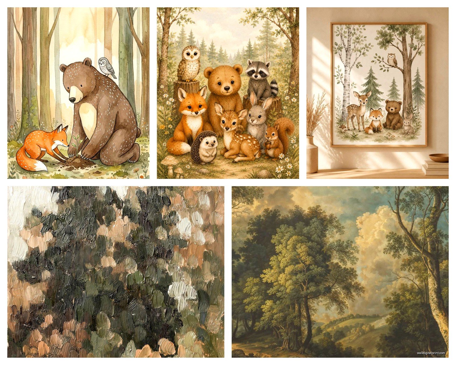
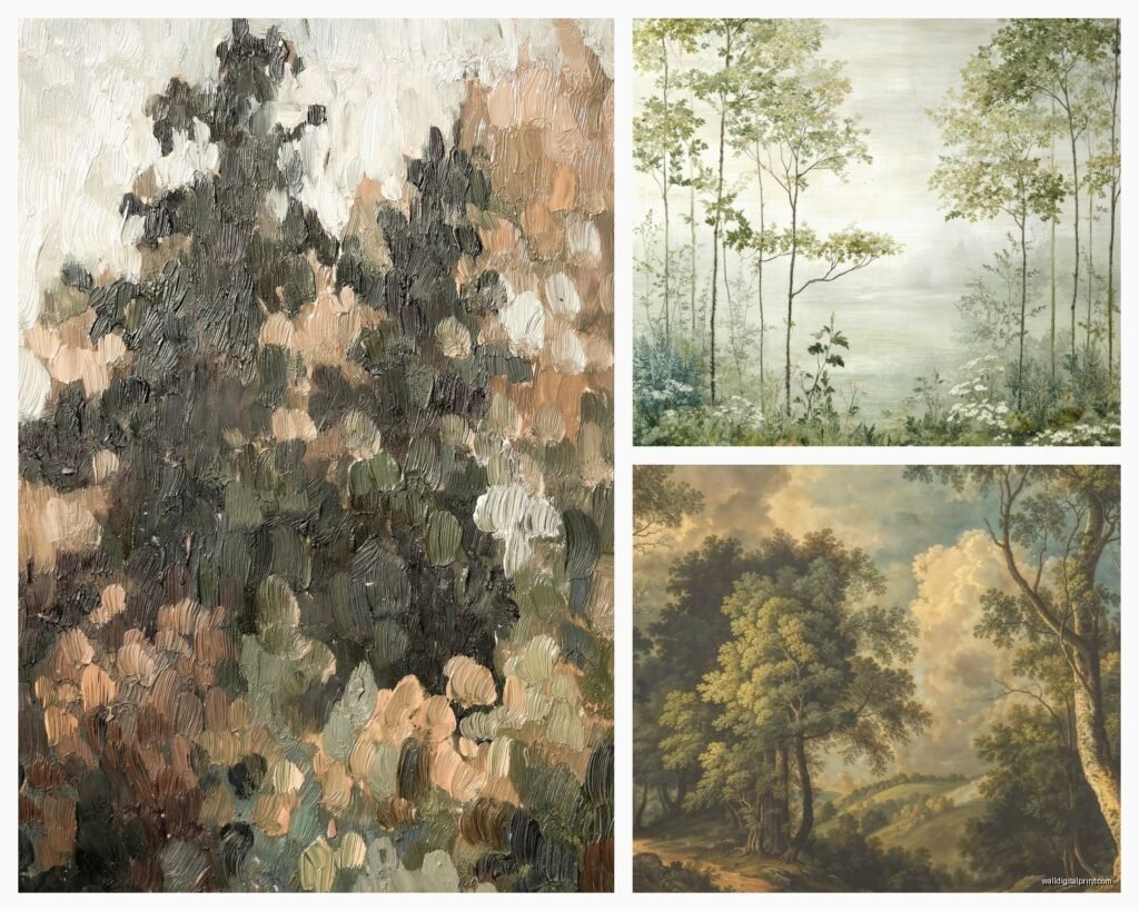
Realistic photography or paintings – These are your detailed deer in misty forests, close-ups of owls, that kind of thing. They work best in modern or contemporary spaces because the realism keeps it from feeling too cutesy. I use these in dining rooms and home offices a lot. They need to be pretty large to make an impact though, like 24×36 minimum.
Minimalist line art – This is having a moment right now and honestly it’s my go-to for smaller spaces. Simple black line drawings of deer heads, tree silhouettes, fox outlines. They’re clean, they don’t overwhelm, and you can mix them with other decor styles easily. I just finished a nursery where we did these in white frames against a sage green wall and it was chef’s kiss.
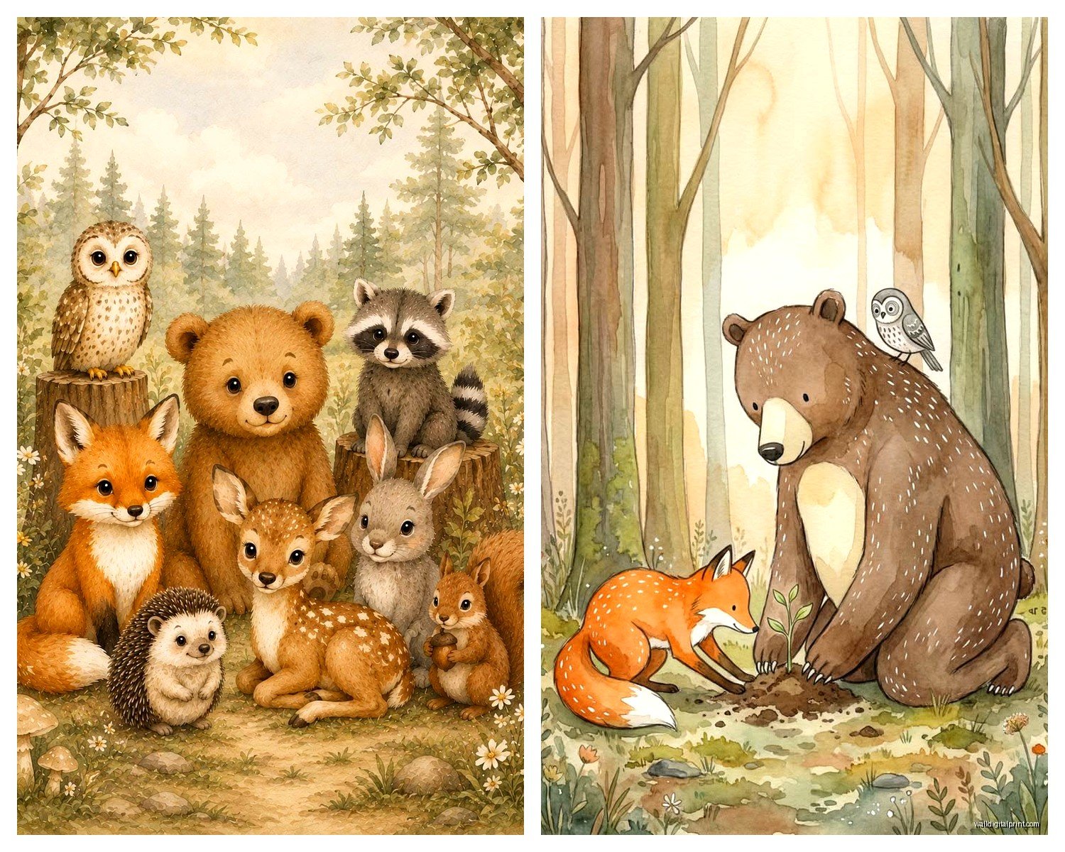
Watercolor or painterly styles – These give you more color options which is huge when you’re trying to tie into existing decor. The soft edges work really well in bedrooms and reading nooks. But – and this is important – they can skew really juvenile really fast. Look for pieces with sophisticated color palettes, not the bright primary color stuff unless you’re actually decorating a kid’s room.
Color Schemes That Don’t Look Like a Lodge
This is where people get stuck because woodland automatically makes you think brown and green and suddenly your living room feels like a hunting lodge. Here’s what I do instead:
Keep your backgrounds neutral or unexpected. I’m obsessed with woodland art that has navy backgrounds, or even black. It immediately elevates the whole thing. Or go the opposite direction with white or cream backgrounds for that Scandinavian minimal vibe.
If you’re doing tree art specifically, consider black and white or sepia tones. I have this birch tree photograph series in a client’s hallway that’s just black and white and it’s stunning, completely modern, no cabin vibes at all.
For animal art, look for pieces where the animal itself might be in natural colors but everything else is tonal or monochromatic. There’s this fox print I keep recommending where the fox is realistic but the background is this soft gray-blue wash and it works in literally every room I’ve tried it in.
Mixing Woodland Art With Other Decor Styles
Okay so funny story, I was watching this documentary about forests last week while reorganizing my print collection and it made me realize why some combinations work and others don’t. Woodland art is actually super versatile if you think about the mood you’re creating instead of the literal subject.
With modern minimalist – Stick to simple silhouettes, black and white, clean lines. One large statement piece or a very organized grid gallery wall. I did three matching birch tree prints in identical black frames, hung in a perfect row, and it looked completely modern.
With bohemian – This is where you can go more colorful and mix different art styles. Watercolor animals, pressed botanical prints, maybe some macrame in there. The key is keeping the frames consistent even if the art varies. All wood frames or all rattan or whatever.
With industrial – Metal frames, black and white photography, maybe some vintage-style botanical drawings. I love pairing deer or elk art with exposed brick and metal shelving. Keep it graphic and high-contrast.
With traditional – Honestly this is the easiest because woodland art has natural traditional vibes. Just use classic wood frames, go for more realistic paintings or detailed prints, and you’re good.
Frame Choices That Actually Matter
I’m gonna sound like a broken record but the frame makes or breaks woodland art. I’ve seen beautiful prints look cheap because of bad frames and mediocre art look expensive with the right framing.
For modern spaces, thin black metal frames or natural light wood (like oak or ash) work best. The thin profile keeps things clean and doesn’t compete with the art.
For traditional or farmhouse vibes, thicker wood frames in darker stains. But watch out – too ornate and you’re back in cabin territory.
White or cream frames are your friend for nurseries and lighter, airier spaces. They let the art be the focus without adding visual weight.
And listen, if you’re doing a gallery wall with multiple pieces, please use the same frame style for everything. I see people mixing frame colors and styles thinking it looks eclectic but with woodland themes it usually just looks messy.
The Gallery Wall Formula I Use Every Time
Since someone asked me about this literally yesterday… here’s my process:
Start with your largest piece and hang it first, slightly off-center. Then build around it with smaller pieces, keeping roughly equal spacing between frames (I use 2-3 inches).
For woodland themes specifically, I like mixing animal art with tree or leaf prints. So maybe a large deer print, then some smaller birch tree images, a fox, some fern prints. Keeps it interesting but cohesive.
Layout everything on the floor first. I cannot stress this enough. Take a photo from above so you can see how it’ll look. Rearrange until it feels balanced.
Oh and another thing – odd numbers work better than even. Three pieces, five pieces, seven. There’s something about odd numbers that feels more natural and less rigid.
Where to Actually Buy This Stuff
Okay so you’ve got options at every price point and honestly some of the budget options are just as good as the expensive ones if you know where to look.
Etsy is my secret weapon for woodland art. You can find independent artists selling prints for like $15-30, and the variety is insane. I search for “woodland animal print” or “forest wall art” and filter by the style I need. Most sellers offer different sizes too which is clutch. Just make sure you’re buying the digital download or print only if you’re gonna frame it yourself, because their framing options are usually overpriced.
Society6 and Redbubble have tons of options and you can get the same design on different products. I’ve ordered from both and the print quality is solid. They do framing too but again, I usually buy elsewhere and frame separately to save money.
For photography prints, I actually really like some of the stuff on Amazon believe it or not. There are a few sellers who do really beautiful nature photography. The trick is reading reviews carefully and checking if the images look professionally shot.
HomeGoods and TJ Maxx if you wanna see things in person before buying. Their selection is hit or miss but when they have good woodland art it’s usually well-priced. I found this amazing set of three birch tree canvases there for $40 total last year.
Minted for higher-end stuff. Their artists are really talented and the printing quality is top-notch. More expensive but worth it for statement pieces.
DIY Options That Don’t Look DIY
If you’re crafty or just want something truly custom, there’s a few routes that actually work:
Print your own from high-res downloads on Etsy. Get them printed at a local print shop or even FedEx Office on nice paper. I do this all the time for clients who want specific sizes. Just make sure the file is high enough resolution – at least 300 dpi.
Frame pressed leaves or ferns between glass. This is super easy and looks expensive if you use nice frames. I collected leaves during a hike last fall and made a whole gallery wall for my guest room. Cost maybe $60 total for frames from IKEA.
Paint your own simple silhouettes if you’re even slightly artistic. Tree silhouettes especially are forgiving. I’ve done this on canvas with acrylic paint and it turned out way better than expected.
Common Mistakes to Avoid
Hanging things too high. Your art should be at eye level, which means the center of the piece should be around 57-60 inches from the floor. I see people hanging stuff way too high all the time and it makes the room feel off.
Going too matchy-matchy with your color scheme. If your walls are forest green, you don’t need forest green in your art too. That’s overkill. Pick one or two accent colors from the art and echo those in pillows or throws instead.
Forgetting about lighting. Woodland art can look really flat without proper lighting. If you’re doing a gallery wall, consider adding a picture light or positioning it near a window. I installed simple battery-operated puck lights above a client’s forest photography series and it completely transformed the look.
Buying everything at once. I know you wanna finish the room but trust me, collect pieces over time. You’ll end up with a more curated, personal collection that way. Plus you can actually live with things and see what works.
wait I forgot to mention – seasonal rotation is actually a thing you can do with woodland art. I have some clients who swap out their pieces seasonally. Lighter, leafy green prints for spring and summer, then darker, more dramatic pieces for fall and winter. You don’t need a ton of art to do this, just like two or three key pieces that you rotate.
Making It Work in Specific Rooms
Living rooms – Go big or go home. This is where you want your statement pieces. Above the sofa is prime real estate for a large forest scene or a dramatic animal portrait. I like balancing woodland art with solid-colored furniture so things don’t get too busy.
Bedrooms – Softer, more calming pieces work best. Watercolor forests, gentle deer illustrations, misty tree scenes. Nothing too dramatic or dark unless that’s your vibe. I did a bedroom recently with a huge minimalist tree line print above the bed and it created this peaceful, retreat-like feeling.
Nurseries – This is where you can lean into the cute factor a bit more but still keep it sophisticated. Woodland creatures in soft colors, alphabet prints with forest animals, that kind of thing. Just avoid anything too cartoonish if you want it to grow with the kid.
Home offices – Realistic photography or black and white prints work great here. Keeps things professional but adds personality. I have a client who’s a lawyer and we did this amazing black and white elk photograph in his home office and it’s become a conversation piece on video calls.
Bathrooms – People forget about bathrooms but they’re perfect for smaller woodland prints. Ferns, leaves, simple tree silhouettes. Just make sure you’re using glass frames or properly sealed prints because humidity is real.
Honestly the biggest thing is just trusting your gut and not overthinking it. I’ve planned elaborate gallery walls that fell flat and thrown together last-minute combinations that looked perfect. Sometimes you just gotta hang stuff up and see how it feels, ya know?