Wall Art Guide, Wall Art Tutoriels
World Wall Art: Global Maps & Travel Decor
Jun
So I’ve been obsessing over world map art lately because honestly my living room looked so boring and I needed something that felt like… me, you know? Like I actually travel and care about places beyond my neighborhood coffee shop.
The thing about world maps as wall art is there are SO many styles and most of them are actually terrible. I learned this the hard way after ordering three different ones from Amazon that looked amazing online but showed up looking like something from a dentist’s office in 1987.
Figure Out Your Actual Style First
Okay so before you buy anything, you gotta think about what vibe you’re going for. I spent like two weeks pinning maps on Pinterest before I realized I was drawn to either super minimal black and white designs OR those gorgeous vintage-looking ones with the old-timey typography. Nothing in between really worked for me.
The main categories I’ve noticed:
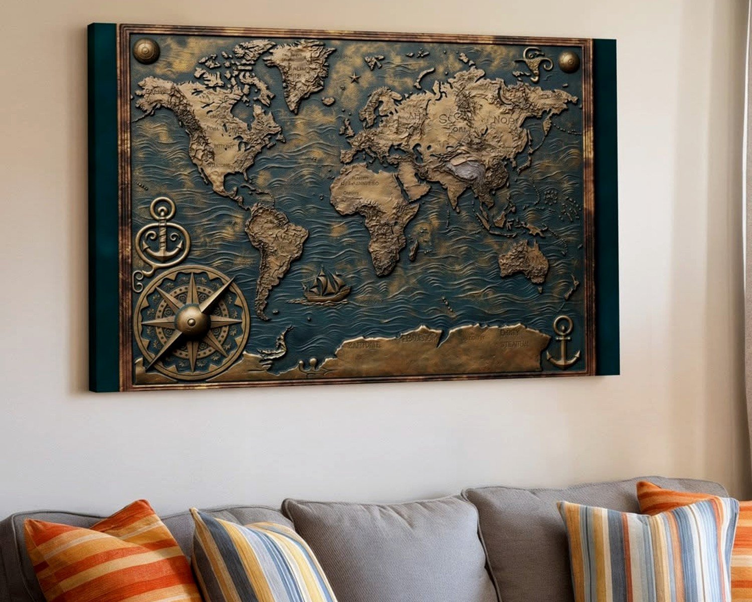
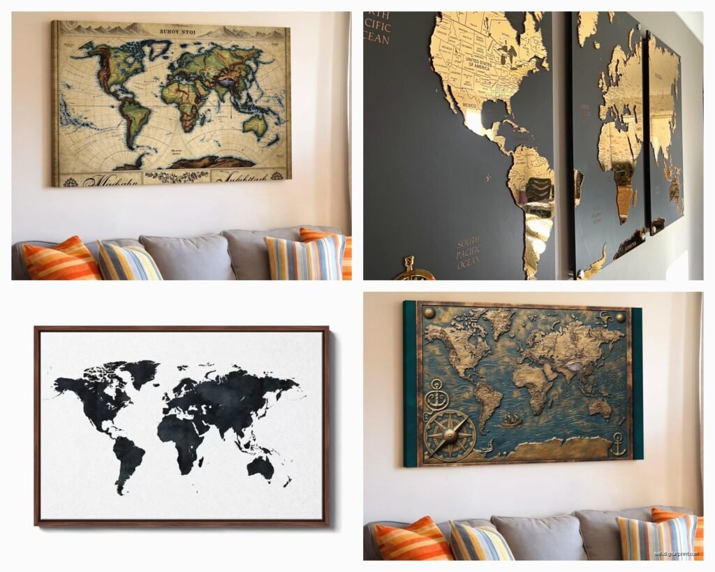
- Vintage/antique reproductions – these have that aged paper look, old cartography style
- Modern minimalist – clean lines, usually monochrome or limited color palette
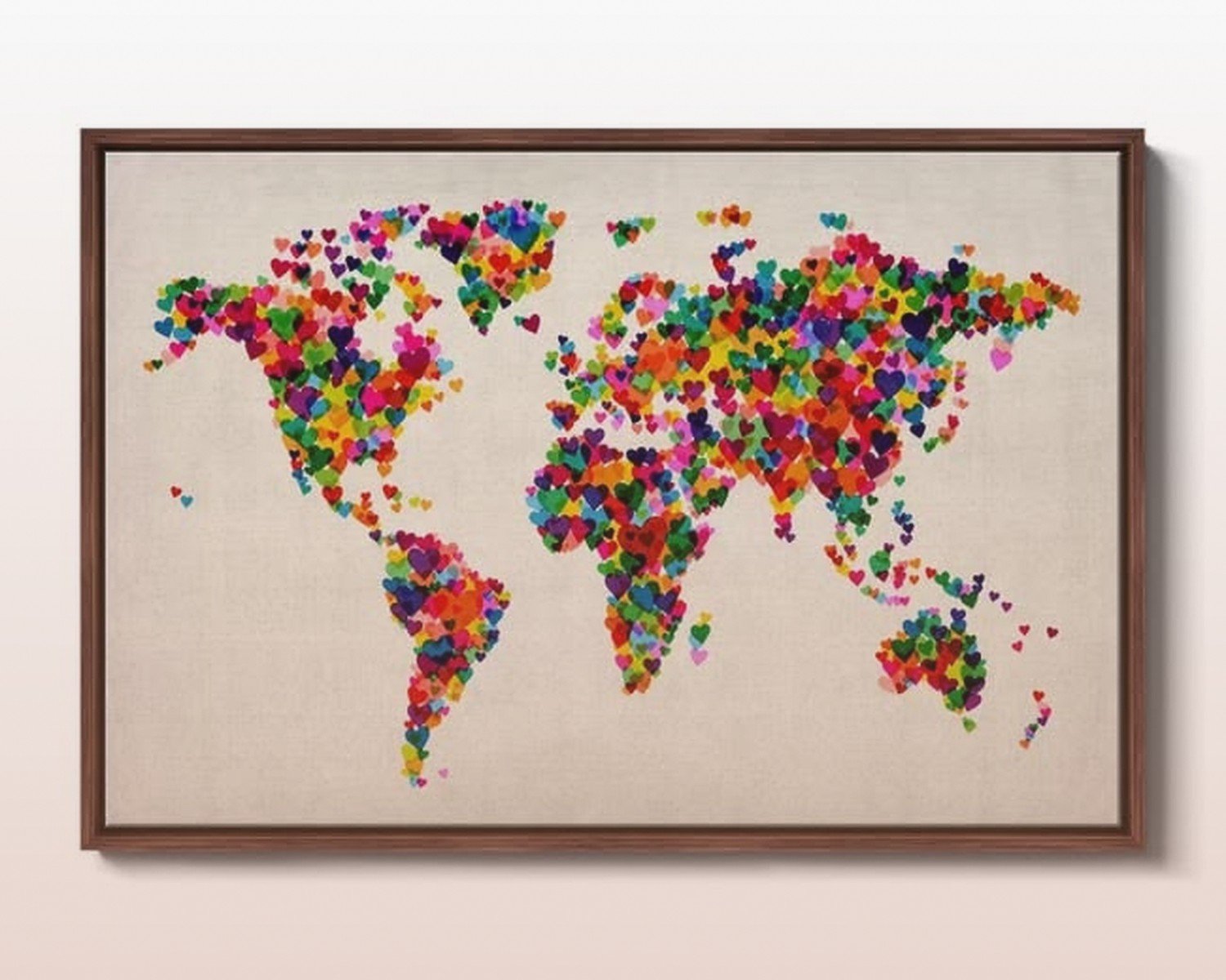
- Watercolor artistic – softer, more painterly interpretation
- Physical relief maps – actually textured, showing topography
- Push pin travel maps – cork or canvas where you mark places you’ve been
- Political boundary maps – the standard colored countries thing
I ended up going with a huge vintage-style one for my main wall and then added a smaller modern black and white one in my office. The contrast actually works because they’re in different rooms and serve different purposes.
Size Matters Way More Than You Think
This is gonna sound obvious but everyone gets this wrong including me. That 24×36 inch map you’re looking at online? It’s gonna look like a postage stamp on your wall. I’m serious.
For a focal point piece above a sofa or in a dining room, you’re looking at minimum 40×60 inches. I went with a 60×40 for my living room wall and it STILL could’ve gone bigger. My wall is like 12 feet wide though so your mileage may vary.
Here’s what I tell people: measure your wall space, then buy something that takes up at least 2/3 of that width. It sounds huge but trust me. Small art floating on a big wall just looks sad and unintentional.
Oh and another thing – if you’re doing a gallery wall with multiple maps or mixing maps with travel photos, you can go smaller with individual pieces. I did this in my hallway with vintage continent maps, each one is like 16×20, and having four of them together creates enough visual weight.
Frame or No Frame
Okay so this depends entirely on what you bought. Canvas prints you can usually hang unframed – they wrap around the edges and look finished. But paper prints? You absolutely need a frame unless you want it to look like a college dorm poster situation.
I made the mistake of buying this gorgeous antique map reproduction on paper and then spending almost as much on custom framing because standard sizes didn’t fit. Learn from my pain: check if the print comes in standard frame sizes like 24×36, 18×24, etc. You can get decent frames at Target or even Amazon for like $30-50 instead of $200+ for custom.
For a modern look I actually love the thin black metal frames. They disappear visually and let the map be the star. Wood frames work better with vintage-style maps – I used a weathered wood frame for mine and it gives off that old explorer vibe.
Wait I forgot to mention – some companies sell framed maps already which seems convenient but they’re usually overpriced and the frame quality is meh. Better to buy separately unless you find a really good deal.
The Push Pin Map Situation
So many people ask me about these. The concept is cute – you pin all the places you’ve traveled. But here’s the reality: most of them look cluttered and messy after you add pins, especially if you’ve traveled a lot OR if you haven’t traveled much and there’s just like three sad pins floating there.
I tested one in my office for six months. The cork-backed ones work better than canvas for actually holding pins securely. But aesthetically? It started looking chaotic. My cat also discovered she could pull the pins out at 3am which was super fun.
If you really want the interactive element, consider a map where you can use different colored pins for different types of trips or different people in your family. At least then the chaos has some organization to it. Or go with a scratch-off map instead – you scratch off the foil layer revealing color underneath for places you’ve been. Less holes in your wall art.
Materials That Actually Matter
Canvas is the most common and honestly the most forgiving. It doesn’t show glare, it’s lightweight, it looks finished from the sides. I have three canvas maps and zero regrets.
Paper prints are beautiful but you’re dealing with framing costs and they show glare under certain lighting. They do tend to have better detail and color accuracy though.
Metal prints are having a moment right now and I just got one for a client’s office. The map is printed directly on aluminum and it’s SO crisp and modern looking. They’re pricey but they last forever and the colors are incredibly vibrant. No framing needed.
Wood prints are also cool if you want that rustic vibe. The map is printed on planks of wood and you can see the grain through parts of the image. Very Pacific Northwest cabin energy.
Acrylic prints give you this glossy, almost 3D depth effect. They’re super modern and sleek but they show every fingerprint and dust particle so maybe skip if you have kids.
Color Schemes and Matching Your Space
Okay so funny story, I bought this gorgeous map with teal oceans because teal is one of my accent colors and when it arrived the teal was more like… turquoise? And it clashed horribly with everything. Colors on screens lie to you.
If you’re trying to match existing decor, look for maps that come in customizable colors. Some Etsy sellers and specialty sites let you choose the ocean color, land color, text color, etc. Costs more but worth it if you’re picky like me.
Neutral maps are the safest bet – black and white, grays, beiges, soft blues. They work with pretty much any style and you won’t get tired of them. I have a client who changes her decor style every year (exhausting but whatever) and her neutral map has survived every redesign.
For a bold statement, consider maps with unexpected colors. I’ve seen blush pink oceans, deep navy land masses, even rainbow gradient maps. They work best in more eclectic or contemporary spaces though.
Where to Actually Buy This Stuff
I’ve ordered from probably 15 different places at this point so here’s the real tea:
Etsy has the most variety and you’re supporting smaller sellers. Quality varies wildly though. Always read reviews and check how many sales they’ve made. I got burned by a shop with gorgeous photos but terrible print quality. Look for shops that show actual customer photos in reviews.
Society6 and Redbubble are print-on-demand sites with lots of artist designs. The quality is consistent which is nice, but the designs can feel kinda trendy and everyone has them. I have a watercolor world map from Society6 in my guest room that’s held up well for three years though.
For vintage map reproductions, I actually love library archives and museum shops online. The Smithsonian, Library of Congress, British Library – they have high-res scans of actual antique maps you can download or buy prints of. Super affordable and the real deal.
Amazon is hit or miss but convenient. Stick with sellers that have tons of reviews and recent orders. I’ve gotten some decent canvas maps there for like $40-60 but also some absolute garbage.
Specialty map companies like Mapiful or Grafomap let you customize maps of specific cities or places. They’re trendy right now – you can get a map of where you met your partner or where you got married. Cute but maybe not for everyone.
Installation Tips Nobody Tells You
Large canvas maps are lighter than you think but also more awkward than you think. The command strips rated for the weight usually work great and don’t damage walls. I use two strips rated for twice the weight just to be safe because my landlord would murder me.
For really big pieces, consider a hanging wire system instead of just nails. It distributes weight better and you can adjust positioning easier. Home Depot has kits for like $15.
If you’re hanging multiple maps in a gallery arrangement, use painter’s tape to map out the layout on your wall first. Cut paper templates the size of each piece and tape them up. Live with it for a day or two before committing. I skipped this step once and ended up with 8 holes in my wall that I had to patch.
Level apps on your phone work fine but honestly I still eyeball it half the time and it turns out fine. Don’t stress too much about perfection – slight variations actually look more natural and less sterile.
Mixing Maps with Other Travel Decor
So if you’re going for a whole travel theme, maps don’t have to stand alone. I mixed my vintage world map with some framed vintage travel posters from the 1950s – like those illustrated airline posters for Paris and Rome. The styles complement each other without being matchy-matchy.
Floating shelves near your map can hold travel books, small globes, or souvenirs. Just don’t go overboard – my friend’s house looks like an airport gift shop exploded because she put every single travel trinket on display.
Old suitcases stacked in a corner, a vintage globe on a side table, some black and white travel photography – these all play nicely with map art. The key is varying the scale and style enough that it feels curated not themed.
Oh wait, lighting makes a huge difference too. If you can add a picture light above your map or even just position it where natural light hits during the day, it becomes way more of a statement piece. I have a small LED picture light above mine that I turn on in the evenings and it completely changes the vibe of the room.
What Doesn’t Work
Let me save you some mistakes. Those decal maps that stick directly on your wall? They look cheap in person and they’re impossible to apply without bubbles. I tried one in my old apartment and gave up halfway through.
Really detailed maps with tiny text and lots of information – they just look busy and cluttered from any distance where you’d actually view them. Unless you’re a cartography nerd who wants to study it up close, go for simpler designs.
Maps with inspirational quotes overlaid on them. Just… no. It’s trying too hard. The map is enough.
Super glossy finishes show every reflection and glare. Matte or satin finishes look way better in actual living spaces.
Honestly the biggest mistake is buying something too small or too safe. If you’re gonna do a world map, commit to it. Make it a focal point. A tiny map tucked in a corner just looks like an afterthought.
I’m probably forgetting stuff but my coffee’s gone cold and I need to wrap this up. The main thing is just pick something that genuinely excites you when you look at it, make sure it’s big enough to matter, and don’t overthink the whole thing. It’s wall art not brain surgery.