Wall Art Guide, Wall Art Tutoriels
Female Body Wall Art: Feminine Figure Line Art
Jun
So I’ve been obsessing over feminine line art lately and honestly it started because I needed something for this awkward wall space in my bedroom and didn’t want another generic print from Target. The whole female body wall art thing has gotten SO popular but there’s like a million options and most of them look terrible in person, trust me.
What Actually Works Size-Wise
Okay so first thing – size matters way more than you think. I made this mistake in my living room where I got these dainty little 8×10 prints thinking they’d look elegant and minimalist but they just looked…sad? Like someone forgot to finish decorating. For line art specifically you want to go bigger than feels comfortable when you’re shopping online.
My rule now is if the wall space is above a sofa or bed, you need AT LEAST 24×36 inches. I know that sounds huge but line drawings have so much negative space that they need the real estate to make an impact. I did a 30×40 abstract female figure above my client’s bed last month and it’s literally the only art in the room but it works because it’s substantial enough to anchor everything.
For smaller walls like bathrooms or that weird space between doorways, 16×20 is your friend. Anything smaller just gets lost unless you’re doing a gallery wall situation which…we’ll get to that because it’s trickier than Instagram makes it look.
The Style Breakdown Nobody Tells You
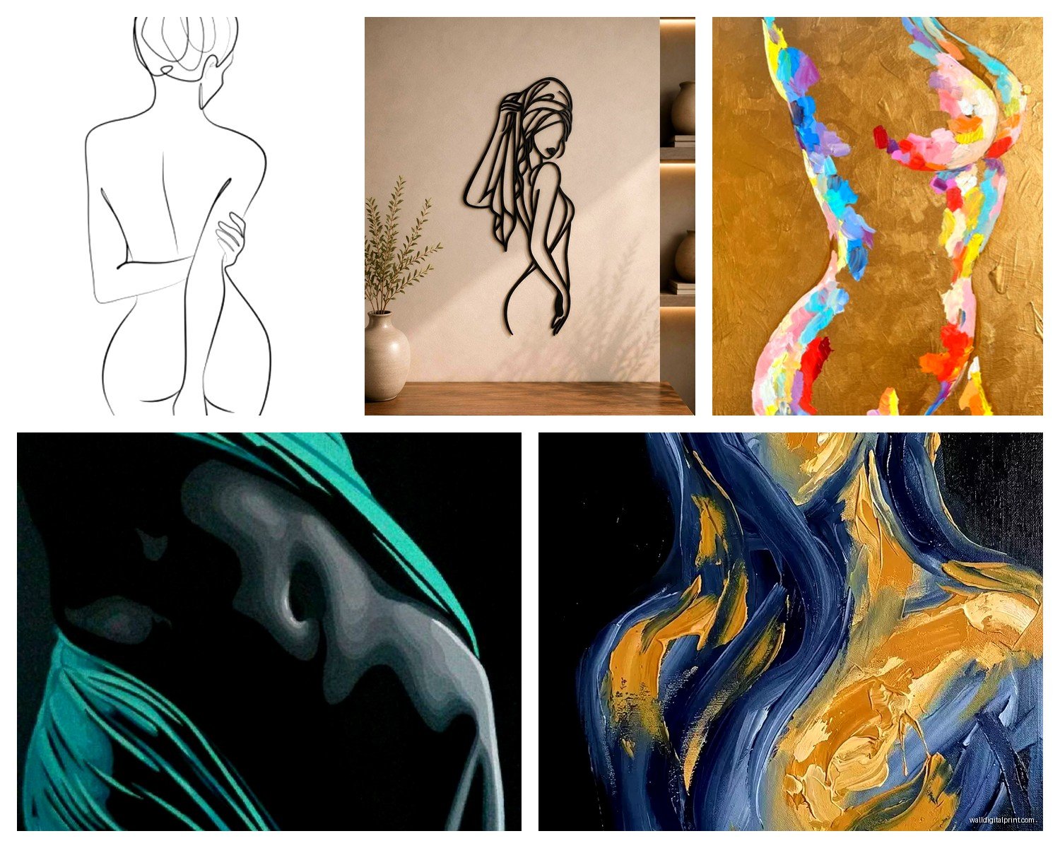
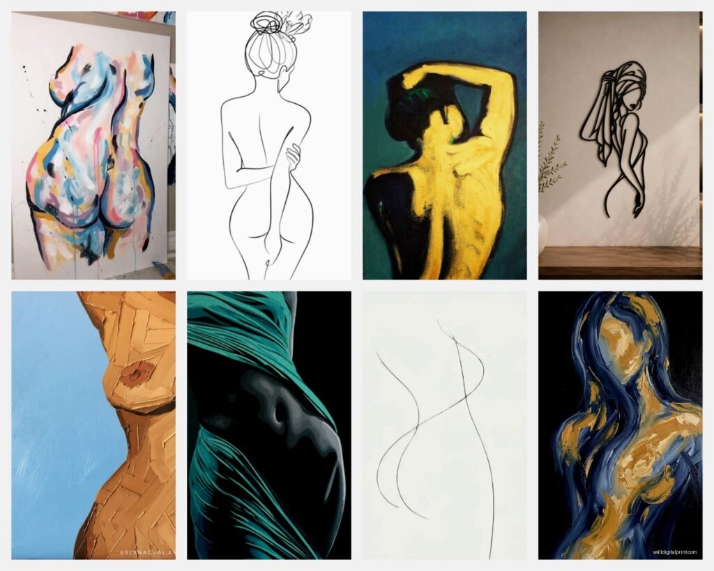
There’s basically three categories of feminine figure line art and they give COMPLETELY different vibes:
Single Continuous Line
This is where the artist draws the whole figure without lifting the pen. Very trendy right now, very Matisse-inspired. Works best in modern or Scandinavian spaces. The thing is these can look really cheap if the line quality is bad – you want smooth confident lines not shaky amateur hour stuff. I found this out the hard way when I ordered from some random Etsy shop and the print arrived looking like someone traced it with a broken mouse.
Minimal Geometric Lines
More angular, sometimes the body parts are suggested rather than fully drawn. These read as more editorial and sophisticated but they’re also harder to pull off. Your room needs to be pretty minimal already or it just adds to visual clutter. My studio apartment can’t handle this style but I used it in a client’s modern condo and it was *chef’s kiss*.
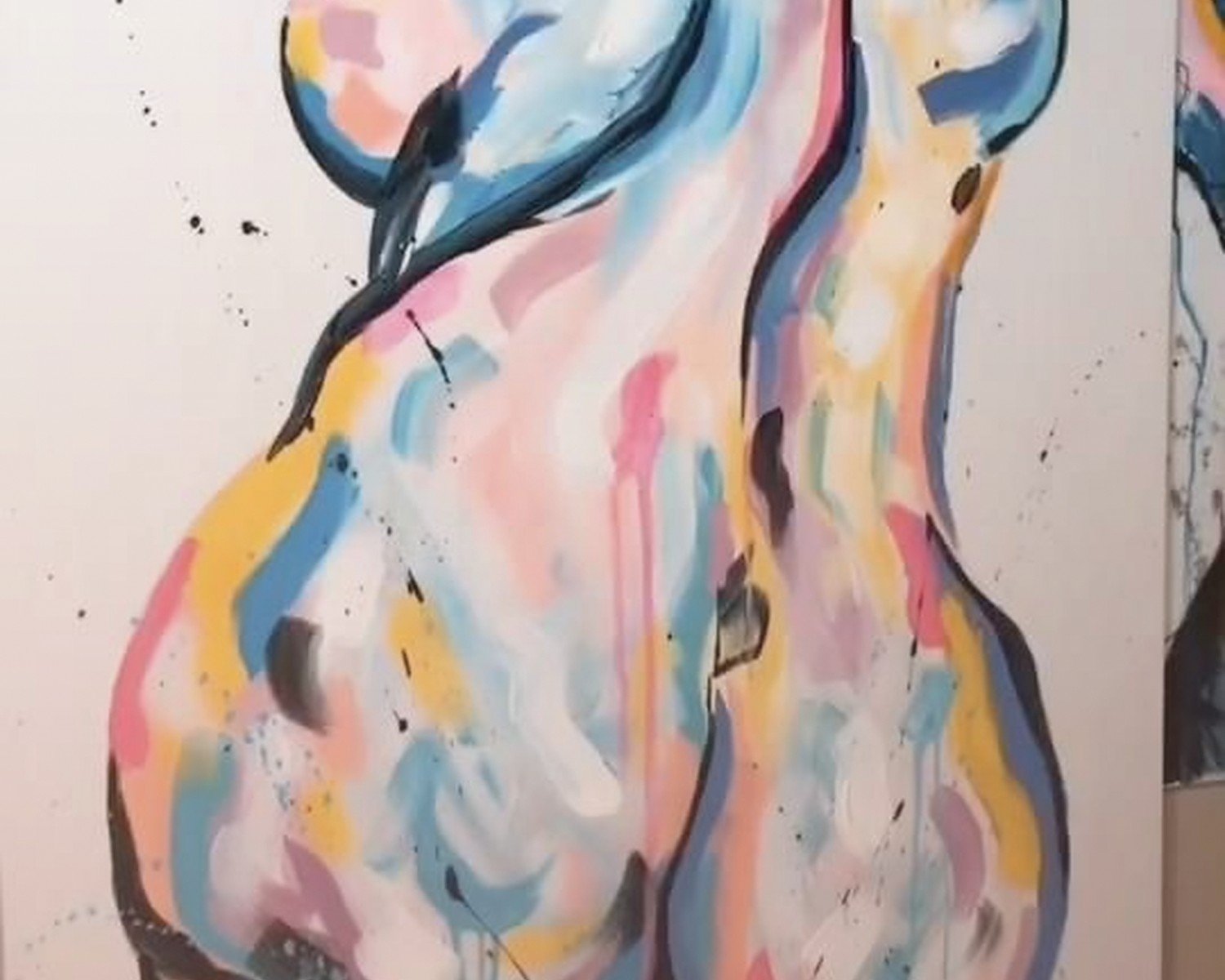
Abstract Feminine Forms
This is where you get curves and shapes that suggest a female body but aren’t literal. Honestly this is the most forgiving style because people interpret it however they want. Great for conservative spaces or if you’re worried about guests feeling weird about nude art.
Color Choices That Don’t Look Basic
Everyone defaults to black line on white background and look, it’s classic for a reason but it’s also everywhere. I’ve been experimenting with other options:
Terracotta or rust colored lines on cream – this is SO good in bedrooms, adds warmth without being too bold. Works especially well if you have any wood tones in the room.
Navy or dark teal lines – more sophisticated than black somehow? I can’t explain it but it just feels more intentional and less like you grabbed the first thing off Amazon.
White lines on dark background – risky but when it works it WORKS. I did this in a client’s dark gray bedroom and everyone who sees it asks where it’s from. The contrast is dramatic without being loud.
Oh and another thing – if you’re printing yourself (which we’ll talk about) you can experiment with different paper colors. I’ve done black line art on that really pale blush paper and it’s gorgeous for feminine spaces that aren’t trying too hard.
Where to Actually Buy This Stuff
Okay so I’ve wasted so much money figuring this out. Here’s the hierarchy:
Etsy digital downloads – this is gonna sound weird but this is actually my favorite option now? You buy the digital file for like $5-15, then print it yourself at a local print shop or online service. The quality is in your control and you can resize it however you need. Just make sure the file is high resolution – you want at least 300 DPI. I use a local print shop that does large format on nice matte paper for way less than buying a finished print online.
Minted or Artfully Walls – if you don’t wanna deal with printing, these sites have better quality control than most. More expensive but the paper quality is actually good and the prints arrive ready to frame. Minted especially has some really beautiful feminine line art that doesn’t look like every other apartment.
Society6 or Redbubble – hit or miss honestly. The designs are great but I’ve had prints arrive with weird color shifts or low resolution looking fuzzy. Better for smaller sizes.
Skip Amazon unless – most of it is dropshipped garbage but occasionally there’s a decent framed print. Just read reviews carefully and look at customer photos not the listing photos.
Wait I forgot to mention – if you find an artist you like on Instagram, most of them sell prints directly and it’s usually cheaper than going through a marketplace. Plus you’re supporting them directly which feels good.
The Framing Situation
This is where people mess up constantly. Beautiful art in a cheap frame looks cheap, period. But also you don’t need to spend $200 at a custom framing place.
For line art specifically, simple frames work best. I’m talking thin black metal frames or light wood – nothing ornate or thick. The art needs to be the focus not the frame. IKEA’s Ribba frames are actually perfectly fine for this and they come in a ton of sizes. My cat knocked one off the wall last week and it didn’t even break so there’s that.
Matting is optional but I usually skip it for line art. It can make smaller prints look more substantial but it also creates distance between you and the art? If the line work is really delicate you might want it but most feminine figure art is bold enough to go straight in the frame.
One thing – make sure there’s glass or acrylic covering the print. I’ve seen people frame unprotected prints and they get dusty and damaged so fast. UV-protective glass is worth it if the wall gets direct sunlight.
Gallery Wall Math
Okay so funny story, I spent an entire Saturday arranging and rearranging a gallery wall of feminine line art for my hallway. Here’s what I learned:
Start with an anchor piece that’s bigger than the rest – this grounds everything. Then build around it with smaller pieces. Odd numbers work better than even (3, 5, 7 pieces total).
For line art specifically you want some variety in the poses or compositions or it gets repetitive. Like don’t do five standing figures all facing the same direction. Mix seated, reclining, abstract, profile views, whatever.
Spacing should be consistent – I use 2-3 inches between frames. Lay everything out on the floor first and take a photo, then use that as your guide when hanging. Painter’s tape on the wall to mark positions is your friend.
The biggest mistake I see is people doing a gallery wall where all the pieces are too similar in size. You want variation – maybe one 24×36, two 16x20s, and three 8x10s. That kind of thing.
Placement Ideas Beyond the Obvious
Everyone puts art above the bed or sofa but there’s so many other spots:
Bathroom – honestly feminine line art is perfect for bathrooms because it’s elegant but not fussy. Just make sure it’s in a frame that can handle humidity.
Walk-in closet or dressing area – if you have the space this is such a vibe. Makes getting ready feel more luxurious.
Stairway wall – this is underutilized space and a vertical arrangement of feminine figures actually emphasizes the upward movement.
Behind a freestanding bathtub – if you’re bougie enough to have one of those. I did this for a client and she sends me photos of her bath setup constantly.
Dining room – unexpected but works if the rest of the room is relatively simple. Creates a sophisticated gallery feel.
The Nude Art Conversation
Real talk – some feminine figure line art is clearly nude and some people get weird about it. If you’re decorating a space where conservative family visits or you’re renting and worried about the landlord, go for more abstract interpretations. You can still get the feminine energy without obvious breasts or anything.
That said, tasteful nude line art is really not that controversial? It’s literally been acceptable fine art for centuries. I have a simple line drawing of a reclining nude figure in my living room and my super traditional mother-in-law complimented it. The minimal style makes it feel artistic rather than sexual.
If you’re genuinely worried, the “from behind” poses or partial figures (just the torso, just the legs) give you the aesthetic without any potentially awkward moments.
DIY Printing Tips
Since I mentioned digital downloads – here’s how to not mess it up:
Get the highest resolution file available. If it’s less than 3000 pixels on the longest side you’re probably gonna have issues printing large.
Print on matte paper not glossy – glossy shows every imperfection and reflects light weird. Matte looks more expensive and gallery-like.
Color calibration matters – what looks pure black on your screen might print as dark gray. Ask your print shop to show you paper samples with black ink before doing a large print.
I use Printique for online printing and they’re really consistent. FedEx print centers are hit or miss depending on who’s working that day honestly.
Mixing Feminine Line Art with Other Styles
You don’t have to commit to ONLY line art – actually it looks better mixed with other stuff usually. I pair feminine figure drawings with:
Abstract color pieces – the line art grounds the chaos of abstract art
Botanical prints – very classic combination
Black and white photography – keeps the monochrome vibe going
Textured pieces like woven wall hangings – adds dimension
The key is keeping a consistent color palette even if the styles vary. Like all black and white plus natural wood tones, or all warm tones with cream and terracotta.
What to Avoid
Okay rapid fire things that don’t work:
– Those prints with the cheesy quotes overlaid on the line art (“she believed she could” blah blah) – just no
– Super thin wispy lines that you can barely see from more than 2 feet away
– Overly complicated line work that’s trying to do too much
– Mixing too many different line weights in one gallery wall
– Putting feminine figure art in kids’ rooms or playrooms – it just feels weird contextually
Also maybe don’t put it directly across from your bed where it’s the first thing you see when you wake up? I did this and it was oddly intense first thing in the morning. Side wall is better.
The whole feminine line art thing is really about creating a sense of elegance and movement without being too literal or heavy-handed. When it works it adds this sophisticated simplicity that makes a room feel more curated. Just gotta avoid the cheap prints and basic placement and you’re golden.