Wall Art Guide, Wall Art Tutoriels
Highland Cow Wall Art: Scottish Cattle Farmhouse Decor
Jul
So I’ve been totally obsessed with highland cow art lately and honestly it started because a client wanted to do this whole Scottish farmhouse thing in her breakfast nook and I was like… okay let me figure out what actually works versus what just looks tacky on Etsy.
The thing about highland cow wall art is it can go SO wrong so fast. Like you end up with something that screams “I bought this at a craft fair in 2019” instead of the cozy rustic vibe you’re actually going for. But when you get it right? It’s genuinely perfect for that farmhouse aesthetic without being too cutesy or overdone.
Choosing the Right Style Without Making Your Wall Look Like a Petting Zoo
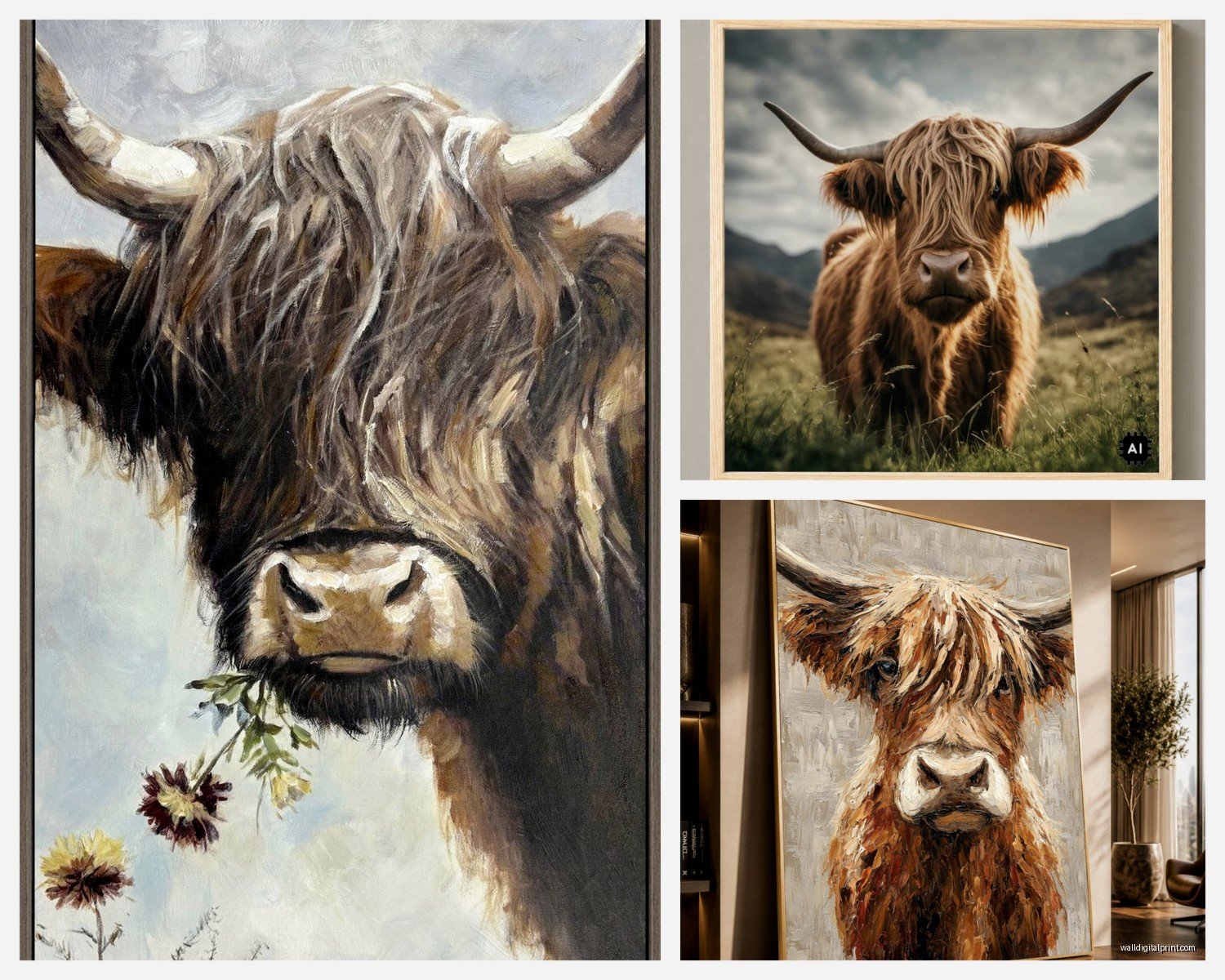
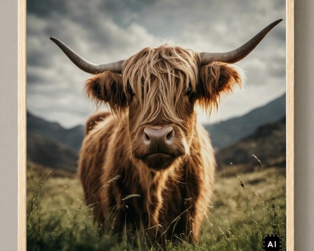
First thing – and I learned this the hard way after ordering three different prints that all looked amazing online – you gotta decide if you want realistic photography or more artistic interpretations. The photographic ones work better in modern farmhouse spaces where you’ve got clean lines and neutral everything. I’m talking those gorgeous close-up shots where you can see every detail of the cow’s shaggy coat, maybe some muted Scottish highlands in the background.
The painterly or watercolor versions though? Those are your friend if you’re going more traditional farmhouse or cottage core. They soften the whole look. I’ve got this one canvas in my own living room that’s sort of an impressionist take on a highland cow and it just… works better than the super crisp photograph I tried first. The photograph felt too safari-documentary if that makes sense.
Size Matters More Than You Think
Okay so this is gonna sound obvious but I see people mess this up constantly. A tiny 8×10 highland cow print on a massive wall looks lost and sad. You want to go bigger than you think you need. For above a couch or bed, I usually tell people to aim for something that takes up about two-thirds to three-quarters of the furniture width.
Here’s my actual measurements that work:
- Above a standard sofa – go for 40 to 60 inches wide total
- Above a queen bed – 48 to 60 inches works perfectly
- Smaller walls or gallery wall components – 16×20 or 20×24 inch pieces
- Statement piece in a dining room – don’t be scared of 36×48 or even larger
I did a thing last month where I hung a massive 48×60 highland cow canvas in a client’s dining room and she literally texted me the next day saying her husband thought it was too big but then he stared at it during dinner and changed his mind. Sometimes you gotta commit to the drama.
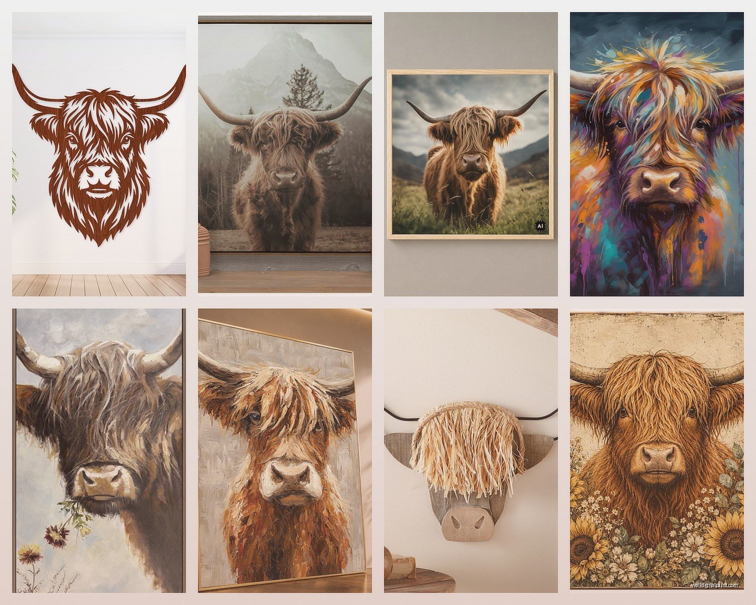
The Gallery Wall Approach That Actually Looks Curated
Wait I forgot to mention – if you’re doing a gallery wall situation with multiple highland cows or mixing them with other farmhouse elements, stick to odd numbers. Three or five pieces. And please please please don’t match the frames exactly unless you’re going for that super formal look.
I mix black frames with natural wood and even some white frames when I’m doing Scottish cattle themes. The key is keeping the mat colors consistent – all white mats or all cream, don’t mix those. My cat knocked over my coffee while I was arranging a gallery wall last week and honestly the stain on my planning paper ended up showing me a better layout so… chaos works sometimes?
For a highland cow gallery wall that doesn’t look like Pinterest threw up on your wall:
- Start with your largest piece slightly off-center
- Add smaller complementary pieces – maybe some Scottish landscape photos or vintage farm tools prints
- Keep about 2-3 inches between frames
- The whole arrangement should form a rough rectangle or square shape
Color Schemes That Won’t Fight With Your Cows
The natural coloring of highland cattle is already pretty bold – those rusty oranges and browns and that shaggy cream-colored fur. So your wall color matters a LOT. I’ve tested this in probably a dozen spaces now and here’s what actually works:
Warm white or cream walls are your safest bet. They let the artwork pop without competing. If you’re feeling brave, a soft sage green or that dusty blue-gray color that’s everywhere right now also works beautifully. Creates a nice moody Scottish highlands vibe.
What doesn’t work – and I learned this in my own guest room disaster – is stark bright white walls. Makes the whole thing feel too sterile and the artwork looks weirdly out of place. Also avoid trendy colors like millennial pink or those deep jewel tones unless you really know what you’re doing with color theory.
Mixing Highland Cows With Other Decor
This is where people get nervous but honestly it’s not that complicated. Highland cow art plays really nicely with:
- Other farm animals but keep it to 2-3 species max – I like pairing with sheep or chickens
- Botanical prints especially eucalyptus or cotton stems
- Vintage farm equipment imagery
- Landscape photography from Scotland or similar rolling hills
- Simple text prints with farm quotes but nothing too cheesy
Don’t mix with: beach themes, tropical stuff, ultra-modern abstract art, or anything too colorful and busy. I watched someone try to put a highland cow next to a flamingo print once and it was… a choice.
Canvas vs Framed Prints vs Metal vs Everything Else
Okay so I’ve probably ordered highland cow art in every possible format at this point and here’s my honest breakdown:
Canvas prints are the most popular for farmhouse decor and yeah they work great. They’ve got that gallery-wrapped look where the image continues around the edges. Super easy to hang, no frame needed. But – and this is important – make sure you’re getting decent quality canvas. The cheap ones from certain websites look fine in photos but in person the image is muddy and the canvas is thin enough to see through. Spend at least $50 for a medium-sized canvas if you want it to look legit.
Framed prints under glass give you more of that collected-over-time vintage vibe. I actually prefer these for smaller pieces. You can find really beautiful highland cow prints and put them in thrifted frames which adds character. The glass protects the print too which matters if you’re hanging in a kitchen where grease and humidity are factors.
Metal prints are having a moment and I’ll be honest… I’m conflicted? They’re super modern and durable, which is great. But they can read a bit too contemporary for traditional farmhouse style. I used one in a transitional space that mixed modern and rustic and it worked perfectly there. Just wouldn’t put it in a full-on cottage farmhouse situation.
Wood prints or prints mounted on wood are really cool for this theme actually. There’s something about the texture of wood showing through or around the image that reinforces that rustic cattle farm aesthetic. A bit pricier usually but worth it for a statement piece.
Where to Actually Buy This Stuff
I’m gonna be real with you – I’ve ordered from everywhere trying to find the best sources. Etsy has a TON of options but quality is all over the place. Read reviews carefully and check if they’re actually printing and shipping themselves or just dropshipping from somewhere else.
Society6 and similar print-on-demand sites have some gorgeous highland cow designs from independent artists. Quality is pretty consistent and you can get the same image on different products which is nice if you wanna test sizes.
For photography prints, I’ve had good luck with sites that specialize in landscape and animal photography. The images are usually higher resolution and more unique than the stuff you see everywhere.
Local art fairs and farm markets sometimes have amazing highland cow art from local artists if you’re lucky enough to live somewhere rural-ish. I found this incredible watercolor series at a market in Vermont last year that I’m still obsessed with.
The DIY Route If You’re Feeling Crafty
Oh and another thing – if you’ve got any artistic ability at all, highland cows are actually not that hard to paint in a simplified style. I’m talking like… blocky shapes and texture with a palette knife kind of thing. I did this for my mom’s birthday last year and it turned out way better than expected. There are tons of tutorials on YouTube.
You can also do the thing where you order a high-res digital file from Etsy and print it yourself at a local print shop. Usually way cheaper than buying pre-made art and you can control the exact size you need.
Styling the Space Around Your Highland Cow Art
So you’ve got your art, now what? The styling matters as much as the artwork itself honestly. I always add these elements to complete the look:
- Chunky knit throws in cream or oatmeal colors
- Wood elements – bowls, candlesticks, furniture with visible grain
- Vintage or vintage-looking metal accents like galvanized buckets
- Natural fiber baskets
- Simple pottery in earth tones
- Real or faux greenery – eucalyptus is perfect here
Keep metals consistent – if you’re going for black metal frames, carry that through with black metal shelf brackets or light fixtures. Or stick with brass and warm metals throughout. Mixing too many metal finishes makes everything look chaotic.
Texture is your best friend with this aesthetic. The shaggy fur of the highland cow should be echoed in your textiles and materials. I layer sheepskins, chunky knits, linen, and jute to create that cozy lived-in farmhouse feel.
Lighting Your Highland Cow Art Properly
This is something people forget about but it makes such a difference. Highland cow art often has a lot of texture and dimension that gets lost without proper lighting. If you can swing it, add a picture light above the artwork or position a floor lamp to highlight it.
Natural light is amazing but watch for direct sunlight that’ll fade your prints over time. I learned this the expensive way when a beautiful print in my south-facing breakfast nook faded after like six months. Now I use UV-protective glass for anything in direct sun.
Warm LED bulbs over cool ones – always. Cool lighting makes the warm tones in highland cow fur look weird and washed out.
Common Mistakes I See All The Time
Hanging art too high – your center point should be at eye level which is roughly 57-60 inches from the floor. So many people hang stuff way too high and it throws off the whole room.
Going too matchy-matchy with farmhouse decor. Yes you love highland cows but you don’t need cow art in every room plus cow figurines plus cow dish towels. Pick your spots. I usually limit it to one or two rooms max.
Forgetting about the fifth wall aka your ceiling. If you’ve got exposed beams or interesting ceiling details, those play into the whole Scottish farmhouse vibe too. Don’t ignore them when you’re planning your art placement.
Choosing art that’s too busy or colorful. Highland cows are already a statement – you want relatively simple compositions without a ton of background clutter competing for attention. Some of the best pieces I’ve used are just the cow’s face on a plain or subtly textured background.
Seasonal Switching
This is gonna sound extra but hear me out – I keep a couple different highland cow pieces that I rotate seasonally. Warmer, golden-toned cows for fall and winter. Cooler, more muted pieces with greener backgrounds for spring and summer. You don’t have to do this but it keeps things feeling fresh without changing your whole decor scheme.
Okay so that’s basically everything I’ve learned from way too many hours obsessing over highland cow decor. The main thing is just make sure whatever you choose actually makes you happy when you look at it, not just what looks good on Instagram. I’ve got a slightly wonky vintage highland cow print that technically doesn’t follow any of my own rules but I love it anyway because it reminds me of a trip to Scotland I took in my twenties.
Just start with one piece, see how you feel about it in your space for a few days, then build from there if you want more. And measure twice before you hammer any nails because patching drywall is the worst.