Wall Art Guide, Wall Art Tutoriels
Botanical Wall Art: Plant & Flower Scientific Prints
Jul
So I’ve been absolutely obsessed with botanical prints lately and honestly it started because I needed to fill this massive wall in my dining room and didn’t want to spend like $800 on a single piece of art. Scientific botanical prints are having this huge moment right now and I totally get why.
Why These Prints Actually Work
Okay so the thing about botanical scientific prints is they’re basically illustrations that were originally made for like, actual science books from the 1700s and 1800s. Think old library vibes but make it work in a modern space. What I love is they’re detailed enough to be interesting but not so busy that they overwhelm a room. My friend Sarah has this tiny apartment and she was worried about adding too much visual noise but these prints are actually perfect for small spaces because they read as organized, not chaotic.
The prints usually show a plant specimen with all its parts labeled in Latin or old-timey script. Roots, leaves, flowers, seeds—everything laid out super precisely. It’s that whole “form meets function” thing that interior designers won’t shut up about, but it actually works here.
Where to Actually Find Good Ones
Right so here’s where I’ve had the best luck. Etsy is obvious but you gotta be careful because quality varies SO much. I learned this the hard way when I ordered what looked like a gorgeous fern print and it showed up looking like someone printed it on their home inkjet in 2003. Look for sellers who specifically mention archival paper or museum-quality prints.
The big places I recommend:
- Etsy shops that specialize in vintage botanical reproductions—check their reviews obsessively
- Society6 has some good ones and their quality is consistent, which I appreciate when I’m ordering for clients
- Desenio actually has a decent botanical collection and ships fast
- Library and museum print shops—the New York Public Library has a whole digital collection you can download and print yourself
- Minted if you want something more curated but gonna cost you more
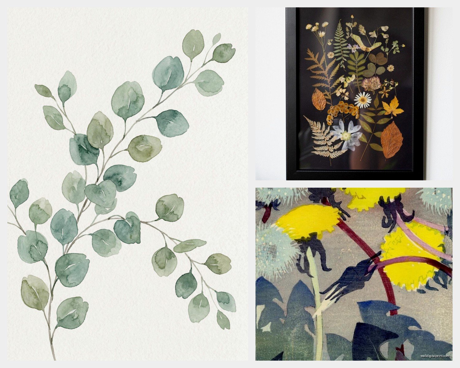
Oh and another thing, vintage stores sometimes have actual old botanical books that you can carefully remove pages from. I know that sounds sacrilegious but if the book is already falling apart and you frame those pages properly… they’re the real deal. Found an amazing moss illustration this way last month.
Sizing and Scale That Actually Makes Sense
This is where people mess up constantly. They either go too small and it looks like an afterthought, or they get one massive print and it dominates everything.
For a gallery wall situation, I usually do a mix of 8×10 and 11×14 prints. Some people swear by all matching sizes but honestly I think that can look a bit sterile unless you’re going for a very specific museum vibe. The key is keeping the frames consistent even if the print sizes vary.
Single statement pieces work best at 16×20 or larger. I hung an 18×24 tobacco plant print in my hallway and it’s literally the first thing people comment on when they come over. My cat keeps trying to knock it down though which is… a whole situation.
The Math Part Nobody Tells You
Okay so if you’re doing a gallery wall, lay everything out on the floor first. I know everyone says this but seriously DO IT. Take a photo. Live with that photo for a day. I’ve rearranged gallery walls three times because I didn’t do this step and trusted my spatial reasoning which is apparently terrible.
For spacing between frames, 2-3 inches works for most situations. Closer than that starts feeling cramped, wider starts feeling disconnected. The center of your arrangement should be roughly at eye level, which is usually around 57-60 inches from the floor.
Frame Choices Without Overthinking It
So frames are weirdly important with botanical prints because the whole aesthetic is kinda refined and scientific. I’ve tried a bunch of different approaches:
Black frames are the safe choice and they work. They make the prints look more modern and graphic. This is what I use in my own place because I have a lot of other stuff going on and needed something clean.
Natural wood frames give you more of that organic, brings-the-outside-in feeling. Light oak or maple works better than dark walnut in my experience—the dark wood can make the prints feel too heavy.
Gold or brass frames if you want to lean into the vintage Victorian scientist vibe. These can look really good but they’re also easy to overdo. I used gold frames in a client’s library and it was perfect but in a bright white kitchen it would’ve been too much.
White frames work if your space is already pretty colorful and you want the prints to fade into the background a bit. Not my favorite personally but I get why people like them.
Wait I forgot to mention—get frames with mats. The mat (usually white or cream) creates breathing room around the print and makes even cheap prints look more expensive. It’s like a $15 upgrade that makes a $200 difference in how it reads.
Color Considerations and Backgrounds
Most vintage botanical prints have this aged cream or beige background which I actually love because it softens the whole look. But you can also find prints on pure white backgrounds if you want something crisper and more modern.
The plant illustrations themselves are usually pretty muted greens and browns with occasional pops of color from flowers or berries. This is why they work in basically any color scheme—they’re not competing with your other stuff.
I hung a series of mushroom prints in a client’s powder room that’s painted this deep navy blue and the contrast is *chef’s kiss*. The aged paper background pops against the dark wall in a way that modern prints just don’t.
Going Monochrome
You can also find black and white botanical engravings which have a totally different vibe. More stark, more dramatic. These work really well in modern or minimalist spaces where colored prints might feel too busy. I have a black and white fern print in my bedroom and it’s very calming but also interesting enough that I don’t get bored looking at it.
Specific Print Types Worth Knowing About
okay so funny story, I got really into the different categories of botanical prints because I was watching this documentary about Victorian plant hunters while organizing my print collection and went down a total rabbit hole.
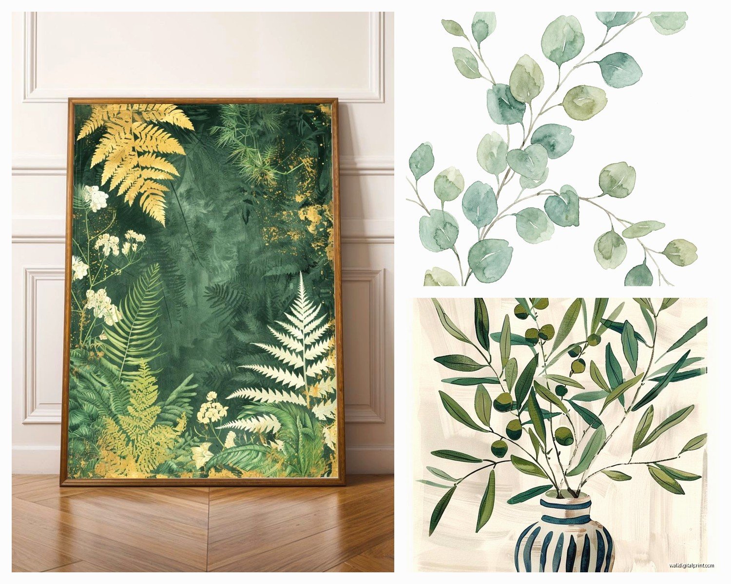
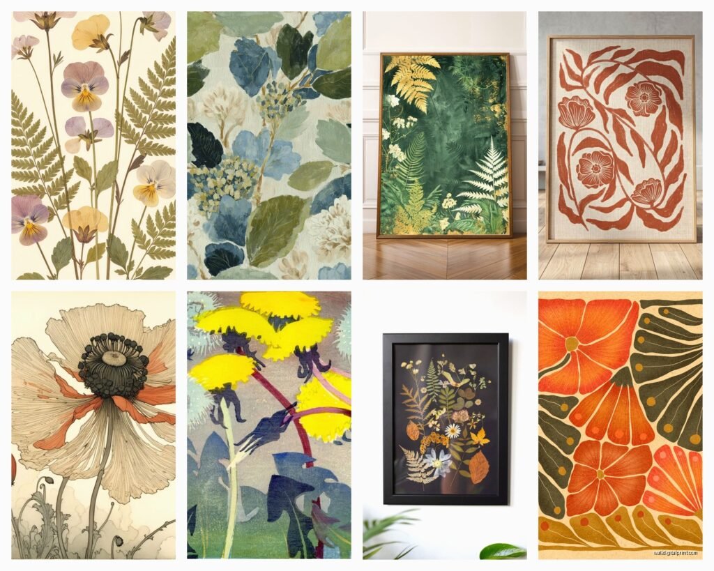
Ferns and foliage are probably the most popular right now. Lots of delicate detail, very pretty, work literally anywhere. Can’t go wrong.
Mushrooms and fungi are having a MOMENT. They’re quirky without being cutesy and the colors are often really gorgeous—lots of reds and oranges and unexpected blues.
Flowers are classic but can veer into grandma territory if you’re not careful. Roses and peonies feel more traditional, while things like poppies or exotic blooms feel fresher.
Herbs and vegetables are perfect for kitchens obviously but I’ve also used them in dining rooms. There’s something very satisfying about a detailed illustration of a tomato plant with all its root systems showing.
Trees and branches work well for larger prints. More architectural than delicate flowers.
Succulents and cacti if you want something that feels current but still has that scientific illustration quality.
The DIY Printing Route
This is gonna sound weird but some of my favorite prints are ones I downloaded from public domain sources and had printed myself. The Biodiversity Heritage Library has THOUSANDS of botanical illustrations that are free to download in high resolution.
I use a local print shop that does large format printing on archival paper. Costs like $25 for an 18×24 print versus $150 for the same thing pre-framed from a retailer. You just gotta find a good printer—ask them about their paper options and make sure they’re using quality ink.
The files you download need to be high enough resolution or they’ll look pixelated when enlarged. I aim for at least 300 DPI at the size I want to print. There’s some trial and error here but honestly after you do it once or twice you get the hang of it.
Styling Them in Different Rooms
Living rooms: Gallery wall above the sofa is classic for a reason. I usually do 5-9 prints in varying sizes. Mix plant types or stick to one category—both work.
Bedrooms: Two matching prints flanking the bed is very hotel-chic. Or one large statement piece centered above the headboard. Keep it calming—ferns, grasses, simple flowers.
Bathrooms: Water-loving plants like water lilies or marsh plants make thematic sense. Mushrooms are unexpectedly perfect in bathrooms too, probably because they like moisture? That’s my justification anyway.
Kitchens: Herbs, vegetables, fruit trees. Or go unexpected and do a collection of grain illustrations which sounds boring but actually looks really cool.
Home offices: This is where you can get more scientific and detailed. Root systems, seed dispersal diagrams, cross-sections of tree trunks. Stuff that rewards closer inspection.
Hallways: Perfect for a vertical arrangement of similar prints. I did four different fern species in identical frames running up a stairwell wall and it’s one of my favorite things I’ve ever done.
Mixing Botanical Prints With Other Art
You don’t have to go full botanical everything unless you really want to. I mix them with other stuff all the time.
They work surprisingly well with abstract art—the precision of the botanical print balances the looseness of abstract work. Put a gestural watercolor next to a detailed plant illustration and they make each other more interesting.
Vintage maps and botanical prints share similar aesthetic qualities so they play well together. Also photography, especially black and white architectural shots or landscapes.
What doesn’t work as well: very modern graphic prints or pop art. The aesthetics are too different and they end up competing.
Maintenance and Longevity
Keep them out of direct sunlight if you want the colors to last. I learned this when a print I had in a south-facing window faded to almost nothing in like six months. UV-protective glass exists but it’s expensive and honestly just easier to not hang them in super sunny spots.
Dust the frames occasionally. That’s it. They’re pretty low maintenance which is one reason I love recommending them to clients who want their homes to look put-together without a ton of upkeep.
If you’re using actual vintage prints, consider getting them professionally framed with acid-free materials so they don’t deteriorate. It’s worth the investment if they’re real antiques.
Budget Breakdown Reality Check
You can do this at basically any price point which is refreshing.
Budget option: Download free prints, get them printed at a copy shop, use IKEA frames. Total cost for a gallery wall of 6 prints: maybe $150.
Mid-range: Buy prints from Etsy or Society6, decent frames from Target or Amazon. Same gallery wall: $400-600.
Splurge: Custom framing, high-end print sources, maybe some actual vintage prints mixed in. Could easily hit $1500+ but it’ll look incredible.
I usually recommend people start with one or two really good pieces and build from there rather than buying everything at once. Your taste will evolve and you might realize you want all ferns instead of the mixed collection you originally planned.
The whole botanical print thing works because it’s sophisticated without being pretentious, decorative without being frivolous, and it brings nature inside in a way that feels intentional. Plus if someone asks about them you can sound very smart talking about Victorian plant classification systems or whatever.