Wall Art Guide, Wall Art Tutoriels
Tree Wall Art: Forest Nature Landscape Decor
Jul
So I’ve been knee-deep in tree wall art lately because like three different clients asked about it in the same week and honestly it’s one of those things where you think “how hard can it be, it’s just trees” but then you start looking and there are SO many directions you can go.
First thing – figure out what vibe you’re actually going for because tree art isn’t just tree art. Are we talking moody black and white forest photography? Those colorful birch tree paintings that were everywhere in 2015? Japanese-style minimal ink drawings? Or like, those massive forest murals that make your wall disappear? I made the mistake of buying this gorgeous aspen print for a client’s living room without checking if they wanted “cozy cabin” or “modern minimalist” and yeah, had to return it.
The Main Categories You’ll Actually See
Okay so here’s what I’ve noticed after spending way too much time on this:
Forest Photography Prints – These are your misty morning forest scenes, sunlight through trees, that kind of thing. They photograph well for Instagram which is probably why they’re everywhere. The trick with these is getting the right color temperature. Cool tones (blues and grays) make a room feel bigger but can read cold if you don’t have warm lighting. Warm tones (golden hour stuff) are safer but everyone has them.
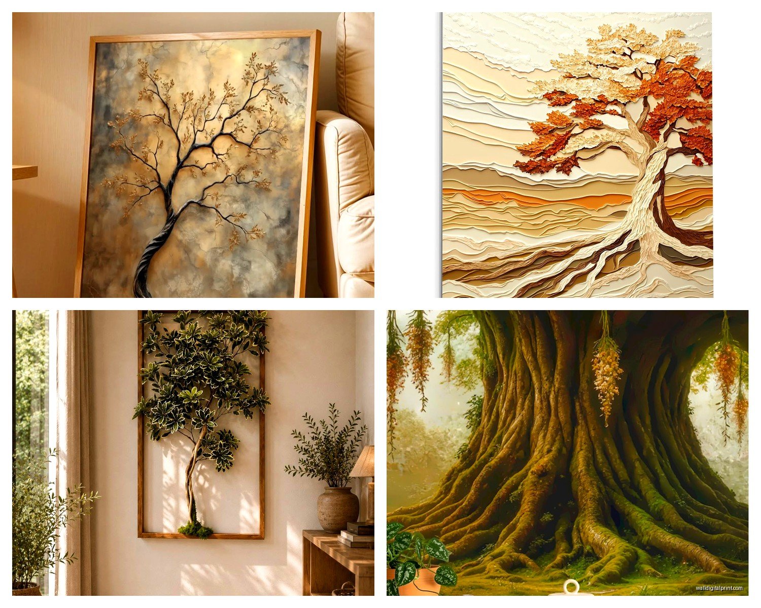
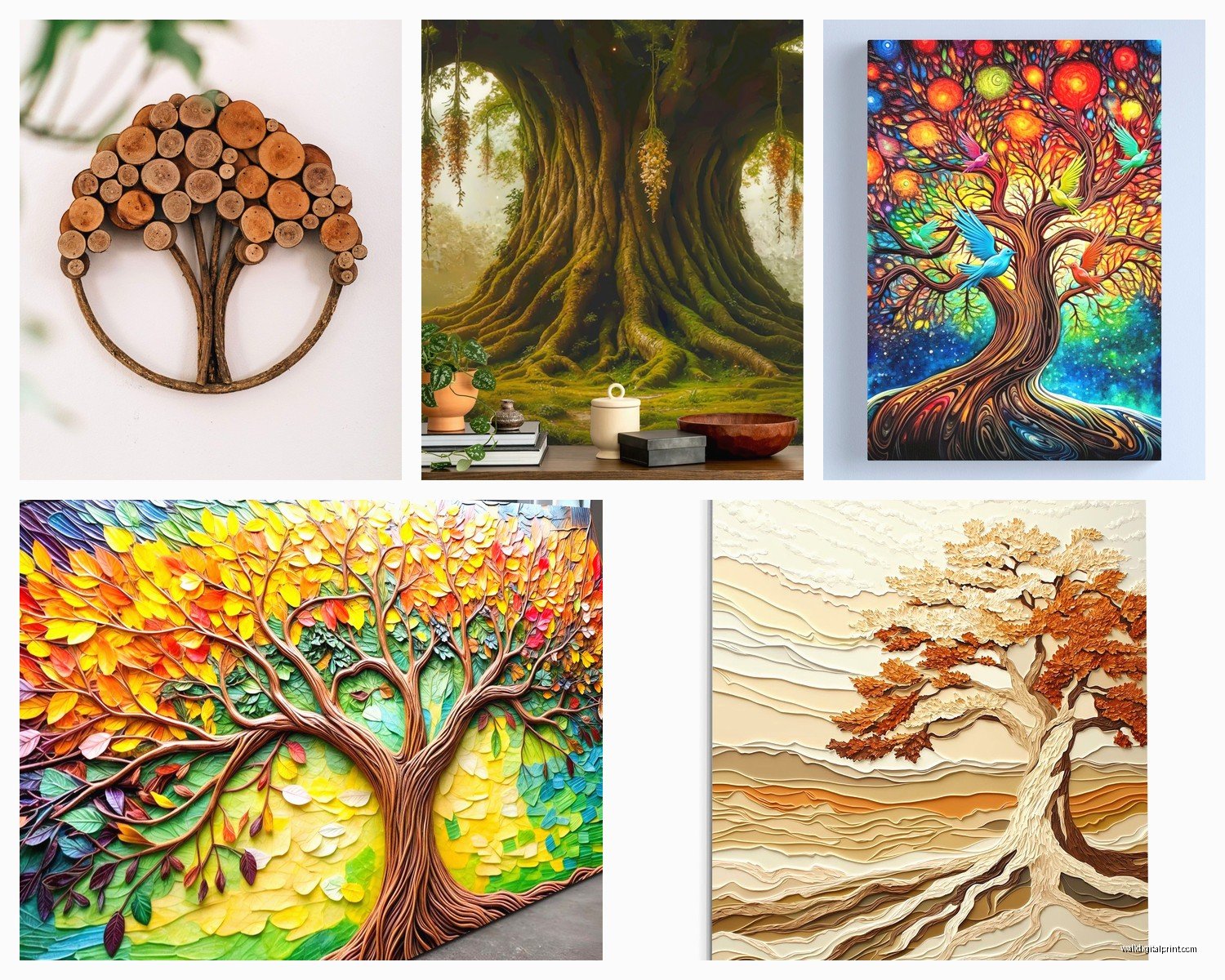
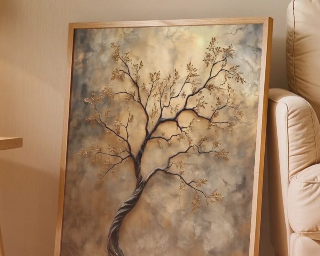
Painted/Illustrated Trees – This is where you get into birch trees, cherry blossoms, abstract forest scenes. More personality than photos usually. I’ve found these work better in bedrooms and dining rooms where you want something interesting to look at but not like, dramatic.
Line Art and Minimalist – Single tree silhouettes, geometric forests, that Scandinavian look. These are actually harder to place than you’d think because they need the right wall color and the rest of your decor has to be pretty intentional or they just look lonely.
Large Scale Murals/Wallpaper – The commitment option. I just installed one of those peel-and-stick forest murals in my office and my cat will NOT stop trying to climb it, so there’s that. But when they work, they really work.
Size Actually Matters More Than You Think
This is gonna sound obvious but I see people mess this up constantly. That tree print that looks massive on the website is probably like 16×20 which is gonna look tiny on your actual wall.
For above a couch or bed, you want something that’s at least two-thirds the width of the furniture. So if your couch is 84 inches, you’re looking at minimum 56 inches of art width. You can do this with one large piece or a diptych/triptych situation.
I usually tell people to tape newspaper or kraft paper to the wall in the size they’re considering before buying anything. Sounds tedious but it’s saved me so many returns. Just last month I almost bought this 24×36 forest scene for above my dining table and when I taped it out I was like… oh that’s sad and small.
The Gallery Wall Option
If you wanna do multiple tree pieces, odd numbers work better – three or five pieces. And mix your sizes but keep the spacing consistent, like 2-3 inches between frames. I did a gallery wall with different tree species (oak, pine, birch, maple) for a client who’s really into hiking and it actually turned out pretty cool, each one was a different size but same frame style.
Color Coordination Without Overthinking It
Okay so this is where people get paralyzed. You’ve got your wall color, your furniture, your existing decor, and now you’re trying to find tree art that works with all of it.
Here’s what actually works in real life:
If your room is mostly neutrals (grays, whites, beiges), you can go either direction – black and white photography for that gallery look, or use tree art to bring in your only pop of color. I did a rust-orange autumn forest print in an all-gray living room and it became the whole room’s color story.
If you already have color going on, pull one color from your existing palette and find tree art that features it. Sounds basic but it works. Like if you have blue throw pillows, look for forest scenes with blue undertones or twilight scenes.
Greens are tricky because there are like a million shades of green and they don’t all play nice together. The green in your tree art needs to be similar in warmth/coolness to any other greens in the room or it’ll look off. I learned this the hard way with a bright spring forest print that clashed with someone’s sage green couch.
Frame or No Frame
Canvas prints (the wrapped kind that go around the edges) are fine for casual spaces but they read cheaper in formal rooms. Just being honest. For a living room or anywhere you’re trying to look put-together, get it framed.
Black frames are the safe choice – they work with literally everything and make colors pop. Wood frames add warmth but you gotta match the wood tone to other wood in the room or at least get close. White frames are having a moment but they need a specific aesthetic to work.
I’ve been seeing a lot of those floating frames lately where the art sits inside a shadow box situation. They look expensive and modern, work especially well with tree line art or watercolors.
Oh and another thing – mat or no mat? If your art is smaller (like under 20×24), a mat makes it feel more substantial and expensive. Bigger pieces don’t really need it. I usually do a white or cream mat that’s about 3-4 inches wide.
Where to Actually Buy This Stuff
Been testing a bunch of sources because print quality varies wildly:
Etsy – Great for unique pieces and you’re supporting actual artists. Quality depends on the seller obviously. Always read reviews and check their return policy. I’ve found some amazing watercolor tree prints here that you just won’t find anywhere else.
Society6 and Redbubble – Decent print quality, lots of options, easy returns. The tree art selection is huge but you have to wade through a lot of mediocre stuff. Their framing options are limited though.
Art.com and AllPosters – Solid for classic forest photography. Professional quality, lots of framing options. More expensive but you know what you’re getting.
Local art fairs and galleries – Okay this is gonna sound pretentious but some of my favorite tree pieces came from local artists. Original paintings or limited prints. More expensive upfront but you get something nobody else has.
Home goods stores (HomeGoods, Target, West Elm) – Hit or miss. You might find something perfect or it might all be the same mass-produced stuff everyone has. Good for quick solutions on a budget though.
Wait I forgot to mention – if you’re going the photography route, make sure you’re getting actual archival quality prints, not just something printed on regular photo paper. It’ll fade. Look for giclée prints or archival pigment prints. Costs more but lasts decades instead of years.
Styling the Wall Around Your Tree Art
So you’ve got your tree art, now what?
Height matters – center of the art should be at eye level, which is usually around 57-60 inches from the floor. But if it’s going above furniture, you want the bottom of the frame about 6-8 inches above the furniture top.
Don’t put tree art directly across from a window if possible because the light will wash it out and potentially fade it over time. I made this mistake in my bedroom with a forest print and by summer it was getting bleached out from afternoon sun.
What to Put With It
This is where it gets fun. Tree art pairs really well with:
- Natural wood elements – floating shelves, wooden bowls, driftwood pieces
- Plants (obviously) but don’t go overboard or it gets too literal
- Neutral textiles – linen, cotton, wool textures
- Stone or ceramic elements
- Vintage or rustic accessories if you’re going cabin-y
- Minimal modern pieces if you’re doing the Scandinavian thing
What doesn’t work as well: shiny metallics (unless it’s brushed brass), super bright colors that compete, beach themes (mixing forest and ocean feels confused), and honestly too many other nature prints. Like if you have tree art AND mountain art AND ocean art it’s just a lot.
Specific Room Recommendations
Living Room – Go bigger and bolder here. This is where you can do those dramatic forest murals or a large-scale triptych. I just did a 60×40 misty forest print above a client’s sectional and it completely changed the room. Makes the ceiling feel higher somehow.
Bedroom – Calming forest scenes work great here. I’d avoid really dark or dramatic pieces unless you’re specifically going for moody. Birch trees, soft watercolors, gentle forest paths. And maybe avoid super vibrant greens because they can be energizing when you want restful.
Dining Room – Good spot for interesting tree art because people are sitting and actually looking at your walls during meals. Four seasons tree set is kind of cliché but I’ve seen it done well. Or a single statement piece in an unexpected color.
Home Office – Nature scenes supposedly boost productivity and reduce stress so this is a solid choice. I have that forest mural I mentioned and it does make staring at my computer less soul-crushing. Something with depth and perspective can make a small office feel bigger.
Bathroom – Only if you have good ventilation because humidity will destroy paper prints. Canvas or acrylic prints work better here. Small tree silhouettes or botanical-style tree prints in simple frames.
The Mistakes I Keep Seeing
Okay real talk, here’s what doesn’t work:
Buying tree art that’s too small because it’s cheaper. It’ll look like an afterthought. Save up for the right size.
Mixing too many different styles of tree art in one space. Like a photograph with a watercolor with a line drawing – pick a lane.
Putting forest scenes in rooms with no natural light. They need some daylight to not feel depressing.
Ignoring the undertones. Cool forest art in a warm-toned room or vice versa creates this weird tension that people notice but can’t quite identify.
Those word overlay prints like forests with inspirational quotes printed on them. Just… no. Unless you’re really into that LiveLaughLove aesthetic, which is fine but own it.
The Canvas Print Quality Thing
Since I mentioned canvas earlier – not all canvas prints are created equal. Cheap ones have visible pixelation and the colors look flat. Good canvas prints have a coating that makes colors richer and protects from UV. They should be stretched on actual wood frames, not cardboard. And the image should wrap around the sides of the canvas, not just have white or black edges.
I ordered a cheap canvas forest print from Amazon once to test it and yeah, you could tell it was cheap. The green looked almost neon and the resolution was bad. Returned it and spent the extra $40 for a better quality one from a specialized print shop and the difference was night and day.
Seasonal Switching
Some people like to rotate their art seasonally and tree art is actually perfect for this. Spring blossoms, summer green forests, autumn foliage, winter bare branches or snowy scenes. You don’t have to buy four different pieces – even just swapping between two different seasons keeps things fresh.
I have a client who does this with a ledge shelf system so she can just swap out prints without putting new holes in the wall. Pretty smart actually.
DIY Options If You’re Crafty
If you’re on a tight budget or just want something personal, you can:
Print your own tree photos at a local print shop – way cheaper than buying art and it’s your actual tree from your actual hike or whatever
Create silhouettes using black vinyl on canvas – surprisingly easy and looks intentional
Press and frame real leaves or branches between glass – more botanical than landscape but same vibe
Use removable wall decals of trees – commitment-free and renter-friendly
I tried the vinyl silhouette thing last year during the first lockdown when I had nothing to do and it actually turned out decent. Got a white canvas from the craft store, cut tree shapes from black vinyl with my Cricut (you could hand-cut too), stuck them on. Took maybe an hour and cost like $15 total.
Anyway, that’s pretty much everything I’ve figured out about tree wall art through trial and error and client work. The main thing is just being intentional about what you’re trying to create mood-wise and not buying something just because it’s trees and you think you should have nature art. Make sure it actually works with your space and your style, otherwise it’s just gonna sit there looking awkward and you’ll eventually replace it.