Wall Art Guide, Wall Art Tutoriels
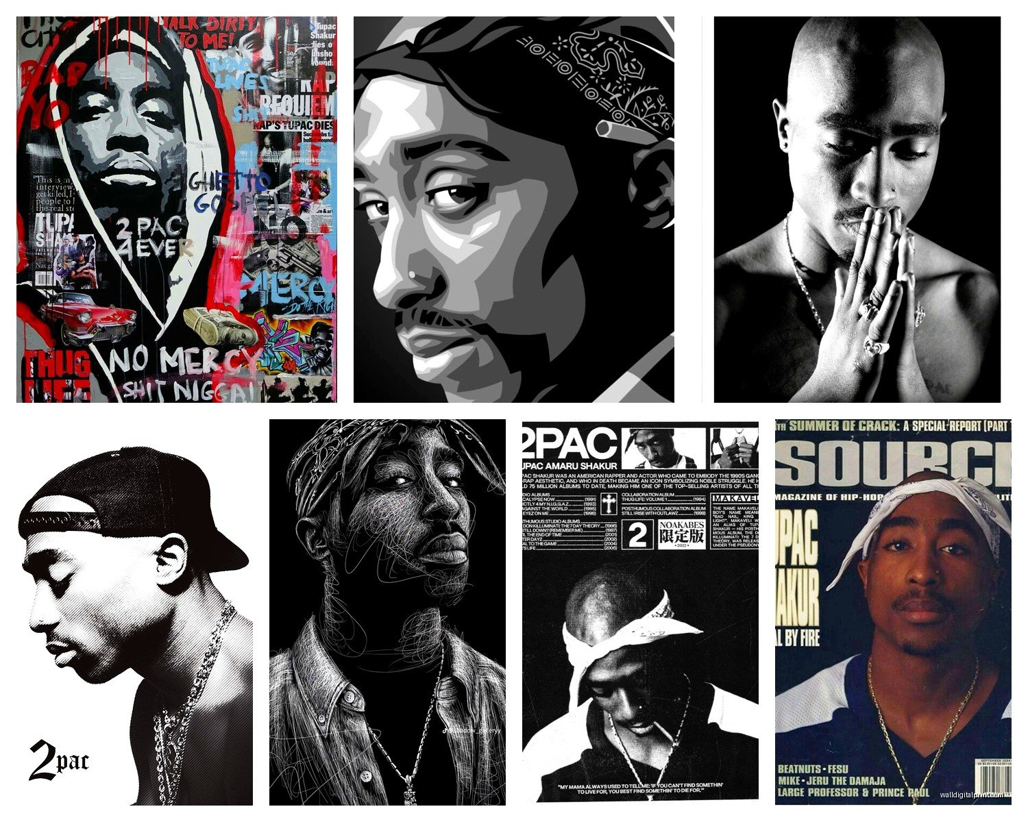
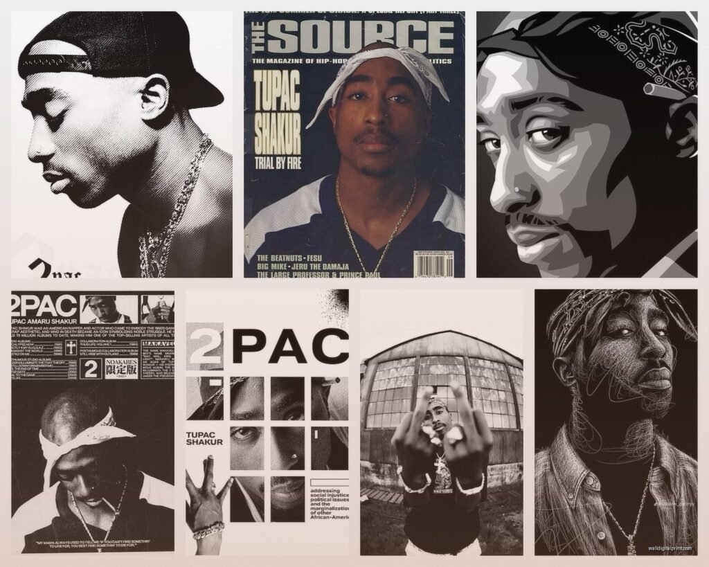
Tupac Wall Art: Hip Hop Rap Legend Music Icon Decor
Jul
So I’ve been working with Tupac wall art for like three years now and honestly it’s one of those things where clients either get it exactly right or they end up with something that looks like a college dorm threw up on their walls, you know?
Finding the Right Style Without Looking Like You’re Stuck in 1996
The biggest mistake I see is people buying those super glossy poster prints that scream “I bought this at a mall kiosk.” You want something with texture and depth. I usually steer people toward canvas prints or metal prints because they have this weight to them that makes the piece feel intentional rather than just… stuck there.
Canvas wraps are gonna be your safest bet if you’re decorating a living room or bedroom. The wrap-around edge thing means you don’t need a frame which honestly saves you like $50-150 depending on size. I had this client last month who wanted a massive Tupac piece for his home studio and we went with a 40×60 canvas of that iconic bandana photo. No frame, just the raw canvas edges, and it looked incredible against his gray walls.
Metal prints though… okay so these are pricier but they’re perfect for modern spaces. The colors pop differently on metal, almost luminescent? I used one in my own place actually, this black and white portrait of Pac from the Makaveli era. My cat knocked it off the wall twice and there’s not a scratch on it, so there’s that durability factor.
Color Schemes That Actually Work
Here’s where people mess up constantly. They see a colorful graffiti-style Tupac piece and just slap it on any wall without thinking about the room’s existing palette. I learned this the hard way decorating a client’s man cave where we had to return THREE different prints because nothing worked with his burgundy leather couch situation.
Black and white Tupac prints are your cheat code. They work with literally everything. You’ve got a beige room? Works. Navy blue accent wall? Works. Even worked in my friend’s place that has this weird mauve thing going on that I still don’t understand but whatever.
If you want color, stick to prints that have one or two dominant colors that you can pull from your existing decor. Like there’s this really popular print of Tupac with a sunset orange background that I’ve used in three different projects. Each time I made sure the room had at least one other orange element – throw pillows, a rug, even just some books on the shelf with orange spines. It ties everything together instead of looking random.
Size Matters and People Always Get This Wrong
Okay so funny story, I once had a client order a 16×20 print for a wall that was literally 12 feet wide. When we hung it up, it looked like a postage stamp floating in space. We ended up doing a gallery wall around it to fill the space but that wasn’t the original plan.
For a focal point piece, you want it to take up about 60-75% of your wall space horizontally. So if you’ve got a wall that’s 6 feet wide, you’re looking at a piece that’s roughly 3.5 to 4.5 feet across. This applies whether you’re hanging it above a couch, bed, or just on an empty wall.
Small prints (like 12×16 or 16×20) work better in groupings. I did this arrangement in my home office with three different Tupac prints – one from his Digital Underground days, one from All Eyez on Me era, and one from his movie roles. They’re all the same size and framed identically, hung in a horizontal line. It tells a story without overwhelming the space.
The Gallery Wall Approach
This is gonna sound weird but I actually prefer mixing Tupac art with other elements rather than doing an all-Tupac wall. Unless it’s like a dedicated music room or studio, going full shrine can feel intense.
I’ll mix a larger Tupac centerpiece with smaller complementary pieces – other hip hop artists, vintage microphone prints, concert tickets, vinyl records, whatever. The key is keeping a consistent frame style or color scheme so it looks curated not chaotic.
Wait I forgot to mention – if you’re doing a gallery wall, lay it out on the floor first. I cannot stress this enough. Use painter’s tape on the wall to mark where each piece goes. I’ve watched too many people just start hammering nails and hoping for the best, then they’ve got 47 holes to patch later.
Frame or No Frame That Is The Question
Canvas prints look fine without frames, we established that. But paper prints absolutely need framing unless you’re going for that street art taped-to-the-wall vibe, which can work in the right space but probably not in your main living areas.
Black frames are the safest choice and they make the artwork pop. I use simple black wood or metal frames for probably 80% of my projects. They’re clean, they don’t compete with the art, and you can find them everywhere from IKEA to custom frame shops.
Wood frames can work really well too, especially lighter woods like oak or maple if you’ve got a more Scandinavian or mid-century modern thing happening. I used natural wood frames for a Tupac print in this couple’s bedroom that had a lot of warm wood tones already, and it felt cohesive instead of jarring.
White frames… I’m honestly not a huge fan with Tupac art specifically because most of the iconic images have darker tones and the white can feel too stark. But I’ve seen it work in really bright, minimalist spaces where everything is light and airy.
Matting Considerations
If you’re framing a smaller print, add a mat. It gives the piece breathing room and makes it look more expensive than it probably was. A black mat with a Tupac print is chef’s kiss. I usually do 3-4 inch mats for prints under 16×20, wider for anything larger.
You can also do double mats – like a thin inner mat in white or cream with a wider outer mat in black. It adds depth and dimension. My client with the home theater did this with his framed Tupac Juice poster and it elevated the whole piece.
Where to Actually Hang This Stuff
Living room is obvious but placement matters. Above the couch is classic – just make sure the bottom of the frame is about 8-10 inches above the couch back. I see people hang things way too high all the time and it throws off the whole room’s balance.
Home offices work great for music icon art because it adds personality without being too casual. I’ve got that metal Tupac print I mentioned in my office and clients always comment on it. It’s a conversation starter that doesn’t feel unprofessional.
Bedrooms can be tricky. Some people feel weird having Pac watching them sleep, others love it. If you’re gonna do it, I’d suggest going for a more artistic interpretation rather than a straight portrait – like a silhouette or an abstract piece that references his lyrics or imagery.
Man caves, game rooms, home studios – these are your no-brainer locations. You can go bigger and bolder here. I had a client who did an entire wall mural of Tupac lyrics in his basement bar area and it was actually sick. Not subtle but that wasn’t the goal.
Hallways Are Underrated
Okay so this is something I figured out kind of by accident when I was stuck with an awkward narrow hallway in my place. Gallery walls work perfectly in hallways because you’ve got that long horizontal space. I did a music legends timeline thing with Tupac as one of the focal pieces, mixed with other artists from different eras. People actually stop and look at it when they’re walking through which never happened when it was just a blank hallway.
Lighting Makes or Breaks Everything
You can have the most amazing Tupac print but if your lighting sucks, nobody’s gonna appreciate it. Natural light is great but watch for direct sunlight because it’ll fade your print over time. I learned this the hard way with a print in my old apartment – the colors got all washed out after like six months.
Track lighting or picture lights can really make your art pop. I installed these small LED picture lights above my friend’s Tupac pieces and the difference was dramatic. They’re not expensive – you can get battery-operated ones for like $20-30 each.
If you’ve got overhead lighting, make sure it’s not creating weird shadows or glare on the glass or canvas. Sometimes you gotta angle the piece slightly forward (most frames have those little bumpers you can adjust) to minimize reflection.
String Lights Are Not The Move
I’m gonna say this because somebody needs to – those string lights people try to hang around their music posters look cheap. I know it’s tempting and I see it all over Pinterest or whatever but in real life it rarely looks intentional. If you want ambient lighting, get proper picture lights or use floor lamps strategically placed to wash light across the wall.
Mixing Eras and Styles of Tupac Imagery
So there’s early 90s Digital Underground Tupac, thug life Tupac, Makaveli Tupac, movie star Tupac – they’re all different aesthetics. You don’t have to pick just one but you do need to think about how they work together.
I usually group by color palette rather than chronological era. Like I’ll put a black and white portrait from any period next to another black and white image even if they’re from different years. The visual consistency matters more than the timeline.
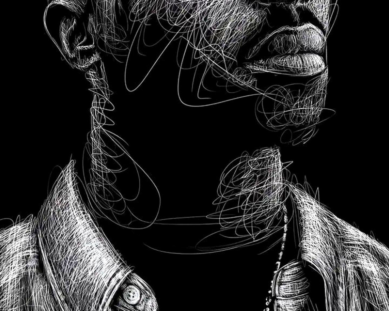
Typography-based prints with Tupac quotes can mix well with photographic prints. I did this in my nephew’s room actually – one big canvas with Pac’s face and two smaller prints with his quotes about ambition and resilience. The text pieces were simpler visually so they didn’t compete with the photo for attention.
Budget Real Talk
You can spend anywhere from $15 to $500+ on Tupac wall art and honestly some of the cheaper options look just fine if you frame them properly. I’ve bought prints off Etsy for $20, put them in $40 frames from Target, and had them look indistinguishable from the expensive versions.
The main difference with pricier options is usually the print quality and paper weight. If you’re going big (like 30×40 or larger), invest in better quality because flaws show up more at that scale. For smaller pieces, mid-range is totally fine.
Custom canvas prints directly from photo printing sites are often cheaper than buying pre-made art from poster shops. I’ve used CanvasDiscount and Printique with good results. You find the image you want (make sure it’s high resolution), upload it, and they ship you the canvas already wrapped and ready to hang.
What’s Actually Worth Splurging On
Metal prints are worth the extra money if you’re putting them in high-traffic areas or anywhere they might get bumped. They’re basically indestructible and the color quality is superior.
Custom framing from a frame shop is worth it for your statement piece – like the main Tupac art that’s the focal point of your room. The quality difference between custom and off-the-shelf framing is noticeable. But for secondary pieces in a gallery wall? IKEA frames are fine, nobody’s gonna notice.
Limited edition prints or officially licensed stuff holds value better if you care about that. I don’t usually care because I’m decorating spaces not investing in art, but some people want authenticity.
Common Mistakes I See Literally All The Time
Hanging things too high is number one. The center of your art should be at eye level, which is roughly 57-60 inches from the floor. People always hang stuff way up near the ceiling for some reason and it looks wrong.
Overcrowding is another big one. If you’re doing multiple pieces, they need space to breathe. I generally leave 2-4 inches between frames in a gallery wall arrangement. Any closer and it looks cluttered, any farther and they don’t read as a cohesive grouping.
Ignoring the room’s existing style is a huge mistake. A gritty black and white Tupac print doesn’t work in a shabby chic room with floral wallpaper and vintage tea sets, you know? Make sure your art choice actually fits the space’s overall vibe.
Oh and another thing – people forget about the space above the art. You need at least a few inches between the top of the frame and the ceiling or it looks cramped and weird.
My Go-To Combinations That Never Fail
One large black and white Tupac portrait (like 30×40) flanked by two smaller complementary pieces – either other hip hop artists or abstract music-themed prints. This works above a couch, bed, or console table.
Three same-size prints in a horizontal row showing different sides of Pac – maybe one with the bandana, one in a suit from a premiere, one performing. Keep frames identical and spacing even. Super clean look that works in modern spaces.
Single oversized canvas (40×60 or bigger) as a statement wall. Nothing else on that wall, just let it dominate. This works best in rooms with minimal furniture and clean lines.
For smaller spaces like offices or bedrooms, one medium print (20x30ish) with two or three tiny accent pieces arranged asymmetrically around it. The small pieces can be quotes, album covers, or related imagery. Creates visual interest without overwhelming a small wall.
The Unexpected Placement That Works
Behind a bar cart or bookshelf can actually be cool if the furniture is low enough that most of the art shows. Creates this layered look that feels intentional and curated. I did this in my living room with a Tupac print behind my record player setup and I honestly love how it turned out.
Okay so I think that covers most of what I’ve figured out through trial and error… my dog is losing his mind at something outside so I gotta go check that out but yeah, hopefully this helps you avoid the mistakes I’ve made over the years. The main thing is just making sure whatever you choose actually fits your space and doesn’t look like you just grabbed random stuff off the internet without thinking about how it works together.