Wall Art Guide, Wall Art Tutoriels
Dr Seuss Wall Art: Children’s Book Character Nursery Decor
Jul
So I’ve been down this Dr Seuss nursery rabbit hole for like three months now because my sister asked me to help with her baby’s room and honestly it turned into this whole thing where I tested way more options than any sane person should.
The Thing Nobody Tells You About Dr Seuss Art
Okay first off, licensing is WEIRD with Dr Seuss stuff. Like you’d think you can just grab any cute Lorax print off Etsy but technically a lot of that is… not exactly official? I’m not saying don’t buy from independent sellers, I’m just saying be aware that some prints are gonna be better quality than others and some might disappear if the shop gets a takedown notice. The officially licensed stuff is usually from Trend Lab, Manhattan Toy Company, or through partnerships with Dr Seuss Enterprises.
The safest route is going through places like Pottery Barn Kids or Target’s nursery section because they’ve got the actual licensing deals figured out. But also those can be kinda pricey and honestly? Sometimes the Etsy versions look better because they’re not trying to match some mass-market aesthetic.
What Actually Works on Walls
I tested this in my own guest room first before recommending anything to my sister (my dog kept staring at the Cat in the Hat print like it personally offended him, it was hilarious). Here’s what I found actually works:
Canvas Prints vs Framed Prints
Canvas is gonna be your safest bet if you’ve got a toddler who might throw things. No glass to worry about. But here’s the thing – cheap canvas prints look CHEAP. Like that weird pixelated thing happens where you can see the texture through the image and it just looks off. You want at least 300 DPI resolution, and most Etsy sellers won’t tell you that info unless you ask.
Framed prints look more polished but you gotta use plexiglass instead of real glass. I learned this the hard way when I was staging a client’s nursery and specifically requested acrylic fronts. Regular glass in a baby’s room is just asking for trouble.
The Size Question Everyone Gets Wrong
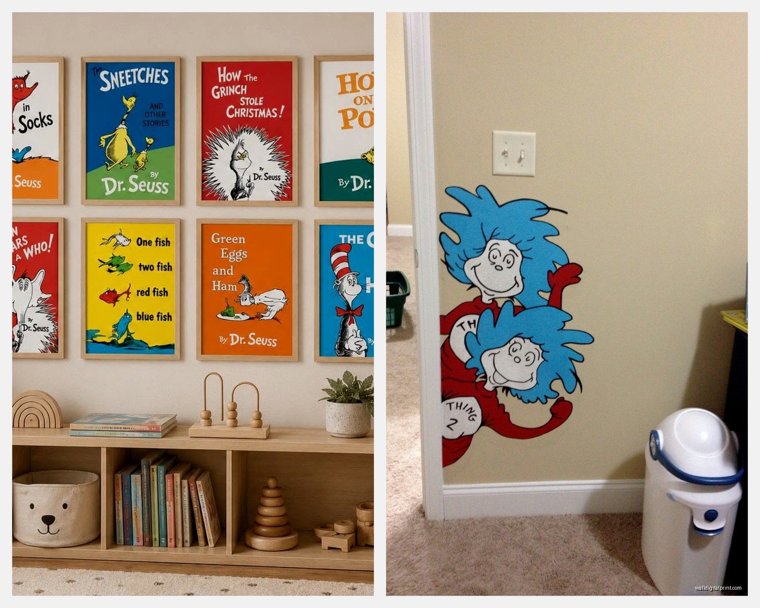
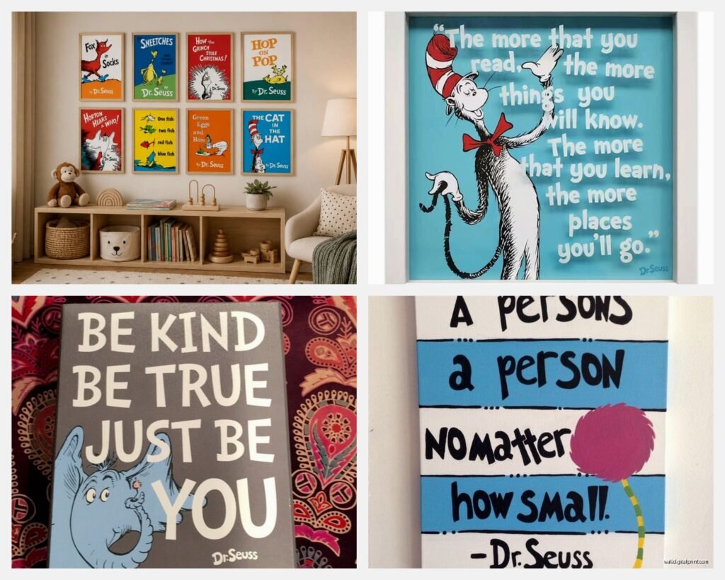
People always go too small. I see it constantly. They’ll put these tiny 8×10 prints above a crib and it just looks… sad? For over a crib or changing table, you want at least 16×20, maybe even 20×30 if you’ve got the wall space.
The rule I use is measure your furniture width and go at least 2/3 that size for your art. So if your changing table is 36 inches wide, you want art that’s at least 24 inches across. You can do a gallery wall of smaller pieces but that’s more work and honestly harder to pull off without it looking chaotic.
Which Characters Actually Work Best
This is gonna sound weird but not all Dr Seuss characters translate well to nursery decor. Like I love the Grinch as much as anyone but his whole vibe is kind of… mean? For a baby’s room?
The Winners
The Lorax – Soft colors, nature themes, that whole environmental message. Works perfectly. I did a whole Lorax-themed accent wall for a client last year with the Truffula trees in pastels and it photographed SO well. The Lorax himself is cute without being too babyish, which means the room can grow with the kid.
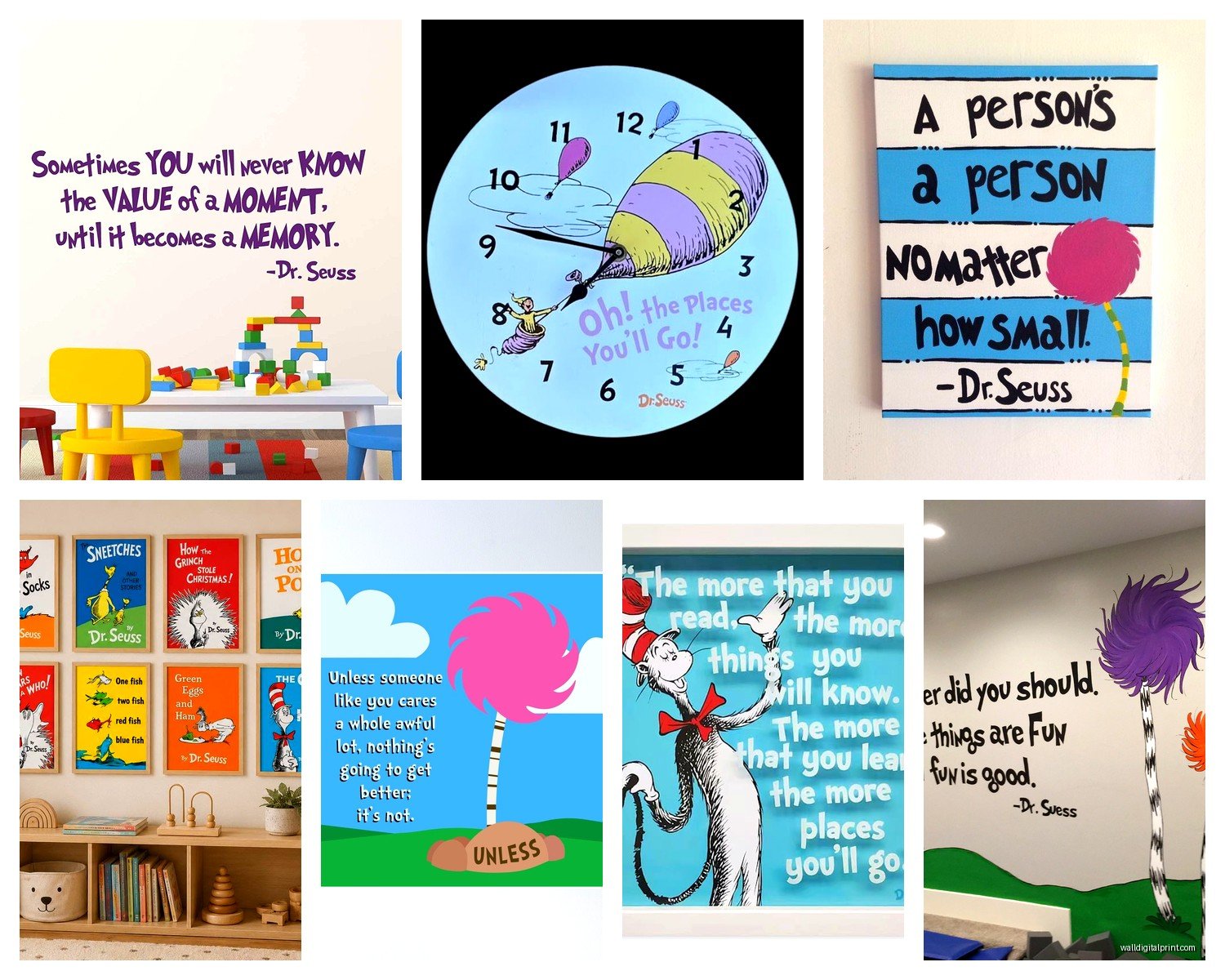
Oh the Places You’ll Go – This one’s huge right now. Hot air balloons, adventure themes, inspirational without being preachy. The color palette is usually soft enough that it doesn’t overwhelm a small room. I’ve used this theme probably five times in the last year alone.
One Fish Two Fish – Classic, recognizable, and the fish themselves are simple shapes that work in any color scheme. You can find this in literally any color combination. Want mint and coral? Someone’s made it. Navy and yellow? Yep. It’s the most flexible option.
The Maybes
The Cat in the Hat – Look, it’s iconic. But that red is AGGRESSIVE. If you’re gonna do Cat in the Hat, you need to commit to that red or find prints that tone it down to like a dusty rose or something. I’ve seen it work in modern black and white with just pops of red, that was actually pretty cool.
Horton Hears a Who – Cute elephant, sweet message, but limited design options compared to other books. Can feel a bit dated depending on the art style.
The Hard Pass
Green Eggs and Ham sounds good in theory but that green is hard to work with. And the Grinch like I said. Also The Cat’s Quizzer is too chaotic for a sleep space – too many competing elements.
My Actual Shopping Strategy
okay so funny story, I once spent like two hours in Target’s baby section just comparing print qualities with my phone flashlight because the store lighting was terrible. The staff definitely thought I was weird.
Here’s what I do now:
Start with your color palette – Don’t pick art first. Pick your wall color, your crib bedding, your rug. THEN find art that works with it. I know everyone says to start with art but trust me, it’s so much easier the other way around. There are a million Dr Seuss prints in every color combo imaginable.
Mix official and unofficial – Get one or two really nice official pieces as your anchors, then fill in with Etsy prints that match the vibe. The Etsy stuff is usually way cheaper and you can often get custom colors.
Check return policies obsessively – Colors look different on screens than in person, especially with nursery stuff. Amazon’s usually good about returns. Etsy varies by seller so read those shop policies.
The Technical Stuff That Matters
Hanging Methods for Nurseries
Do NOT use those 3M strips for anything over 5 pounds. I don’t care what the package says. They fail. I’ve had art crash down in the middle of the night and it’s terrifying.
For canvas prints, use proper wall anchors. For frames, use two hanging points instead of one so it can’t tilt. And this is super important – install everything BEFORE the baby arrives. You don’t wanna be drilling holes and making dust when there’s a newborn in the house.
Placement Height
People always hang nursery art too high because they’re thinking about adult eye level. But you’re gonna be sitting in that glider or standing at the changing table, and you want to actually enjoy looking at the art.
For over a crib: 6-12 inches above the headboard
For over a changing table: Same thing, 6-12 inches above
For a gallery wall: Center point should be about 57 inches from the floor (that’s standard gallery height)
Budget Breakdown From Someone Who’s Done This Too Many Times
Splurge option ($200-400 total): Get a custom canvas set from Pottery Barn Kids or a similar retailer. Three-piece sets usually run around $300. Quality is consistently good, colors are accurate to website, they’ll last forever.
Middle ground ($80-150 total): Mix of Target framed prints (they have cute Dr Seuss options for like $30-40 each) plus one or two Etsy downloads that you print at Costco or your local print shop. This is honestly the sweet spot.
Budget option ($30-60 total): All Etsy digital downloads, print them yourself at Costco (seriously their print quality is shockingly good), frames from Michael’s with a coupon. Takes more effort but totally works.
I did the budget option for my sister because she was adamant about not spending much, and honestly? Her nursery looks just as good as the ones where I’ve used expensive prints. You just gotta be more careful about resolution and color matching.
The Color Coordination Thing
This is where people get stuck. You’ve got this Dr Seuss print you love but it has like seven colors and now what?
Pull 2-3 colors max from the print and repeat those throughout the room. Ignore the rest. So if you’ve got a Lorax print with orange, yellow, blue, green, and pink, pick maybe the orange and blue and use those for your accents. The other colors are just there in the art, they don’t need to appear elsewhere.
I see people trying to match every single color and the room ends up looking like a crayon box exploded. Less is more, I promise.
Neutral Walls Are Your Friend
White, cream, light gray, soft greige – these all make Dr Seuss art pop without competing. I tried doing a Dr Seuss room with a statement wall color once (this teal situation) and it was too much. The art got lost.
If you want color on the walls, do it on an accent wall that doesn’t have the main art. Or go really light with it, like a barely-there mint or the palest yellow.
Real Talk About What Actually Matters
Your baby will not care about any of this. Like at all. They can barely see colors for the first few months. This is 100% for you and for photos and for visitors to compliment.
That said, you’re gonna spend SO much time in this room. Middle of the night feedings, rocking a fussy baby, endless diaper changes. You might as well make it a space you don’t hate looking at.
The Dr Seuss stuff works because it’s cheerful without being overly cutesy, and it’s something you can appreciate even when you’re exhausted at 3am. Plus the messages from the books are actually pretty sweet – way better than generic “dream big” type stuff.
What I’d Buy Right This Second
If someone handed me like $150 and said do a Dr Seuss nursery wall, I’d get:
- One large “Oh the Places You’ll Go” canvas from Target or Amazon (around $60-80 for a good 20×30)
- Two coordinating prints from Etsy – maybe hot air balloons and a quote print, get the digital downloads for like $5-8 each
- Print those at Costco for $15-20 total
- Grab two simple frames from IKEA (their RIBBA frames are perfect and cheap)
- Spend whatever’s left on some 3D elements like paper butterflies or felt ball garland in matching colors
That would give you a cohesive look with variety and wouldn’t break the bank. The 3D elements are key because flat art alone can feel boring – you want some texture and dimension.
wait I forgot to mention the lighting thing. If your nursery doesn’t have great natural light, warm LED bulbs make a huge difference in how art looks. Cool white bulbs make everything look washed out and sad. This seems obvious but I’ve walked into so many nurseries with terrible lighting that makes beautiful art look meh.
Also consider a picture light if you’ve got one large statement piece. Not necessary but it adds that finished look and makes the art visible during nighttime stuff without needing harsh overhead lights.
Mistakes I’ve Made So You Don’t Have To
Bought a print set where the colors were slightly different between pieces because they came from different printers. Looked fine online, weird in person. Now I always order sets from the same seller at the same time.
Hung a heavy frame with just a single nail. It lasted three weeks before crashing down. Luckily not over the crib but still scary.
Got talked into a very specific color palette that matched the bedding perfectly, then the baby had reflux issues and they had to replace all the bedding with darker colors. The art didn’t work anymore. Keep it flexible.
Printed digital downloads at Walgreens to save money. Quality was terrible, had to redo them at a real print shop anyway. Sometimes cheap is actually more expensive.
The main thing is you can always change it later. Art is literally the easiest thing to swap out if you decide you hate it or the kid grows out of it. So don’t stress too much about making it perfect, just make it functional and pleasant to look at and you’re good.