
Wall Art Guide, Wall Art Tutoriels
Peaceful Wall Art: Calming Serene Tranquil Designs
Jul
So I’ve been absolutely obsessed with peaceful wall art lately because honestly, my apartment was starting to feel like visual chaos and I needed to figure this out. Let me tell you what actually works versus what just looks good on Pinterest but does nothing for your actual stress levels.
The Color Thing Everyone Gets Wrong
Okay so most people think peaceful = blue and white, and like, yes but also no? I spent way too much time testing this in my own bedroom and then with a few clients who specifically said they wanted “calming vibes.” Blues work, obviously, but you gotta be careful because some blues are actually energizing. I learned this the hard way when I hung this gorgeous cobalt abstract piece above my bed and couldn’t figure out why I felt restless.
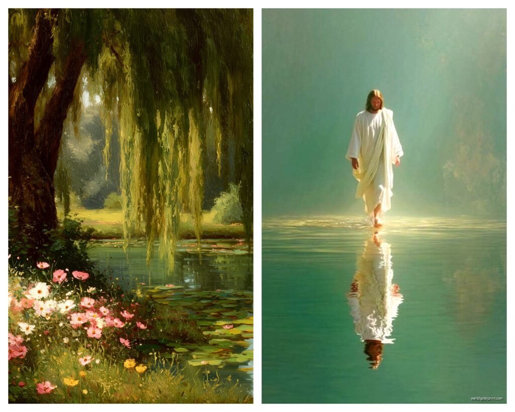
The blues that actually calm you down are the ones with gray undertones. Think foggy morning, not tropical ocean. Sage greens are honestly the MVP here though. I put a large sage and cream botanical print in a client’s home office and she literally texted me a week later saying her afternoon anxiety had decreased. Could be placebo, could be the art, but I’ll take it.
Soft terracotta and blush tones work too, which surprised me because I always associated those with energy. But when they’re muted and combined with neutrals, they create this cocooning effect that’s… I don’t know how to describe it, it’s like visual chamomile tea?
What to Actually Avoid
- Bright whites – they’re harsh and clinical unless you’re going for that specific aesthetic
- Pure black in large quantities – small amounts for contrast are fine but big black pieces can feel heavy
- Neon anything – I mean obviously but I’ve seen people try to make it work and it just doesn’t
- Too much red – even muted reds tend to activate rather than calm
Subject Matter That Actually Calms Your Brain
This is gonna sound weird but I started paying attention to what made me actually pause and breathe versus what I just thought was pretty. Huge difference.
Landscapes work because of the depth thing. Your eye travels into the distance and apparently that mimics the feeling of open space which our brains interpret as safety and calm. I have this simple mountain landscape print above my couch – just soft blues and grays, nothing dramatic – and every single person who visits ends up staring at it. Not because it’s stunning, but because it’s… restful? My cat knocked it off the wall last month and the week it took me to rehang it, I genuinely felt more stressed. Could’ve been work stuff but still.
Abstract pieces with flowing lines are clutch. I’m talking gentle curves, not chaotic geometric stuff. Think water patterns, soft gradients, organic shapes. I found this abstract piece that’s basically just cream and taupe with these flowing brushstrokes and it does more for my nervous system than any meditation app.
Natural Elements
Botanical prints are having a moment but they’ve been calming people forever so that makes sense. But here’s the thing – not all botanical prints are created equal. Those super detailed vintage botanical illustrations? Too busy for actual calm. You want simplified, modern takes on plants. Single stems, minimal backgrounds, lots of negative space.
I curated a gallery wall for someone last year with six small botanical prints – all black and white line drawings with tons of white space around each plant – and the simplicity is what made it work. She wanted something peaceful for her meditation corner and these delivered.
Water scenes are obvious but effective. Oceans, lakes, even abstract representations of water. There’s something about horizontal lines that read as calm to our brains. I have a theory that it’s because horizons mean stability but I’m not a neuroscientist, I just notice what works.
Size and Scale Mistakes I Made
Oh and another thing – size matters way more than I initially thought. I used to think bigger was always better for impact but for peaceful art specifically, you don’t want overwhelming.
For above a bed or sofa, you want something that’s roughly two-thirds the width of the furniture. But for calming specifically, I actually go slightly smaller. Like maybe 55-60% instead. It creates more breathing room, more of that negative space that lets your brain relax.
Multiple smaller pieces can work too but – and this is important – they need to be arranged with plenty of space between them. I see so many gallery walls that are packed tight and yeah they look cool on Instagram but in person they’re visually exhausting. For peaceful vibes, spread things out. My rule is at least 3-4 inches between frames, sometimes more.
The Solo Large Piece Approach
Sometimes one substantial piece is the move though. I’m talking like 40×60 inches or even bigger. But it needs to be simple. A huge abstract with just two or three colors in soft tones. A minimalist landscape. Something that fills the space but doesn’t fill your brain.
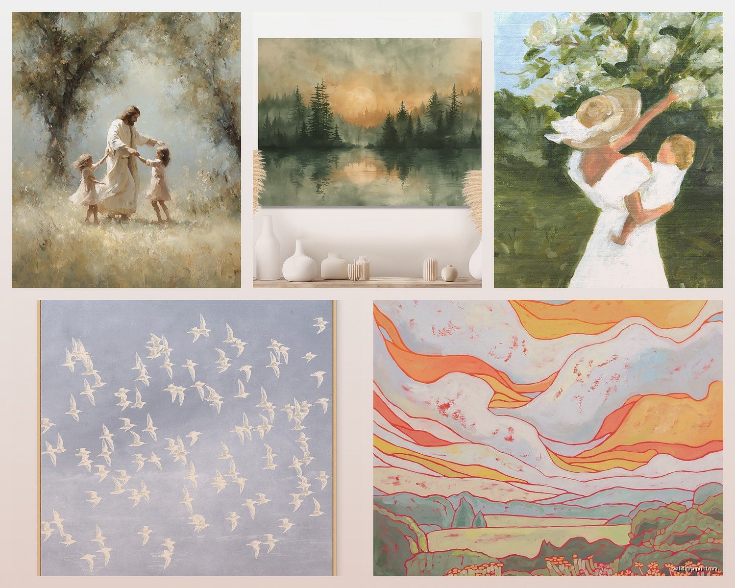
I helped a client choose this massive 48×72 inch abstract for her living room – just soft grays and creams with subtle texture – and it became the entire vibe of the room. Everything else could be a bit messy or mismatched but that piece anchored everything in calm.
Frame Choices That Don’t Ruin Everything
Okay so you can find the perfect peaceful art and then completely mess it up with the wrong frame, I’ve done this.
Natural wood frames in light finishes are your safest bet. Maple, light oak, even bamboo. They add warmth without adding visual weight. White frames work too but they need to be the right white – not bright white, more of a soft white or cream. I usually go with something called “linen white” or “antique white” when I’m buying frames.
Black frames can work for peaceful art but only if the art itself is mostly light. You’re using the black as a grounding element, not a dominant feature. And thin black frames, not chunky ones.
Avoid: ornate frames, metallic finishes (unless it’s a very subtle brushed brass), anything distressed or shabby chic. Those styles fight with the calm vibe you’re trying to create.
No frame at all – just canvas – can be really effective for abstract pieces. Less visual interruption between the art and the wall.
Where to Actually Buy This Stuff
So my client canceled yesterday afternoon and I spent an hour comparing peaceful art options across different sites because apparently that’s what I do with free time now.
Etsy is honestly incredible for this. Search terms like “minimalist landscape print,” “abstract calm art,” “serene botanical print.” You can find downloadable prints for like $5-15 that you print yourself at a local print shop. I’ve done this probably twenty times. Just make sure the resolution is high enough – at least 300 DPI.
Society6 has a huge selection and you can get prints in different sizes, even framed. Their quality is pretty consistent. I’ve ordered maybe a dozen pieces from there over the years for various projects.
Minted is pricier but the quality is noticeably better. I use them when a client has more budget. Their independent artists collection has some really beautiful peaceful pieces.
Local art fairs and markets are worth checking out too. I found this amazing serene abstract piece at a neighborhood art fair last summer that I haven’t seen anywhere online. Plus you’re supporting actual local artists which feels good.
The DIY Route
Wait I forgot to mention – if you’re even slightly crafty, creating your own peaceful art is surprisingly doable. I’m not talking about painting realistic landscapes, I mean abstract calm pieces.
Get a canvas, some acrylic paints in your chosen calm colors, and just do gradients or simple brushstrokes. I made three pieces for my hallway using just cream, sage, and soft gray. Took maybe two hours total including drying time. They’re not gallery-worthy but they’re exactly the vibe I wanted and cost maybe $30 total.
Or do ink wash experiments – that’s when you dilute ink or watercolor with lots of water and let it flow on watercolor paper. Very organic, very calming, very forgiving because there’s no “wrong” way to do it.
Placement Strategy Nobody Talks About
Okay so you’ve got your peaceful art, now where does it actually go? This matters more than people think.
Bedroom: Above the bed obviously, but also consider the wall you see when you’re lying down. I have a small piece on the wall opposite my bed and it’s what I look at when I can’t sleep. Way more useful than the one above my headboard that I never actually see.
Bathroom: Underrated location. A small calming piece in your bathroom makes your morning routine feel more spa-like. Just make sure it’s protected from moisture – sealed print or behind glass.
Home office: Behind your computer screen if possible, so when you look up from work you see something calming. This has genuinely helped my work stress. Also good on the wall opposite your desk so you see it when you’re on video calls – it helps you look relaxed which then actually makes you feel more relaxed, weird brain trick.
Entryway: First thing you see when you come home sets the tone. I have a simple abstract piece by my door and it’s like a visual signal to my brain that I’m entering calm space.
Lighting Makes or Breaks It
This is something I didn’t pay enough attention to at first. You can have perfect peaceful art but if the lighting is harsh or wrong, it won’t feel peaceful.
Soft, warm lighting is essential. I use LED bulbs in the 2700K-3000K range – that’s the warm white range. Avoid cool white or daylight bulbs near your peaceful art, they make everything feel clinical.
Picture lights can work for larger pieces but keep them subtle. No bright spotlights. You want gentle illumination that enhances the art without creating drama.
Natural light is great during the day but consider what happens at night. I have blackout curtains in my bedroom because the streetlight was washing out my art and making the whole peaceful vibe disappear after dark.
Mixing Peaceful Art with Your Existing Stuff
You probably can’t just redo your entire space with only peaceful art, and honestly you shouldn’t because too much of one thing gets boring. But you can anchor a room with calming pieces and let other stuff be more energetic.
I have a pretty eclectic living room – some colorful throw pillows, books everywhere, kinda messy if I’m being honest – but the large serene abstract above the sofa keeps everything from feeling chaotic. It’s like… the calm eye of a colorful storm? That sounds dramatic but you know what I mean.
Or create a dedicated calm zone. One wall or one corner that’s your peaceful spot with the serene art, simple furniture, minimal stuff. The rest of your space can be more energetic.
The Matting Trick
Oh and if your peaceful print feels like it’s not quite working, try adding a mat before you give up on it. A wide mat in white or cream creates more of that precious negative space and can transform a piece. I’ve saved several art choices this way.
Testing Before You Commit
Here’s what I actually do now before buying or hanging anything permanent: I tape up a paper version first. Just print a small version or even tape up a piece of paper the right size and live with it for a few days. See if you actually feel calmer or if you stop noticing it.
I know this sounds extra but I’ve wasted money on art that looked perfect online but felt wrong in my actual space. The testing phase has saved me probably hundreds of dollars at this point.
Also pay attention to your body’s response, not just your brain’s opinion. Do your shoulders relax when you look at it? Does your breathing slow down even a tiny bit? That’s the art working. If you just think “yeah that’s nice” but don’t feel anything, keep looking.
The whole point of peaceful wall art isn’t to impress people or check a design box, it’s to actually create a feeling in your space. And that feeling is personal – what calms me might not calm you – so trust your own nervous system over any design rules, including mine.
