Wall Art Guide, Wall Art Tutoriels
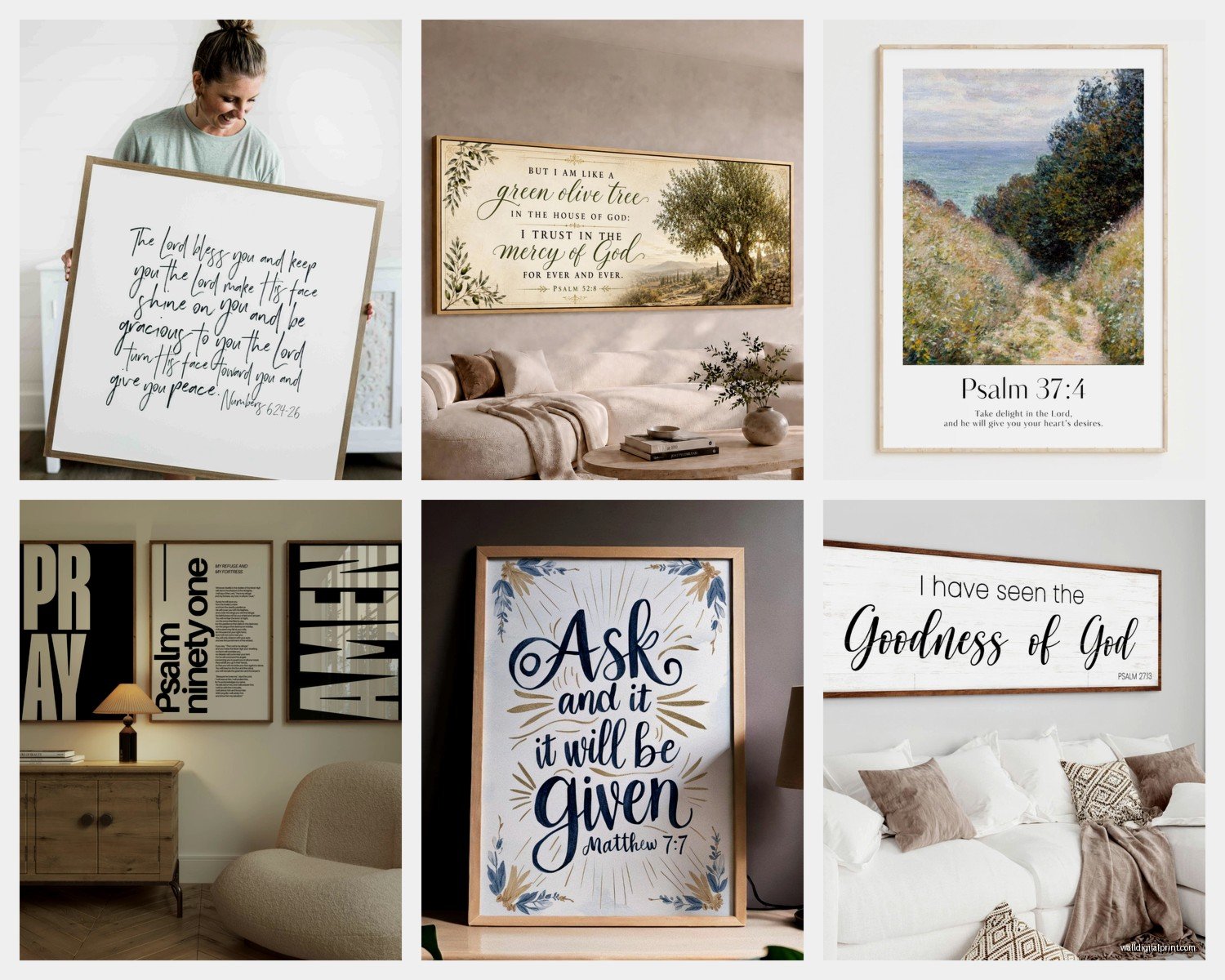
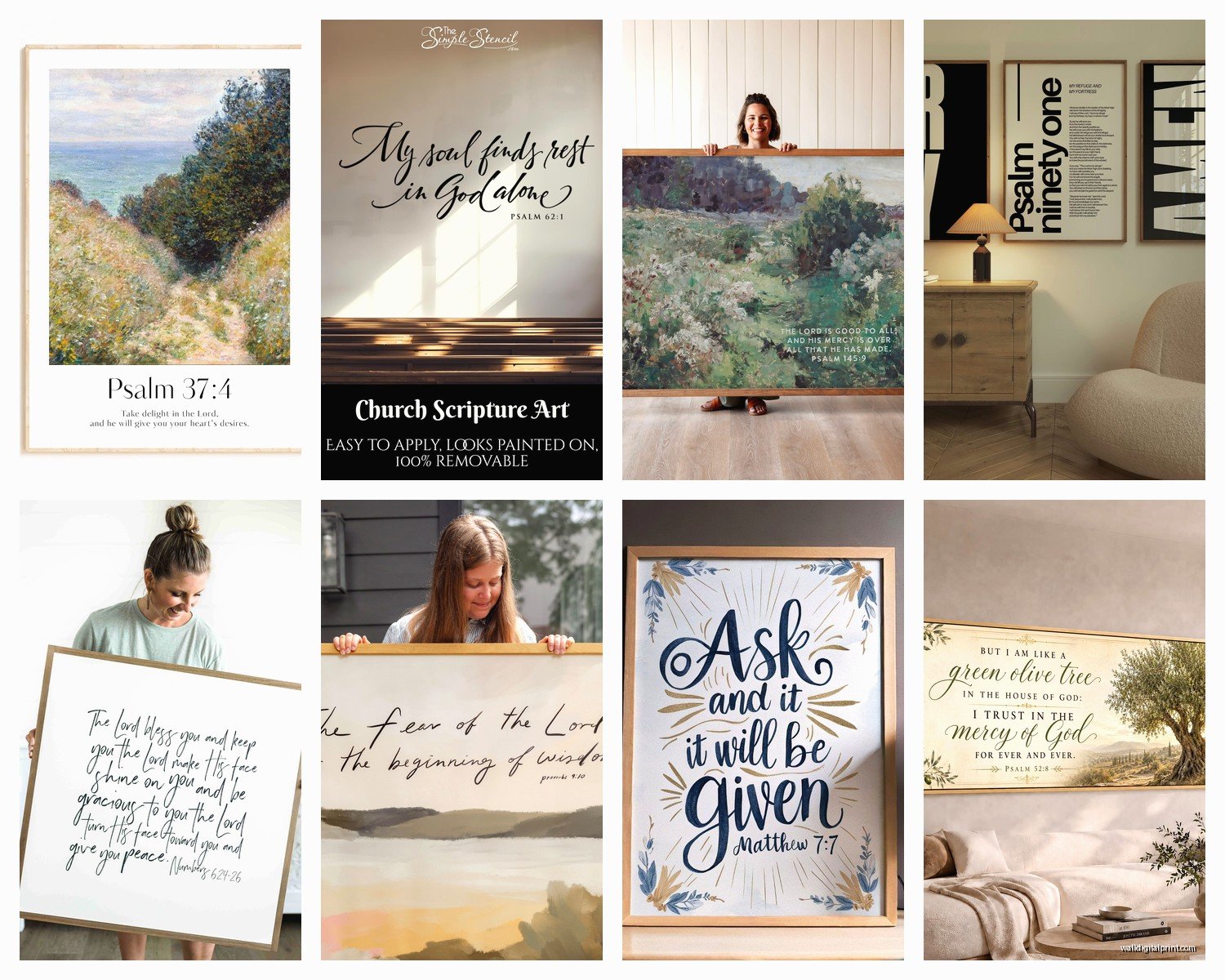
Large Scripture Wall Art: Oversized Bible Verse Designs
Jul
So I’ve been totally obsessed with these oversized scripture pieces lately and honestly it started because a client wanted to fill this massive wall in her entryway and I was like…regular art isn’t hitting the way she wanted. She’s super faith-based and we landed on this enormous Psalm 46:5 piece that literally changed the entire vibe of her home.
The thing about large scripture wall art is it’s NOT the same as just sizing up a regular bible verse print. Like, the design has to actually work at that scale or it looks weird and churchy in a bad way. I’ve tested probably 30+ different styles over the past year and there’s definitely a method to getting it right.
Size Actually Matters More Than You Think
Okay so when I say oversized, I’m talking minimum 36×48 inches, but honestly the sweet spot is around 48×60 or even bigger if you have the wall space. Anything smaller and you’re just dealing with regular wall art that happens to have words on it. The impact comes from that scale.
I made this mistake early on where I ordered what I THOUGHT was large (30×40) and when it arrived it just looked…fine? Not statement-making at all. My cat literally seemed more interested in the box it came in than the actual piece. You want people to walk into the room and have that moment of “oh wow.”
The rule I follow now: measure your wall space and go for something that takes up about 60-70% of the available width. So if you have an 8-foot wide wall section, you’re looking at something in the 5-6 foot range width-wise. Sounds huge but trust me it works.
Where to Actually Find These
This is gonna sound weird but Etsy is actually one of the best sources for this. Search for “large canvas scripture art” or “oversized bible verse print” and filter by size. The advantage is you can often get custom sizing which is HUGE because not every wall is standard proportions.
I’ve also had good luck with:
- Minted – they do custom sizing and the print quality is consistently good
- Society6 – hit or miss on designs but when you find a good one, the large format options are solid
- Local print shops that can do canvas mounting – sometimes I’ll buy a digital file and have it printed locally which gives you total control over size
- Direct from Christian home decor brands like Dayspring or Carpentree, though their styles tend more traditional
Design Styles That Actually Work at Scale
Here’s where it gets tricky. Not every design translates well when you blow it up huge. I learned this the hard way with a really intricate floral design that looked amazing in the thumbnail but at 5 feet wide it was just…busy and overwhelming.
Minimalist Typography
This is my go-to recommendation like 80% of the time. Clean, simple text with maybe one design element. Think black text on white background or vice versa. The verse becomes the focal point without competing visual elements.
I did a Philippians 4:13 piece for a home gym space that was literally just the text in a bold sans-serif font, 60×40 inches, black on cream. The client was skeptical at first but once it was up she was like yeah okay I get it now. The scale makes the simplicity powerful instead of boring.
Watercolor or Abstract Backgrounds
These work if the background is subtle enough. Soft washes of color – think dusty blues, sage greens, muted corals. The text should still be the star but the background adds dimension without chaos.
Wait I forgot to mention – if you’re going this route, make sure the contrast is strong enough. I once approved a design with gray text on a pale blue watercolor background and from more than 6 feet away you couldn’t even read it. Total fail. Needed to be much darker text.
What Doesn’t Work
Heavy borders or frames within the design itself – looks dated and cuts down on the impact of the size. Also multiple fonts in one piece usually reads as cluttered at large scale. And this might be controversial but I’m not a fan of the really scripty, hard-to-read calligraphy fonts when you go big. They’re pretty but illegible from across a room which defeats the purpose.
Choosing the Right Verse
Length matters a LOT here. You can’t fit Romans 8:28 with the full context on a piece and have it be readable. Well you CAN but it’ll look like a book page mounted on your wall.
Best verses for oversized art are:
- Short and punchy – Psalm 46:10 “Be still and know that I am God”
- Single powerful lines – Joshua 1:9, Proverbs 3:5-6 (though this one’s borderline too long)
- Phrases that stand alone – “I am with you always” from Matthew 28:20
I usually recommend sticking to 15 words or less if possible. More than that and either the text gets too small to make an impact, or you need a truly massive wall to accommodate it.
Oh and another thing – consider whether you want the reference included. Sometimes just the verse without the chapter/verse citation looks cleaner. Sometimes including it adds authenticity. Depends on your space and preference.
Placement Strategy
Okay so you’ve got this giant piece of scripture art…where does it actually go?
Entryways and foyers – This is honestly my favorite spot. It’s the first thing people see and it sets the tone for your entire home. I hung a huge “As for me and my house, we will serve the Lord” piece in my own entryway last year and the number of comments I get is wild.
Above the bed – Classic for a reason but you gotta be careful with scale here. It should be about 2/3 the width of your bed minimum. A king bed needs a seriously large piece or it looks dinky.
Living room focal wall – Especially if you don’t have a TV or fireplace dominating the space. This becomes your anchor point for furniture arrangement.
Stairway walls – If you have a tall stairwell wall, a vertical orientation piece can be absolutely stunning. Psalm 121 “I lift up my eyes to the hills” works beautifully in vertical format.
Material Choices and Mounting
This is gonna sound boring but it actually matters for longevity and appearance.
Canvas – Most popular and for good reason. Gallery-wrapped canvas (where the image wraps around the sides) looks finished without needing a frame. At large sizes, make sure it’s stretched on a substantial frame, like 1.5-2 inch depth minimum or it can warp over time.
Wood signs – Super trendy right now, especially the rustic farmhouse vibe. These work great for certain aesthetics but they’re HEAVY at large sizes. Like you need to find studs, use proper anchors, the whole thing. I helped install a 4×6 foot wood piece last month and we needed three people to hang it safely.
Acrylic or metal prints – More modern look, really crisp. The reflection can be an issue depending on lighting so I usually recommend these for spaces without direct window glare.
Framed prints – Traditional but at oversized dimensions, frames get expensive fast. You’re looking at $200-400 just for framing on top of the print cost. But if your decor style is more classic or traditional, totally worth it.
Installation Reality Check
You cannot just hammer a nail and hope for the best with these pieces. A 48×60 canvas weighs like 15-25 pounds depending on materials. You need:
- Stud finder
- Level (a long one, not that tiny thing in your junk drawer)
- Heavy-duty picture hanging hooks or D-rings with wire
- Wall anchors if you can’t hit studs
- Honestly maybe a second person to help
I’ve seen too many beautiful pieces crash to the floor because someone used inadequate hardware. My client’s teenage son learned this lesson at 2am when their Joshua 1:9 piece came down. Thankfully the canvas wasn’t damaged but the drywall repair was not fun.
Color Coordination Without Being Matchy-Matchy
The scripture piece should complement your space but doesn’t need to match exactly. Actually, it’s usually better if it doesn’t.
If your room is mostly neutrals (beige, gray, white), you can go bold with the scripture art – deep navy text, rich charcoal, even colorful backgrounds. It becomes the pop of visual interest.
If your room already has color happening, I usually recommend sticking with neutral scripture art (black on white, white on gray, etc.) so it doesn’t compete.
The exception is if you’re doing a really cohesive color story throughout the space. Like I did a coastal themed bedroom where we used a scripture piece with soft blue watercolor background that pulled the exact same blue from the bedding and curtains. But that’s more advanced and requires being intentional about it.
Typography Nerding Out for a Second
The font choice literally makes or breaks these pieces. At large scale, you can see every detail of the letterforms, so quality matters.
Serif fonts (the ones with little feet on the letters) read as more traditional, classic, formal. Good for: traditional homes, formal spaces, older congregations if you’re buying for a church.
Sans-serif fonts (clean, no decorative elements) feel modern, accessible, contemporary. This is what I use probably 70% of the time because it works with more decor styles.
Script fonts need to be used sparingly and only if they’re genuinely readable. That trendy brush lettering everyone loves? Cute in small doses, can be a disaster at 5 feet wide if the designer didn’t know what they were doing.
Budget Real Talk
Oversized scripture art isn’t cheap if you want quality that’ll last. Here’s what I typically see:
- Budget option: $80-150 for a large canvas print from Etsy or Amazon
- Mid-range: $150-300 for better quality materials, custom sizing from places like Minted
- High-end: $300-600+ for wood signs, framed pieces, or really premium canvas
- Custom commission: $500-1500+ if you hire an artist to create something unique
I always tell people this is a statement piece, so it’s worth investing in quality. A cheap canvas that fades or warps after a year is actually more expensive than buying a good one upfront.
That said, I’ve found some absolute gems on Etsy in the $120 range that have held up beautifully. You just gotta read reviews and check the seller’s specs carefully.
Mixing Scripture Art with Other Pieces
You don’t have to make your scripture piece the ONLY art in the room, but it should be the dominant piece. I usually create a gallery wall situation where the large scripture piece is the anchor and then add smaller complementary pieces around it.
For example: 48×60 “Be still” verse as the center, then two smaller 16×20 abstract pieces flanking it, maybe some floating shelves with plants below. The scripture is clearly the focal point but it’s not isolated.
Or in a stairway, a large vertical scripture piece with family photos arranged around it at different heights. The verse ties everything together thematically.
What doesn’t work: multiple large scripture pieces competing for attention in the same sightline. Pick one hero piece per space or it starts feeling like a church lobby instead of a home.
Seasonal Swapping
Okay this is extra but some people do swap their large scripture pieces seasonally and honestly…I get it? Like a Christmas-themed verse in a festive colorway for December, then back to your everyday piece in January.
I don’t personally do this because the pieces are heavy and it’s a whole production, but I have a client who swaps between two different verses twice a year and she loves it. Just make sure you have proper storage for the off-season piece because leaning a giant canvas in your garage is asking for damage.
Anyway I think that covers most of what I’ve learned through trial and error with these pieces. The main thing is don’t be scared of going bigger than you think you need – that’s literally the point of oversized art and it’s where the impact comes from.